Brand building no longer depends only on creativity, logos, or advertising slogans. Instead, successful brands grow because leaders track performance, measure perception, and act quickly on data. Therefore, a Brand Management KPI Dashboard in Power BI plays a critical role in modern brand strategy.
In this in-depth guide, you will clearly understand what a Brand Management KPI Dashboard in Power BI is, why organizations need it, how it works, its page-wise structure, key KPIs, advantages, best practices, and frequently asked questions. Moreover, this article uses simple language, strong transitions, and practical explanations so that marketers, brand managers, and business leaders can easily apply these insights.
Click to buy Brand Management KPI Dashboard in Power BI
What Is a Brand Management KPI Dashboard in Power BI?
A Brand Management KPI Dashboard in Power BI is a centralized, ready-to-use analytical dashboard that tracks and visualizes brand performance metrics in one interactive place.
Instead of reviewing scattered Excel files, reports, and presentations, this dashboard converts brand data into clear KPIs, trend charts, icons, and comparisons. As a result, decision-makers gain instant visibility into brand health.
Because the dashboard runs on Power BI, users can explore data dynamically, apply filters, drill through KPIs, and monitor performance across time periods. Additionally, the dashboard connects to an Excel data source, which makes data entry simple and flexible.
Why Do Businesses Need a Brand Management KPI Dashboard?
Brand performance directly impacts revenue, customer trust, and long-term growth. However, many organizations still struggle because they track brand data manually or inconsistently.
A Brand Management KPI Dashboard in Power BI solves this problem by offering:
- Centralized brand performance tracking
- Clear visibility into MTD and YTD performance
- Comparison of current year vs previous year
- Quick identification of underperforming KPIs
- Data-driven brand strategy decisions
Therefore, companies that focus on measurable branding always outperform competitors that rely only on assumptions.
How Does a Brand Management KPI Dashboard in Power BI Work?
The dashboard works by connecting Power BI with a structured Excel data model. You enter actual values, target values, and KPI definitions in Excel. Then, Power BI automatically transforms this data into interactive visuals.
Key Functional Flow
- Enter KPI data in Excel sheets
- Refresh Power BI dataset
- Analyze KPIs using slicers, charts, and icons
- Drill through KPIs for detailed definitions
- Take corrective actions based on insights
Because of this structured flow, teams save time and avoid manual reporting errors.
What Are the Key Pages in the Brand Management KPI Dashboard in Power BI?
This ready-to-use dashboard includes three powerful pages designed for clarity and performance analysis.
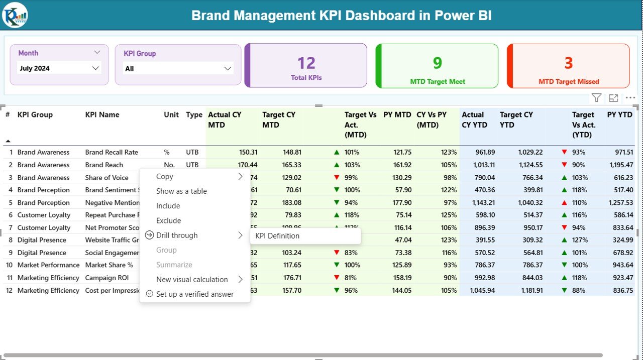
the Summary Page Show
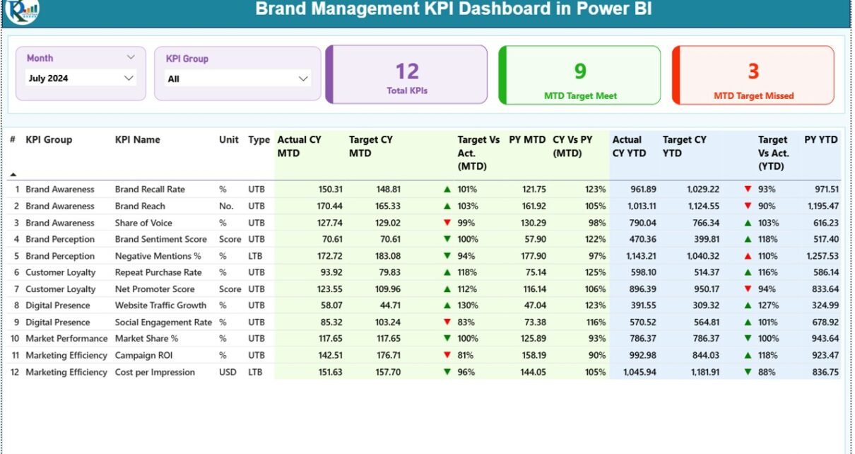
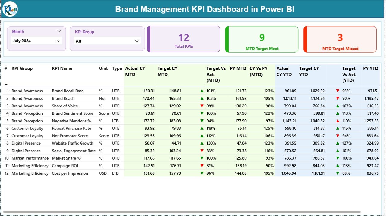
The Summary Page serves as the main landing page of the dashboard. It provides a complete snapshot of brand performance at a glance.
Key Elements on the Summary Page
Slicers
- Month Slicer to select reporting period
- KPI Group Slicer to filter KPIs by category
KPI Cards
- Total KPIs Count
- MTD Target Met Count
- MTD Target Missed Count
These cards instantly highlight brand performance status.
Detailed KPI Table on the Summary Page
The detailed table displays comprehensive KPI-level information, including:
- KPI Number – Sequential number of each KPI
- KPI Group – Category or group of the KPI
- KPI Name – Name of the brand KPI
- Unit – Measurement unit (%, Score, Index, Count, etc.)
- Type – UTB (Upper the Better) or LTB (Lower the Better)
Performance Metrics Displayed
- Actual CY MTD – Current year actual month-to-date value
- Target CY MTD – Target value for the current month
- MTD Icon – ▲ or ▼ icons with green/red indicators
- Target vs Actual (MTD) – Actual ÷ Target percentage
- PY MTD – Previous year MTD value
- CY vs PY (MTD) – Current year vs previous year comparison
YTD Performance Metrics
- Actual CY YTD
- Target CY YTD
- YTD Icon – Visual status indicator
- Target vs Actual (YTD)
- PY YTD
- CY vs PY (YTD)
Because of this structured layout, users can quickly identify trends, gaps, and growth opportunities.
Click to buy Brand Management KPI Dashboard in Power BI
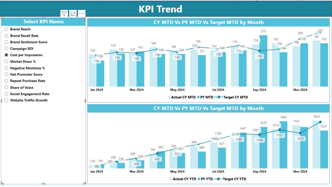
KPI Trend Page
The KPI Trend Page focuses on time-based analysis. It allows users to analyze how a specific brand KPI performs across months.
Key Features of the KPI Trend Page
- KPI Name Slicer for selection
Two Combo Charts showing:
Actual Current Year values
Actual Previous Year values
Target values
These charts visualize both MTD and YTD trends, which helps teams understand momentum and seasonality.
Therefore, brand managers can quickly spot declining awareness, engagement drops, or improvement patterns.
Click to buy Brand Management KPI Dashboard in Power BI
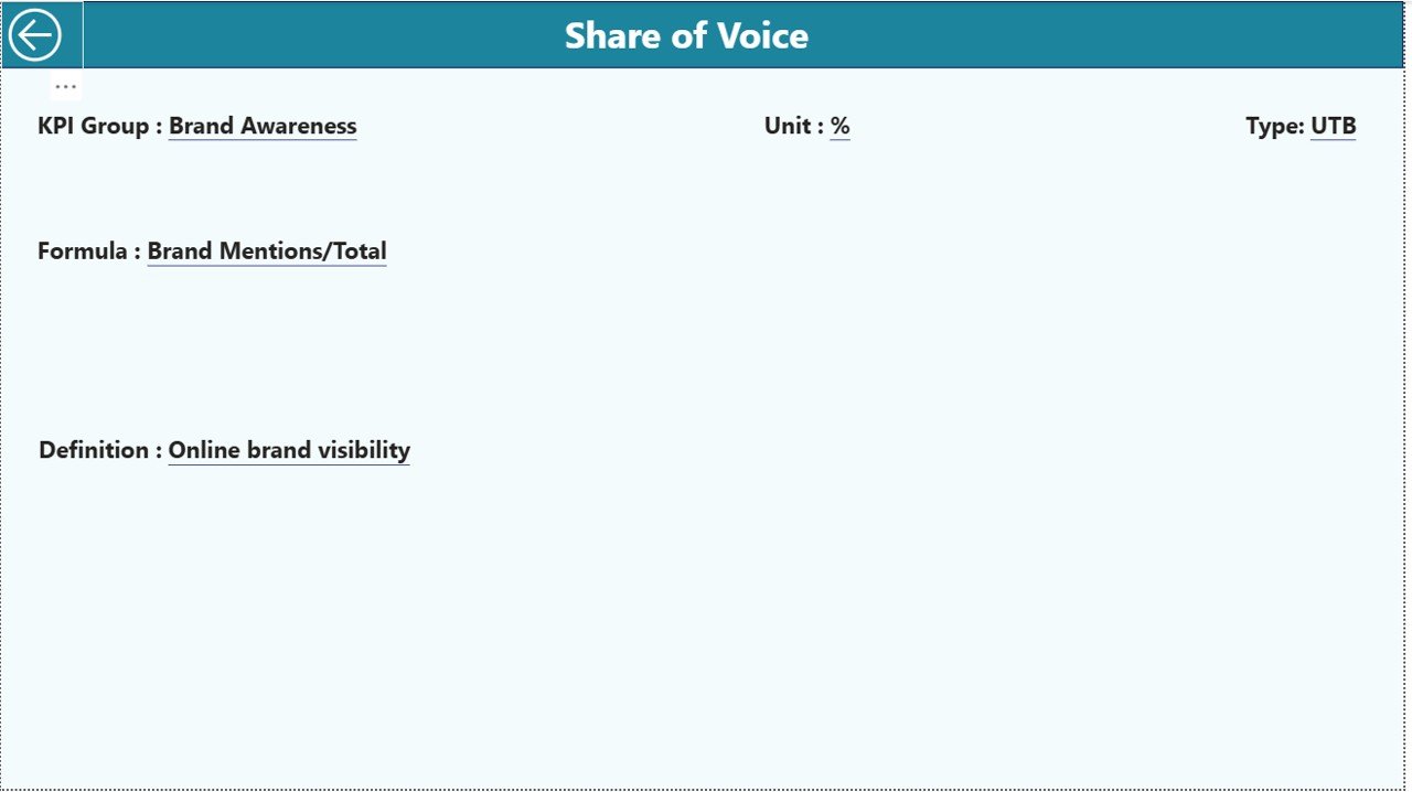
KPI Definition
The KPI Definition Page acts as a hidden drill-through page designed for clarity and governance.
Key Benefits of the KPI Definition Page
- Displays KPI Formula
- Explains KPI Definition
- Shows KPI Unit and Type
- Ensures KPI consistency across teams
Users can drill through from the Summary Page to view KPI details. Moreover, a back button allows easy navigation to the main page.
This structure ensures that all stakeholders interpret KPIs correctly.
Click to buy Brand Management KPI Dashboard in Power BI
How Is Excel Used as the Data Source for the Dashboard?
The dashboard uses Excel as the primary data source, which makes it user-friendly and flexible.
Required Excel Worksheets
Input_Actual Sheet
In this sheet, users enter actual performance data:
- KPI Name
- Month (use first date of the month)
- MTD value
- YTD value
Input_Target Sheet
This sheet stores target values:
- KPI Name
- Month
- MTD Target
- YTD Target
Click to buy Brand Management KPI Dashboard in Power BI
KPI Definition Sheet
This sheet defines KPI metadata:
- KPI Number
- KPI Group
- KPI Name
- Unit
- Formula
- Definition
- Type (UTB or LTB)
Because of this clear structure, data maintenance becomes simple and scalable.
Which KPIs Can You Track Using a Brand Management KPI Dashboard?
A Brand Management KPI Dashboard in Power BI can track a wide range of brand metrics, such as:
- Brand Awareness Score
- Brand Recall Percentage
- Brand Sentiment Index
- Customer Trust Score
- Net Promoter Score (NPS)
- Share of Voice
- Brand Engagement Rate
- Social Media Mentions
- Brand Loyalty Index
- Campaign Effectiveness
Since the dashboard remains flexible, organizations can customize KPIs based on their brand strategy.
Advantages of Brand Management KPI Dashboard in Power BI
A Brand Management KPI Dashboard in Power BI delivers strong business value across marketing and leadership teams.
Key Advantages
- Centralized brand performance tracking
- Real-time MTD and YTD insights
- Clear comparison with targets and previous year
- Visual icons for quick decision-making
- Interactive slicers and drill-through analysis
- Excel-based data input for simplicity
- Scalable and reusable dashboard structure
- Improves strategic brand alignment
Because of these advantages, organizations gain clarity, speed, and confidence in brand decisions.
How Does This Dashboard Improve Brand Decision-Making?
This dashboard converts raw brand data into actionable insights. Therefore, leaders can:
- Identify weak brand touchpoints
- Adjust campaigns quickly
- Improve brand perception proactively
- Align marketing teams on shared KPIs
- Track progress against brand goals
As a result, brand strategy becomes measurable and outcome-focused.
Best Practices for the Brand Management KPI Dashboard in Power BI
To maximize value, teams should follow proven best practices.
Best Practices
- Define clear KPI ownership
- Use consistent KPI definitions
- Update Excel data regularly
- Review MTD and YTD trends monthly
- Compare CY vs PY before decisions
- Limit KPIs to strategic priorities
- Use slicers for focused analysis
- Train teams on KPI interpretation
When teams follow these practices, dashboards deliver long-term value instead of becoming static reports.
Who Should Use a Brand Management KPI Dashboard?
This dashboard benefits multiple stakeholders, including:
- Brand Managers
- Marketing Leaders
- Digital Marketing Teams
- Strategy Teams
- CMOs and Executives
- Market Research Analysts
Because the dashboard remains intuitive, both technical and non-technical users can use it confidently.
How Is This Dashboard Different from Traditional Brand Reports?
Traditional brand reports rely on static slides and delayed data. In contrast, a Power BI dashboard offers:
- Live filtering
- Interactive visuals
- Faster insights
- Reduced manual effort
- Better collaboration
Therefore, organizations move from reporting to performance management.
Conclusion: Why Every Brand Needs a KPI Dashboard in Power BI
A Brand Management KPI Dashboard in Power BI transforms how organizations measure, monitor, and manage brand performance. Instead of guessing brand health, teams rely on accurate data, structured KPIs, and clear trends.
Because the dashboard integrates Excel data, interactive visuals, and KPI governance, it supports smarter decisions and stronger brand growth. In today’s competitive environment, brands that track performance consistently always stay ahead.
Frequently Asked Questions (FAQs)
What is a Brand Management KPI Dashboard in Power BI?
A Brand Management KPI Dashboard in Power BI is an interactive dashboard that tracks brand performance metrics using Power BI visuals and Excel data sources.
Can beginners use this dashboard?
Yes, beginners can easily use it because data entry happens in Excel and Power BI visuals remain intuitive.
Which data source does this dashboard use?
The dashboard uses an Excel file with Actual, Target, and KPI Definition sheets.
Can I customize KPIs in the dashboard?
Yes, you can add, remove, or modify KPIs by updating the Excel data and KPI Definition sheet.
Does this dashboard support MTD and YTD analysis?
Yes, it provides both MTD and YTD performance with target and previous year comparisons.
Is Power BI Desktop required?
Yes, you need Power BI Desktop to open, refresh, and analyze the dashboard.
Can this dashboard scale for large organizations?
Yes, the structure supports scalability and can handle multiple KPI groups and periods.
YouTube channel to learn step-by-step video tutorials
Watch the step-by-step video tutorial:
Click to buy Brand Management KPI Dashboard in Power BI