In today’s fast-moving digital workplace, knowledge sharing and collaboration decide how fast teams learn, innovate, and deliver results. However, many organizations still struggle to measure how well employees share knowledge, collaborate across teams, and use internal resources. That is exactly where a Knowledge Sharing & Collaboration KPI Dashboard in Power BI becomes a powerful solution.
This in-depth article explains what a Knowledge Sharing & Collaboration KPI Dashboard in Power BI is, why organizations need it, how it works, its page-wise structure, data model, advantages, best practices, and frequently asked questions. Moreover, the content uses simple language, active voice, strong transitions, and practical explanations to ensure clarity and SEO effectiveness.
Click to buy Knowledge Sharing & Collaboration KPI Dashboard in Power BI
What Is a Knowledge Sharing & Collaboration KPI Dashboard in Power BI?
A Knowledge Sharing & Collaboration KPI Dashboard in Power BI is a ready-to-use, interactive analytical dashboard that tracks, analyzes, and visualizes key performance indicators related to knowledge exchange and teamwork.
Instead of relying on assumptions or scattered reports, this dashboard provides data-driven visibility into how effectively employees collaborate, share insights, and contribute to organizational learning. As a result, leaders gain clear, actionable insights to improve collaboration culture.
Because the dashboard uses Power BI, users can explore KPIs dynamically, apply slicers, drill through metrics, and compare performance across time.
Why Do Organizations Need a Knowledge Sharing & Collaboration KPI Dashboard?
Although collaboration tools like intranets, document repositories, and chat platforms exist, many organizations fail to measure their effectiveness. Therefore, decision-makers often lack visibility into collaboration performance.
A Knowledge Sharing & Collaboration KPI Dashboard in Power BI solves this challenge by:
- Centralizing all collaboration KPIs in one place
- Tracking MTD (Month-to-Date) and YTD (Year-to-Date) performance
- Comparing current year vs previous year trends
- Highlighting KPIs that meet or miss targets
- Supporting data-driven improvement initiatives
As a result, organizations move from intuition-based decisions to measurable collaboration outcomes.
How Does the Knowledge Sharing & Collaboration KPI Dashboard in Power BI Work?
This dashboard uses an Excel file as the data source, which makes it easy to maintain and update. You only need to enter actual and target values in structured sheets, and Power BI handles the visualization automatically.
Data Flow Overview
- Update KPI actual and target values in Excel
- Refresh the Power BI dashboard
- Instantly view updated KPIs, trends, and status indicators
Because of this structure, even non-technical users can manage the dashboard efficiently.
What Are the Key Features of the Knowledge Sharing & Collaboration KPI Dashboard?
This ready-to-use dashboard includes three well-designed pages, each serving a specific analytical purpose.
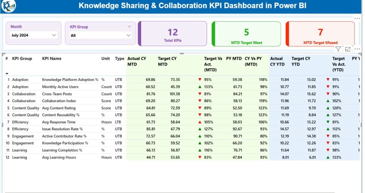
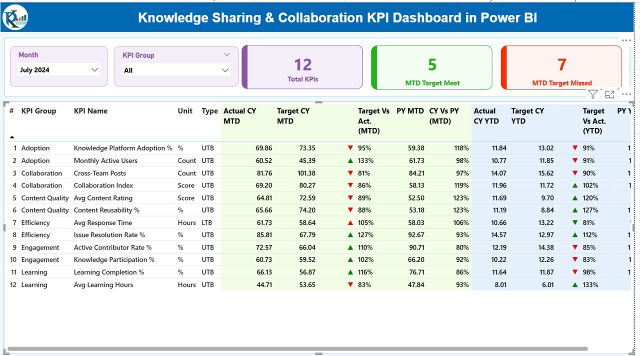
Summary Page
The Summary Page acts as the central control panel of the dashboard. It provides a high-level overview of all knowledge sharing and collaboration KPIs.
Key Elements of the Summary Page
Interactive Slicers
- Month slicer
- KPI Group slicer
These slicers allow users to focus on specific time periods and KPI categories.
KPI Cards
- Total KPIs count
- MTD Target Meet count
- MTD Target Missed count
These cards instantly show overall performance status.
Detailed KPI Table
The table below the cards displays comprehensive KPI-level details:
- KPI Number – Sequence number of the KPI
- KPI Group – Category or group of the KPI
- KPI Name – Name of the KPI
- Unit – Unit of measurement
- Type – LTB (Lower the Better) or UTB (Upper the Better)
- Actual CY MTD – Current Year Month-to-Date actual value
- Target CY MTD – Current Year Month-to-Date target value
- MTD Icon – ▲ or ▼ with green/red color for target status
- Target vs Actual (MTD) – Actual ÷ Target (MTD)
- PY MTD – Previous Year Month-to-Date value
- CY vs PY (MTD) – Current Year ÷ Previous Year (MTD)
- Actual CY YTD – Current Year Year-to-Date actual value
- Target CY YTD – Current Year Year-to-Date target value
- YTD Icon – ▲ or ▼ with green/red color
- Target vs Actual (YTD) – Actual ÷ Target (YTD)
- PY YTD – Previous Year Year-to-Date value
- CY vs PY (YTD) – Current Year ÷ Previous Year (YTD)
Because of this structured view, users can immediately identify performance gaps.
Click to buy Knowledge Sharing & Collaboration KPI Dashboard in Power BI
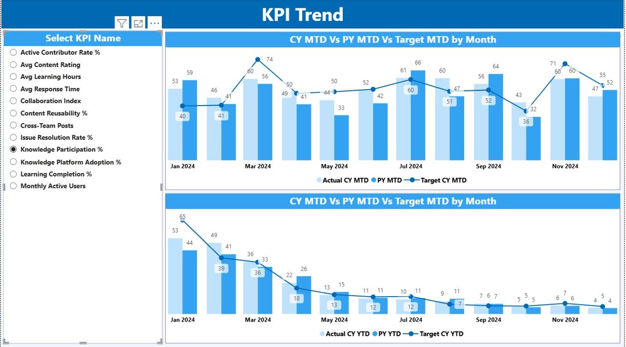
KPI Trend Page
The KPI Trend Page focuses on performance trends over time.
Key Features of the KPI Trend Page
- Two combo charts for MTD and YTD
Comparison of:
Current Year Actual
Previous Year Actual
Target values
KPI Name slicer on the left
This page helps users answer critical questions such as:
- Is collaboration improving month by month?
- Are targets realistic or too aggressive?
- How does current performance compare with last year?
As a result, managers gain clarity on long-term collaboration trends.
Click to buy Knowledge Sharing & Collaboration KPI Dashboard in Power BI
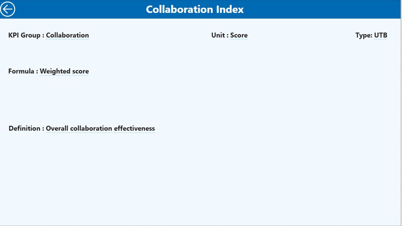
KPI Definition Page
The KPI Definition Page provides contextual clarity for each KPI.
Key Characteristics
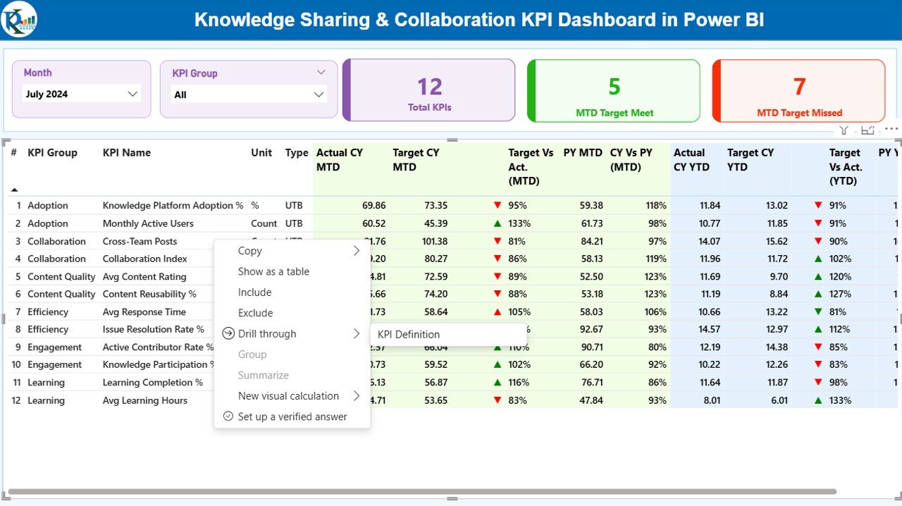
- Hidden drill-through page
- Accessible directly from the Summary Page
- Displays:
KPI Formula
KPI Definition
KPI intent and measurement logic
Users can return to the main page using the back button on the top-left corner.
Because of this feature, users avoid confusion and ensure consistent KPI interpretation.
Click to buy Knowledge Sharing & Collaboration KPI Dashboard in Power BI
How Is the Excel Data Structured for This Dashboard?
The dashboard uses a simple but powerful Excel-based data model.
Input_Actual Sheet
The Input_Actual sheet captures actual performance values.
You need to fill:
- KPI Name
- Month (first date of the month)
- MTD value
- YTD value
This sheet represents real collaboration performance.
Input_Target
The Input_Target sheet stores target values.
You need to fill:
- KPI Name
- Month (first date of the month)
- MTD target
- YTD target
These values help measure performance gaps.
Click to buy Knowledge Sharing & Collaboration KPI Dashboard in Power BI
the KPI Definition Sheet
The KPI Definition sheet defines the structure of KPIs.
It includes:
- KPI Number
- KPI Group
- KPI Name
- Unit
- Formula
- Definition
- Type (LTB or UTB)
This sheet ensures governance and consistency across KPIs.
Which KPIs Can You Track in a Knowledge Sharing & Collaboration Dashboard?
Organizations can track multiple KPIs, such as:
- Knowledge articles created
- Knowledge reuse rate
- Collaboration tool adoption rate
- Cross-team collaboration index
- Training participation rate
- Average response time to queries
- Knowledge contribution per employee
- Content quality score
Because the dashboard is flexible, you can customize KPIs as needed.
Advantages of Knowledge Sharing & Collaboration KPI Dashboard in Power BI
A Knowledge Sharing & Collaboration KPI Dashboard in Power BI delivers several strategic advantages.
Clear Visibility
- Centralized KPI tracking
- Real-time performance insights
Better Decision-Making
- Data-backed collaboration strategies
- Early identification of gaps
Improved Productivity
- Faster knowledge access
- Reduced duplication of effort
Consistent KPI Measurement
- Standard definitions
- Transparent calculations
Easy Scalability
- Add new KPIs without redesign
- Suitable for teams of any size
Best Practices for the Knowledge Sharing & Collaboration KPI Dashboard
To get the maximum value, follow these best practices.
Define Clear KPIs
Always select KPIs that align with business goals.
Maintain Data Discipline
Update Excel data regularly and accurately.
Use Realistic Targets
Set achievable targets to motivate teams.
Review Trends Frequently
Track MTD and YTD trends during reviews.
Train Stakeholders
Ensure users understand KPI definitions and usage.
How Does This Dashboard Support a Collaboration Culture?
This dashboard encourages transparency, accountability, and continuous learning. When teams see measurable collaboration outcomes, they actively participate in knowledge sharing initiatives.
Moreover, leaders can recognize top contributors and address gaps proactively.
Who Should Use the Knowledge Sharing & Collaboration KPI Dashboard?
This dashboard benefits:
- HR and L&D teams
- Knowledge management teams
- Project managers
- Department heads
- Senior leadership
Because of its flexibility, it fits organizations of all sizes.
How Is This Dashboard Different from Manual Reports?
Unlike static Excel reports, this dashboard offers:
- Interactive slicers
- Drill-through insights
- Visual trend analysis
- Automated calculations
As a result, users save time and gain deeper insights.
Conclusion
A Knowledge Sharing & Collaboration KPI Dashboard in Power BI transforms how organizations measure and improve collaboration. Instead of guessing engagement levels, leaders gain clear metrics, trends, and insights.
By using structured Excel inputs, interactive Power BI visuals, and standardized KPIs, organizations build a data-driven collaboration culture. Ultimately, this dashboard helps teams learn faster, collaborate better, and perform stronger.
Frequently Asked Questions (FAQs)
What is the main purpose of a Knowledge Sharing & Collaboration KPI Dashboard?
The dashboard measures and visualizes collaboration and knowledge-sharing performance using KPIs.
Can non-technical users manage this dashboard?
Yes, because users only update Excel data and refresh Power BI.
Does the dashboard support MTD and YTD analysis?
Yes, it tracks both MTD and YTD metrics with comparisons.
Can I customize KPIs?
Yes, you can add or modify KPIs using the KPI Definition sheet.
Is this dashboard suitable for large organizations?
Yes, it scales easily for teams of any size.
Does the dashboard compare current year with previous year?
Yes, it includes CY vs PY analysis for both MTD and YTD.
How often should data be updated?
Monthly updates work best, although weekly updates also work.
Visit our YouTube channel to learn step-by-step video tutorials
Watch the step-by-step video tutorial:
Click to buy Knowledge Sharing & Collaboration KPI Dashboard in Power BI