The dairy industry runs on precision, quality, and efficiency. However, managing a dairy processing plant involves multiple moving parts. You must track production cost, revenue, yield, quality score, downtime, energy usage, and supplier performance at the same time.
If you rely only on manual reports, you miss important insights. Moreover, you waste valuable time compiling data from different departments.
So, how can you monitor your entire dairy plant in one structured system?
The answer is simple.
You need a Dairy Products Processing Plant Dashboard in Excel.
This ready-to-use Excel dashboard gives you full visibility into plant performance, product analysis, operational efficiency, and quality metrics. Furthermore, it provides interactive slicers, dynamic charts, and automated KPIs to help you make data-driven decisions quickly.
In this article, we will explain the Dairy Products Processing Plant Dashboard in Excel in detail.
What Is a Dairy Products Processing Plant Dashboard in Excel?
A Dairy Products Processing Plant Dashboard in Excel is a structured reporting tool that monitors financial performance, production efficiency, and quality control in dairy plants.
Instead of reviewing separate spreadsheets for revenue, costs, and downtime, you can:
- Track total revenue and production cost
- Monitor average quality score
- Analyze yield percentage
- Measure machine downtime
- Compare plant locations
- Evaluate supplier performance
Because the dashboard uses slicers for Year, Month, Product Category, Shift, Plant Location, Quality Status, and Supplier Name, you can filter data instantly. Therefore, you gain full control over plant operations.
Key Features of the Dairy Plant Dashboard
Click to Buy Dairy Products Processing Plant Dashboard in Excel
This dashboard contains 5 powerful analysis pages:
Each page focuses on a specific operational area.
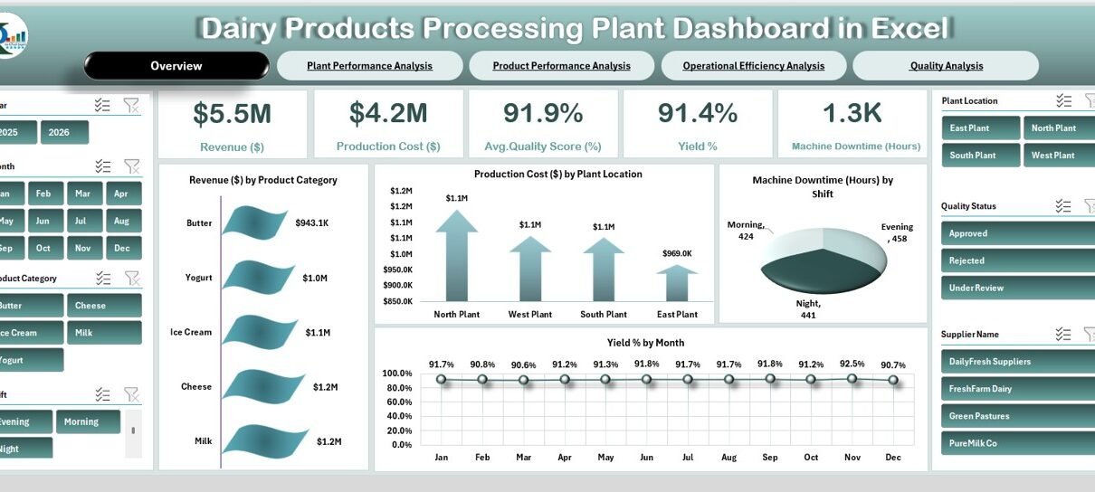
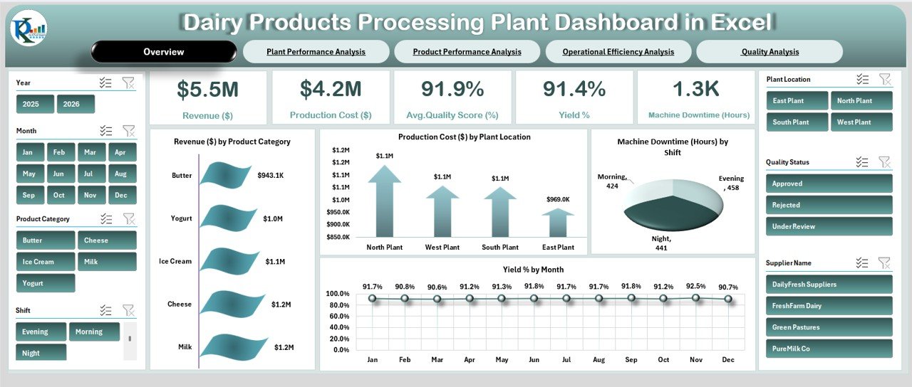
Overview Page – How Can You See Complete Plant Performance at a Glance?
The Overview page acts as the main control panel.
At the top, you see key performance cards such as:
- Revenue ($5.5M)
- Production Cost ($4.2M)
- Average Quality Score (91.9%)
- Yield % (91.4%)
- Machine Downtime (1.3K Hours)
These KPI cards provide instant insights into plant health.
Key Visuals on Overview Page
- Revenue by Product Category
- Production Cost by Plant Location
- Machine Downtime by Shift
- Yield % by Month
Because the slicers allow filtering by year, month, product category, and shift, you can quickly analyze performance changes.
For example:
- If yield drops in a specific month, you can investigate immediately.
- If downtime increases during the night shift, you can adjust maintenance scheduling.
Therefore, this page supports fast operational decisions.
Click to Buy Dairy Products Processing Plant Dashboard in Excel
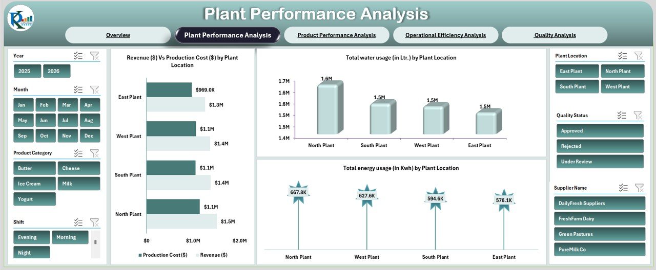
Plant Performance Analysis – Which Plant Performs Best?
The Plant Performance Analysis page compares performance across different plant locations.
Charts Included
- Revenue vs Production Cost by Plant
- Total Water Usage (Liters) by Plant
- Total Energy Usage (KWh) by Plant
From the dashboard visuals, you can observe:
- North Plant shows higher revenue
- Water usage varies across locations
- Energy consumption differs by plant
Because resource usage directly impacts cost, this analysis helps you optimize utilities.
For example:
- If one plant consumes more energy, you can review machinery efficiency.
- If production cost remains high despite lower output, you can review operations.
Thus, you improve plant-level performance.
Click to Buy Dairy Products Processing Plant Dashboard in Excel
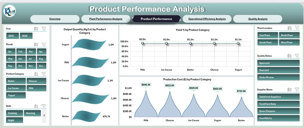
Product Performance Analysis – Which Dairy Products Drive Growth?
The Product Performance Analysis page focuses on product categories such as:
- Milk
- Cheese
- Butter
- Yogurt
- Ice Cream
Charts Included
- Output Quantity (Kg/Ltr) by Product
- Yield % by Product Category
- Production Cost by Product Category
This analysis helps you identify:
- High-performing products
- Cost-heavy categories
- Yield variations by product
For instance:
- If cheese shows higher cost but lower yield, you can review production process.
- If milk generates consistent output, you can increase focus on distribution.
Therefore, product-level insights improve profitability.
Click to Buy Dairy Products Processing Plant Dashboard in Excel
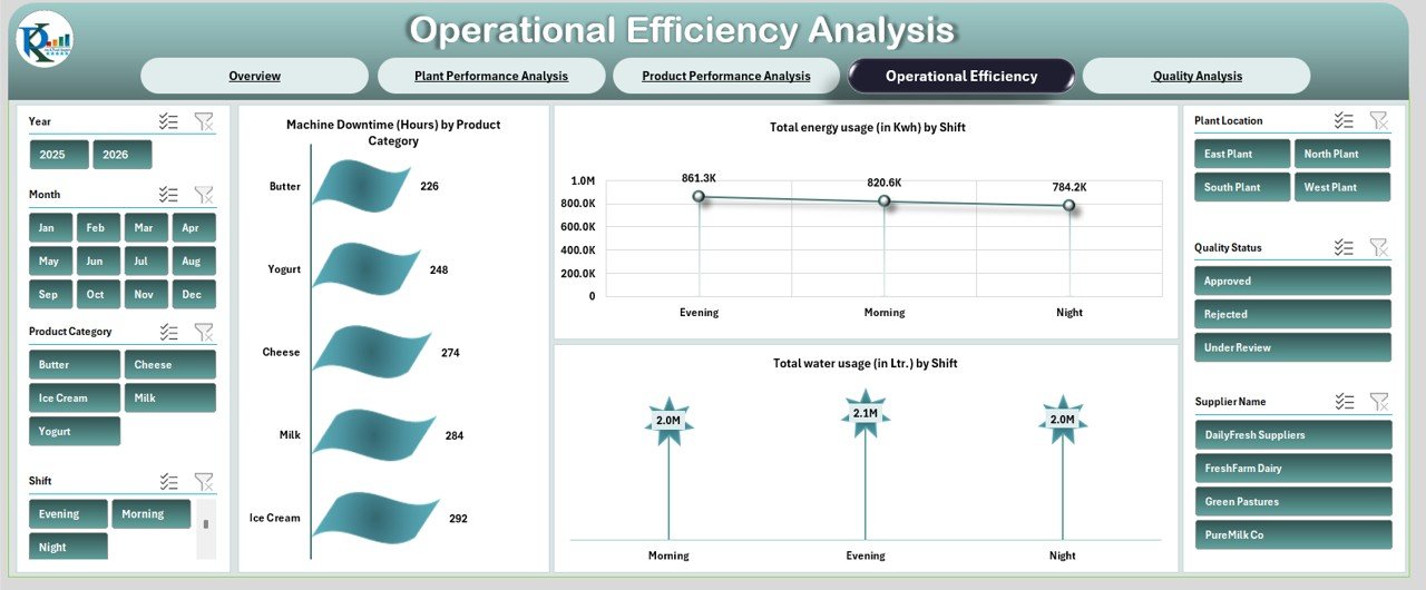
Operational Efficiency Analysis – Are Your Operations Running Smoothly?
Operational efficiency plays a major role in dairy processing plants.
This page tracks:
- Machine Downtime (Hours) by Product Category
- Total Energy Usage (KWh) by Shift
- Total Water Usage (Liters) by Shift
From the dashboard, you can observe:
- Ice Cream shows higher downtime
- Evening shift consumes more energy
-
Water usage varies by shift
Because downtime directly reduces production capacity, this analysis helps reduce losses.
For example:
- If night shift downtime increases, you can schedule preventive maintenance.
- If energy usage rises sharply, you can inspect equipment load.
Thus, you enhance operational control.
Click to Buy Dairy Products Processing Plant Dashboard in Excel
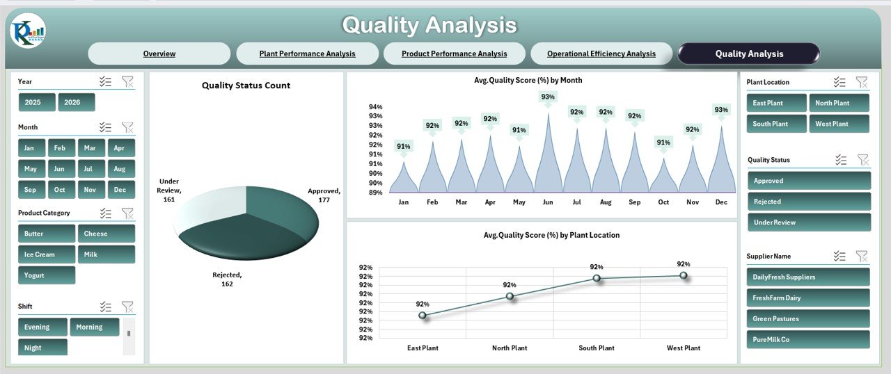
Quality Analysis – How Do You Maintain Product Quality?
Quality defines brand reputation in the dairy industry.
The Quality Analysis page includes:
- Quality Status Count (Approved, Rejected, Under Review)
- Average Quality Score by Month
- Average Quality Score by Plant Location
From the dashboard:
- Most products fall under Approved category
- Monthly quality score remains around 91–93%
- Plant-level quality comparison reveals performance differences
Because quality impacts customer trust, this page ensures continuous monitoring.
If rejection rate increases, you can act immediately. Therefore, you maintain high product standards.
Click to Buy Dairy Products Processing Plant Dashboard in Excel
Advantages of Dairy Products Processing Plant Dashboard in Excel
Centralized Monitoring
You track all KPIs in one dashboard.
Improved Decision Making
ou analyze financial and operational metrics instantly.
Better Resource Management
You monitor water and energy usage effectively.
Plant Comparison
You compare performance across locations.
Product Optimization
You identify profitable and cost-heavy products.
Downtime Reduction
You detect machine issues early.
Quality Assurance
You monitor quality score and rejection rate consistently.
Therefore, this dashboard strengthens operational excellence.
Best Practices for the Dairy Plant Dashboard
Click to Buy Dairy Products Processing Plant Dashboard in Excel
To maximize results, follow these best practices:
Update Data Regularly
Enter monthly production and cost data accurately.
Monitor Downtime Trends
Review machine downtime weekly.
Focus on Yield %
Yield directly impacts profit.
Control Utility Costs
Track water and energy usage continuously.
Review Quality Status
Address rejected products immediately.
Use Slicers Smartly
Filter by plant, product, and shift to gain deeper insights.
When you follow these practices, you improve plant efficiency consistently.
Conclusion
Click to Buy Dairy Products Processing Plant Dashboard in Excel
Managing a dairy processing plant requires real-time visibility into finance, production, quality, and operations. The Dairy Products Processing Plant Dashboard in Excel provides a structured, interactive, and easy-to-use solution.
With five powerful analytical pages—Overview, Plant Performance, Product Performance, Operational Efficiency, and Quality Analysis—you gain complete control over plant operations.
Therefore, if you want to reduce cost, improve yield, enhance quality, and increase profitability, this dashboard becomes an essential management tool.
Frequently Asked Questions (FAQs)
1. What is a Dairy Products Processing Plant Dashboard in Excel?
It is an interactive Excel dashboard that tracks revenue, cost, yield, downtime, quality, and resource usage.
2. Can I filter the dashboard by plant location?
Yes, you can filter by plant location using slicers.
3. Does this dashboard track energy and water usage?
Yes, it tracks total energy (KWh) and water usage (Liters) by plant and shift.
4. How many analysis pages does the dashboard include?
It includes five pages: Overview, Plant Performance, Product Performance, Operational Efficiency, and Quality Analysis.
5. Can small dairy plants use this dashboard?
Yes, both small and large dairy plants can use it effectively.
6. Does the dashboard monitor product quality?
Yes, it tracks quality score and quality status count.
7. Why is yield percentage important?
Yield percentage shows production efficiency and directly impacts profitability.
Visit our YouTube channel to learn step-by-step video tutorials
Watch the step-by-step video tutorial:
Click to Buy Dairy Products Processing Plant Dashboard in Excel