Seasonal sales can make or break the profitability of many businesses. Whether you run a retail store, an e-commerce business, or a wholesale operation, demand often fluctuates with time. For example, clothing retailers see spikes during festive seasons, while home appliance stores experience higher sales during summer or winter. Without a structured way to monitor and analyze sales patterns, businesses risk losing opportunities or overstocking products.
That is why a Seasonal Sales KPI Dashboard in Excel becomes essential. It helps track performance in real time, compare results against targets, and make better decisions to manage seasonal demand effectively. In this article, we will explore everything about this dashboard—its structure, features, advantages, best practices, and frequently asked questions.
Click to buy Seasonal Sales KPI Dashboard In Excel
What Is a Seasonal Sales KPI Dashboard in Excel?
A Seasonal Sales KPI Dashboard is a reporting tool created in Excel that tracks key sales performance indicators (KPIs) across different months or seasons. Instead of juggling multiple spreadsheets, managers can rely on one dashboard to visualize:
- Month-to-Date (MTD) performance.
- Year-to-Date (YTD) performance.
- Comparisons with Targets and Previous Year (PY) values.
- Trends for key seasonal sales metrics like revenue, margin, conversion rate, and stock turnover.
This Excel-based dashboard is simple, cost-effective, and powerful. It can be used by sales managers, retail owners, e-commerce analysts, and even financial controllers.
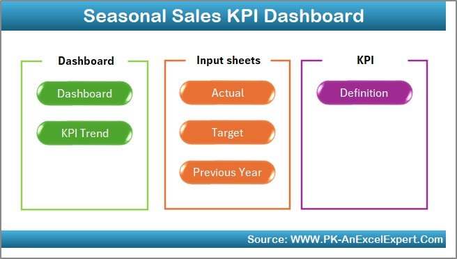
Structure of the Seasonal Sales KPI Dashboard in Excel
The dashboard comes with seven worksheets. Each sheet plays a unique role in capturing, storing, and analyzing seasonal sales data.
Home Sheet
The Home sheet acts as the index page. It contains six buttons that link directly to the other sheets. This saves time and allows quick navigation between sections without scrolling through tabs.
Click to buy Seasonal Sales KPI Dashboard In Excel
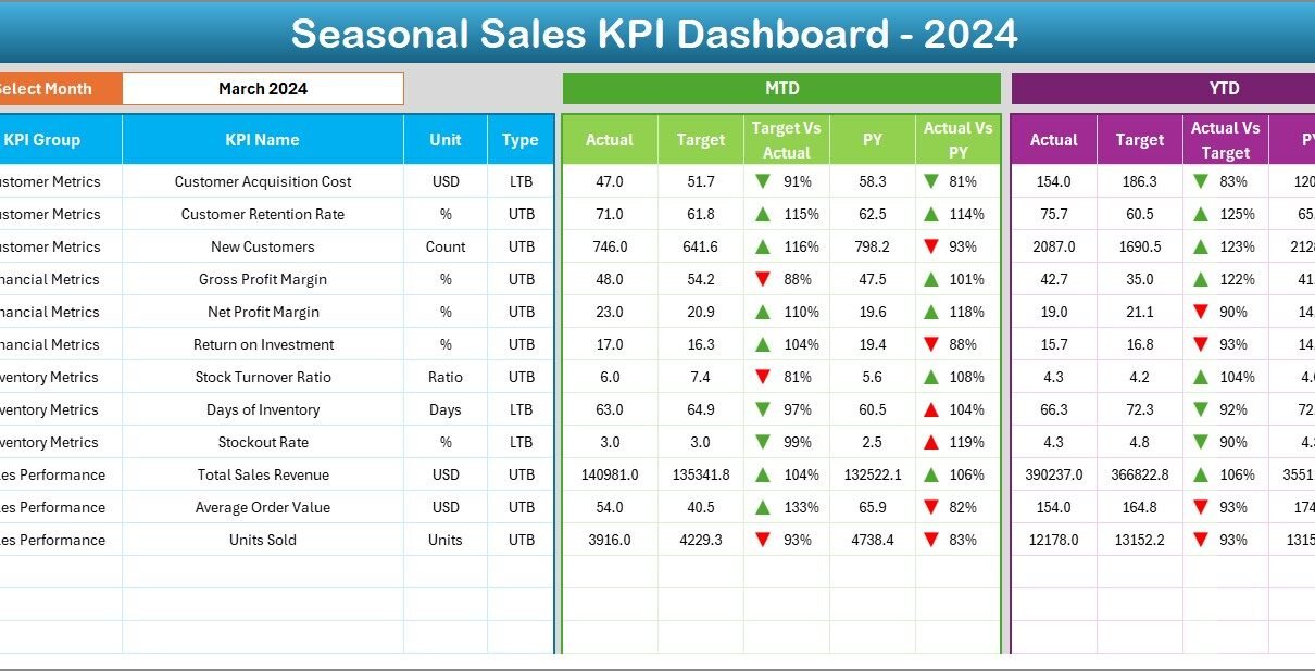
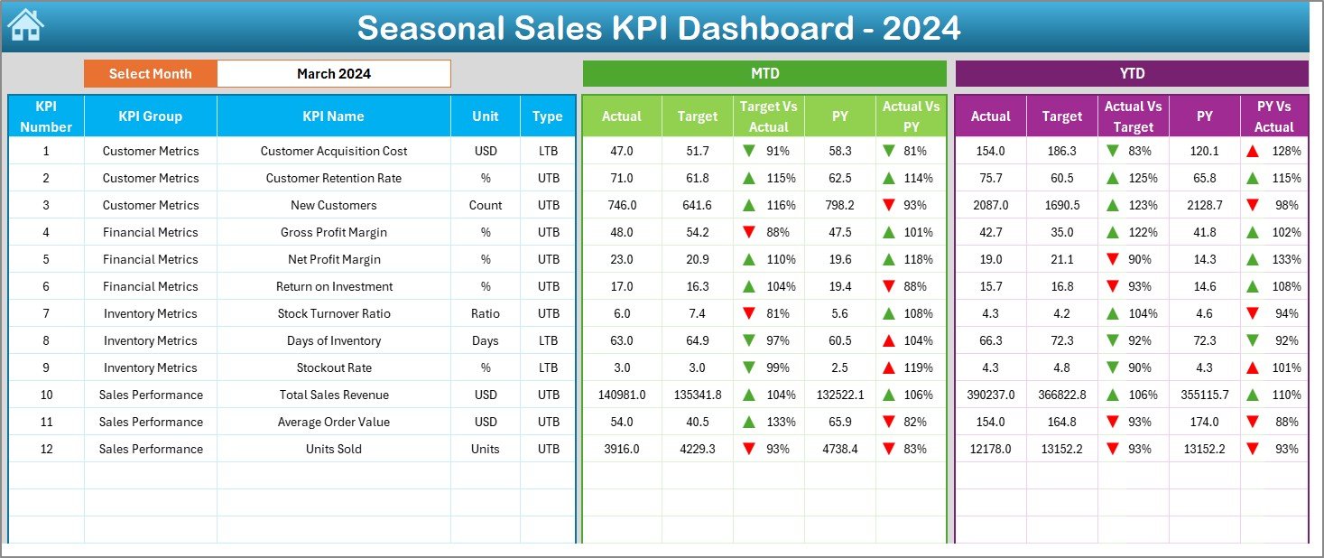
Dashboard Sheet
The Dashboard sheet is the central hub. It displays:
- MTD Actual, Target, and PY data.
- YTD Actual, Target, and PY data.
- Conditional formatting with up/down arrows for quick visual cues.
Users can select the month from a drop-down menu in cell D3. As soon as a month is chosen, all numbers update automatically, giving managers a seasonal snapshot at a glance.
Click to buy Seasonal Sales KPI Dashboard In Excel
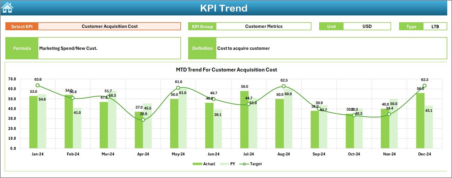
KPI Trend Sheet
This sheet allows deeper analysis of each KPI. On cell C3, you can select a KPI from the drop-down. The sheet then shows:
- KPI Group, Unit, Type (LTB or UTB), Formula, and Definition.
- Trend charts for MTD and YTD against Target and PY data.
It provides a visual representation of how a KPI is performing over time, which is especially useful for seasonal sales analysis.
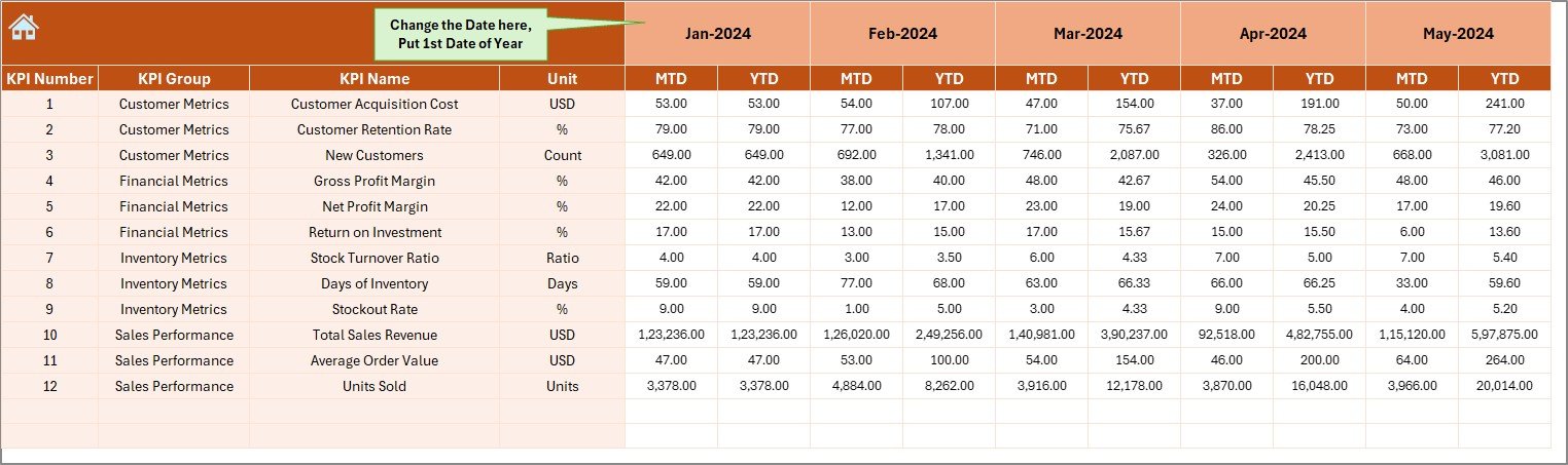
Actual Numbers Input Sheet
In this sheet, you enter monthly actual sales data. Both MTD and YTD figures are updated here. A parameter in cell E1 lets you define the starting month of the year, making it flexible for businesses that follow different fiscal calendars.
Click to buy Seasonal Sales KPI Dashboard In Excel
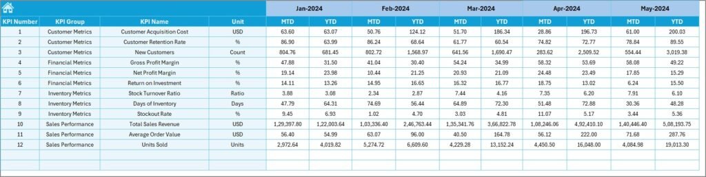
Target Sheet
The Target sheet stores monthly KPI targets for both MTD and YTD. Managers can set realistic seasonal goals, such as higher targets in peak seasons and moderate ones in off-seasons.
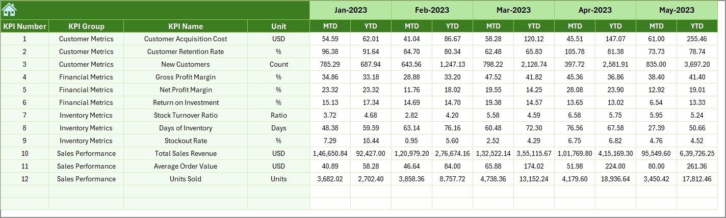
Previous Year Numbers Sheet
This sheet records PY data, which is crucial for seasonal comparisons. For instance, if your sales increased by 20% in December compared to the previous year, the dashboard highlights that improvement.
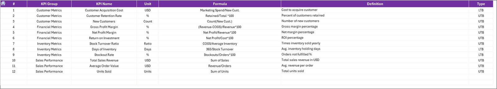
KPI Definition Sheet
Finally, this sheet lists the KPI Name, Group, Unit, Formula, and Definition. It ensures clarity for all users, making the dashboard easy to understand and reducing misinterpretation.
Click to buy Seasonal Sales KPI Dashboard In Excel
Why Do You Need a Seasonal Sales KPI Dashboard?
Sales cycles rarely stay constant. Businesses often experience:
- Festive demand spikes (Christmas, Diwali, Black Friday).
- Weather-driven demand (summer clothes, heaters, air conditioners).
- Event-based sales (sports tournaments, back-to-school season).
Without monitoring, these shifts can cause stockouts, missed opportunities, or excess inventory. The dashboard provides:
- A single source of truth for performance tracking.
- Instant visibility of actual vs. target sales.
- Historical comparisons to understand seasonality.
- Actionable insights for future planning.
Advantages of Seasonal Sales KPI Dashboard in Excel
Using this dashboard offers several benefits:
Real-Time Monitoring – See how sales are performing in the current season.
Data Accuracy – Centralized input reduces errors from multiple sheets.
Better Decision-Making – Compare targets, actuals, and past performance instantly.
Trend Analysis – Identify patterns in seasonal peaks and troughs.
Cost Efficiency – Excel eliminates the need for costly software.
Flexibility – Adaptable to different industries and fiscal years.
User-Friendly – Drop-downs and conditional formatting make it easy for non-technical users.
Best Practices for the Seasonal Sales KPI Dashboard
To get maximum value, follow these best practices:
Keep KPI definitions clear. Ensure everyone knows what each KPI means.
Update actuals regularly. Input monthly data without delays.
Set realistic targets. Align targets with seasonal patterns.
Review trends often. Use KPI Trend charts to detect performance issues early.
Benchmark against PY. Seasonal sales insights are incomplete without year-on-year comparisons.
Automate where possible. Use Excel formulas, conditional formatting, and pivot tables for efficiency.
Limit complexity. Avoid overcrowding the dashboard with too many KPIs. Stick to the most relevant seasonal metrics.
Key Seasonal KPIs to Track
Some of the most valuable KPIs for seasonal sales include:
- Sales Revenue – Total earnings in a given period.
- Gross Profit Margin – Profitability percentage.
- Conversion Rate – Ratio of sales to leads.
- Inventory Turnover – How quickly stock is sold.
- Average Order Value (AOV) – Average spend per customer.
- Customer Retention Rate – Returning customer percentage.
- Seasonal Growth Rate – Change compared to the previous season.
How Does This Dashboard Support Decision-Making?
The Seasonal Sales KPI Dashboard helps businesses:
- Forecast demand more accurately.
- Allocate resources to peak seasons.
- Plan promotions based on trends.
- Control inventory to avoid overstocking or understocking.
- Measure marketing impact by analyzing conversion rates and customer retention.
For example, if the dashboard shows lower YTD conversion rates in a festive month, managers can run targeted campaigns to improve results.
Opportunities for Improvement
While the Excel dashboard is powerful, businesses can enhance it further:
- Integrate it with Power BI for more interactive visuals.
- Use automation tools to pull data from sales systems directly.
- Add forecasting models using Excel’s advanced formulas.
- Track customer demographics alongside sales KPIs for deeper insights.
Conclusion
Seasonal sales are unpredictable but also full of opportunities. A Seasonal Sales KPI Dashboard in Excel gives businesses the ability to track performance, compare with targets, and plan for future demand. With its seven structured sheets, it ensures both accuracy and usability. By following best practices and focusing on the right KPIs, businesses can turn seasonal challenges into growth opportunities.
Frequently Asked Questions (FAQs)
- What is the main purpose of a Seasonal Sales KPI Dashboard in Excel?
It helps track seasonal sales performance, compare results against targets and previous years, and analyze trends for better planning.
- Who can use this dashboard?
Sales managers, retail owners, e-commerce businesses, and financial analysts can all benefit from it.
- Can I customize the KPIs?
Yes, you can add or remove KPIs in the KPI Definition Sheet based on your business needs.
- How often should I update the dashboard?
You should update it monthly with actual sales data to ensure accuracy.
- Does this dashboard require advanced Excel skills?
No, it uses simple drop-downs, formulas, and conditional formatting. Anyone with basic Excel knowledge can use it.
- Can I compare data with multiple previous years?
The default template allows one previous year, but you can expand it by adding more sheets or formulas.
- What industries benefit the most?
Retail, e-commerce, consumer goods, and any industry affected by seasonal demand will find it highly useful.
Visit our YouTube channel to learn step-by-step video tutorials
Watch the step-by-step video tutorial:
Click to buy Seasonal Sales KPI Dashboard In Excel