In today’s fast-paced digital environment, technical support teams play a critical role in maintaining customer satisfaction, operational continuity, and product reliability. Yet, tracking performance and understanding service trends can be challenging without proper visualization and data management.
That’s where the Technical Support KPI Dashboard in Power BI comes into play.
This article explores how a Power BI dashboard can transform your technical support function, offering insights into key metrics, data structure, dashboard features, benefits, best practices, and frequently asked questions — all in a clear and easy-to-understand format.
Click to buy Technical Support KPI Dashboard in Power BI
What Is a Technical Support KPI Dashboard in Power BI?
A Technical Support KPI Dashboard in Power BI is a powerful data visualization tool designed to track, analyze, and display the most important Key Performance Indicators (KPIs) related to a company’s technical support operations.
Built within Microsoft Power BI, this dashboard consolidates data from Excel or other sources and turns it into dynamic visuals — enabling IT leaders and support managers to monitor service efficiency, identify performance gaps, and improve decision-making.
With interactive charts, slicers, and visual cues, users can gain instant insights into ticket resolution rates, first response times, customer satisfaction, and other performance metrics that define service excellence.
Key Features of the Technical Support KPI Dashboard in Power BI
This ready-to-use dashboard includes three core pages that together provide a comprehensive performance view. Each page is designed for a specific analytical purpose, ensuring that both managers and executives can extract valuable insights efficiently.
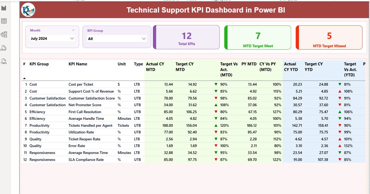
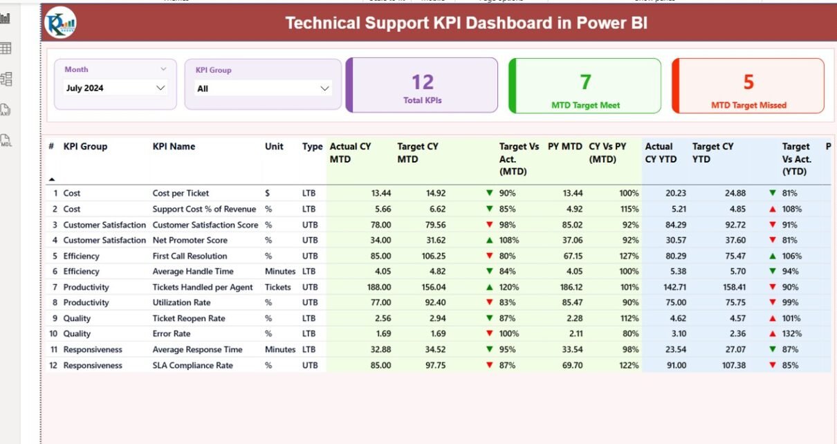
Summary Page — Your Main Control Center
The Summary Page acts as the central hub for performance analysis. It offers a snapshot of all critical KPIs and enables month-wise and category-wise analysis.
Main Highlights:
- Slicers for Month and KPI Group: Users can easily filter data by month or category to focus on specific time periods or KPI groups.
- Performance Cards: Three key metric cards display:
- Total KPIs Count
- Month-to-Date (MTD) Target Met Count
- MTD Target Missed Count
- Detailed KPI Table:
The table presents a full breakdown of technical support metrics such as:
- KPI Number: Sequential reference number for each KPI.
- KPI Group: The functional area, such as response time, resolution, or satisfaction.
- KPI Name: Specific performance indicator name.
- Unit: The measurement unit (percentage, count, hours, etc.).
- Type: KPI type — LTB (Lower the Better) or UTB (Upper the Better).
- Actual CY MTD & Target CY MTD: Actual vs. Target values for the current month.
- MTD Icons: Green ▲ or red ▼ indicators quickly show whether the KPI meets or misses the target.
- Target vs. Actual (MTD): Displays performance percentage for MTD metrics.
- PY MTD: Previous year’s MTD value for comparison.
- CY vs. PY (MTD): Performance comparison between current and previous year MTD data.
- Actual CY YTD & Target CY YTD: Year-to-Date (YTD) values for current year actuals and targets.
- YTD Icons: Visual status indicators for YTD results.
- Target vs. Actual (YTD): Percentage of achievement based on YTD data.
- PY YTD & CY vs. PY (YTD): Comparison with the previous year’s performance.
This well-structured format allows managers to instantly understand where the team stands and which KPIs need attention.
Click to buy Technical Support KPI Dashboard in Power BI
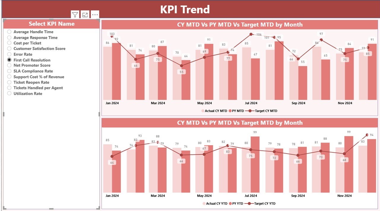
KPI Trend Page — Tracking Performance Over Time
The KPI Trend Page focuses on performance evolution, displaying both MTD and YTD trends through interactive combo charts.
Key Functionalities:
- A slicer on the left allows users to select specific KPIs for deep analysis.
- Two combo charts show:
- Actual numbers for Current Year (CY)
- Previous Year (PY) comparison
- Target lines for both MTD and YTD metrics
This visual representation makes it easy to identify performance patterns, seasonal variations, and improvement areas over time.
Click to buy Technical Support KPI Dashboard in Power BI
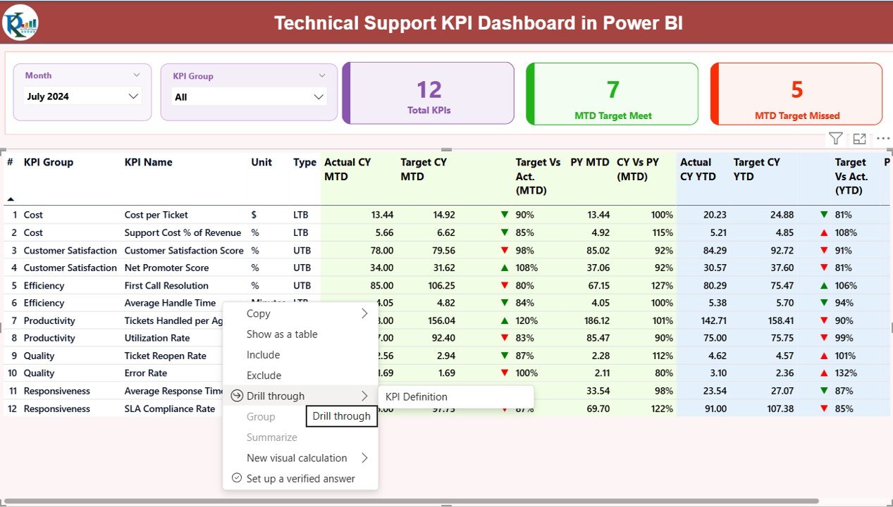
KPI Definition Page — Understanding the Metrics
The KPI Definition Page serves as a drill-through page, hidden by default but accessible from the Summary Page.
By right-clicking on a KPI and selecting Drill Through, users can access detailed metadata for each KPI.
Displayed Fields:
- Formula: The calculation logic behind the KPI.
- Definition: The meaning and scope of the KPI.
- Type: LTB (Lower the Better) or UTB (Upper the Better).
A Back Button is placed in the top-left corner to easily return to the main dashboard.
How the Excel Data Structure Powers the Dashboard
The dashboard relies on an Excel data source that contains three essential worksheets. These sheets make the dashboard dynamic and easy to maintain — ideal for both beginners and advanced users.
Input_Actual Sheet
This sheet records the actual performance numbers for each KPI.
- Columns include: KPI Name, Month, MTD Value, and YTD Value.
- The month column uses the first date of each month for consistency.
Input_Target Sheet
Here, users fill in the target values for each KPI.
- Fields are identical to the Actual sheet: KPI Name, Month, MTD Target, and YTD Target.
KPI Definition Sheet
This sheet defines the entire KPI structure.
It includes:
- KPI Number
- KPI Group
- KPI Name
- Unit
- Formula
- Definition
- Type (LTB or UTB)
By keeping the data in Excel, organizations can update the dashboard without complex database integrations — ensuring flexibility and control.
Why Use Power BI for Technical Support KPI Tracking?
Power BI provides a visual, scalable, and interactive environment for analyzing performance metrics. It eliminates the need for manual reports and enables stakeholders to make data-backed decisions quickly.
Here’s why Power BI stands out for technical support analytics:
- Centralized Insights
Power BI consolidates multiple data sources into one unified view. Managers no longer need to juggle spreadsheets or manual reports.
- Real-Time Updates
By connecting Power BI to live Excel files or databases, teams can view performance updates instantly.
- Interactive Visuals
Charts, slicers, and conditional icons make performance analysis intuitive and engaging.
- Better Decision-Making
Data-driven visuals highlight underperforming areas and help allocate resources effectively.
- Easy Sharing and Collaboration
Dashboards can be published to Power BI Service, allowing secure sharing across departments.
Advantages of the Technical Support KPI Dashboard in Power BI
Centralized Data Visualization:
View all essential technical support KPIs — such as ticket resolution time, escalation rates, and satisfaction scores — in one unified dashboard.
Quick Performance Evaluation:
Easily identify which KPIs are meeting or missing their targets using clear icons and color-coded visuals.
Improved Accountability:
Assign clear ownership for each KPI to ensure that team members remain focused on achieving their goals.
Data-Driven Insights:
Leverage comparisons between current and previous year data to assess long-term progress.
Enhanced Reporting Efficiency:
Save hours of manual work by automating monthly and yearly performance summaries.
Scalable and Customizable:
Adapt the dashboard to new KPIs or categories without altering its structure.
Better Strategic Planning:
Use trends and insights to make informed decisions about staffing, training, and technology investments.
How to Use the Technical Support KPI Dashboard
Using this dashboard is straightforward, even for non-technical users. Here’s a quick step-by-step guide:
- Prepare Excel Data:
Update the Actual, Target, and KPI Definition sheets with relevant values. - Refresh Power BI Data:
Connect the Excel file and click “Refresh” to load the latest data. - Explore Summary Page:
Use slicers to view KPIs for specific months or groups. - Analyze Trends:
Switch to the KPI Trend Page to view performance changes over time. - Drill Through for Details:
Dive deeper into KPI definitions to understand the formulas and logic behind each metric.
Best Practices for the Technical Support KPI Dashboard
To get the most from your dashboard, follow these expert best practices:
- Define KPIs Clearly
Ensure each KPI has a well-defined formula and purpose. Avoid ambiguous metrics that don’t align with business goals.
- Maintain Data Consistency
Use the same month-start dates and naming conventions across Actual and Target sheets.
- Automate Data Updates
Link Excel to Power BI Service or use Power Automate to refresh data automatically.
- Apply Conditional Formatting
Use color-coded arrows or icons to visualize progress instantly.
- Monitor Regularly
Review KPIs weekly or monthly to catch early warning signs of performance decline.
- Involve Stakeholders
Encourage input from support agents, team leads, and managers when defining KPIs.
- Keep it Simple
Avoid overloading the dashboard with unnecessary visuals or metrics.
Common KPIs Tracked in a Technical Support Dashboard
While each organization’s KPIs may vary, below are some of the most common and impactful ones:
- First Response Time (FRT) – Measures how quickly the team responds to customer queries.
- Average Resolution Time (ART) – Tracks the average time taken to resolve support tickets.
- Customer Satisfaction (CSAT) – Reflects how satisfied customers are with the support experience.
- Ticket Volume – Number of support tickets received during a specific period.
- First Contact Resolution (FCR) – Percentage of issues resolved during the first interaction.
- Escalation Rate – Measures how often tickets are escalated to higher levels.
- Backlog Volume – The number of unresolved or pending tickets.
- SLA Compliance – Percentage of tickets resolved within agreed service levels.
Each of these metrics can be analyzed using the MTD and YTD views provided by the Power BI dashboard.
Practical Benefits for Organizations
Implementing this dashboard brings tangible improvements to technical support operations:
- Increased Transparency: Everyone from team leads to executives can monitor performance easily.
- Better Customer Experience: Faster response and resolution times improve satisfaction and retention.
- Operational Efficiency: Automated reporting reduces administrative burden.
- Performance Benchmarking: Compare different teams or periods to identify best performers.
- Continuous Improvement: Identify weak areas and implement targeted training or process changes.
Conclusion
The Technical Support KPI Dashboard in Power BI is more than just a visualization tool — it’s a performance management system that helps IT support teams operate efficiently, respond faster, and improve customer satisfaction.
By combining clear visuals, structured data, and real-time insights, this dashboard empowers organizations to transform raw data into actionable strategies. Whether you’re managing an internal helpdesk or a global technical support team, this solution helps you achieve operational excellence with ease.
Frequently Asked Questions (FAQs)
- What is the purpose of a Technical Support KPI Dashboard?
It tracks and visualizes key performance indicators related to technical support, helping managers monitor team efficiency and service quality.
- Can this dashboard be customized for different industries?
Yes, you can modify KPI names, groups, and formulas to fit IT, software, telecom, or customer service industries.
- What tools are required to use this dashboard?
You only need Microsoft Excel (for data entry) and Power BI Desktop (for dashboard visualization).
- How often should I update the Excel data?
You can update it monthly, weekly, or even daily depending on your reporting needs.
- Can I share this dashboard with my team?
Yes, by publishing it to Power BI Service, you can securely share it with your entire organization.
- Does it require coding or DAX knowledge?
No, the dashboard comes prebuilt with DAX formulas and visuals — users only need to input their data.
- What kind of insights can I gain?
You can analyze monthly trends, target achievements, customer satisfaction, and team productivity metrics all in one view.
- Is it suitable for small teams?
Absolutely. The dashboard is designed to be scalable — ideal for startups, mid-sized companies, and large enterprises alike.
Watch the step-by-step video tutorial:
Visit our YouTube channel to learn step-by-step video tutorials
Click to buy Technical Support KPI Dashboard in Power BI