In the era of advanced space exploration, data drives every decision. From mission planning to satellite communication, every parameter must be measured and analyzed to ensure success. The Space Mission Operations KPI Dashboard in Excel serves as a comprehensive solution for tracking, analyzing, and visualizing the key performance indicators (KPIs) of a space mission — all within a familiar, user-friendly Excel environment.
This dashboard helps mission analysts, engineers, and management teams make data-driven decisions with ease. It transforms raw operational data into clear insights, improving efficiency, reliability, and coordination across departments.
Let’s explore what makes this dashboard a powerful asset for space mission analytics.
Click to buy Space Mission Operations KPI Dashboard in Excel
What Is a Space Mission Operations KPI Dashboard in Excel?
A Space Mission Operations KPI Dashboard is an Excel-based performance tracking system designed to monitor critical metrics that determine mission success. Whether it’s spacecraft telemetry, launch readiness, payload performance, or communication success rate, this dashboard offers a unified view of all mission-critical parameters.
It consolidates various datasets — actual values, targets, and historical data — into interactive visualizations, tables, and charts. By doing so, it eliminates manual data comparisons and enables mission control teams to spot deviations instantly.
Instead of relying on multiple reports, you get one cohesive platform where every metric tells a story about your mission’s performance.
Structure of the Space Mission Operations KPI Dashboard
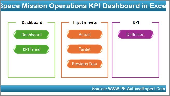
The Space Mission Operations KPI Dashboard in Excel contains seven structured worksheet tabs, each with a specific purpose. These tabs collectively enable smooth data entry, automatic updates, and powerful visualization.
Home Sheet – The Command Center
The Home sheet works as the control hub for your dashboard. It includes six interactive navigation buttons that let you jump directly to specific sheets, saving time and effort.
This page provides a clean and organized entry point to the entire dashboard, making it intuitive even for non-technical users.
Click to buy Space Mission Operations KPI Dashboard in Excel
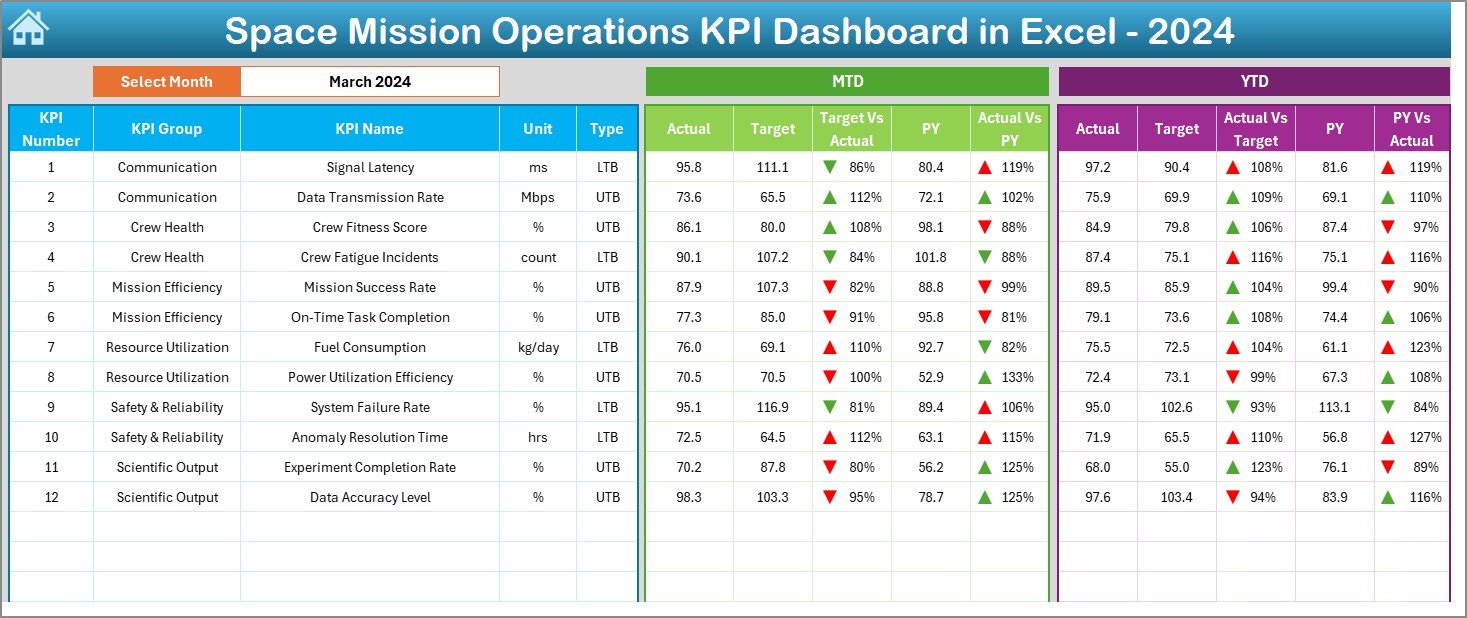
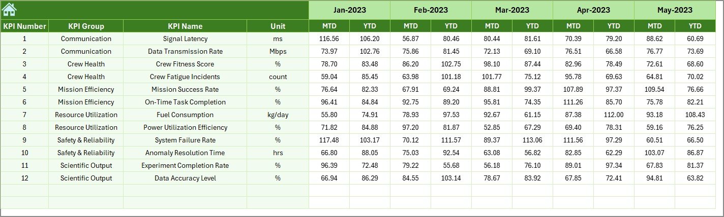
Dashboard Sheet – The Main Analytical View
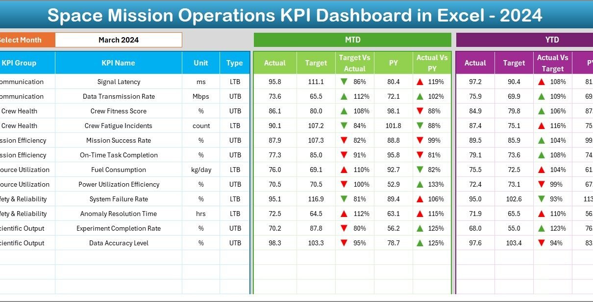
The Dashboard tab is the heart of the system. It displays all key metrics in an easy-to-read, visually appealing layout.
- You can select the month from a dropdown in cell D3.
- Once selected, all KPI values update automatically to show data for that month.
- Each KPI includes MTD (Month-to-Date) and YTD (Year-to-Date) performance views.
- Conditional formatting uses up/down arrows to indicate improvement or decline against target and previous year.
This makes it possible to identify trends instantly — whether you’re monitoring mission reliability, communication uptime, or fuel efficiency.
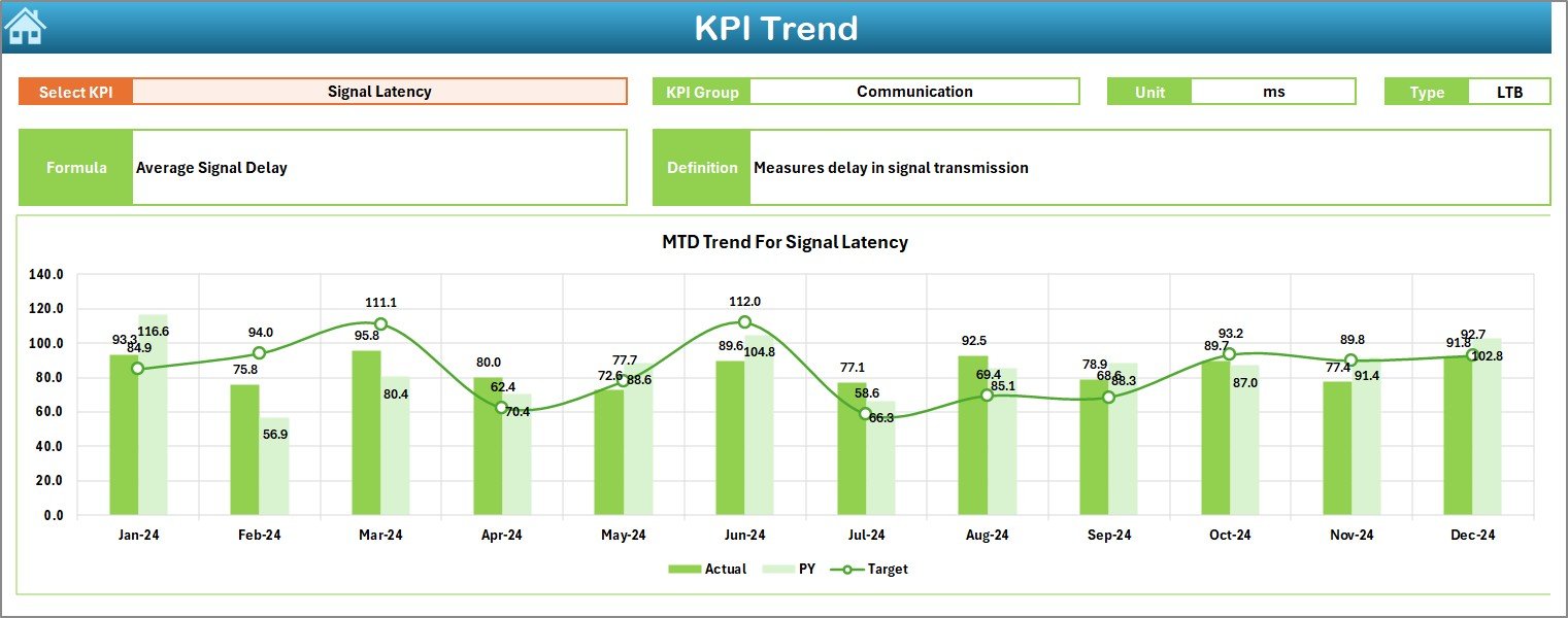
KPI Trend Sheet – Visualizing Progress Over Time
In the KPI Trend sheet, you can explore trends for each metric individually.
By selecting a KPI from the dropdown (cell C3), the dashboard dynamically displays:
- KPI Group and Unit
- KPI Type (Upper the Better or Lower the Better)
- Formula used to calculate it
- Definition for reference
Below this section, you’ll see two trend charts that show MTD and YTD data for Actual, Target, and Previous Year — offering a clear picture of whether performance is improving over time.
Click to buy Space Mission Operations KPI Dashboard in Excel
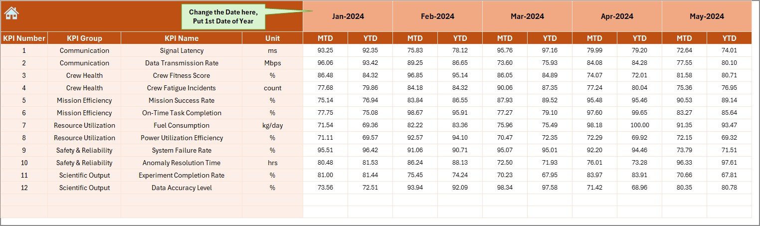
Actual Numbers Input Sheet – Data Entry Made Simple
This tab allows users to input the actual results for every KPI.
You can update MTD and YTD values for each month. To make things even easier, simply specify the first month of the year in cell E1.
Once entered, all linked charts and summaries update automatically.
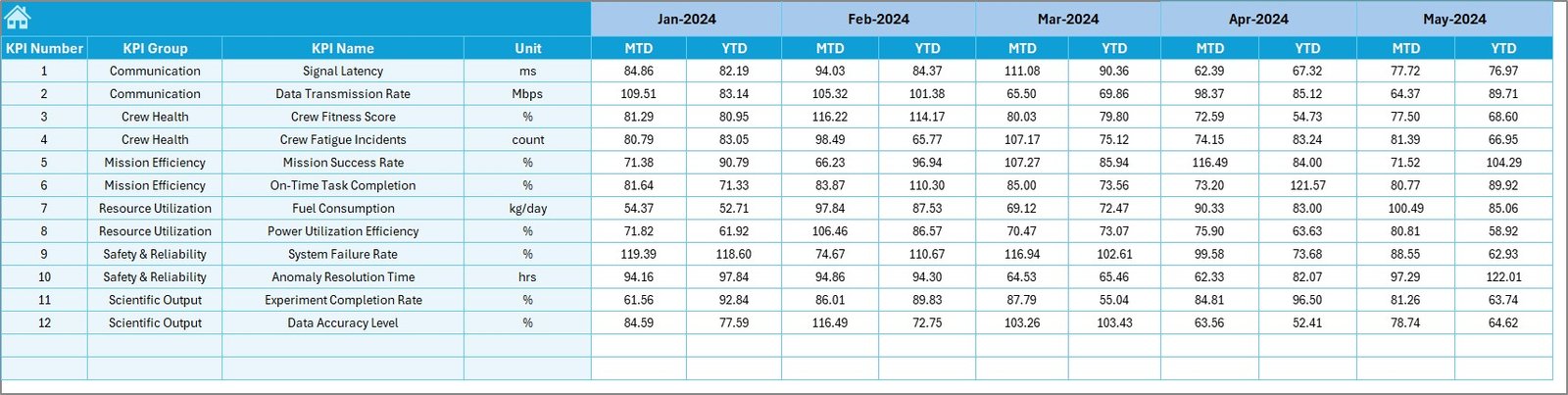
Target Sheet – Set Your Mission Benchmarks
The Target Sheet enables you to define the monthly and yearly goals for each KPI.
For instance, you can set a target for communication latency, orbital accuracy, or payload efficiency.
These targets serve as benchmarks for evaluating performance in the dashboard and trend charts.
Click to buy Space Mission Operations KPI Dashboard in Excel
Previous Year Number Sheet – Year-on-Year Comparison
This sheet stores the previous year’s data for every KPI.
It’s structured identically to the current year sheets, making it easy to compare historical trends.
With year-on-year comparisons, teams can evaluate whether improvements in efficiency or accuracy are sustained over time.
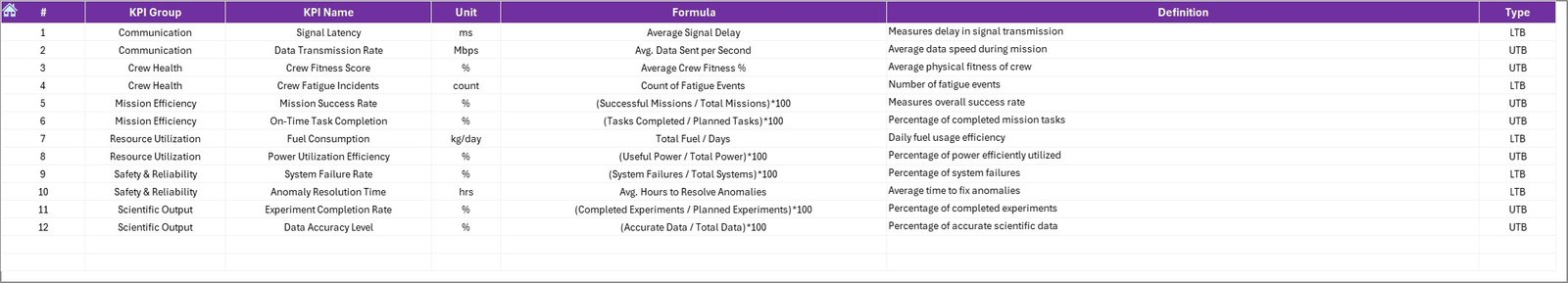
KPI Definition Sheet – The Knowledge Repository
The KPI Definition Sheet lists every metric tracked in the dashboard.
Each entry includes the:
- KPI Name
- KPI Group
- Unit of Measurement
- Formula
- KPI Definition
This ensures transparency and consistency in KPI reporting. It also helps new users quickly understand what each KPI measures and how it’s calculated.
Why Use Excel for Space Mission KPIs?
While specialized analytics software exists, Excel remains a preferred platform for many organizations — including aerospace teams — for several reasons:
- Accessibility: No need for expensive licenses; Excel is available on most systems.
- Flexibility: You can customize the layout, calculations, and visualizations easily.
- Compatibility: Import data from telemetry systems, CSVs, or APIs effortlessly.
- Interactivity: Dropdowns, slicers, and conditional formatting make analysis quick and intuitive.
- Automation: Built-in formulas and macros help automate data refresh and visualization.
In short, Excel provides an ideal mix of power, simplicity, and adaptability — perfect for managing mission-critical KPIs.
Key Benefits of Using the Space Mission Operations KPI Dashboard in Excel
This dashboard offers several strategic and operational advantages for mission control and analytics teams.
- Centralized Data Monitoring
- All mission-critical data — from satellite telemetry to system uptime — is consolidated into a single, easy-to-navigate workbook.
- Real-Time Insights
- Drop-down selectors and automated charts give you instant feedback on current performance, enabling quick corrective action.
- Improved Decision-Making
- By comparing actual vs target and previous year results, teams can pinpoint what’s working and where improvements are needed.
- Simplified Reporting
- With built-in visuals and KPIs summarized in one place, managers can generate mission reports in seconds.
- Historical Trend Analysis
Tracking performance across months and years helps identify patterns, predict issues, and set realistic future goals.
Advantages of the Space Mission Operations KPI Dashboard
Let’s explore the main advantages that make this dashboard a must-have for mission management teams:
Data Transparency
Every KPI is clearly defined and supported with its formula and unit, ensuring everyone understands the same metrics.
Enhanced Collaboration
Different departments — propulsion, communication, research, and control — can share data seamlessly in one file.
Early Risk Detection
Conditional formatting instantly highlights anomalies or declining trends, allowing teams to take immediate action.
Consistent Reporting
Since all KPIs follow the same structure, comparisons across departments or missions remain consistent and reliable.
Time Efficiency
Automated charts and dropdowns minimize manual reporting work, giving analysts more time to focus on interpretation and action.
How to Use the Space Mission Operations KPI Dashboard Effectively
To maximize the value of this Excel tool, follow these steps:
Enter Actual Data: Update the “Actual Numbers” sheet each month with current readings or values.
Set Realistic Targets: Populate the “Target” sheet with achievable benchmarks.
Record Historical Data: Fill the “Previous Year Numbers” sheet for trend comparison.
Review Monthly Trends: Use the Dashboard and KPI Trend tabs to visualize data.
Refine KPIs: Adjust definitions or formulas if mission goals evolve over time.
Share Insights: Present visuals during mission briefings or review meetings.
Best Practices for the Space Mission Operations KPI Dashboard in Excel
To ensure accuracy, clarity, and usability, consider implementing these best practices:
- Maintain Data Integrity
Ensure that only authorized users update KPI data. Use Excel’s protection and data validation features to avoid accidental errors.
- Automate Where Possible
Use Excel formulas, named ranges, and VBA scripts (if needed) to automate repetitive tasks such as data updates and visual refresh.
- Visualize Effectively
Choose appropriate chart types for each KPI — line charts for trends, bar charts for comparisons, and gauge visuals for goal progress.
- Keep KPI Definitions Updated
As mission objectives evolve, regularly update the KPI definition sheet to reflect any new measurements or calculation logic.
- Conduct Monthly Reviews
At the end of each month, use the MTD/YTD dashboards to assess performance, discuss results, and plan corrective actions.
- Archive Historical Data
At the end of each year, back up all files to maintain historical trend records and continuity for future missions.
Use Cases of the Space Mission Operations KPI Dashboard
This dashboard isn’t limited to just one application — it supports multiple operational areas, such as:
- Satellite Health Monitoring — Track subsystem status, signal strength, and anomaly rates.
- Mission Launch Tracking — Compare planned vs actual launch timelines and readiness parameters.
- Crew Operations — Measure crew performance metrics like task completion or training hours.
- Ground Station Efficiency — Evaluate communication uptime, data transmission quality, and downtime causes.
- Budget and Resource Management — Monitor actual spend vs projected costs for mission phases.
Conclusion
The Space Mission Operations KPI Dashboard in Excel is more than a spreadsheet — it’s a mission intelligence system.
It brings clarity to complex data, helps maintain performance discipline, and supports decision-making at every level of space operations.
By tracking, analyzing, and comparing KPIs in a structured and visual format, space organizations can achieve higher reliability, reduced risks, and improved mission outcomes — all powered by the simplicity and flexibility of Microsoft Excel.
Frequently Asked Questions (FAQs)
- What makes this dashboard suitable for space operations?
It’s designed to track mission-specific KPIs such as orbital accuracy, communication uptime, and payload efficiency. Each KPI can be customized to reflect your mission’s priorities.
- Can I add more KPIs or modify existing ones?
Yes. You can easily add new KPIs or modify formulas in the KPI Definition Sheet. The dashboard automatically adapts to new data points.
- Does this dashboard require advanced Excel skills?
No. It uses simple formulas, dropdowns, and conditional formatting. Basic Excel knowledge is enough to operate it effectively.
- Can I integrate live telemetry data into this dashboard?
Yes. You can link the Actual Numbers sheet to external data sources like telemetry logs or databases through Excel’s data connections.
- Is it possible to use this dashboard for non-space projects?
Absolutely. The framework can be adapted for any technical or operational domain that relies on KPI tracking — including defense, research, and engineering projects.
Visit our YouTube channel to learn step-by-step video tutorials
Watch the step-by-step video tutorial:
Click to buy Space Mission Operations KPI Dashboard in Excel