In today’s fast-moving retail industry, store operations play a crucial role in driving customer satisfaction, efficiency, and profitability. Managing hundreds of performance metrics across multiple outlets can become overwhelming — especially when you rely on manual reports.
That’s where the Store Operations KPI Dashboard in Power BI comes in. This smart, data-driven solution helps retailers visualize, analyze, and track store performance in real time. Built using Microsoft Power BI, it consolidates critical operational data into interactive visuals that empower managers to make faster, data-backed decisions.
Let’s dive deep into what this dashboard offers, how it works, and why every retail business should have it.
Click to buy Store Operations KPI Dashboard in Power BI
What Is a Store Operations KPI Dashboard in Power BI?
A Store Operations KPI Dashboard in Power BI is a performance-monitoring tool designed to track key performance indicators (KPIs) related to daily retail operations.
It helps store managers, regional heads, and corporate executives assess how well their stores are performing against defined targets — in terms of sales, customer satisfaction, employee productivity, inventory control, and more.
The dashboard connects directly to an Excel data source, processes the information, and presents it in dynamic visuals. Whether you want to view month-to-date (MTD) performance or year-to-date (YTD) trends, this Power BI dashboard delivers it instantly and interactively.
Why Power BI for Store Operations?
Power BI stands out as the perfect analytics platform for store operations because it offers:
- Interactive visualizations that simplify complex retail data.
- Real-time performance tracking for MTD and YTD metrics.
- Drill-through analysis for detailed KPI insights.
- Easy integration with Excel, databases, and cloud systems.
- Customizable dashboards tailored for retail management.
In short, Power BI transforms raw data into actionable insights, ensuring retail leaders spend less time compiling reports and more time optimizing performance.
Key Features of the Store Operations KPI Dashboard in Power BI
This dashboard contains three well-structured pages — each designed for a specific purpose in monitoring and analyzing KPIs.
Let’s explore each page in detail 👇
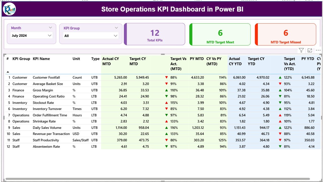
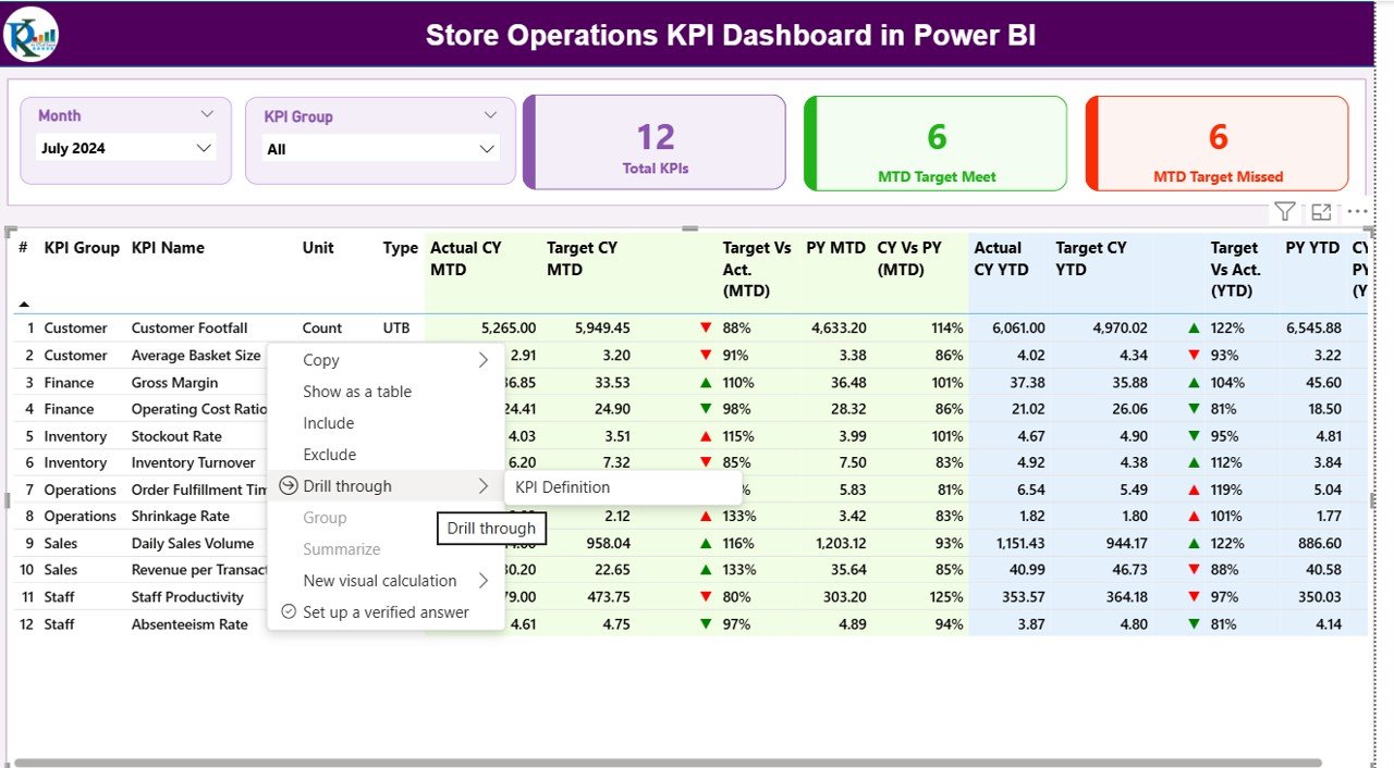
Summary Page – A Complete Snapshot of Store Performance
The Summary Page is the main hub of this dashboard. It provides an instant overview of how your store operations are performing across different KPI groups and time periods.
Here’s what you’ll find on this page:
Click to buy Store Operations KPI Dashboard in Power BI
Slicers for Dynamic Filtering
At the top, you’ll see Month and KPI Group slicers. These filters allow users to view specific performance segments and time periods instantly.
KPI Overview Cards
Three KPI cards summarize the key highlights:
- Total KPIs Count – Displays the total number of KPIs being tracked.
- MTD Target Met Count – Shows how many KPIs have achieved their month-to-date targets.
- MTD Target Missed Count – Highlights KPIs that failed to meet their MTD targets.
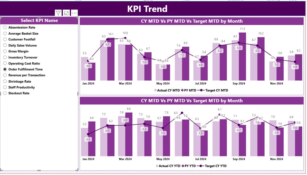
KPI Trend Page – Track Monthly and Yearly Progress
The KPI Trend Page helps users analyze performance trends visually over time. This page includes:
- Two combo charts showing Actual, Target, and Previous Year values.
- One slicer on the left side to select a specific KPI name.
With this setup, users can instantly see how each KPI is performing month-by-month, both in MTD and YTD views.
These charts reveal performance patterns — such as seasonal fluctuations, consistent improvements, or areas requiring corrective action.
Click to buy Store Operations KPI Dashboard in Power BI
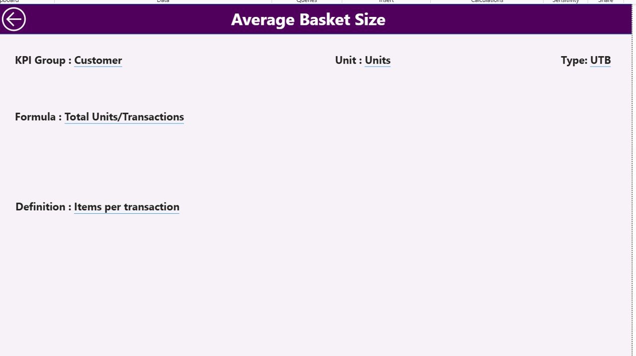
KPI Definition Page – Drill-Through for KPI Understanding
The KPI Definition Page is a hidden but powerful feature. From the Summary Page, users can drill through to view detailed information about any KPI.
This page displays:
- KPI Formula – How the metric is calculated.
- KPI Definition – A clear explanation of what the metric measures.
- Type (UTB/LTB) – Indicates whether higher or lower values represent better performance.
There’s also a back button at the top-left corner to easily navigate back to the Summary Page.
This drill-through functionality ensures that anyone using the dashboard — even without technical knowledge — can fully understand the KPIs being analyzed.
Excel Data Source – Simple Yet Powerful Integration
This Power BI dashboard connects seamlessly to an Excel file, making it easy to update and maintain. The Excel file includes three key worksheets:
1. Input_Actual Sheet
This sheet captures the actual KPI data, including:
- KPI Name
- Month (first date of each month)
- MTD and YTD numbers
2. Input_Target Sheet
Here, you record the target values for each KPI, using the same structure:
- KPI Name
- Month (first date of each month)
- MTD and YTD numbers
3. KPI Definition Sheet
This worksheet contains the KPI metadata, such as:
- KPI Number
- KPI Group
- KPI Name
- Unit
- Formula
- Definition
- Type (UTB/LTB)
This setup makes the dashboard dynamic — simply update the Excel file and refresh Power BI to see real-time results.
What Can You Analyze with This Dashboard?
The Store Operations KPI Dashboard enables a wide range of analysis across retail operations. Some examples include:
- Sales Performance: Track monthly and yearly sales achievements.
- Inventory Management: Identify understocked or overstocked products.
- Customer Experience: Measure service quality, complaint rates, and satisfaction scores.
- Employee Productivity: Evaluate staff efficiency, attendance, and sales contribution.
- Store Efficiency: Compare operational costs vs. sales revenue per location.
These insights help store managers pinpoint areas that need attention and drive performance improvement through actionable data.
Advantages of the Store Operations KPI Dashboard in Power BI
Let’s look at some of the biggest advantages of using this tool:
1. Centralized Performance View
It provides a single dashboard for all operational KPIs — no more juggling multiple reports.
2. Real-Time Insights
Instantly track both MTD and YTD performance to make informed decisions.
3. Data Accuracy
With direct Excel integration, data remains consistent and transparent.
4. Visual Storytelling
Charts and icons help interpret data faster than rows of numbers.
5. Easy Drill-Through Access
The KPI Definition page allows users to explore how each metric is calculated.
6. Customization Ready
Easily adapt KPIs, visuals, and filters based on your organization’s needs.
7. Enhanced Decision Making
Combining historical, target, and actual data supports smarter, faster business moves.
How to Use the Store Operations KPI Dashboard Effectively
Follow these steps to make the most of this Power BI dashboard:
- Update Excel Data Regularly – Keep actual and target numbers current for accurate reporting.
- Use Filters Wisely – Apply slicers for month or KPI group to focus your analysis.
- Drill Down When Needed – Explore KPI definitions to ensure proper understanding.
- Review Trends Monthly – Monitor ongoing progress and compare year-over-year performance.
- Share Insights – Export visuals or share Power BI links with regional and store managers.
Best Practices for the Store Operations KPI Dashboard
Toensure consistent and meaningful results, follow these best practices:
1. Define KPIs Clearly
Every KPI should have a specific purpose, calculation method, and responsible owner.
2. Keep Data Timely
Refresh your data sources at least weekly or monthly to reflect the latest numbers.
3. Maintain Data Quality
Avoid missing or inconsistent entries in Excel; even small errors can distort visuals.
4. Balance UTB and UTB KPIs
Ensure you’re tracking both “Upper the Better” (like Sales Revenue) and “Lower the Better” (like Complaint Rate) metrics.
5. Review Visual Layouts
Keep visuals clean and intuitive — too many charts can confuse users.
6. Automate Data Refresh
Set up scheduled refreshes in Power BI Service to keep dashboards updated without manual effort.
7. Train Your Team
Ensure that users understand KPI logic and Power BI navigation to make the most of this tool.
Who Can Benefit from the Store Operations KPI Dashboard?
This dashboard can transform performance management for a variety of retail professionals:
- Store Managers – To track operational efficiency daily.
- Regional Managers – To compare store-level performance.
- Operations Executives – To analyze multi-store trends and patterns.
- Finance Teams – To align financial and operational KPIs.
- HR Departments – To assess workforce productivity.
Essentially, any stakeholder involved in retail management can benefit from this data-driven tool.
Why Every Retail Business Needs This Dashboard
Store operations involve countless moving parts — from sales and staffing to inventory and customer engagement. Without centralized visibility, it’s impossible to identify where performance dips or improvements occur.
This Power BI dashboard ensures complete transparency. It brings together operational data from various sources into one unified view. Decision-makers can then measure progress, set benchmarks, and implement improvements quickly — leading to enhanced store efficiency, profitability, and customer satisfaction.
Future Enhancements and Ideas
While this version of the Store Operations KPI Dashboard is comprehensive, you can enhance it further with features like:
- Region-wise Drill-Down Pages
- Employee Performance Cards
- Customer Sentiment Integration (via survey data)
- Inventory Turnover Visualization
- Automated Alerts for Underperforming KPIs
These additions can help your dashboard evolve into a complete retail intelligence platform.
Conclusion
The Store Operations KPI Dashboard in Power BI is a must-have tool for modern retailers. It simplifies complex operational data, making performance tracking transparent and actionable. With its user-friendly design, interactive visuals, and Excel integration, this dashboard empowers retail professionals to take smarter, faster, and more confident decisions.
Whether you manage one store or a hundred, this Power BI dashboard ensures you always stay on top of your business performance — from MTD results to YTD achievements.
Frequently Asked Questions (FAQs)
What data source is used for the Store Operations KPI Dashboard?
The dashboard uses Excel as its primary data source, containing three sheets — Input_Actual, Input_Target, and KPI Definition.
Can this dashboard handle multiple store locations?
Yes, it can be easily modified to include Store Name or Region fields to analyze performance by location.
Is Power BI required to view this dashboard?
Yes, you need Microsoft Power BI Desktop or Power BI Service to open and interact with the dashboard.
Can I customize the KPIs according to my store’s needs?
Absolutely! You can edit the KPI Definition sheet in Excel to include or remove metrics as per your requirements.
How often should I update the data?
Ideally, you should update it monthly to align with operational reporting cycles. However, weekly updates work best for fast-paced retail environments.
Does this dashboard support mobile viewing?
Yes, Power BI supports mobile layouts, allowing you to view this dashboard on smartphones or tablets seamlessly.
How does the MTD and YTD comparison work?
The dashboard compares Month-to-Date (MTD) and Year-to-Date (YTD) actuals with target and previous year values to show progress and performance trends.
Can I share this dashboard with my team?
Yes, if you publish it to Power BI Service, you can securely share it with authorized users in your organization.
Visit our YouTube channel to learn step-by-step video tutorials
Watch the step-by-step video tutorial:
Click to buy Store Operations KPI Dashboard in Power BI