Healthcare organizations today are under more pressure than ever to deliver quality care, improve patient outcomes, and maintain operational efficiency — all while controlling costs. From hospitals and clinics to diagnostic centers and specialty practices, every healthcare service provider needs a way to monitor performance, analyze results, and make informed decisions.
That’s where the Healthcare Services KPI Dashboard in Excel becomes invaluable.
It’s a powerful, ready-to-use tool designed to simplify healthcare performance monitoring through interactive visuals, automated calculations, and centralized KPI tracking. Built entirely in Microsoft Excel, this dashboard helps healthcare managers, administrators, and decision-makers get real-time insights without needing advanced software or complex coding.
Click to buy Healthcare Services KPI Dashboard in Excel
What Is a Healthcare Services KPI Dashboard in Excel?
A Healthcare Services KPI Dashboard in Excel is an interactive performance-tracking tool that consolidates all your key healthcare metrics into one organized file. It enables users to monitor monthly and yearly trends for patient care, operational efficiency, financial performance, and resource utilization.
Unlike manual reports or fragmented spreadsheets, this dashboard provides an integrated view — allowing you to analyze your Month-to-Date (MTD) and Year-to-Date (YTD) results in real time.
It is completely customizable, meaning you can modify KPIs according to your facility type — whether you run a small clinic, a multi-specialty hospital, or a large healthcare network.
Why Do Healthcare Organizations Need KPI Dashboards?
Healthcare institutions generate massive amounts of data every day — from patient records to billing details and equipment utilization. Without a structured reporting system, that data remains underused.
An Excel-based KPI dashboard transforms raw data into meaningful insights by:
- Tracking performance across departments (clinical, administrative, financial).
- Highlighting trends that affect service quality and cost.
- Comparing results with targets and previous years.
- Improving accountability through data transparency.
- Simplifying reporting for senior management and regulatory compliance.
In short, it bridges the gap between data collection and decision-making — helping healthcare teams focus on outcomes, not spreadsheets.
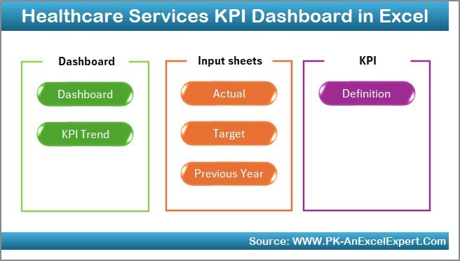
Key Features of the Healthcare Services KPI Dashboard
This dashboard template contains seven powerful worksheets, each serving a specific purpose. Let’s explore each one in detail.
Home Sheet – The Central Navigation Hub
The Home sheet acts as the control center of the dashboard. It provides six navigation buttons that allow users to jump directly to different sheets, making the experience user-friendly and efficient.
Whether you want to check performance charts, enter actual data, or review KPI definitions, this page helps you get there with a single click.
This simple yet smart design makes navigation seamless — perfect for busy healthcare professionals who need quick access to insights.
Click to buy Healthcare Services KPI Dashboard in Excel
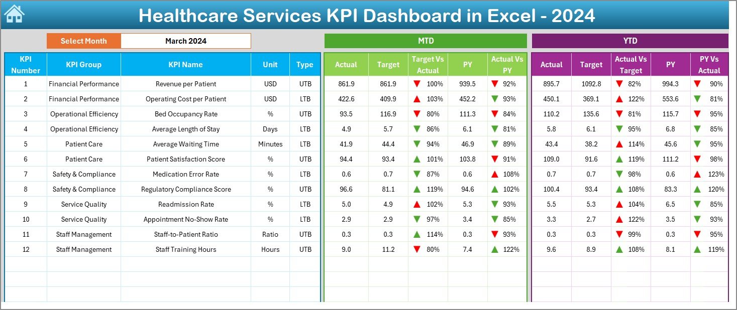
Dashboard Sheet – The Main Performance View
The Dashboard Sheet is the heart of the file. It provides a comprehensive view of all healthcare KPIs in one place.
Here’s what it includes:
- Month Selector (Cell D3): Choose any month from the drop-down, and all KPIs automatically update for that period.
- MTD and YTD Analysis: See Month-to-Date and Year-to-Date performance side by side.
- Actual vs Target Comparison: Identify how close your current performance is to the goal.
- Previous Year Comparison: Compare results with the same period last year.
- Conditional Formatting: Green and red arrows instantly show improvements or declines.
This sheet provides instant visibility into metrics like patient satisfaction, treatment turnaround time, operational cost, and staff utilization — giving decision-makers a real-time pulse of the organization.
Click to buy Healthcare Services KPI Dashboard in Excel
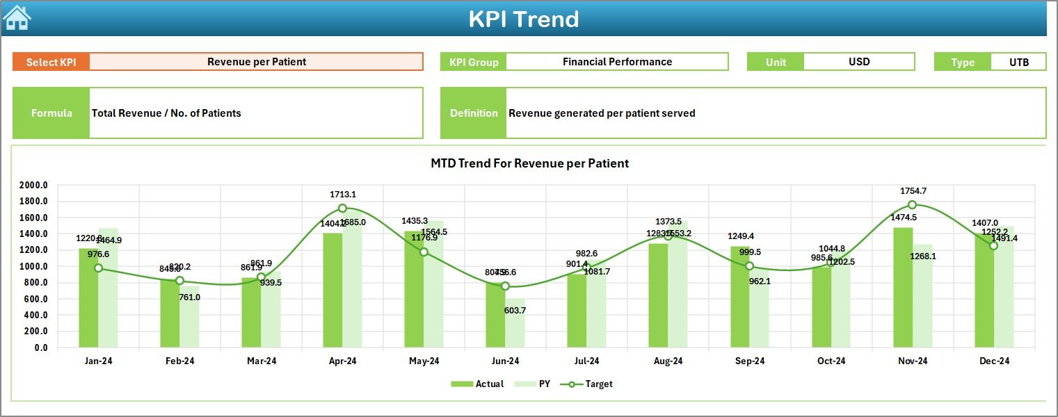
KPI Trend Sheet – Visualize the Progress
The KPI Trend Sheet helps users track the historical performance of each KPI over time.
Features include:
- Dynamic KPI Selection (Cell C3): Choose any KPI to view its details.
- KPI Metadata Display: Automatically shows the KPI Group, Unit, Type (LTB or UTB), Formula, and Definition.
- Trend Charts: Visual representation of MTD and YTD trends for Actual, Target, and Previous Year.
For instance, if you track “Average Patient Waiting Time,” you can instantly see whether it’s improving or getting worse month after month.
This sheet makes analysis visually intuitive and helps identify root causes behind performance variations.
Click to buy Healthcare Services KPI Dashboard in Excel
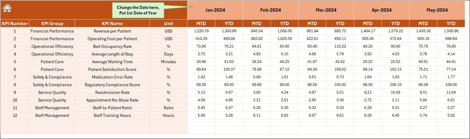
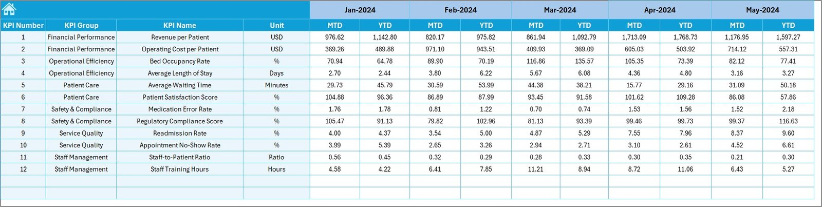
Actual Numbers Input Sheet – Data Entry Made Simple
Every dashboard depends on accurate data. The Actual Numbers Input Sheet is where users record MTD and YTD actuals for each KPI.
Key highlights:
- Change the base month easily from Cell E1.
- Automatically updates calculations across the workbook.
- Data fields include metrics like “Number of Patients Served,” “Average Consultation Time,” “Revenue per Bed,” etc.
This structured input system ensures data accuracy and minimizes manual errors — perfect for teams handling large volumes of information.
Click to buy Healthcare Services KPI Dashboard in Excel
Target Sheet – Setting the Goals
The Target Sheet allows you to define target values for each KPI for all 12 months.
This is where you plan expected results — whether it’s patient satisfaction, cost efficiency, or equipment utilization. By comparing these targets against actual values on the Dashboard, you can instantly measure progress and identify improvement areas.
Such clarity empowers management to set realistic goals and track whether strategic initiatives are working.
Click to buy Healthcare Services KPI Dashboard in Excel
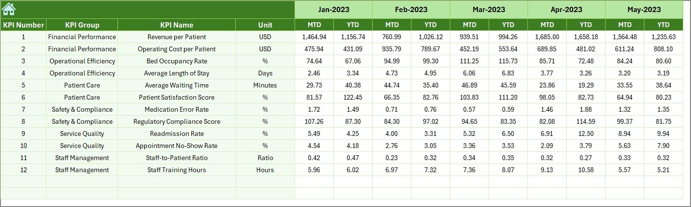
Previous Year Number Sheet – Benchmarking Against History
To understand growth, you need context. The Previous Year Sheet helps you benchmark current performance against historical data.
This allows healthcare administrators to:
- Compare trends across years.
- Identify recurring challenges.
- Evaluate long-term improvement.
By studying year-on-year progress, you can ensure sustainable performance and continuous improvement.
Click to buy Healthcare Services KPI Dashboard in Excel
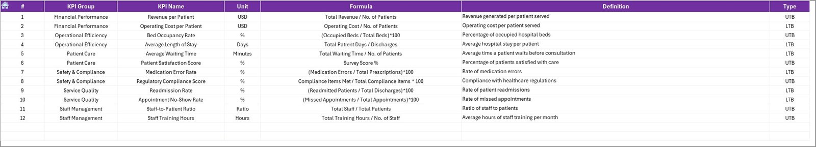
KPI Definition Sheet – The Reference Library
The KPI Definition Sheet documents all essential details for each KPI, including:
- KPI Name
- KPI Group
- Unit
- Formula
- Definition
- Type (LTB or UTB)
This sheet acts as a KPI dictionary, making it easier for anyone — even new team members — to understand what each indicator means and how it’s calculated.
Click to buy Healthcare Services KPI Dashboard in Excel
Advantages of Healthcare Services KPI Dashboard in Excel
A healthcare dashboard in Excel provides more than just data visualization. It creates a culture of accountability and improvement across the organization.
- Centralized Performance Monitoring
All KPIs are stored and visualized in one file, eliminating the need for multiple reports or systems.
- Real-Time Insights
The dashboard updates automatically as you change months or input new data, providing real-time analytics for quick decision-making.
- Improved Efficiency
Automation reduces manual calculations and report preparation time — allowing staff to focus on patient care instead.
- Data Transparency
Since all sheets interlink seamlessly, every stakeholder can access consistent and reliable data, improving trust and communication.
- Customizability
Every healthcare facility has unique metrics. You can easily modify or add KPIs, units, and definitions as per your organization’s needs.
- Visual Analysis
Conditional formatting, charts, and trend lines make it easy to spot performance deviations instantly.
- Cost-Effective Solution
Compared to paid BI tools, Excel dashboards deliver professional-level analytics without recurring subscription costs.
How to Use the Healthcare Services KPI Dashboard
Using this Excel template is simple and intuitive. Follow these steps to get started:
- Open the Home Sheet – Navigate using the buttons.
- Go to the Target Sheet – Define monthly and yearly targets.
- Enter Actual Data – Record real performance in the Actual Numbers Input Sheet.
- Update Previous Year Data – Enter the last year’s numbers for comparison.
- Check the Dashboard Sheet – Select the desired month (Cell D3) to refresh all metrics.
- Analyze KPI Trends – Open the KPI Trend Sheet and review detailed progress.
That’s it! The system automatically calculates comparisons, displays trend arrows, and updates all visuals instantly.
Best Practices for Using a Healthcare KPI Dashboard
To make the most of this tool, follow these best practices:
- Define Clear KPIs
Ensure each KPI has a precise definition, measurable unit, and data source. Avoid ambiguous metrics that can’t be verified.
- Keep Data Updated
Enter data consistently every month to maintain trend accuracy and enable better forecasting.
- Align KPIs with Strategic Goals
Choose KPIs that reflect your organization’s mission — such as patient satisfaction, cost efficiency, or service accessibility.
- Validate Data Sources
Always double-check data integrity from hospital systems or manual records to ensure reliability.
- Review Visuals Regularly
Use the trend charts and conditional formatting to identify problem areas before they escalate.
- Encourage Team Involvement
Share the dashboard with department heads so everyone takes ownership of performance improvement.
- Backup and Version Control
Maintain backup copies of your dashboard to avoid data loss and confusion between versions.
Common Challenges and How to Overcome Them
- Inconsistent Data Entry
Problem: Different departments may record data in varying formats.
Solution: Create standardized templates and train teams on consistent entry.
- Overloaded KPIs
Problem: Tracking too many metrics can dilute focus.
Solution: Limit your dashboard to 10–15 key indicators that truly matter.
- Resistance to Change
Problem: Staff may find it hard to adopt new systems.
Solution: Start small, demonstrate value quickly, and involve them in KPI selection.
Conclusion
The Healthcare Services KPI Dashboard in Excel is more than just a reporting tool — it’s a performance management system that empowers healthcare leaders to transform data into action.
By combining accuracy, simplicity, and visualization, this dashboard helps you improve care quality, operational efficiency, and financial outcomes — all while staying cost-effective.
Whether you manage a hospital, diagnostic center, or multi-clinic network, this Excel-based solution gives you a clear, data-driven edge.
Start using it today and turn your healthcare data into measurable results.
Frequently Asked Questions (FAQs)
- What is a Healthcare KPI Dashboard?
A Healthcare KPI Dashboard is a tool that tracks, analyzes, and visualizes key performance indicators for healthcare operations. It helps administrators measure efficiency, patient outcomes, and financial performance.
- Why should I use Excel for healthcare dashboards?
Excel offers flexibility, affordability, and ease of customization — perfect for organizations that want analytical power without complex software.
- How often should I update the dashboard?
You should update it monthly to maintain accuracy and spot trends early.
- Can I customize KPIs in this dashboard?
Yes, you can easily modify KPI names, units, and formulas in the KPI Definition Sheet to suit your specific requirements.
- Is this dashboard suitable for small clinics?
Absolutely. It’s designed for both small clinics and large hospitals, scaling effortlessly based on your data volume.
- Does this dashboard require Excel macros or VBA?
No. It works entirely on built-in Excel formulas, ensuring safety and compatibility across devices.
- Can I use this dashboard to create reports for management meetings?
Yes. The Dashboard and KPI Trend Sheets provide visual and numerical summaries ideal for presentations or reports.
- What are the main benefits of tracking healthcare KPIs?
They help identify performance gaps, reduce costs, improve patient satisfaction, and ensure compliance with quality standards.
Visit our YouTube channel to learn step-by-step video tutorials
Watch the step-by-step video tutorial:
Click to buy Healthcare Services KPI Dashboard in Excel

