In the fast-paced business world, organizations invest heavily in hiring, onboarding, and training new employees. However, one of the biggest challenges companies face is understanding how long it takes for a new employee to become productive. That’s where the Time-to-Productivity KPI Dashboard in Power BI comes in — a modern, data-driven solution designed to measure, visualize, and improve workforce productivity over time.
Whether you are an HR manager, business analyst, or data-driven leader, this dashboard helps you track how efficiently your employees reach full performance levels after joining the organization. Built using Microsoft Power BI, it combines data analytics and visualization to deliver actionable insights for better decision-making.
Click to buy Time-to-Productivity KPI Dashboard in Power BI
What Is a Time-to-Productivity KPI Dashboard in Power BI?
A Time-to-Productivity KPI Dashboard in Power BI is an interactive reporting solution that measures how quickly new employees achieve their expected performance levels. It connects with Excel-based datasets and transforms raw information into dynamic visuals that show trends, comparisons, and performance metrics across departments, time periods, and KPI groups.
This dashboard provides real-time insights into workforce efficiency by comparing actual performance against targets — both for Month-to-Date (MTD) and Year-to-Date (YTD) measures.
It allows HR teams to identify training gaps, optimize onboarding programs, and evaluate which departments or managers are enabling faster employee ramp-up.
Structure of the Dashboard
The Time-to-Productivity KPI Dashboard in Power BI is designed with simplicity, clarity, and usability in mind. It includes three key pages, each serving a distinct analytical purpose.
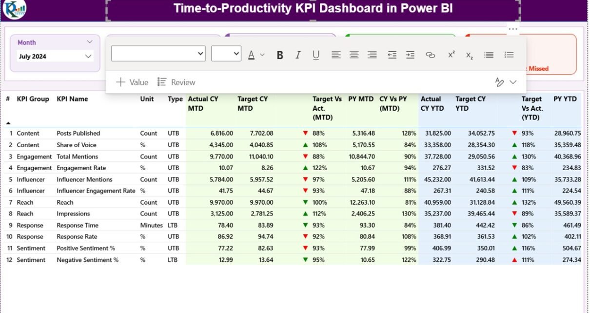
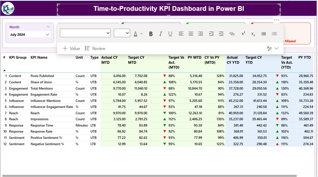
Summary Page
This is the main page of the dashboard, providing an overview of all productivity KPIs.
At the top, users can select filters through Month and KPI Group slicers to analyze specific time periods or categories.
The top section also includes three performance cards that summarize:
- Total KPIs Count: The total number of productivity metrics tracked.
- MTD Target Met Count: The number of KPIs that achieved their monthly target.
- MTD Target Missed Count: The number of KPIs that didn’t meet expectations.
Below these cards lies a detailed data table that presents critical insights for each KPI. The columns include:
- KPI Number: Sequential identifier for each metric.
- KPI Group: Category or domain of the KPI (for example: Onboarding, Training, Efficiency).
- KPI Name: The title or description of the KPI.
- Unit: The unit of measurement (hours, days, percentage, etc.).
- Type: Classification as LTB (Lower-the-Better) or UTB (Upper-the-Better).
- Actual CY MTD: Actual performance value for the current month-to-date.
- Target CY MTD: The target benchmark for the same period.
- MTD Icon: Visual indicator (▲ or ▼) representing whether the KPI met or missed its monthly target.
- Target vs. Actual (MTD): Shows the percentage difference between actual and target performance.
- PY MTD: Last year’s MTD figure for comparison.
- CY vs. PY (MTD): Percentage comparison between current and previous year performance.
- Actual CY YTD: Current year’s year-to-date performance.
- Target CY YTD: Year-to-date target value.
- YTD Icon: Visual cue showing performance trend versus target (▲ green for met, ▼ red for missed).
- Target vs. Actual (YTD): Ratio between actual and target YTD values.
- PY YTD: Previous year’s YTD data.
- CY vs. PY (YTD): Year-on-year productivity improvement percentage.
This summary table is the analytical backbone of the dashboard. Users can instantly identify underperforming areas, monitor monthly progress, and assess long-term improvement.
Click to buy Time-to-Productivity KPI Dashboard in Power BI
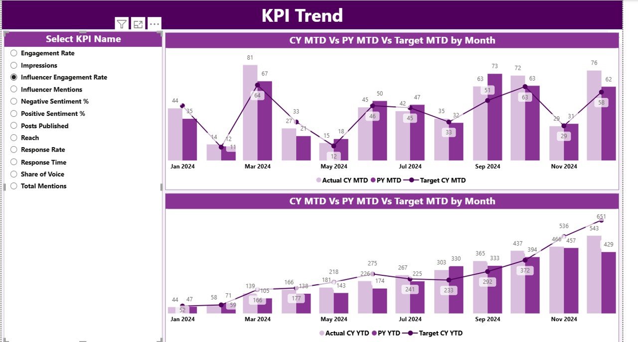
KPI Trend Page
The KPI Trend page enables deep-dive analysis for specific KPIs.
It features two combo charts that display:
- Monthly and yearly actual values for the current and previous years.
- Comparative target lines to evaluate gaps and improvements visually.
A KPI Name slicer on the left lets users choose which metric to explore. This interactive design helps identify seasonal trends, training effectiveness, or workforce efficiency patterns across time.
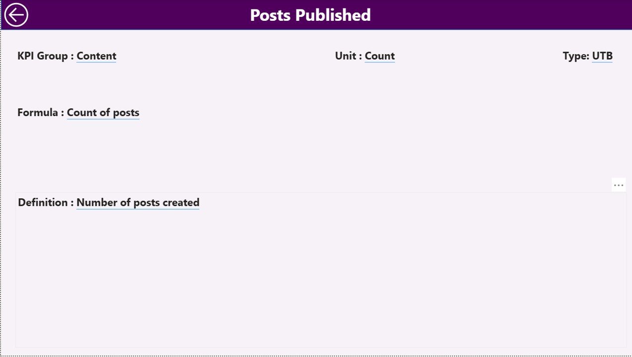
KPI Definition Page
The KPI Definition Page is a hidden drill-through page that provides context and explanation for each KPI.
When users right-click on a KPI from the summary page, they can drill through to view details such as:
- KPI Formula
- Detailed Definition
- Measurement Methodology
- Type (LTB or UTB)
This transparency ensures everyone in the organization interprets KPIs consistently.
To return to the main page, users can click the Back button placed on the top-left corner of the page.
Click to buy Time-to-Productivity KPI Dashboard in Power BI
Excel Data Source Integration
The dashboard seamlessly integrates with Excel data sources.
There are three essential worksheets used to maintain and update the data behind the visuals:
Input_Actual Sheet
This sheet stores actual KPI values.
Columns include:
- KPI Name
- Month (use the first date of the month)
- MTD (Month-to-Date) value
- YTD (Year-to-Date) value
This data helps Power BI calculate current performance levels.
Input_Target Sheet
This sheet holds target data for each KPI and month.
It mirrors the structure of the actuals sheet — with columns for KPI Name, Month, MTD, and YTD target values.
These targets help evaluate performance variance.
KPI Definition Sheet
This sheet documents metadata about each KPI, including:
- KPI Number
- KPI Group
- KPI Name
- Unit
- Formula
- Definition
- Type (LTB or UTB)
This structured input ensures that the dashboard remains dynamic, flexible, and easy to maintain.
Why Businesses Need a Time-to-Productivity Dashboard
Organizations spend significant resources hiring and training employees, yet often fail to measure how quickly those employees become productive. Without visibility, teams cannot identify performance gaps or improve onboarding processes.
The Time-to-Productivity KPI Dashboard in Power BI addresses this problem by:
- Providing clear visibility into employee ramp-up timelines.
- Highlighting training effectiveness through KPI comparisons.
- Identifying departments or roles where productivity lags.
- Facilitating data-driven decision-making for HR and management teams.
This dashboard isn’t just about tracking data — it’s about turning analytics into action.
Advantages of Time-to-Productivity KPI Dashboard in Power BI
Faster Decision-Making
The dashboard helps HR and business leaders make quick, informed decisions based on real-time data. Visual indicators clearly show which KPIs are on track and which need attention.
Improved Onboarding Programs
By analyzing time-to-productivity trends, companies can refine onboarding processes and training modules to reduce ramp-up times for new hires.
Better Resource Allocation
When you understand how long it takes different roles or departments to reach full productivity, you can allocate resources more effectively.
Year-over-Year Performance Tracking
The comparison between current and previous year data provides valuable insights into long-term improvements and workforce efficiency trends.
Interactive and User-Friendly
With Power BI’s intuitive design, users can explore the data visually using slicers, filters, and drill-throughs — no technical expertise required.
Integration with Excel
Since many companies already use Excel for KPI data entry, this dashboard easily fits into existing workflows without additional setup costs.
Enhanced Transparency
Every KPI is documented with a formula and definition, ensuring clarity across teams and promoting accountability.
Key Metrics to Include in a Time-to-Productivity Dashboard
When designing or analyzing this type of dashboard, consider including the following KPIs:
- Average Time to Productivity (Days)
Measures how long it takes for an employee to reach expected performance. - Training Completion Rate (%)
Tracks how many employees finish onboarding or training modules on time. - Early Productivity Ratio (%)
Evaluates employees who achieve targets earlier than expected. - Average Training Cost per Employee (USD)
Helps assess the financial efficiency of onboarding programs. - New Hire Retention Rate (%)
Shows how many new employees stay beyond their first six months. - Performance Score Improvement (%)
Compares the growth of new employees’ performance over time.
Including these KPIs ensures a balanced mix of time, cost, and performance measures — providing a holistic view of productivity.
How to Use the Dashboard Effectively
- Set clear targets for each KPI at the start of every month or quarter.
- Regularly update Excel sheets with actual performance values.
- Monitor trends on the summary page to catch early signs of delays.
- Drill through to definitions to ensure teams interpret KPIs correctly.
- Compare CY vs. PY metrics to track overall improvement.
- Leverage visual icons (▲▼) to communicate results instantly to management.
- Use the KPI Trend page to analyze performance at both monthly and yearly levels.
Best Practices for the Time-to-Productivity KPI Dashboard
To maximize the impact of your Power BI dashboard, follow these proven best practices:
Keep the Dashboard Simple
Avoid cluttered visuals. Display only key KPIs on the main page and use drill-throughs for details.
Automate Data Refresh
Connect the dashboard to automatically updated Excel files or databases so that your insights are always current.
Use Conditional Formatting
Visual cues like green and red arrows instantly communicate performance status, making reports easy to understand.
Maintain Consistency
Use standardized KPI definitions and formulas to ensure reliable year-to-year comparisons.
Encourage Collaboration
Share the dashboard with department heads to foster accountability and promote data-driven discussions.
Review KPIs Quarterly
Regularly revisit which metrics truly drive productivity and remove redundant ones.
Combine with Employee Feedback
Augment KPI data with qualitative insights from employee surveys for a complete performance picture.
Conclusion
The Time-to-Productivity KPI Dashboard in Power BI is more than just a reporting tool — it’s a performance accelerator.
By tracking how quickly employees become productive, organizations can fine-tune their onboarding, improve training quality, and achieve faster returns on talent investments.
With its combination of Excel integration, dynamic visuals, and user-friendly features, this dashboard delivers actionable insights that drive real business outcomes.
Frequently Asked Questions (FAQs)
- What does “Time-to-Productivity” mean?
It refers to the time taken by a new employee to reach full performance or productivity levels in their role after joining the organization.
- Why is tracking Time-to-Productivity important?
Tracking this KPI helps HR teams improve onboarding, identify skill gaps, and enhance employee engagement and retention.
- Can I customize the KPIs in this dashboard?
Yes, the dashboard is fully customizable. You can add, edit, or remove KPIs based on your organization’s needs.
- What data sources can I connect besides Excel?
You can link Power BI to SQL databases, SharePoint lists, cloud apps, or HR management systems for automated updates.
- How often should I update the dashboard?
Monthly updates are recommended for MTD and YTD tracking, but you can automate refresh schedules for real-time insights.
- Can small businesses use this dashboard?
Absolutely! The dashboard works for organizations of all sizes — from startups to global enterprises.
- Do I need coding skills to use this dashboard?
No. The interface is user-friendly, with slicers and visuals designed for non-technical users.
- How does this dashboard improve HR decision-making?
It helps HR professionals identify departments with slower onboarding, measure productivity trends, and optimize workforce planning.
- Can I share this dashboard online?
Yes. Power BI allows secure sharing via Power BI Service, Teams, or SharePoint.
- Where can I get this dashboard?
Visit our YouTube channel to learn step-by-step video tutorials
Watch the step-by-step video tutorial:
Click to buy Time-to-Productivity KPI Dashboard in Power BI