In today’s data-driven world, every organization that manages social programs needs clear visibility into its operations, performance, and impact. Whether you are running community development projects, health awareness campaigns, education programs, or welfare initiatives, tracking every fund, project, and beneficiary matters.
That’s where the Social Services Dashboard in Excel comes into play. This ready-to-use, interactive Excel template helps social organizations and non-profits monitor their programs efficiently—without needing any complex software or technical setup.
Click to buy Social Services Dashboard in Excel
What Is a Social Services Dashboard in Excel?
A Social Services Dashboard in Excel is a smart, data-driven template that consolidates all your program details—funding, beneficiaries, satisfaction levels, and project status—into one visual and interactive view.
It enables managers, donors, and policymakers to understand where resources are going, how effectively they are being used, and what kind of results they are generating.
The dashboard helps answer questions like:
- How many projects are currently active or completed?
- How much of the allocated budget has been used?
- Which regions or programs are performing best?
- What is the average satisfaction level of beneficiaries?
With Excel’s power of automation, formulas, and pivot charts, this dashboard brings clarity, accountability, and data-driven insights to social service management.
Structure of the Social Services Dashboard in Excel
The Social Services Dashboard is organized into multiple sheet tabs for better navigation and analysis. Each sheet has a specific purpose and delivers actionable insights for managers and team members.
Let’s explore each one in detail.
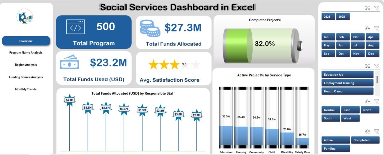
Overview Sheet Tab
The Overview sheet is the main page of the dashboard. It gives a quick summary of the organization’s performance through KPI cards and dynamic charts.
KPI Cards
The key metrics displayed are:
- Total Programs: The total number of social service programs being managed.
- Total Funds Allocated (USD): The total budget assigned across all programs.
- Total Funds Used (USD): The amount of money utilized till date.
- Average Satisfaction Score: The average rating of service satisfaction from beneficiaries.
- Active Projects (%): The percentage of ongoing projects.
- Completed Projects (%): The percentage of projects that have reached completion.
Click to buy Social Services Dashboard in Excel
Charts in the Overview Tab
The charts in this section help you analyze data visually:
- Total Funds Allocated (USD) by Responsible Staff: Displays how funds are distributed among project managers.
- Active Project % by Service Type: Helps identify which service categories are performing well and which need attention.
This page acts as the “executive summary” for management reviews or donor reporting.
Program Name Analysis Sheet Tab
The Program Name Analysis sheet focuses on individual program performance.
Key Insights
- Total Funds Used (USD) by Program Name: Reveals which programs consume the most resources.
- Project Status Distribution: Visualizes the number of completed, pending, and active projects per program.
- Average Satisfaction Score by Program: Highlights the impact quality of each program.
- Total Beneficiaries Served by Program Name: Measures outreach and effectiveness.
These visuals allow program heads to make comparisons, optimize budget allocations, and identify best-performing programs.

Click to buy Social Services Dashboard in Excel
Region Analysis Sheet Tab
Regional performance matters in social service delivery. The Region Analysis page provides detailed geographic insights.
Metrics Covered
- Total Beneficiaries Served by Region: Shows outreach scale by location.
- Active Project % by Region: Helps understand operational load and engagement.
- Average Satisfaction Score by Region: Indicates which regions have high beneficiary satisfaction.
- Total Funds Allocated (USD) by Region: Reveals regional funding distribution.
Such information helps managers target underperforming areas and allocate resources more equitably.

Click to buy Social Services Dashboard in Excel
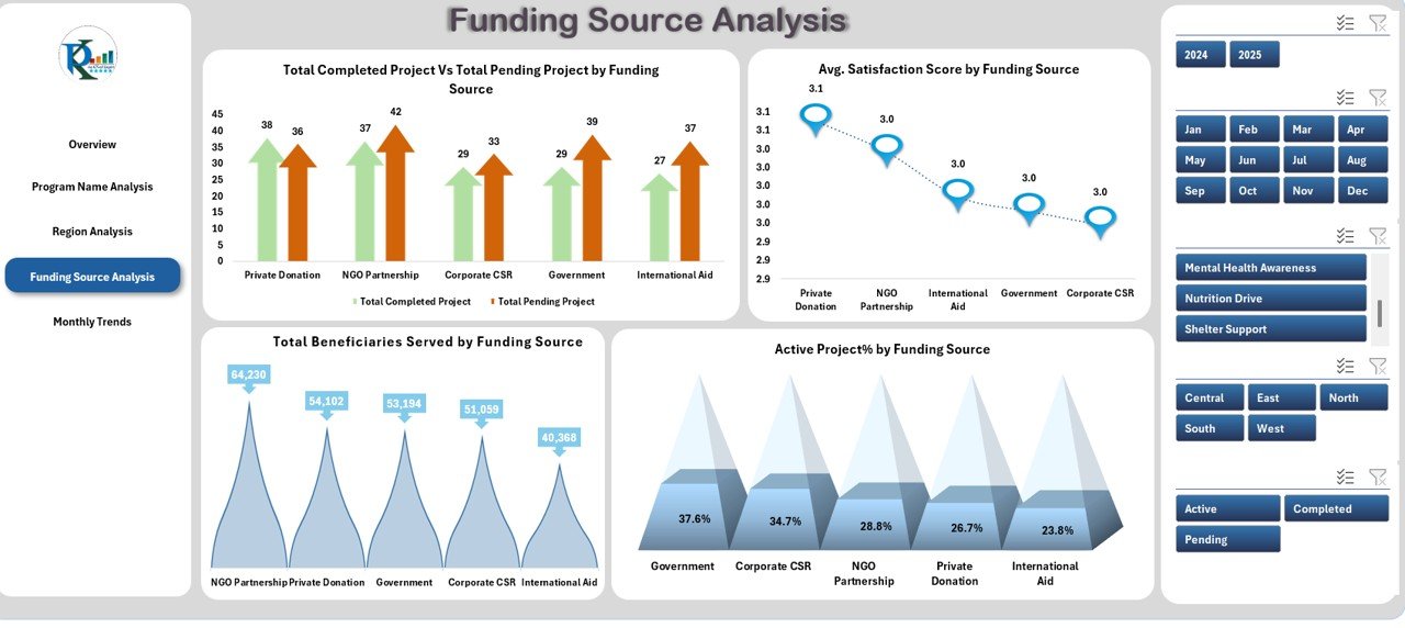
Funding Source Analysis Sheet Tab
For NGOs and social programs, funding sources are vital. This sheet tracks performance across various funding contributors such as government grants, private donors, and CSR partners.
Metrics Included
- Completed vs. Pending Projects by Funding Source: Displays how effectively each funder’s contributions are being utilized.
- Average Satisfaction Score by Funding Source: Shows the correlation between fund allocation and service outcomes.
- Total Beneficiaries Served by Funding Source: Reflects the impact of each funding partner.
- Active Project % by Funding Source: Helps evaluate fund utilization efficiency.
This page makes it easier to prepare funder reports and demonstrate accountability.
Click to buy Social Services Dashboard in Excel
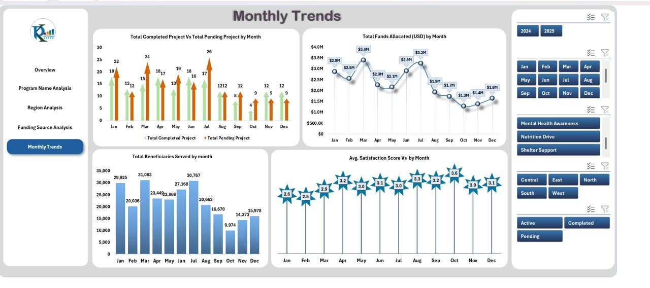
Monthly Trends Sheet Tab
The Monthly Trends page captures time-based analysis for performance tracking and forecasting.
Charts Displayed
- Completed vs. Pending Projects by Month: Reveals operational pace and project closure trends.
- Total Beneficiaries Served by Month: Shows seasonal or periodic variations in outreach.
- Total Funds Allocated (USD) by Month: Helps monitor budget flow and spending patterns.
Managers can use this sheet to compare performance across months, identify bottlenecks, and plan future activities more efficiently.
Data Sheet Tab
This is the Data Input Sheet—the foundation of the dashboard.
Users enter all program details here, including:
- Program Name
- Region
- Responsible Staff
- Funding Source
- Budget Allocated
- Funds Used
- Satisfaction Score
- Beneficiary Count
- Project Status (Active, Pending, Completed)
Since all charts and KPIs pull data from this sheet, maintaining clean and updated records ensures accurate insights.
Why Use the Social Services Dashboard in Excel?
Organizations involved in social welfare often manage multiple projects, partners, and regions simultaneously. Tracking all of this manually can lead to errors and inefficiency.
The Social Services Dashboard in Excel centralizes this information into one clear, visual tool. You no longer need to sift through hundreds of rows of raw data; instead, you can view interactive summaries and pivot-based insights instantly.
Here are the main reasons to use it:
- Simplifies complex data management
- Enhances reporting and transparency
- Saves time in monthly or donor reporting
- Supports better decision-making
- Helps visualize trends and performance gaps
- Works entirely within Excel—no extra tools needed
Advantages of the Social Services Dashboard in Excel
Let’s look at the key benefits this dashboard brings to your organization:
Real-Time Visibility
With dynamic charts and automated KPIs, you can instantly monitor how funds, programs, and projects perform.
Enhanced Accountability
By tracking every dollar spent and project outcome, organizations can maintain transparency with donors and stakeholders.
Centralized Data
Instead of maintaining multiple sheets or files, everything resides in one Excel workbook with clear navigation.
Easy Customization
Since it’s built in Excel, users can modify labels, colors, or even add their own metrics without coding.
Data-Driven Decisions
Comparing satisfaction scores, regional outcomes, and funding efficiency empowers teams to make informed policy or budget decisions.
Cost-Effective Solution
No need for expensive software. Excel’s built-in formulas and charts make this dashboard accessible and affordable.
Opportunities for Improvement
Even with its advantages, continuous improvement helps maximize dashboard performance.
Here are a few enhancement ideas:
- Integrate with Power BI or Google Sheets: For larger organizations, syncing this dashboard with cloud tools can automate data refreshes.
- Include Predictive Trends: Add formulas or pivot calculations to forecast future funding or beneficiary numbers.
- Add Conditional Formatting: Highlight critical data like underfunded programs or below-average satisfaction.
- Automate Data Entry with VBA: Use forms or macros for error-free data input.
- Add Regional Maps: Incorporate Excel maps to visualize impact geographically.
How to Use the Dashboard Effectively
Follow these best practices for smoother implementation:
- Maintain Data Accuracy: Update the data sheet regularly to ensure insights stay reliable.
- Set Standard Definitions: Keep consistent units and scales (e.g., USD, percentages, satisfaction scores).
- Use Slicers Efficiently: Add slicers to filter by program, region, or month to compare performance dynamically.
- Review KPIs Monthly: Schedule regular reviews with program heads to discuss findings.
- Protect Data: Lock formulas and key cells to avoid accidental edits.
- Document Changes: Maintain a log for updates, especially when adding new programs or funders.
Key Insights You Can Derive from the Dashboard
The Social Services Dashboard enables powerful analysis through pivot charts and tables.
Here are some insights you can easily obtain:
- Top-Performing Regions: Identify regions with the highest satisfaction and fund utilization.
- Underperforming Programs: Detect programs with low completion or high pending rates.
- Funding Efficiency: Compare allocated vs. used funds across donors.
- Seasonal Trends: Track how activity changes month by month.
- Beneficiary Growth: Measure outreach expansion over time.
- Satisfaction vs. Funds Used: Correlate beneficiary happiness with financial efficiency.
Best Practices for the Social Services Dashboard in Excel
To ensure your dashboard always provides accurate and actionable insights, follow these practical guidelines:
Use Pivot Tables for Analysis
Leverage pivot tables to slice and dice your data by program, region, or month. It makes analysis flexible and fast.
- Keep the Interface Simple
- Avoid cluttering the dashboard with too many visuals. Stick to 3–4 impactful charts per page for better readability.
- Apply Conditional Formatting
- Highlight KPIs that exceed or fall below target levels using color codes (e.g., green for good, red for concern).
- .Create Backup Copies
- Always keep backup versions before making structural or formula changes.
- Train Your Team
Ensure all users understand how to input data correctly and interpret visuals.
Review and Update Regularly
Set a monthly or quarterly schedule to refresh the dashboard and check accuracy.
How This Dashboard Supports Decision-Making
This Excel-based dashboard is not just about tracking—it’s about insight and action.
- For Program Managers: Helps prioritize projects and allocate resources effectively.
- For Donors and Sponsors: Provides measurable proof of how their funds are used.
- For Senior Management: Offers a bird’s-eye view of organizational performance.
- For Field Teams: Clarifies expectations and shows progress transparently.
With these insights, social service leaders can make evidence-based decisions to improve impact and efficiency.
How to Customize the Social Services Dashboard for Your Needs
Every organization is unique. You can tailor this dashboard to fit your structure:
- Add or rename KPI cards (e.g., add “Volunteer Hours” or “Gender Distribution”).
- Insert additional slicers for deeper filtering (e.g., “Program Type” or “Funding Cycle”).
- Modify chart types—switch from bar to line or donut charts as needed.
- Change the color scheme to match your organization’s brand.
- Add automation buttons using simple VBA macros for easy navigation.
Conclusion
The Social Services Dashboard in Excel transforms raw data into clear, actionable insights.
By organizing key metrics like program funds, beneficiaries, and satisfaction scores into visual dashboards, it empowers social organizations to plan better, deliver efficiently, and demonstrate their impact with confidence.
Whether you’re an NGO director, donor, or program analyst, this dashboard simplifies your reporting and strengthens your management capabilities—all within familiar Excel.
Frequently Asked Questions (FAQs)
- Who can use the Social Services Dashboard in Excel?
This dashboard is ideal for NGOs, non-profits, CSR teams, and government agencies managing welfare or community programs.
- Do I need technical skills to use it?
No. The dashboard is completely Excel-based and easy to use. You only need basic spreadsheet knowledge.
- Can I add new KPIs or charts?
Yes, you can easily customize it by adding new columns in the data sheet or creating additional pivot charts.
- How often should I update the data?
It’s best to update the data weekly or monthly, depending on the frequency of your program activities.
- Does this dashboard work on Mac and Windows?
Yes, it’s compatible with both versions of Excel. Some slicer visuals may look slightly different across platforms, but all functionality remains intact.
- Can I share this dashboard with my team?
Absolutely! You can share it through OneDrive, Google Drive, or email. For real-time collaboration, use Excel Online.
- Is this template suitable for donor reporting?
Yes. It provides clear, visual summaries that make it perfect for donor presentations, funding reports, and annual reviews.
- How do I get accurate charts?
Ensure the data input sheet has no missing values or incorrect formats. Use consistent text labels (e.g., “Completed,” “Pending,” “Active”).
- Can I use it for multiple years?
Yes. You can add year columns or duplicate the file annually to maintain clean records.
- What if I want to automate updates?
You can enhance the dashboard with simple VBA scripts or link it to external data sources for automatic refreshes.
Visit our YouTube channel to learn step-by-step video tutorials
Watch the step-by-step video tutorial:
Click to buy Social Services Dashboard in Excel