In every modern government setup, efficiency and transparency matter more than ever. Citizens expect faster services, better project outcomes, and effective use of resources. To achieve these goals, government agencies must track their operations, projects, and budgets in real time. That’s exactly where the Government Administration Dashboard in Excel makes a difference.
This dynamic Excel-based reporting tool provides a clear and comprehensive view of government projects, budgets, citizen satisfaction, and performance indicators — all in one place. It helps public administrators, policymakers, and department heads make better decisions through data-driven insights.
Click to buy Government Administration Dashboard in Excel
What Is a Government Administration Dashboard in Excel?
A Government Administration Dashboard in Excel is an interactive reporting system built to monitor key performance indicators (KPIs) across multiple government departments. It simplifies complex administrative data and converts it into easy-to-understand visuals, ensuring that decision-makers can assess performance quickly.
This dashboard tracks crucial aspects such as:
- Total projects managed
- Average project duration
- Budget allocation vs. actual spending
- Citizen satisfaction scores
- Department and regional performance
- Monthly spending and beneficiary trends
Because it’s designed in Microsoft Excel, users don’t need advanced software or coding skills. They can use familiar Excel features such as pivot tables, slicers, and charts to explore the data, making the dashboard both powerful and easy to use.
Why Every Government Department Needs a Performance Dashboard
Government operations generate large volumes of data — project timelines, fund allocations, resource usage, and citizen feedback. Without a structured monitoring system, this data remains underutilized.
A dashboard solves this challenge by transforming data into actionable insights. It provides a centralized platform where all stakeholders can see the same numbers, track progress, and ensure accountability.
The Government Administration Dashboard in Excel not only highlights achievements but also identifies areas needing attention. This visibility leads to timely interventions, better planning, and efficient public service delivery.
Structure of the Government Administration Dashboard
The dashboard includes several interactive sheets, each focusing on a specific performance dimension. Let’s go through them in detail.
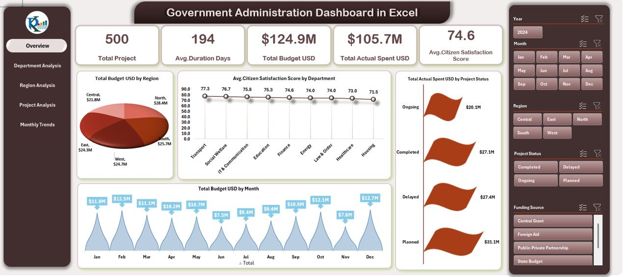
Overview Sheet
The Overview Sheet is the heart of the dashboard. It gives a high-level snapshot of key government performance metrics and financial health.
Key Features:
- Total Projects: Displays how many projects are currently active or completed across departments.
- Average Duration (Days): Shows the average time taken to complete projects, helping in efficiency tracking.
- Total Budget (USD): Summarizes the total allocated funds for ongoing and completed projects.
- Total Actual Spent (USD): Helps compare actual spending against the allocated budget.
- Average Citizen Satisfaction Score: Captures how satisfied citizens are with government services.
Visual Charts:
- Total Budget (USD) by Region – A region-wise breakdown of budget allocation to ensure balanced fund distribution.
- Average Citizen Satisfaction by Department – Measures departmental performance from the citizen’s viewpoint.
- Total Budget by Month – Highlights monthly spending patterns and trends for better fiscal management.
Click to buy Government Administration Dashboard in Excel
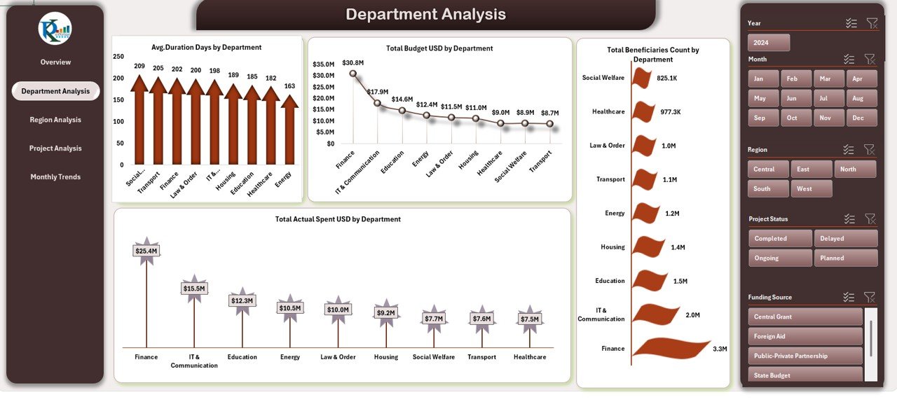
Department Analysis Sheet
The Department Analysis Sheet provides deeper insights into how each department performs against targets and budgets.
KPIs Tracked:
- Average Duration Days by Department
- Total Actual Spent (USD) by Department
- Total Budget (USD) by Department
- Total Beneficiaries Count by Department
This sheet makes it easy to identify which departments are most efficient, where overspending occurs, and which ones deliver the highest citizen satisfaction. With conditional formatting and color-coded visuals, performance gaps become visible at a glance.
Click to buy Government Administration Dashboard in Excel
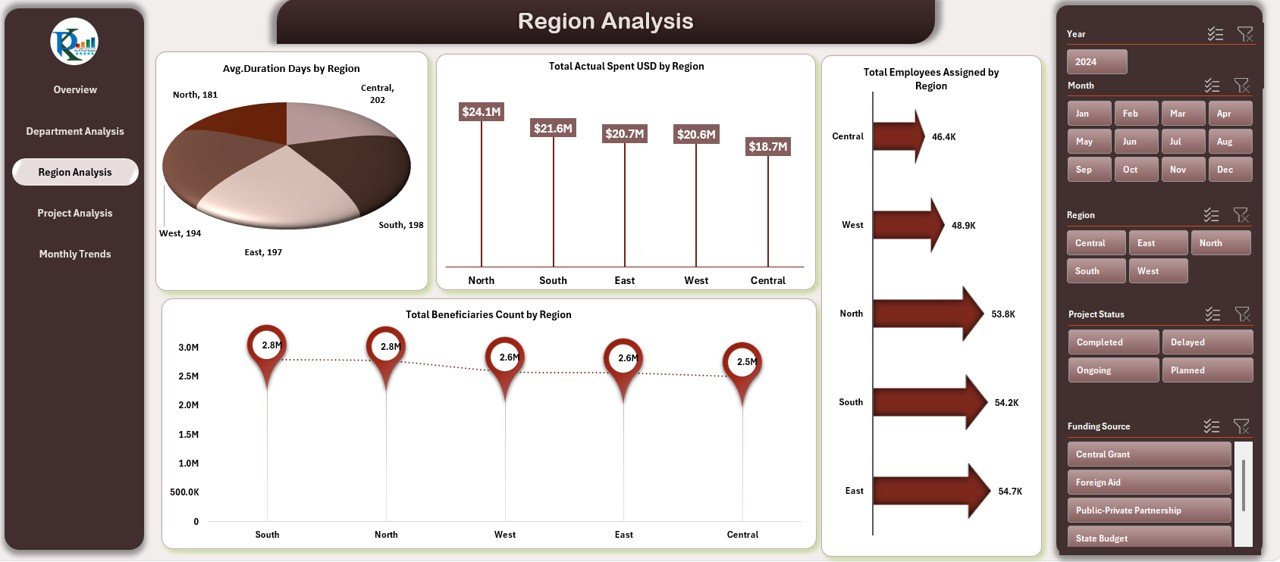
Region Analysis Sheet
Regional balance and equity are critical in government planning. The Region Analysis Sheet allows administrators to analyze performance across regions.
Insights Provided:
- Average Duration Days by Project Status – Tracks completion speed for projects in each region.
- Total Budget (USD) by Project Status – Shows how much funding is allocated and spent per region.
- Average Citizen Satisfaction Score by Project Status – Reveals public perception in each location.
- Total Beneficiaries Count by Project Status – Indicates how many people benefit from regional projects.
These visuals help regional managers identify underperforming zones and take corrective measures.
Click to buy Government Administration Dashboard in Excel
Project Analysis Sheet
The Project Analysis Sheet focuses on individual project performance metrics. It’s particularly useful for project management teams who want to understand progress and performance.
Displayed KPIs:
- Average Duration Days by Project Status
- Total Budget (USD) by Project Status
- Total Beneficiaries Count by Project Status
- Average Citizen Satisfaction Score by Project Status
This analysis reveals how each project contributes to the overall mission, highlighting delays, budget overruns, and satisfaction trends.

Click to buy Government Administration Dashboard in Excel
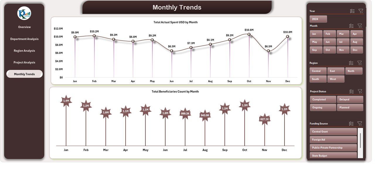
Monthly Trends Sheet
Government projects often follow fiscal timelines. The Monthly Trends Sheet helps monitor spending and outcomes over time.
Key Charts:
- Total Actual Spent (USD) by Month – Tracks month-wise expenditure trends.
- Total Beneficiaries Count by Month – Indicates how citizen reach grows or fluctuates monthly.
By reviewing monthly data, administrators can forecast future expenses, plan budgets, and identify seasonal performance trends.
Advantages of the Government Administration Dashboard in Excel
Implementing this dashboard offers numerous benefits to government organizations. Let’s explore the key advantages.
Enhanced Transparency
Transparency is the foundation of good governance. This dashboard promotes transparency by displaying real-time performance metrics accessible to all authorized stakeholders.
Data-Driven Decision Making
Instead of relying on assumptions, officials can use facts and figures to make decisions. Whether it’s allocating funds or evaluating project efficiency, data guides every move.
Improved Accountability
Each department and project has visible metrics. This accountability encourages teams to meet goals and maintain performance consistency.
Efficient Resource Utilization
Budget vs. actual spending comparisons prevent overspending and ensure optimal use of taxpayer funds.
Citizen-Centric Governance
By monitoring citizen satisfaction scores, the government can focus on improving areas that directly affect the public experience.
Quick Performance Review
The dashboard simplifies reviewing hundreds of projects at once, reducing manual reporting time and improving operational speed.
How to Use the Dashboard Effectively
To get the most out of your Government Administration Dashboard, follow these best steps:
- Input Accurate Data – Always ensure that your department or regional data is updated regularly.
- Use Dropdown Filters – Filter by month, department, or region to focus on specific metrics.
- Compare MTD and YTD – Analyze Month-to-Date and Year-to-Date values for continuous improvement.
- Check Variances – Identify where Actual vs. Target gaps exist.
- Visualize Trends – Study charts to observe patterns over time.
- Review Citizen Feedback – Prioritize improvement areas based on satisfaction scores.
Best Practices for the Government Administration Dashboard
Following best practices ensures long-term success and accuracy in reporting.
Keep Data Updated Regularly
An outdated dashboard can mislead decision-makers. Update data monthly or weekly depending on reporting cycles.
Maintain Consistent Data Formatting
Uniform date formats, naming conventions, and units make comparisons more accurate.
Use Conditional Formatting Wisely
Apply traffic-light color coding (green for good, red for poor) for quick visual interpretation.
Secure Sensitive Information
Ensure that confidential financial or citizen data is protected using Excel’s password and access control features.
Automate Data Refresh
Link data from external Excel sheets or databases to automatically update dashboard visuals.
Train Staff
Provide training to department staff on how to use filters, charts, and interpretations effectively.
Validate Before Presentation
Before sharing, cross-verify all figures to avoid discrepancies in public or administrative reports.
How This Dashboard Supports Better Governance
Governments often face challenges in synchronizing operations across various departments. This Excel dashboard bridges those gaps by aligning data, enabling collaboration, and creating a single source of truth.
It turns scattered numbers into stories — how much was spent, who benefited, and what outcomes were achieved. With one glance, leaders can understand if projects are on track or if adjustments are needed.
From improving efficiency to building trust, this dashboard helps governments become more responsive and citizen-oriented.
Use Cases of the Government Administration Dashboard
This template can be customized for various administrative levels and functions:
- Municipal Administration: Track local development projects and service delivery.
- State Governments: Monitor department-wide budgets and progress.
- National Ministries: Evaluate large-scale programs, citizen satisfaction, and fund distribution.
- Public Enterprises: Measure operational efficiency and compliance with government objectives.
- Non-Governmental Agencies: Use the same framework to analyze project impact and funding utilization.
Steps to Customize the Dashboard
To make the dashboard more tailored to your needs, follow these simple steps:
- Replace Sample Data: Insert your actual department or regional data into the input sheets.
- Update Dropdowns: Modify the dropdown lists for months, departments, and regions.
- Add KPIs: Include custom indicators such as Employment Rate, Project Delay %, or Revenue Generated.
- Edit Charts: Change chart titles, colors, or layouts to suit your organization’s branding.
- Protect the Dashboard Sheet: Prevent unauthorized edits using Excel’s protection tools.
- Create Export Buttons: Use VBA macros to export department reports automatically.
Conclusion
The Government Administration Dashboard in Excel transforms how public institutions manage data. It replaces manual spreadsheets with automated analysis, ensuring every number tells a story. By tracking projects, budgets, satisfaction levels, and beneficiaries, it empowers administrators to make informed, transparent, and accountable decisions.
Whether you manage a single department or oversee an entire government division, this Excel dashboard provides the clarity and control needed to drive progress.
Frequently Asked Questions (FAQs)
What is the main purpose of a Government Administration Dashboard?
The main purpose is to track and evaluate the performance of government projects, budgets, and departments through data visualization in Excel.
Who can use this dashboard?
It’s designed for government officers, project managers, policy analysts, auditors, and administrative leaders who need real-time performance insights.
Can I customize this dashboard for my organization?
Yes. You can easily modify the KPI names, data sources, and chart visuals to match your department’s needs.
Does this dashboard require advanced Excel skills?
Not at all. It uses built-in Excel features like pivot tables, slicers, and formulas, which are easy to understand.
How often should I update the data?
Monthly updates are ideal for project-based departments, but weekly updates are better for fast-moving agencies.
Can this dashboard handle large datasets?
Yes. Excel’s Power Query and Pivot Table functionalities allow you to analyze thousands of rows efficiently.
Is the dashboard suitable for public reporting?
Yes. With a clean layout and clear visuals, it can be presented in departmental meetings or published as a public performance report.
Visit our YouTube channel to learn step-by-step video tutorials
Watch the step-by-step video tutorial:
Click to buy Government Administration Dashboard in Excel