Agriculture has always depended on experience, intuition, and seasonal patterns. However, modern farming now demands data-driven decision-making. Costs continue to rise, weather patterns change quickly, and profit margins remain tight. Therefore, farmers, farm managers, and agribusiness owners must track performance accurately and act fast.
That is exactly where an Agriculture Dashboard in Excel becomes a powerful solution.
In this detailed guide, you will learn what an Agriculture Dashboard in Excel is, why it is essential, how it works, page-wise dashboard structure, key metrics, advantages, best practices, and frequently asked questions. Moreover, the article uses clear language, smooth transitions, and practical explanations to help you understand everything easily.
Click to buy Agriculture dashboard in Excel
What Is an Agriculture Dashboard in Excel?
An Agriculture Dashboard in Excel is a ready-to-use, interactive reporting tool that helps track farming performance, production efficiency, costs, revenue, and profitability in one centralized view.
Instead of maintaining multiple spreadsheets for crops, regions, soil types, fertilizers, seasons, and costs, this dashboard consolidates all agricultural data into a single Excel file. As a result, users gain instant insights into yield, cost per acre, production volume, and profit trends.
Moreover, because the dashboard runs in Excel, users can:
- Update data easily
- Use pivot tables and pivot charts
- Apply slicers for dynamic filtering
- Share reports without complex software
Therefore, this dashboard suits small farmers, large farms, cooperatives, and agribusiness firms alike.
Why Do Farmers and Agribusinesses Need an Agriculture Dashboard in Excel?
Many agricultural operations still rely on manual tracking. However, this approach often causes delays, errors, and missed opportunities.
Let us understand why a dashboard becomes essential.
Common Challenges Without a Dashboard
- Difficulty tracking cost per acre
- No clear visibility into profit margins
- Delayed insights into low-yield regions
- Poor comparison across soil types and crops
- Limited understanding of seasonal performance
- Time-consuming monthly and annual reporting
However, when you use an Agriculture Dashboard in Excel, you eliminate these challenges step by step.
How Does an Agriculture Dashboard in Excel Work?
The dashboard uses structured agricultural data such as crop type, region, soil type, fertilizer type, acreage, yield, cost, and revenue. Excel then processes this data using pivot tables, calculated fields, and charts.
As a result:
- Raw data converts into visual insights
- Users apply slicers to filter by region, season, crop, or month
- KPIs update automatically
- Trends become easy to identify
Therefore, decision-making becomes faster and more accurate.
What Sheets Are Included in the Agriculture Dashboard in Excel?
This ready-to-use Agriculture Dashboard in Excel includes multiple analytical sheet tabs, each designed for a specific purpose. Let us explore them one by one.
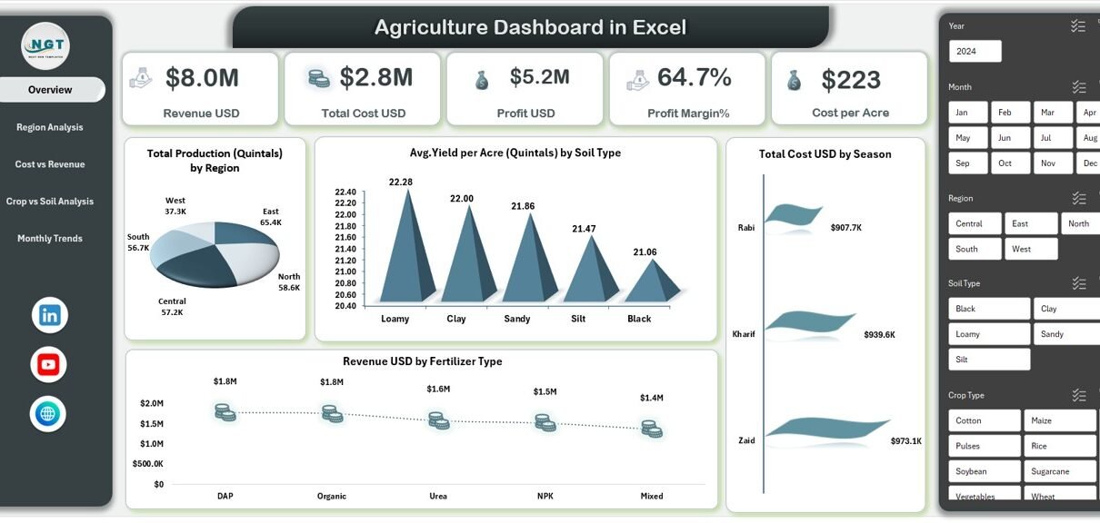
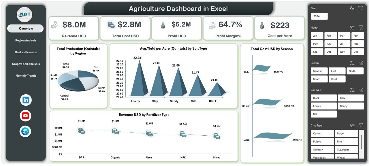
Overview Sheet Tab: What Key Metrics Does It Show?
The Overview sheet acts as the command center of the dashboard. It provides a quick summary of overall agricultural performance.
Key KPIs Displayed
- Revenue (USD)
- Total Cost (USD)
- Profit (USD)
- Profit Margin (%)
- Cost per Acre
These KPIs allow farm managers to instantly understand whether operations remain profitable.
Key Charts in the Overview Sheet
- Total Production (Quintals) by Region
- Average Yield per Acre (Quintals) by Soil Type
- Total Cost (USD) by Season
- Revenue (USD) by Fertilizer Type
Because all metrics appear on one screen, users can quickly identify high-performing and underperforming areas.
Click to buy Agriculture dashboard in Excel
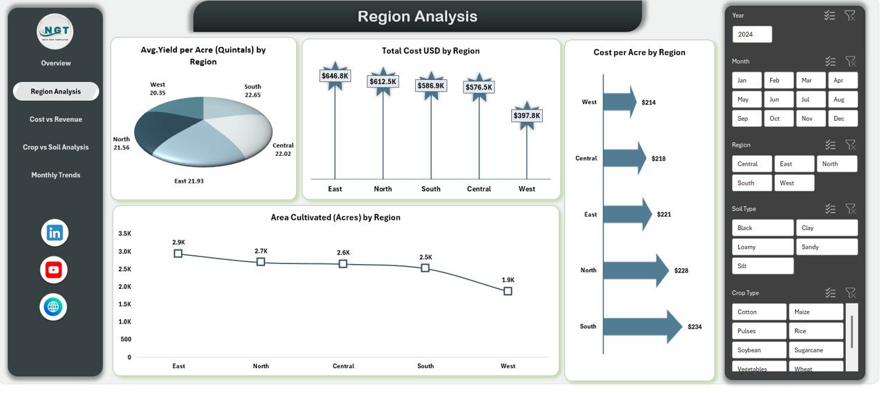
Region Analysis Sheet: How Do Different Regions Perform?
Agricultural performance varies significantly by location. Therefore, the Region Analysis sheet focuses on regional comparison.
Key Insights Provided
- Average Yield per Acre (Quintals) by Region
- Total Cost (USD) by Region
- Cultivated Area (Acres) by Region
- Cost per Acre by Region
With these insights, users can:
- Compare productivity across regions
- Identify high-cost, low-yield regions
- Optimize land allocation
- Plan region-specific strategies
As a result, resource utilization improves.
Click to buy Agriculture dashboard in Excel
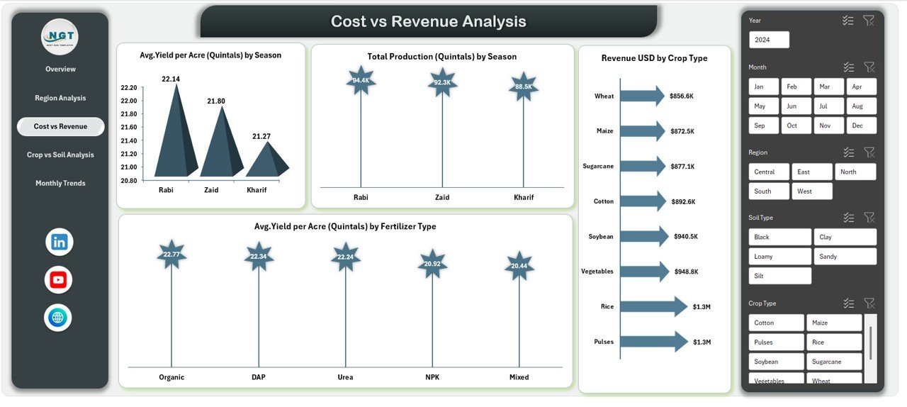
Cost vs Revenue Analysis: Are Costs Generating Enough Returns?
Profitability depends on balancing costs and revenue. Therefore, the Cost vs Revenue Analysis sheet plays a critical role.
Key Charts Included
- Average Yield per Acre (Quintals) by Season
- Total Production (Quintals) by Season
- Average Yield per Acre (Quintals) by Fertilizer Type
- Revenue (USD) by Crop Type
This sheet helps users understand:
- Which seasons deliver better returns
- Which fertilizers improve yield
- Which crops generate higher revenue
- Where cost optimization is required
Thus, farmers can adjust inputs intelligently.
Click to buy Agriculture dashboard in Excel
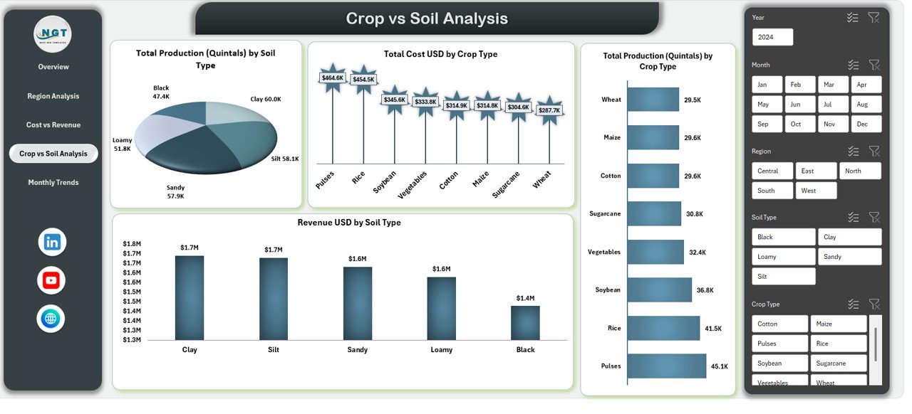
Crop vs Soil Analysis: Which Combinations Work Best?
Soil quality directly affects crop output. Therefore, the Crop vs Soil Analysis sheet highlights this relationship.
Key Visuals Available
- Total Production (Quintals) by Soil Type
- Total Cost (USD) by Crop Type
- Revenue (USD) by Soil Type
- Total Production (Quintals) by Crop Type
These insights help users:
- Select suitable crops for each soil type
- Reduce wastage caused by poor crop-soil matching
- Improve yield consistency
- Increase long-term sustainability
As a result, farming decisions become more scientific.
Click to buy Agriculture dashboard in Excel
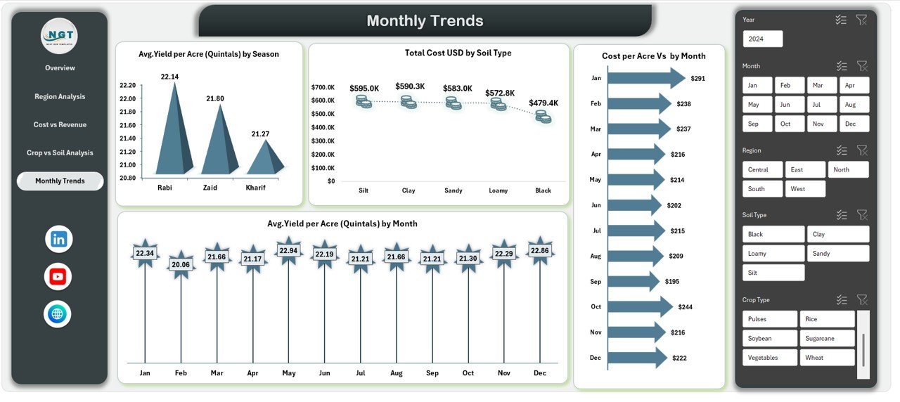
Monthly Trends Sheet: How Does Performance Change Over Time?
Agriculture follows seasonal and monthly cycles. Therefore, the Monthly Trends sheet focuses on time-based analysis.
Key Trend Metrics
- Average Yield per Acre (Quintals) by Season
- Average Yield per Acre (Quintals) by Month
- Cost per Acre vs Month
This sheet enables users to:
- Detect yield fluctuations
- Track rising input costs
- Plan planting and harvesting schedules
- Forecast future performance
Thus, planning becomes proactive rather than reactive.
Click to buy Agriculture dashboard in Excel
What KPIs Can You Track Using an Agriculture Dashboard in Excel?
An Agriculture Dashboard in Excel supports a wide range of KPIs, including:
- Revenue per Acre
- Cost per Acre
- Profit Margin (%)
- Yield per Acre
- Total Production (Quintals)
- Cultivated Area (Acres)
- Cost by Season
- Revenue by Crop Type
- Yield by Soil Type
- Fertilizer Efficiency
Because KPIs update automatically, users always work with current insights.
Advantages of Agriculture Dashboard in Excel
An Agriculture Dashboard in Excel offers several practical advantages.
- Easy to Use
Excel is familiar to most users. Therefore, no special training is required.
- Cost-Effective
Users avoid expensive farm management software and subscriptions.
- Centralized Reporting
All agricultural data remains in one structured file, which reduces confusion.
- Real-Time Insights
Once data updates, charts and KPIs refresh instantly.
- Better Decision-Making
Visual insights make trends and problems easy to spot.
- Scalable Design
The dashboard works for small farms and large agribusinesses alike.
Best Practices for the Agriculture Dashboard in Excel
To get maximum value, users should follow these best practices.
- Maintain Clean Data
Always ensure accurate and consistent data entry.
- Use Standard Units
Keep units like acres, quintals, and USD consistent across datasets.
- Update Data Regularly
Frequent updates improve accuracy and relevance.
- Leverage Slicers
Use slicers for quick filtering by region, season, crop, or soil type.
- Review Trends Monthly
Regular review helps catch issues early.
- Back Up the File
Always maintain backups to avoid data loss.
Who Can Use an Agriculture Dashboard in Excel?
This dashboard benefits a wide range of users:
- Individual farmers
- Farm managers
- Agricultural consultants
- Agribusiness owners
- Cooperative societies
- Policy planners
- Agriculture students
Because Excel works offline, users can operate it even in low-connectivity areas.
Conclusion: Why Should You Use an Agriculture Dashboard in Excel?
An Agriculture Dashboard in Excel transforms raw farm data into actionable insights. It helps track yield, costs, revenue, and profitability in a simple yet powerful way. Moreover, it supports smarter planning, better resource allocation, and higher profitability.
In today’s competitive agricultural environment, relying on intuition alone no longer works. Therefore, adopting an Agriculture Dashboard in Excel gives farmers and agribusinesses a strong analytical advantage.
Frequently Asked Questions (FAQs)
- What is an Agriculture Dashboard in Excel used for?
It tracks agricultural performance, including yield, cost, revenue, profit, and trends across regions, crops, seasons, and soil types.
- Can small farmers use this dashboard?
Yes, small farmers can use it easily because it runs in Excel and requires no advanced technical skills.
- Does the dashboard support pivot charts?
Yes, the dashboard uses pivot tables and pivot charts for dynamic analysis.
- Can I customize the dashboard?
Yes, users can add new fields, charts, or KPIs based on their needs.
- How often should I update the data?
You should update data monthly or seasonally for best results.
- Is Excel suitable for large agricultural datasets?
Yes, Excel handles large datasets efficiently when structured properly.
- Does the dashboard help with profitability analysis?
Yes, it tracks profit, profit margin, cost per acre, and revenue trends clearly.
Visit our YouTube channel to learn step-by-step video tutorials
Watch the step-by-step video tutorial:
Click to buy Agriculture dashboard in Excel