Today’s car rental industry runs on speed, convenience, and constant updates. Customers want fast service, clean vehicles, quick check-in and check-out, and transparent pricing. Because of this, car rental companies must track their operations in real time. They cannot wait for monthly reports or depend on manual spreadsheets. They need instant insights for better decisions.
A Car Rental Services KPI Dashboard in Power BI solves all these problems. It converts raw rental data into clean visuals, smart KPIs, and interactive charts. When managers use this dashboard, they understand rental trends, fleet usage, revenue performance, customer behavior, and operational efficiency much faster. This saves time and improves business results.
In this detailed guide, you will learn everything about this dashboard, how it works, what KPIs it tracks, why car rental companies need it, advantages, best practices, and FAQs.Car Rental Services KPI Dashboard in Power BI
Click to buy Car Rental Services KPI Dashboard in Power BI
What Is a Car Rental Services KPI Dashboard in Power BI?
A Car Rental Services KPI Dashboard in Power BI is a ready-to-use analytical tool. It pulls rental data from Excel and converts it into visual KPIs, trend charts, comparison cards, and performance tables. Anyone can use it without coding. You only need to refresh the file after updating your Excel sheets.
The dashboard tracks MTD (Month-to-Date) and YTD (Year-to-Date) results, targets, previous-year comparisons, and KPI status indicators. Because it uses slicers, you can filter by month and KPI group instantly. Managers get a complete overview of how the rental business performs.Car Rental Services KPI Dashboard in Power BI
This dashboard contains:
- A Summary Page
- A KPI Trend Page
- A KPI Definition Page
Each page shows clean insights for rental operations, revenue, fleet performance, and service quality.
Why Do Car Rental Companies Need a KPI Dashboard?
Car rental services operate in a dynamic environment. Every hour, new bookings come in, returns happen, vehicles move between branches, and maintenance tasks pop up. Without a dashboard, managers face challenges like:
- Delayed decision-making
- Inaccurate performance evaluation
- Limited visibility on fleet availability
- Difficulty tracking past performance
- Manual reporting workload
Therefore, a KPI dashboard helps rental businesses stay competitive. It allows you to see all important KPIs in one place and take quick action when targets slip.Car Rental Services KPI Dashboard in Power BI
How the Car Rental Services KPI Dashboard Works
This dashboard connects to an Excel file with three worksheets:
Input_Actual Sheet
Here you enter the Actual MTD and YTD numbers for each KPI.
Input_Target Sheet
Here you enter the Target MTD and YTD numbers for each KPI.
KPI Definition Sheet
Here you list all KPIs along with:
- KPI Number
- KPI Group
- KPI Name
- Unit
- Formula
- Definition
- Type (UTB – Upper the Better, LTB – Lower the Better)
Once the Excel file updates, the dashboard refreshes automatically.Car Rental Services KPI Dashboard in Power BI
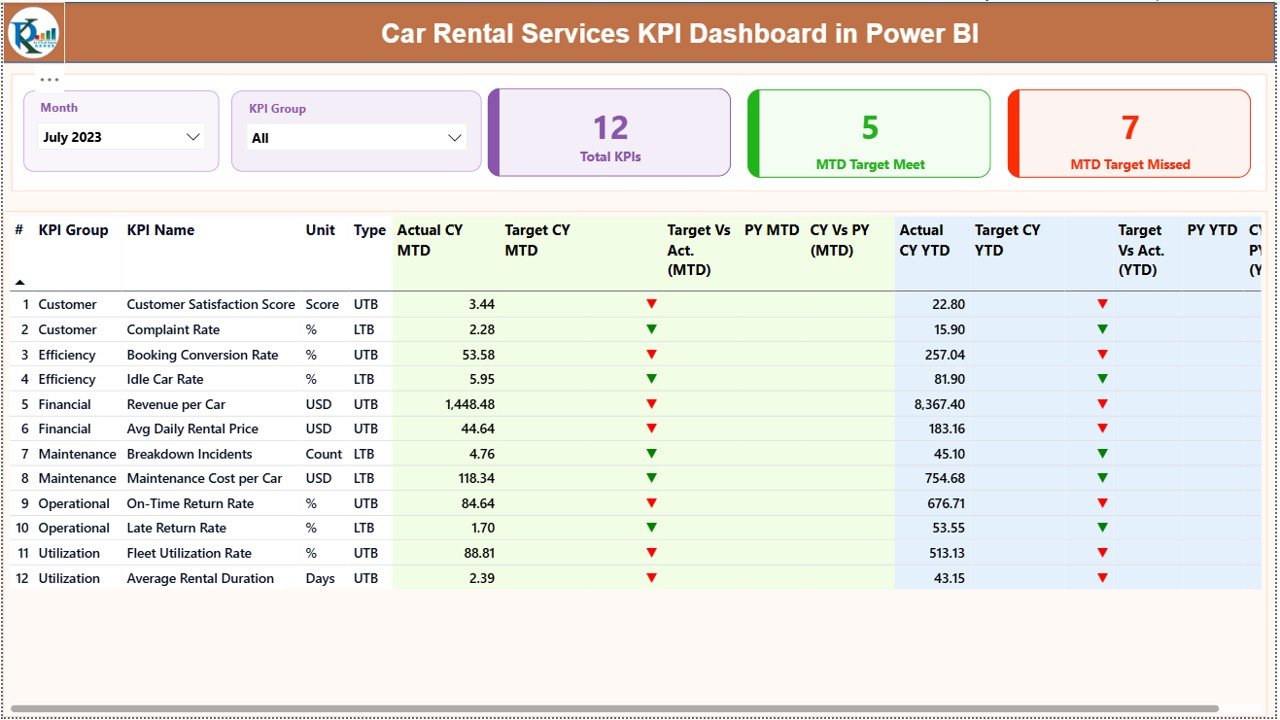
the Summary Page – The Heart of the Dashboard
The Summary Page gives you a full overview of your car rental KPIs. It includes:
Month Slicer
Select any month and the dashboard updates instantly.
KPI Group Slicer
Choose KPIs by category like:
- Fleet Performance
- Revenue
- Customer Satisfaction
- Operational Metrics
- Booking Performance
KPI Cards
You see:
- Total KPI Count
- MTD Target Met Count
- MTD Target Missed Count
These cards help you understand your business status at a glance.
Click to buy Car Rental Services KPI Dashboard in Power BI
Detailed Table on the Summary Page – What You Can See
The detailed table shows insights for each KPI. Each row explains:
KPI Number
The sequence number.
KPI Group
Category such as bookings, fleet, or revenue.
KPI Name
Example: Fleet Utilization %, Daily Rental Revenue, Customer Complaints.
Unit
Percentage, count, hours, revenue, etc.
Type
- UTB (Upper the Better)
- LTB (Lower the Better)
Actual CY MTD
The current month’s performance.
Target CY MTD
The planned target for the month.
MTD Icon
or ▼ in green or red to show performance.
Target vs Actual (MTD)
Shows if you met the monthly target.
PY MTD
Previous year’s same-month number.
CY vs PY (MTD)
Comparison between this year and last year MTD.
Actual CY YTD
Current year total up to now.
Target CY YTD
Total target up to now.
YTD Icon
or ▼ to show YTD performance.
Target vs Actual (YTD)
Shows whether YTD is on track.
PY YTD
Previous year’s YTD value.
CY vs PY (YTD)
Shows yearly progress compared to last year.
This table gives complete clarity on performance.
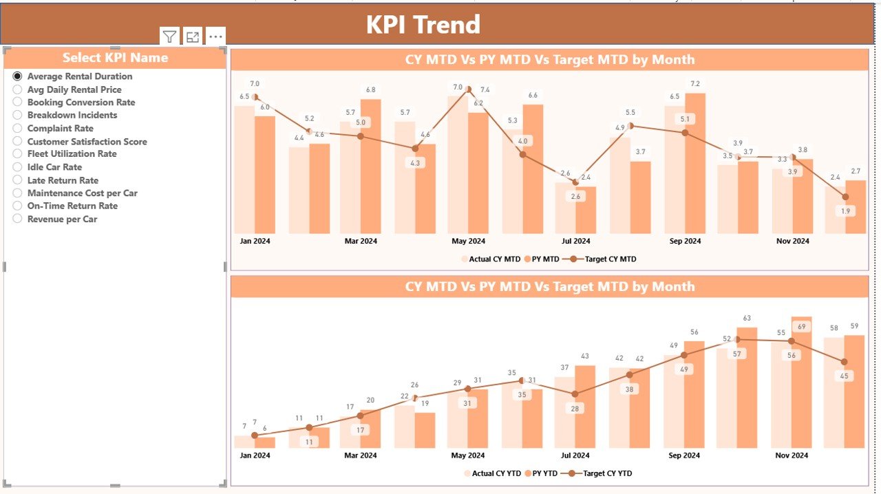
KPI Trend Page – Why It Helps You See Patterns Clearly
The KPI Trend Page helps you analyze month-wise performance patterns. When you select a KPI from the slicer, you see:
MTD Trend Chart
Displays:
- CY Actual
- PY Actual
- CY Target
YTD Trend Chart
Shows:
- Year-to-date performance
- Comparison with last year
- Target line
This helps you answer questions like:
- Are bookings increasing?
- Is fleet utilization improving?
- Are revenue targets achievable?
- Do certain months perform better?
Trend charts help managers make forward-looking decisions.
Click to buy Car Rental Services KPI Dashboard in Power BI
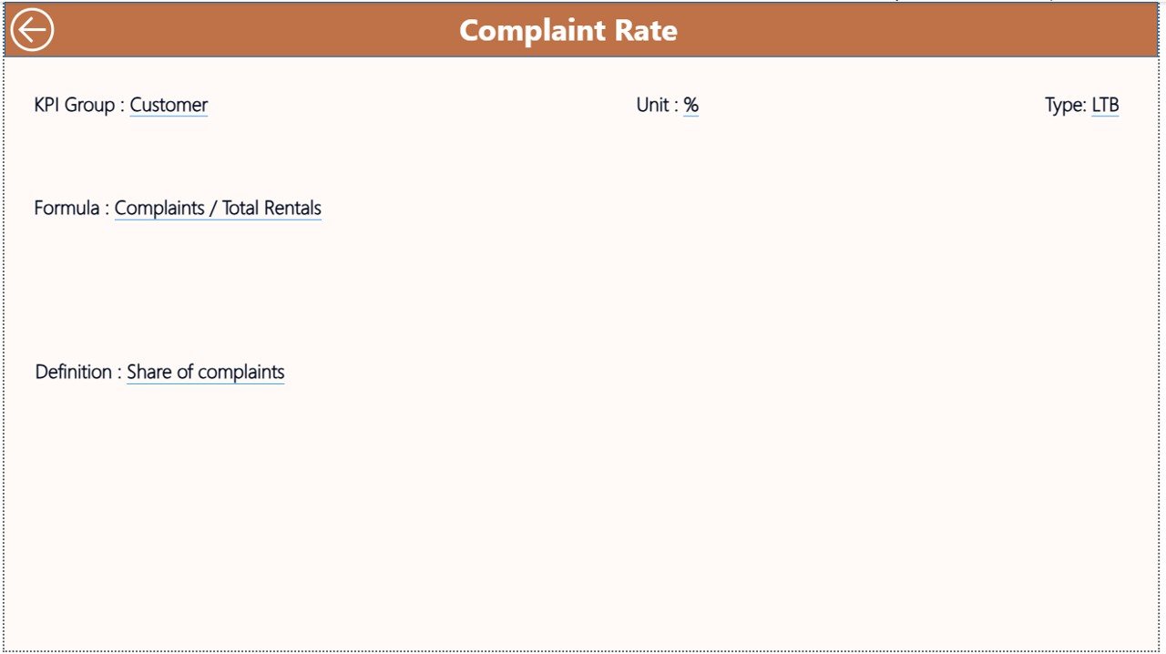
KPI Definition Page – Clear Explanation of Each KPI
This hidden drill-through page shows:
- KPI formula
- KPI meaning
- KPI type
- Calculation method
If someone wants to understand how a KPI works, they right-click on the KPI in the summary table and drill through. This page improves clarity and makes the dashboard more user-friendly.
Click to buy Car Rental Services KPI Dashboard in Power BI
What KPIs Can Car Rental Companies Track in This Dashboard?
Here are the most common KPIs for car rental businesses:
Fleet KPIs
- Fleet Utilization %
- Available Vehicles
- Vehicles Under Maintenance
- Vehicle Downtime Hours
Revenue KPIs
- Daily Revenue
- Cost per Vehicle
- Rental Yield
- YTD Revenue Achievement
Customer KPIs
- Customer Complaints
- Complaint Resolution Time
- Customer Satisfaction Score
Booking KPIs
- Total Bookings
- Cancelled Bookings
- Online vs Offline Bookings
Operational KPIs
- Turnaround Time
- Check-in and Check-out Time
- Fuel Cost Trends
Managers can adjust the KPI Definition sheet to include their custom KPIs.
Advantages of a Car Rental Services KPI Dashboard in Power BI
- A good dashboard brings several benefits. Let’s understand them.
- Faster Decision Making
- The dashboard updates instantly. You get quick insights that help you act faster.
- Clear Fleet Visibility
- You always know:
- How many vehicles are available
- Which vehicles are under maintenance
- Which branches perform better
- Better Customer Experience
- You track complaints, service time, and satisfaction scores. This helps improve customer experience.
- Improved Revenue Tracking
- When you monitor revenue daily and monthly, you find gaps quickly.
- Easy Month-to-Month Comparison
- MTD and YTD comparisons help you track year-over-year growth.
- Removes Manual Work
- No more scattered spreadsheets. The dashboard automates everything.
- Helps Forecast Business Performance
You can use trends to plan fleet purchases, marketing, and pricing.
Best Practices for Using a Car Rental Services KPI Dashboard
To get the best results, follow these practices:
Always Enter Accurate Data
Good input leads to good output.
Update Excel Sheets Monthly
Your dashboard stays current.
Use Clear KPI Definitions
This helps everyone understand KPI meaning.
Keep KPI Targets Realistic
- Targets should match the business environment.
Review Trend Charts Regularly
This helps you catch performance drops early.
Focus on Key KPIs
Do not overload the dashboard with too many KPIs.
Train Your Team
Everyone should know how to use the dashboard.
With these practices, your dashboard gives reliable insights.
How This Dashboard Helps Car Rental Managers
Managers get answers to important questions like:
- Which month performs the best?
- Are bookings increasing or decreasing?
- Are we meeting our revenue targets?
- How well does the fleet perform?
- Are customers happy?
- Which KPI group needs attention?
This dashboard becomes a complete performance monitoring system for the company.
Conclusion
The Car Rental Services KPI Dashboard in Power BI offers a simple, powerful, and interactive way to track rental operations. It helps managers analyze fleet usage, revenue performance, customer feedback, bookings, and operational metrics. Because it uses Excel as a data source, anyone can update numbers without technical skills. With trend charts, comparison tables, and KPI definitions, this dashboard supports better decisions, faster reporting, and smooth business growth.
Car rental companies that adopt data-driven dashboards stay ahead of competition and run their operations with more confidence and clarity.
Frequently Asked Questions (FAQs)
- What is the main use of a Car Rental Services KPI Dashboard?
It helps track rental business performance using KPIs, trends, and insights in one interactive view.
- Do I need coding skills to use this dashboard?
No. You only update the Excel sheets and refresh the dashboard.
- What KPIs should a car rental company track?
Fleet utilization, bookings, customer complaints, revenue, maintenance metrics, and turnaround time.
- Can I add more KPIs to the dashboard?
Yes. You can add new KPIs in the KPI Definition sheet.
- Does the dashboard show month-to-month comparison?
Yes. It shows both MTD and YTD comparisons for CY and PY.
- Can the dashboard be used by multiple branches?
Yes. You can include branch or location fields in your KPIs.
- Is this dashboard beginner-friendly?
Yes. The interface is simple, and the slicers make navigation easy.
Visit our YouTube channel to learn step-by-step video tutorials
Watch the step-by-step video tutorial:
Click to buy Car Rental Services KPI Dashboard in Power BI