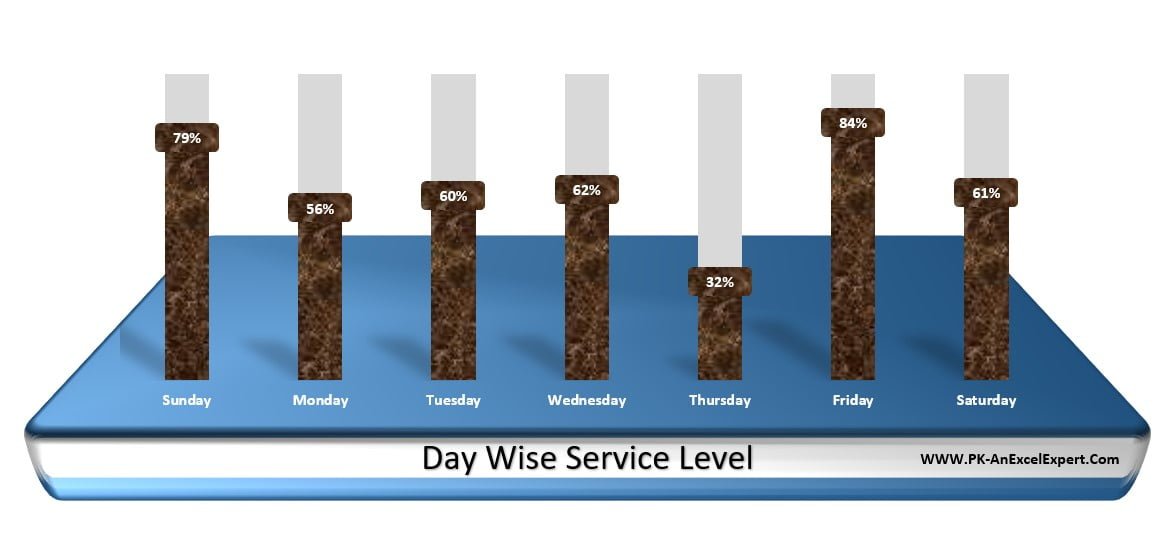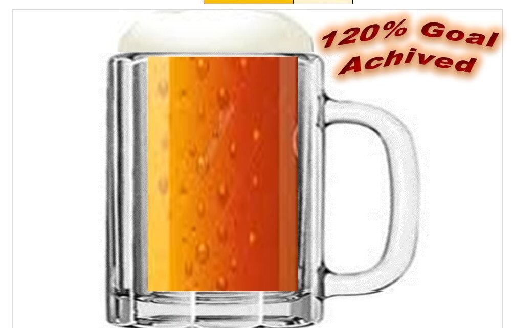
Beer Mug Graph in excel
Beer mug chart is a beautiful infographic representation for KPI metrics in percentage like - Target Achieved%, Service Level%, Quality Score etc. Beer Mug Graph in excel [caption id="attachment_56543"
Transforming Data into Decisions
In this category, you will find comprehensive tutorials on creating stunning charts and visualizations in Excel. Impress your colleagues and boss with attractive and informative visuals by following our step-by-step guides. Each tutorial comes with a free practice file for download and tutorial videos to help you understand the process. Explore this category now and enhance your data analysis and presentation skills with Excel.