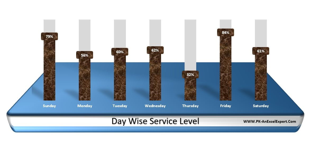
In this article, we have created a Stylish Column Chart in Microsoft Excel. You can use this info-graphic chart in your Excel Report or Business Dashboard. We have displayed Day wise Service level in this chart. We have filled Texture Fill in the columns.
Stylish Column Chart in Excel
We have created a platform using Excel Shapes. We have used 3D Rotation and 3D Format feature to make it realistic.
Click to buy Stylish Column Chart in Excel
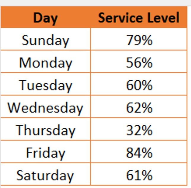
Below is the data points, which we have used to create this chart-
Click to buy Stylish Column Chart in Excel
Visit our YouTube channel to learn step-by-step video tutorials
Watch the step by step video tutorial:
Click to buy Stylish Column Chart in Excel