Running a clinic requires accurate insights, clear data, and fast decision-making. However, many clinics still work with scattered reports, manual spreadsheets, and outdated files. Because of this, leaders struggle to track performance, understand patient trends, monitor staff efficiency, or improve service quality.
A Clinics KPI Dashboard in Excel solves these challenges. It brings all important Key Performance Indicators (KPIs) into one dynamic dashboard. You can monitor patient flow, financial performance, operational efficiency, and clinical quality—without switching between multiple files. With the right structure, this dashboard helps every clinic improve transparency, speed, and accountability.
In this detailed article, you will learn what a Clinics KPI Dashboard in Excel is, how it works, what each sheet includes, why clinics need it, and how to implement it smoothly.
Click to buy Clinics KPI Dashboard in Excel
What Is a Clinics KPI Dashboard in Excel?
A Clinics KPI Dashboard in Excel is a ready-to-use analytical template designed for medical clinics, diagnostic centers, outpatient facilities, and healthcare practices. It organizes key metrics into visual insights so that clinic managers, doctors, and administrators can take better actions.
You track:
- Patient visits
- Appointment trends
- Revenue and billing
- Staff productivity
- Treatment performance
- Resource utilization
- Clinical service quality
- Month-to-Date (MTD) and Year-to-Date (YTD) growth
- Previous Year comparisons
The dashboard updates instantly when you update the data. Because of the interactive drop-downs, slicers, cards, charts, conditional formatting, and well-structured sheets, you can make decisions quickly and confidently.
Why Do Clinics Need a KPI Dashboard in Excel?
Clinics deal with complex operations every day. Doctors manage patient loads, receptionists handle appointments, and administrators look after billing, staffing, and compliance. Without a unified dashboard, these tasks become stressful.
A Clinics KPI Dashboard helps because it:
- Improves visibility
- Reduces manual reporting
- Speeds up decisions
- Identifies performance gaps
- Helps staff understand goals
- Tracks progress month by month
- Keeps clinical operations aligned
When you place all metrics in one Excel dashboard, you create a powerful decision-making tool that guides the clinic toward continuous improvement.
How Does the Clinics KPI Dashboard in Excel Work?
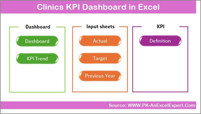
This Clinics KPI Dashboard contains 7 powerful worksheets, each with a specific purpose. These sheets organize your KPIs, actual numbers, targets, and trends in a clean structure that supports decision-making.
Below are the detailed explanations of all sheets.
Summary Page – The Main Navigation Hub
The Summary Page works as the index page for the entire dashboard. It includes 6 navigation buttons that help you move to key analytical pages. These buttons make the file more user-friendly because you can jump to any section in seconds.
This page ensures:
- Easy movement between sheets
- Fast access to KPIs and inputs
- A structured layout for users
Because clinics have many KPIs, this quick navigation feature saves time for doctors and administrators.
Click to buy Clinics KPI Dashboard in Excel
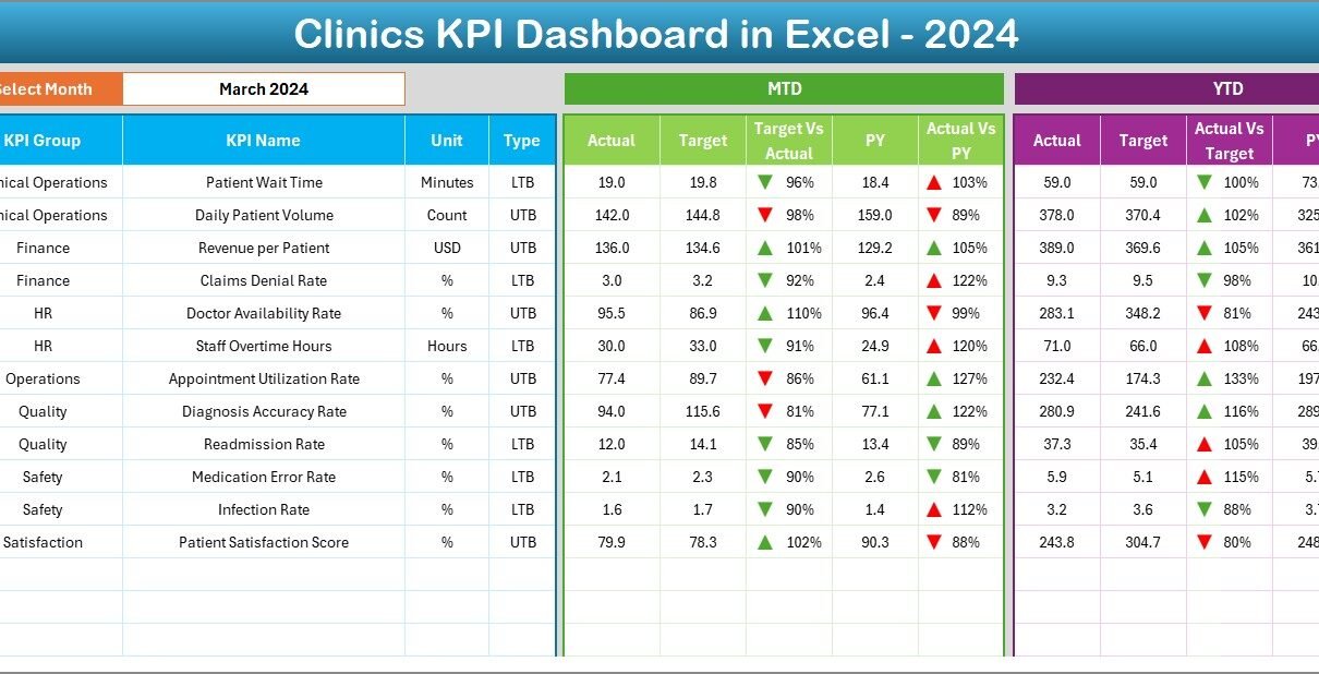
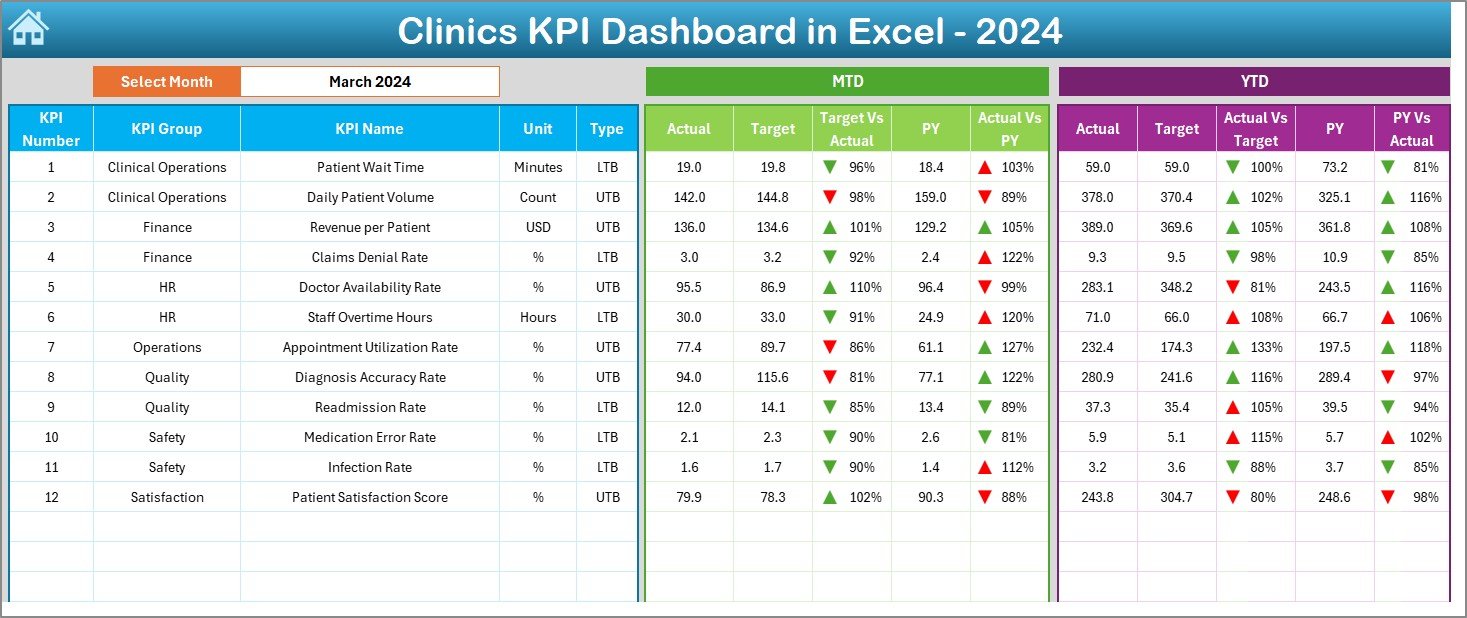
Dashboard Sheet – The Heart of KPI Analysis
The Dashboard sheet is the main visualization tab. It shows all KPIs for the selected month with attractive charts, KPI cards, and conditional formatting indicators.
What makes this sheet powerful?
Month Selector (Cell D3)
You select any month from the drop-down list, and the entire dashboard updates instantly. Numbers change for MTD and YTD values.
MTD Section (Month-To-Date)
This section shows:
- Actual
- Target
- Previous Year (PY)
- Target vs Actual
- PY vs Actual
- Up/Down arrows to show performance
YTD Section (Year-To-Date)
This section shows:
- YTD Actual
- YTD Target
- YTD PY
- Target vs Actual trend
- PY vs Actual comparison
Because all visuals respond to one click, analyzing clinical performance becomes simple and effective. You can understand patient trends, revenue performance, and staff efficiency instantly.
Click to buy Clinics KPI Dashboard in Excel
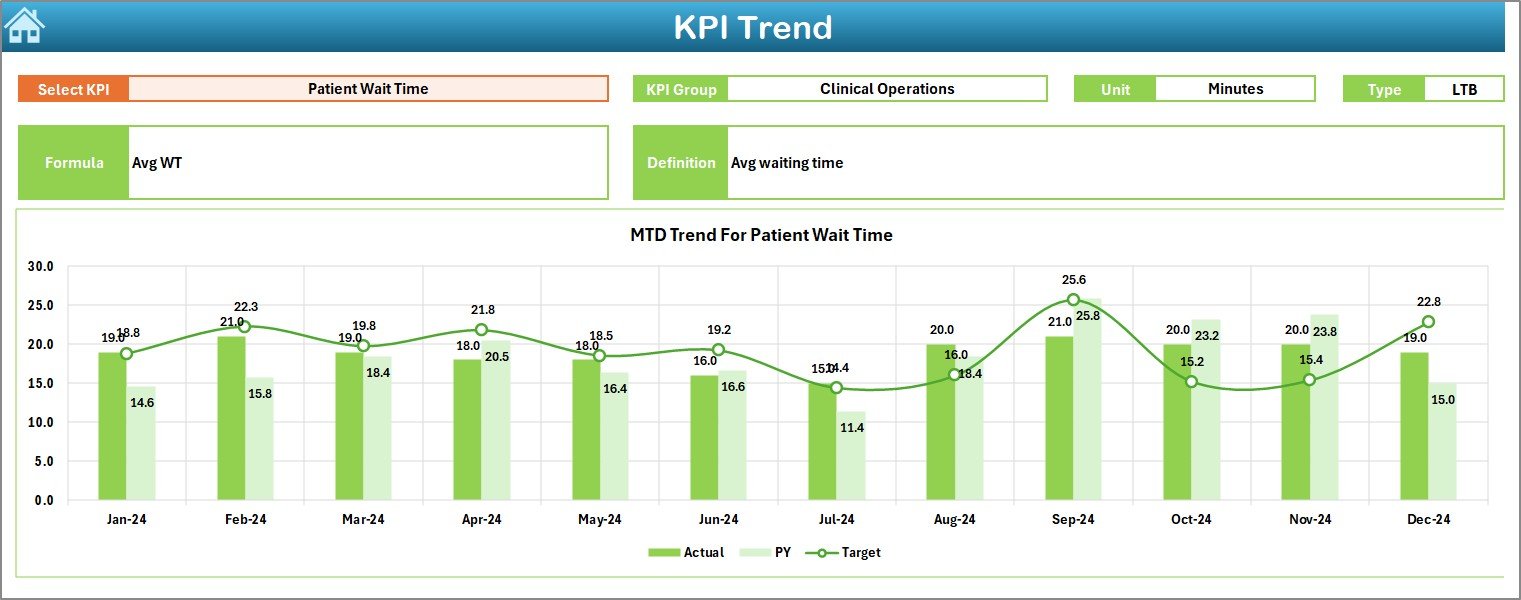
Trend Sheet – Deep-Dive KPI Analysis
The Trend sheet helps you analyze how a KPI behaves over time. You select a KPI from the drop-down in cell C3, and the sheet updates automatically.
What does this sheet display?
- KPI Group
- Unit of measurement
- KPI Type
- Lower the Better or Upper the Better
- KPI Formula
- KPI Definition
Trend Charts Included
- MTD Trend Chart – Actual, Target, and PY
- YTD Trend Chart – Actual, Target, and PY
These trend charts help you answer questions like:
- Are patient visits increasing?
- Are staff response times improving?
- Is billing accuracy improving?
- Are treatment success rates going up?
When you view multiple months together, you understand performance patterns more clearly.
Click to buy Clinics KPI Dashboard in Excel
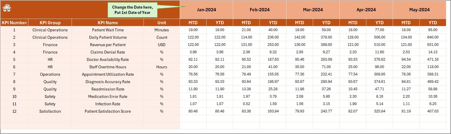
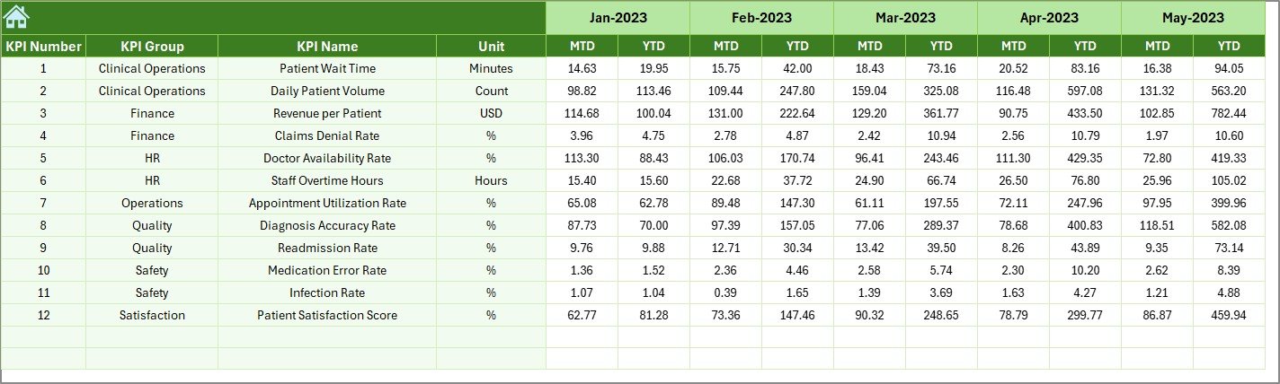
Actual Numbers Input Sheet – Enter Monthly Data with Ease
Clinics update their KPIs every month. The Actual Numbers Input Sheet makes this process fast and simple.
Key Elements in this Sheet
- You enter the MTD and YTD Actual numbers.
- You choose the first month of the year from cell E1.
- The dashboard reads this data and updates all visuals.
Because the structure is clean and standardized, you can enter real numbers quickly without confusion.
Target Sheet – Set MTD and YTD Goals
Clinics need targets for each KPI. This sheet allows you to enter both MTD and YTD targets for every KPI.
What You Enter Here
- Monthly targets
- YTD targets
- KPI-wise goals
Once targets are entered, the dashboard compares actual performance against targets and highlights gaps.
Click to buy Clinics KPI Dashboard in Excel
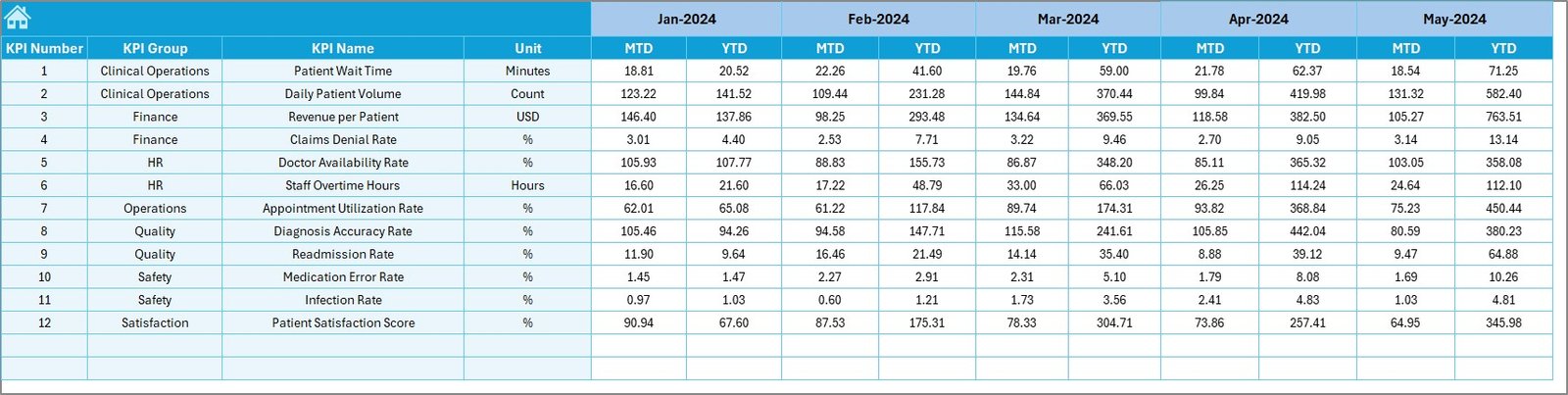
Previous Year Data Sheet – Compare with Last Year
Healthcare performance becomes meaningful only when you compare it with the previous year. This sheet stores:
- Last year’s MTD Actual
- Last year’s YTD Actual
The dashboard uses this data to generate:
- PY vs Actual comparison
- Up/down arrows to show improvement
This helps clinics understand whether performance is improving or declining.
Click to buy Clinics KPI Dashboard in Excel
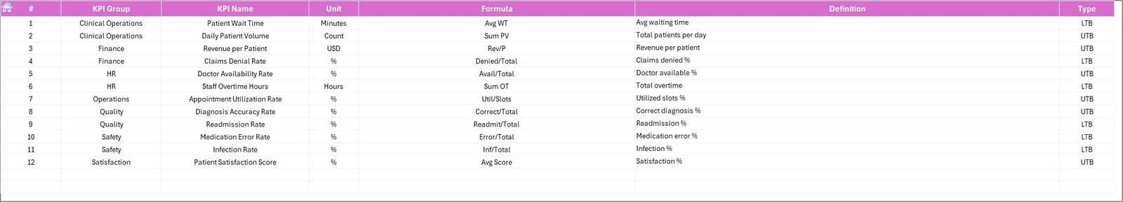
KPI Definition Sheet – One Place for All KPI Information
This sheet stores:
- KPI Name
- KPI Group
- Unit of Measurement
- Formula
- KPI Definition
This makes the dashboard easy for new staff members to understand. Clear definitions reduce confusion and create standardization across teams.
What KPIs Should Clinics Track in This Dashboard?
Clinics track many performance indicators. Below are some common and important KPIs:
Patient KPIs
- Total Patient Visits
- New Patients
- Follow-up Patients
- Appointment No-show Rate
- Average Waiting Time
Financial KPIs
- Total Revenue
- Billing Accuracy
- Claims Rejection Rate
- Cost per Patient
Operational KPIs
- Staff Productivity
- Room Utilization Rate
- Equipment Usage Rate
Quality KPIs
- Patient Satisfaction Score
- Complaint Count
- Treatment Success Rate
These KPIs build the complete picture of clinic performance.
Advantages of Clinics KPI Dashboard in Excel
- Better Visibility
You view all important KPIs in a single place.
- Faster Decisions
The dashboard updates instantly when you change a month or KPI.
- Accurate Performance Tracking
Conditional formatting helps you identify good or poor performance quickly.
- Improved Staff Productivity
Team members understand what they need to improve.
- Reduced Manual Reporting
Excel formulas automate calculations and comparisons.
- Clear Trend Analysis
MTD and YTD charts help you see long-term improvements.
- Better Clinical Quality
You track patient experience, waiting times, service quality, and outcomes properly.
Best Practices for Using the Clinics KPI Dashboard in Excel
- Update the Actual Data Every Month
This helps you maintain accuracy.
- Set Realistic KPI Targets
Targets must match the clinic’s capacity and resources.
- Review YTD Performance Regularly
This ensures the clinic stays aligned with annual goals.
- Use Trend Analysis Before Making Decisions
Trends show real patterns, not single-month variations.
- Standardize KPI Definitions
All staff must use the same meaning for every KPI.
- Compare with Previous Year Numbers
This reveals whether the clinic is improving.
- Train Staff to Use the Dashboard
When everyone understands the dashboard, performance improves faster.
Conclusion
A Clinics KPI Dashboard in Excel is a powerful tool that helps clinics monitor performance, improve service quality, and make data-driven decisions. With dynamic drop-downs, trend charts, MTD/YTD comparisons, and previous-year analysis, clinics get complete visibility of their operations. Because the dashboard is easy to use, anyone—from clinic managers to doctors—can understand performance immediately.
This dashboard not only saves time but also helps clinics achieve long-term success.
Frequently Asked Questions (FAQs)
- What is a Clinics KPI Dashboard in Excel?
It is a ready-made Excel template that tracks clinic performance using visual KPIs, charts, and monthly comparisons.
- Why do clinics need a KPI dashboard?
Clinics need it to monitor patient flow, revenue, staff productivity, treatment quality, and operational efficiency.
- Can beginners use this dashboard easily?
Yes. The dashboard includes drop-downs, buttons, and clear navigation, so even beginners can use it.
- What KPIs are important for clinic performance?
Patient visits, revenue, waiting time, staff productivity, room utilization, and treatment success rate are important KPIs.
- Can I change the KPIs in the dashboard?
Yes. You can update the KPI definitions and add or remove KPIs as needed.
- How often should clinics update the dashboard?
Clinics should update it every month for accurate insights.
- What makes this dashboard better than manual reports?
It saves time, reduces errors, shows trends clearly, and supports faster decision-making.
Visit our YouTube channel to learn step-by-step video tutorials
Watch the step-by-step video tutorial:
Click to buy Clinics KPI Dashboard in Excel