Coaching and tutoring centers grow only when they measure the right performance indicators and take action at the right time. Every institute, whether online or offline, wants to improve learner outcomes, increase enrollment, raise satisfaction levels, and boost teaching efficiency. Yet many teams struggle with scattered data, slow reports, and confusing spreadsheets. Because of this, a Coaching & Tutoring KPI Dashboard in Power BI becomes an essential part of modern education management.
This dashboard offers a single, interactive, and easy-to-use platform that helps coaching owners, managers, teachers, coordinators, and academic heads track all key performance indicators (KPIs) with complete clarity. Since the dashboard updates instantly whenever new data arrives, teams make better decisions and work with more confidence.
In this article, you will explore what this dashboard is, how it works, what pages it contains, and how its structured design helps coaching institutions improve their performance. You will also learn the advantages, best practices, and frequently asked questions to understand the complete value of this system.
Click to buy Coaching & Tutoring KPI Dashboard in Power BI
What Is a Coaching & Tutoring KPI Dashboard in Power BI?
A Coaching & Tutoring KPI Dashboard in Power BI is a ready-to-use reporting system that tracks academic, operational, financial, and student-success metrics. Since all data comes from a simple Excel file, coaching centers of any size use it without technical skills.
The dashboard displays month-to-date (MTD), year-to-date (YTD), target, and previous-year comparisons for every KPI. It also shows icons, trend charts, slicers, and drill-through views to help users understand performance at a glance. Because the dashboard uses Power BI’s capabilities, it delivers fast visuals, quick filters, and instant data transformations.
This makes the tool perfect for academic leaders who want clarity without complexity.
Why Coaching Centers Need KPI Dashboards
Every coaching and tutoring business deals with many questions, such as:
- Are students improving month after month?
- How do attendance rates change with time?
- Which subject or instructor needs support?
- Are enrollment and inquiry numbers meeting targets?
- How does this year’s performance compare with last year?
Most coaching centers track these numbers manually. However, this leads to delays, errors, and confusion. A KPI dashboard solves these issues because it gathers all data in one place and displays insights in a clear visual format.
As a result, every team member understands what works well and what needs improvement.
Key Features of the Coaching & Tutoring KPI Dashboard
The Coaching & Tutoring KPI Dashboard in Power BI includes three powerful pages, each designed to simplify decision-making. Since every page has slicers, charts, and highlight indicators, users control the entire data flow with ease.
Let’s explore each page in detail.
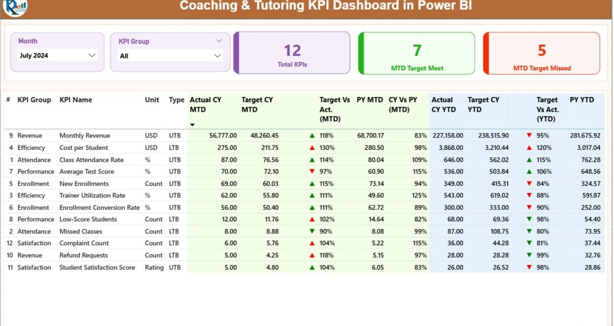
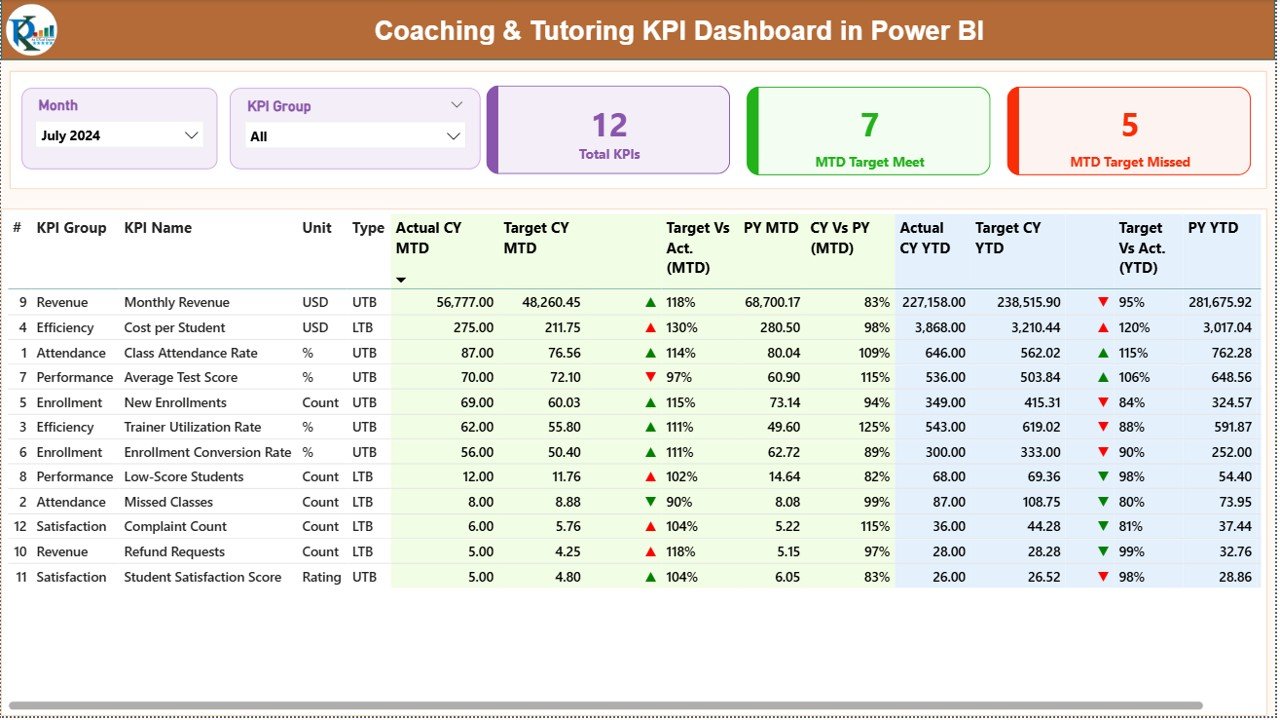
Summary Page – The Main Performance Overview
The Summary Page works as the heart of the dashboard. Since it provides all KPI details in a clean table view, users get a complete picture of performance within seconds.
Top Area: Filters & Cards
The page includes:
- Month Slicer – Select any month to view updated numbers
- KPI Group Slicer – Filter data by category
- Total KPIs Count Card
- MTD Target Met Count Card
- MTD Target Missed Count Card
These cards show how many KPIs meet expectations and how many need attention.
Detailed KPI Table
Below the cards, you will find a comprehensive table with all KPI details:
- KPI Number – Sequence number
- KPI Group – Category or classification of KPI
- KPI Name – Name of the metric
- Unit – Measurement unit
- Type (UTB or LTB) – Upper the Better / Lower the Better
- Actual CY MTD – Actual value for the current month
- Target CY MTD – Expected target for the month
- MTD Icon – ▲ or ▼ to show KPI performance
- Target vs Actual (MTD) – Comparison percentage
- PY MTD – Previous year’s MTD value
- CY vs PY (MTD) – Current vs previous year, in percentage
- Actual CY YTD – Year-to-date actual number
- Target CY YTD – Year-to-date target
- YTD Icon – ▲ or ▼ icon
- Target vs Actual (YTD) – YTD performance percentage
- PY YTD – Previous year’s YTD value
- CY vs PY (YTD) – Comparison of YTD against last year
Because the summary page shows both MTD and YTD numbers side-by-side, teams spot issues before they grow.
Click to buy Coaching & Tutoring KPI Dashboard in Power BI
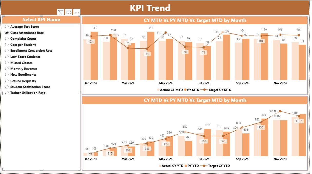
KPI Trend Page – A Clear View of Performance Over Time
The KPI Trend Page helps users understand how each KPI moves across months. Since coaching performance fluctuates due to exams, seasons, or admissions, this visual page becomes very important.
What This Page Shows
- A slicer on the left to select any KPI
- Two combo charts:
- MTD Actual, Target, and Previous Year
- YTD Actual, Target, and Previous Year
- These charts make trends more visible. Because of this, academic heads and managers take better long-term decisions.
Click to buy Coaching & Tutoring KPI Dashboard in Power BI
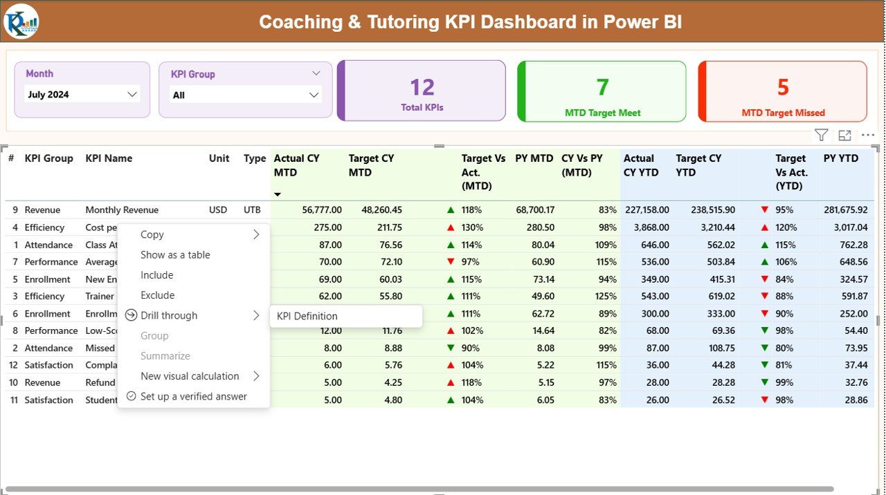
KPI Definition Page – Clear Understanding of Each KPI
The KPI Definition Page is a hidden drill-through page. You reach it by right-clicking on any KPI in the summary page.
This page displays:
- KPI Number
- KPI Group
- KPI Name
- Unit
- Formula
- Definition
- Type (UTB or LTB)
Since every KPI has a unique purpose, the definition page helps users understand metrics without confusion.
A Back button on the top-left corner returns users to the main dashboard quickly.
Click to buy Coaching & Tutoring KPI Dashboard in Power BI
Excel Data Structure for the Dashboard
The dashboard connects to an Excel file that includes three worksheets. Since the structure is simple and clean, anyone updates the data without effort.
- Input_Actual Sheet
You fill:
- KPI Name
- Month (first date of the month)
- Actual MTD
- Actual YTD
This sheet holds all actual numbers for the current year.
- Input_Target Sheet
You fill:
- KPI Name
- Month
- Target MTD
- Target YTD
This sheet holds all target values for each KPI.
- KPI Definition Sheet
You fill:
- KPI Number
- KPI Group
- KPI Name
- Unit
- Formula
- Definition
- Type (UTB or LTB)
These definitions flow into the dashboard automatically.
Which KPIs Work Best for Coaching & Tutoring Institutes?
Although KPIs depend on the nature of the coaching center, the following categories are widely used:
Student Performance KPIs
- Average Score Improvement
- Assignment Completion Rate
- Mock Test Accuracy
- Weak Topic Identification Score
Attendance & Engagement KPIs
- Student Attendance %
- Class Participation Score
- Learning Hour Utilization
Operations KPIs
- Instructor Performance Rating
- Batch Completion Rate
- Complaint Closure Time
Admissions & Growth KPIs
- Inquiry Conversion Rate
- Enrollment Growth Rate
- Retention Rate
Financial KPIs
- Revenue per Student
- Fee Collection Rate
- Refund Ratio
When dashboards track these KPIs, coaching leaders gain a deeper understanding of their business.
Advantages of Coaching & Tutoring KPI Dashboard in Power BI
The Coaching & Tutoring KPI Dashboard provides many operational and academic benefits. These advantages make the system valuable for any coaching institute that wants growth with clarity.
- It Improves Academic Quality
Teachers track student progress and identify learning gaps early. Since they understand which subjects or skills need attention, they offer personalized support to each learner.
- It Helps Coaching Centers Increase Enrollment
Management measures inquiry trends, conversions, and retention rates. Because of this, they plan better admissions strategies and improve marketing efforts.
- It Brings Complete Transparency
With clear data, every department knows its responsibilities. Managers align goals and track progress without confusion.
- It Boosts Productivity
Because the dashboard updates automatically, teams save hours of manual reporting. They focus more on teaching, planning, and student support.
- It Encourages Data-Driven Decisions
The dashboard displays accurate numbers for every KPI. This helps leaders make decisions that lead to continuous improvement.
- It Supports Compliance and Documentation
Coaching centers often need reports for audits, government submissions, or quality checks. With this dashboard, they create those reports within minutes.
Opportunities for Improvement in Coaching & Tutoring Dashboard Usage
Although the dashboard is a strong tool, coaching centers improve its effectiveness further by focusing on a few key areas:
- Use consistent data entry practices to avoid errors
- Review KPI definitions regularly to align with new goals
- Train staff so they understand each chart and metric
- Add more KPIs as the coaching center grows
- Track student satisfaction as part of performance analytics
When teams follow these improvements, the dashboard works at its full potential.
Best Practices for Using the Coaching & Tutoring KPI Dashboard in Power BI
To get the best results from the dashboard, coaching institutions follow these practical steps:
- Define KPIs Clearly
You set clear academic, operational, and financial KPIs. This helps teams work with direction and purpose.
- Update Data Consistently
Enter actual and target numbers every month. Because of this, the dashboard remains accurate at all times.
- Use Slicers to Explore Insights
Switch between months, KPI groups, and categories. This helps you understand performance from different angles.
- Compare With Previous Year Numbers
Review trends against last year to identify growth patterns and challenges.
- Conduct Monthly Review Meetings
Use the dashboard in meetings to make decisions together. Since the visuals are clear, everyone understands the results quickly.
- Train Staff Members
Teach instructors and coordinators how to read KPIs. When everyone knows the meaning of each metric, the organization grows faster.
Conclusion
A Coaching & Tutoring KPI Dashboard in Power BI works as a powerful reporting tool for modern education organizations. Since the dashboard brings together all KPIs, charts, slicers, and definitions in one place, teams work with more clarity and confidence. The system helps coaching centers track MTD and YTD performance, compare numbers with last year, and measure student progress with ease. When teams follow the best practices, they create a strong environment for growth, quality improvement, and student success.
This dashboard not only simplifies reporting, but also builds a data-driven culture inside the organization. As a result, decision-making becomes faster, performance improves, and students achieve better outcomes.
Frequently Asked Questions (FAQs)
- What is a Coaching & Tutoring KPI Dashboard?
A Coaching & Tutoring KPI Dashboard in Power BI is a visual reporting tool that tracks academic, operational, and financial performance indicators. It helps coaching centers monitor targets and progress in real time.
- Do I need technical skills to use this dashboard?
No. You only update data in the Excel sheets. Power BI handles all calculations and visuals.
- Which KPIs should coaching centers track?
They track KPIs such as attendance, student improvement, inquiry conversion, batch performance, faculty efficiency, and fee collection.
- Can I customize the KPIs?
Yes. You add or modify KPIs in the KPI Definition sheet. The dashboard updates automatically.
- How often should I update the Excel file?
You update it every month or as soon as new performance data becomes available.
- Can this dashboard help small coaching centers?
Yes. Since it is simple, efficient, and low-cost, even small institutes benefit greatly.
- Does the dashboard show previous year data?
Yes. It compares MTD and YTD numbers with previous year values through charts and percentages.
Visit our YouTube channel to learn step-by-step video tutorials
Watch the step-by-step video tutorial:
Click to buy Coaching & Tutoring KPI Dashboard in Power BI