Tracking performance in colleges and universities becomes easier when you use a structured and well-designed KPI dashboard. Every educational institution wants better student outcomes, efficient operations, and improved academic quality. However, without a proper system, teams struggle to monitor progress. This is where a Colleges & Universities KPI Dashboard in Excel helps you. It organizes all your KPIs in one place and gives you clear insights through charts, tables, and comparisons.
In this detailed article, you will learn everything about this powerful Excel dashboard. You will understand its structure, features, advantages, and best practices. You will also learn how institutions use it to make better decisions every month. At the end, you will find helpful FAQs that answer the most common questions.
Click to buy Colleges & Universities KPI Dashboard in Excel
What Is a Colleges & Universities KPI Dashboard in Excel?
A Colleges & Universities KPI Dashboard in Excel is a performance-tracking system that brings all academic, operational, and administrative KPIs into a single template. It shows you MTD (Month-to-Date) and YTD (Year-to-Date) results for each KPI along with target comparison and previous year performance analysis.
Since the dashboard runs inside Excel, anyone can update it without needing advanced skills. It works for small colleges, large universities, private institutions, coaching institutes, and training centers.
Why Do Colleges and Universities Need a KPI Dashboard?
Educational environments produce a lot of data, including admissions, enrollment rates, dropout ratios, staff performance, research output, hostel occupancy, and fee collection. When this data stays scattered, decision-making becomes difficult.
A KPI dashboard solves this by:
- Combining multiple data points
- Showing trends and comparisons
- Helping management track performance regularly
- Offering alerts when KPIs move away from the target
Therefore, you get quick insights without checking multiple files or reports.
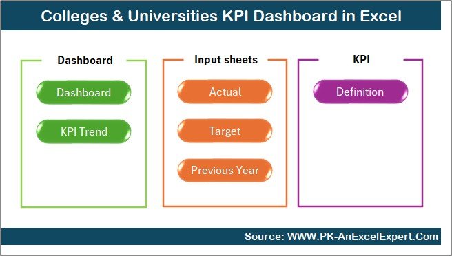
Overview of the Dashboard Structure
This dashboard comes with seven well-organized worksheets, each serving a unique purpose. Together, they create a complete performance monitoring system.
Let’s explore each one.
Summary Page – Your Quick Navigation Center
The Summary Page works like the index of your Excel dashboard. It includes six navigation buttons, and each button takes you directly to the required sheet. This saves time and keeps the dashboard clean.
Because this page focuses only on navigation, you always start with a simple and user-friendly interface. Institutions find this helpful because different teams often use the dashboard, and each user wants to quickly reach the right section.
Click to buy Colleges & Universities KPI Dashboard in Excel
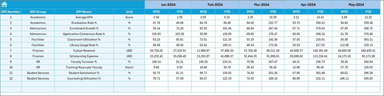
Dashboard Sheet – Main KPI Monitoring Page
The Dashboard Sheet is the core of the template. It displays all important KPIs for the selected month. You simply choose the month from a drop-down menu located at cell D3.
Once you choose a month, every KPI updates automatically. You see:
- MTD Actual vs Target
- MTD Actual vs Previous Year
- YTD Actual vs Target
- YTD Actual vs Previous Year
The dashboard uses up and down arrows to show performance instantly. Up arrows indicate improvement, and down arrows show decline. Because these visuals update dynamically, users understand KPI movement without reading long reports.
This sheet gives you:
- Quick performance checks
- Monthly comparisons
- Yearly trends
- Target achievements
- Warning signals when KPIs start dropping
For colleges and universities that review data every month, this saves hours of work.

Click to buy Colleges & Universities KPI Dashboard in Excel
Trend Sheet – Deep Performance Insights
The Trend Sheet helps you study performance trends over months. You can select any KPI from a drop-down (cell C3), and the sheet shows:
- KPI Group
- KPI Unit
- KPI Type (LTB or UTB)
- KPI Formula
- KPI Definition
Along with these details, you also get MTD and YTD trend charts showing Actual, Target, and Previous Year movement.
Trend charts help institutions identify:
- Seasonal performance patterns
- Improvement or decline over time
- Variations between student intake periods
- Monthly gaps between actual and target numbers
This sheet becomes especially useful during annual academic planning.

Click to buy Colleges & Universities KPI Dashboard in Excel
Actual Numbers Input Sheet – Enter Monthly Results
In this sheet, you enter the MTD and YTD actual numbers for each KPI. You can update monthly values easily by selecting the month from cell E1. Once you enter the actual data, the dashboard updates in real-time.
Academic teams use this sheet to enter:
- Enrollment numbers
- Examination results
- Attendance values
- Hostel occupancy
- Revenue and fee collections
- Research statistics
Because all sheets link with each other, a single update automatically refreshes the entire dashboard.

Click to buy Colleges & Universities KPI Dashboard in Excel
Target Sheet – Enter KPI Targets
The Target Sheet allows you to enter MTD and YTD targets for each KPI. You can set monthly targets for:
- Student satisfaction
- Admission conversion
- Attendance performance
- Budget utilization
- Academic achievements
- Faculty activity levels
These targets help you track whether your institution is moving in the right direction. When you compare Actual vs Target, you understand where improvement is needed.
Click to buy Colleges & Universities KPI Dashboard in Excel
Previous Year Numbers Sheet
This sheet stores the Previous Year KPI values. It follows the same format as the Actual Numbers Sheet. You can compare:
- This year’s performance
- Last year’s performance
- Monthly gaps
- Yearly improvements
This comparison is useful when institutes conduct annual performance reviews.

KPI Definition Sheet – KPI Library for Your Dashboard
This sheet contains all the KPI definitions. You record:
- KPI Name
- KPI Group
- Unit
- Type (LTB / UTB)
- Formula
- KPI Explanation
A KPI library helps new users understand every metric and ensures consistency.

Key KPIs Measured in Colleges & Universities
Here are some of the commonly tracked KPIs:
- Student Enrollment Rate
- Student-Faculty Ratio
- Dropout Rate
- Exam Pass Percentage
- Average Attendance
- Research Publications
- Revenue Per Student
- Hostel Occupancy
- Budget Utilization
- Admission Conversion Rate
Every college has its own set of KPIs, and this dashboard easily adapts to all of them.
Advantages of Colleges & Universities KPI Dashboard in Excel
Using this dashboard offers many advantages:
1. Saves Time
You no longer need to prepare monthly reports manually. The dashboard updates instantly.
2. Improves Accuracy
Because all calculations run in Excel, the chances of mistakes reduce.
3. Enhances Decision-Making
You get fast insights that help you take action at the right time.
4. Helps Spot Problems Early
Trend charts and monthly comparisons highlight performance drops immediately.
5. Increases Transparency
Departments can see how their KPIs move throughout the year.
6. Makes Planning Easy
You compare actual performance with targets and previous year data, which helps with academic and financial planning.
Best Practices for Using Colleges & Universities KPI Dashboard
To get the best results, follow these tips:
Keep KPI definitions simple
Always use clear definitions so every user understands each KPI.
Update actual numbers every month
Regular updates make trend analysis meaningful.
Review MTD and YTD numbers separately
This helps you understand short-term and long-term performance.
Monitor target gaps
When the gap between Actual and Target increases, take action quickly.
Use trend charts for strategic planning
Trend charts help you identify long-term patterns.
Stay consistent with data formats
Use the same units and formats in all sheets to avoid confusion.
Conclusion
The Colleges & Universities KPI Dashboard in Excel is a complete performance-tracking tool that helps educational institutions stay focused on their goals. It offers monthly and yearly insights, easy navigation, clear comparisons, and useful visualizations. Because the dashboard runs inside Excel, teams can update it easily and make decisions faster.
This dashboard proves helpful for administrators, academic coordinators, department heads, and management teams who want a professional and automated reporting system.
Frequently Asked Questions (FAQs)
- Who can use this KPI dashboard?
Academic teams, administrators, faculty members, finance teams, and management at colleges or universities use this dashboard.
- Do I need advanced Excel skills to use it?
No. You only need basic Excel knowledge to update numbers and select months.
- Can I customize the KPIs?
Yes. You can add, remove, or modify KPIs in the KPI Definition Sheet as needed.
- Does the dashboard update automatically?
Yes. Once you enter actual numbers, targets, and previous year data, the dashboard updates instantly.
- Can I use this template for multiple departments?
Yes. You can track academic, financial, operational, and administrative KPIs in the same file.
- Does the dashboard work in all Excel versions?
Yes. It works in Excel 2016, Excel 2019, Excel 2021, and Microsoft 365.
Visit our YouTube channel to learn step-by-step video tutorials
Watch the step-by-step video tutorial:
Click to buy Colleges & Universities KPI Dashboard in Excel