Understanding what customers think about your product or service is the foundation of every successful business. Feedback helps you identify strengths, address weaknesses, and continuously improve customer satisfaction. However, when feedback pours in from multiple sources — email, surveys, chatbots, or social media — analyzing it manually can quickly become overwhelming.
That’s where the Customer Feedback Analysis Dashboard in Excel comes into play. It is a ready-to-use, data-driven solution that turns complex feedback data into clear, visual insights — all within a familiar Excel environment.
In this article, we’ll explore what this dashboard is, how it works, its key features, advantages, and the best practices for using it effectively.
Click to buy Customer Feedback Analysis Dashboard in Excel
What Is a Customer Feedback Analysis Dashboard in Excel?
A Customer Feedback Analysis Dashboard in Excel is a dynamic tool designed to collect, analyze, and visualize customer responses efficiently. It transforms raw survey data into interactive charts and key performance indicators (KPIs) that help decision-makers track satisfaction, sentiment, and service quality.
This Excel-based dashboard empowers teams to monitor critical metrics like:
- Average Rating
- Average Net Promoter Score (NPS)
- Average Response Time (in Hours)
- Average Resolution Time (in Hours)
- Positive Sentiment Percentage
Unlike complex BI tools, Excel offers simplicity, accessibility, and customization flexibility. Whether you are a small business owner or part of a corporate analytics team, you can quickly import feedback data, view visual insights, and make data-driven decisions without coding knowledge.
Why Analyze Customer Feedback?
Customer feedback holds valuable insights that go beyond satisfaction numbers. When analyzed properly, it becomes a strategic resource for innovation, retention, and growth.
Here’s why feedback analysis matters:
- Identifies improvement areas: Understand what customers love and where they face issues.
- Drives innovation: Feedback highlights opportunities to enhance your products or services.
- Improves communication: Helps align internal teams with customer expectations.
- Reduces churn: Satisfied customers stay longer, recommend more, and boost lifetime value.
- Supports data-driven decisions: Visualization of KPIs enables management to make informed choices.
Key Features of the Customer Feedback Analysis Dashboard in Excel
The Customer Feedback Analysis Dashboard in Excel includes multiple sheet tabs — each built with a specific purpose. Let’s explore each section in detail.
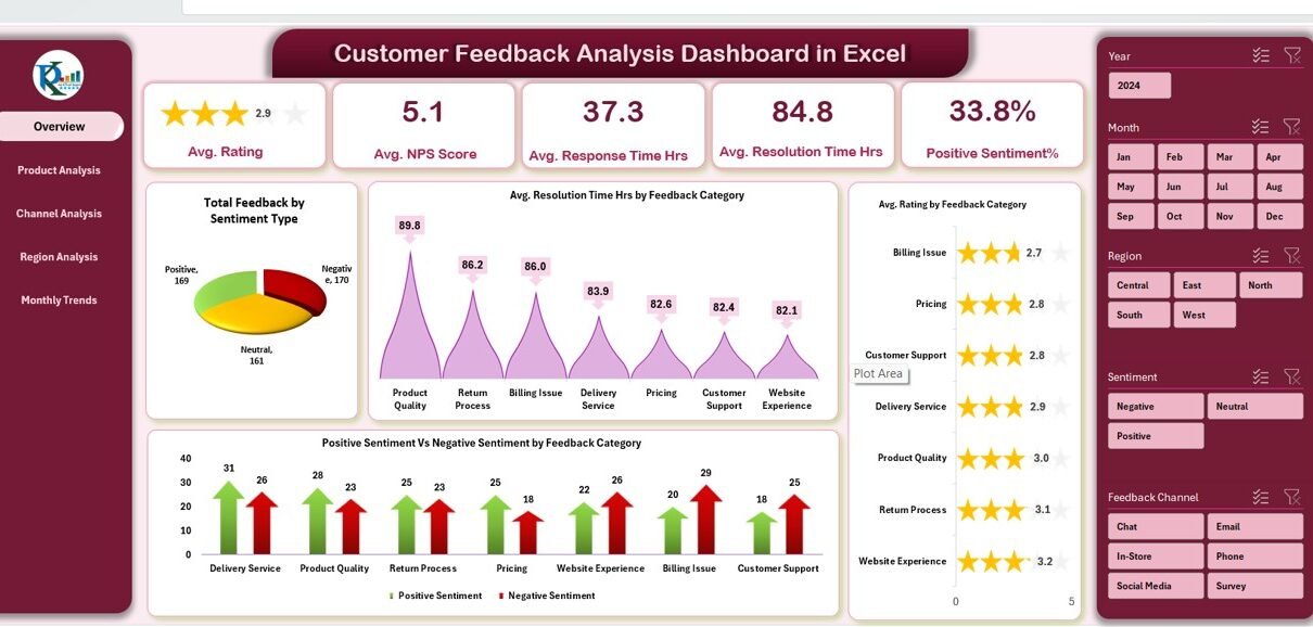
Overview Sheet Tab
The Overview Sheet is the heart of the dashboard. It displays top-level KPIs and interactive charts that summarize all customer feedback data at a glance.
KPI Cards
At the top of the Overview sheet, five dynamic KPI cards showcase essential metrics:
- Average Rating
- Average NPS Score
- Average Response Time (Hours)
- Average Resolution Time (Hours)
- Positive Sentiment (%)
These cards instantly update when new data is added, offering a live snapshot of customer sentiment.

Click to buy Customer Feedback Analysis Dashboard in Excel
Charts and Visuals
The dashboard includes multiple visual charts to help users interpret the data visually and identify trends.
- omparison for each feedback type.
- Average Rating by Fe
- Total Feedback by Sentiment Type:
Displays how many responses fall into categories like Positive, Neutral, or Negative. - Average Resolution Time (Hours) by Feedback Category:
Helps pinpoint areas where response times are slower. - Positive vs. Negative Sentiment by Feedback Category:
Provides a sentiment c - edback Category:
Reveals which categories perform well and which require attention.
Product Analysis Sheet Tab
Product-related feedback offers insights into how customers perceive individual items or services.
This sheet includes:
- Average Response Time (Hours) by Product
- Average NPS Score by Product
- Positive vs. Negative Sentiment by Product
- Average Rating by Product
These visuals help you determine which products delight customers and which ones generate the most complaints. Managers can use these insights to focus on quality improvement or prioritize high-performing items for promotions.

Click to buy Customer Feedback Analysis Dashboard in Excel
Channel Analysis Sheet Tab
Customers share their feedback through different communication channels — email, chat, calls, or social media.
This sheet helps analyze performance across these channels using charts like:
- Average Response Time (Hours) by Channel
- Average NPS Score by Channel
- Positive vs. Negative Sentiment by Channel
- Average Rating by Channel
By comparing results, you can see which channels offer faster resolution, better satisfaction, or need process optimization.

Click to buy Customer Feedback Analysis Dashboard in Excel
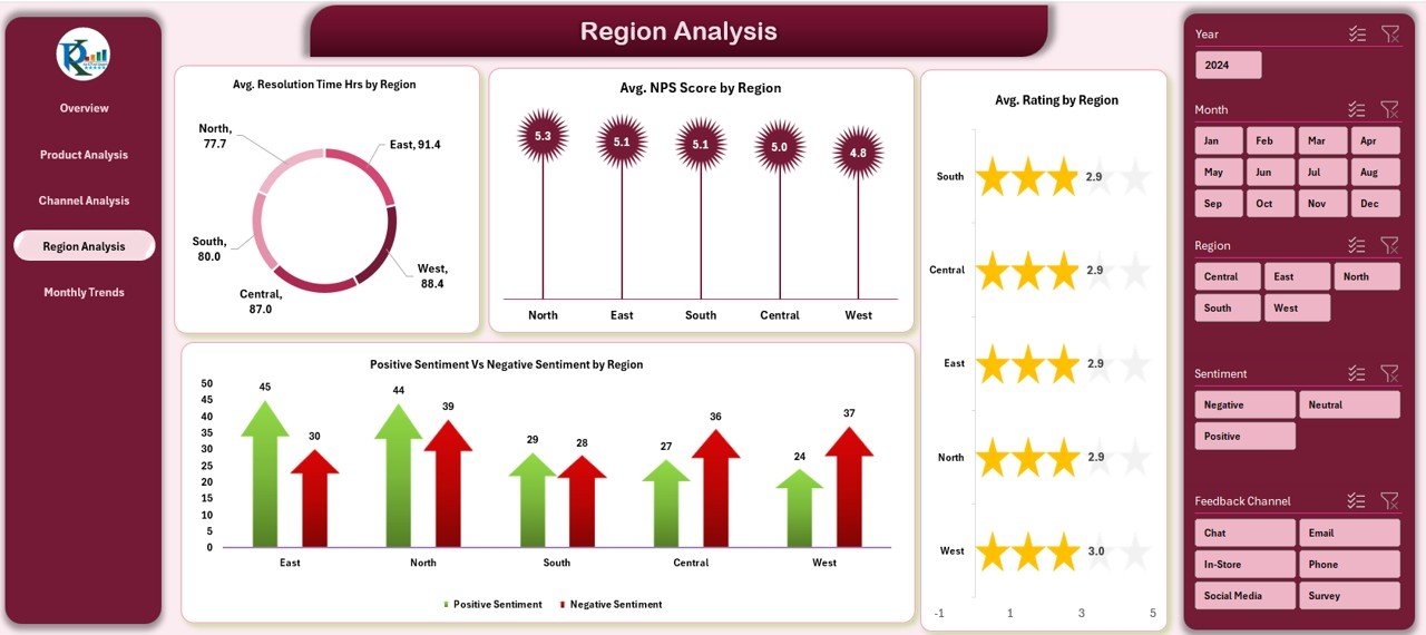
Region Analysis Sheet Tab
Regional insights help organizations understand geographical differences in customer experience.
This tab includes:
- Average Resolution Time (Hours) by Region
- Positive vs. Negative Sentiment by Region
- Average NPS Score by Region
- Average Rating by Region
Regional analysis is extremely valuable for global businesses that serve multiple markets. It uncovers local issues or patterns in satisfaction levels.
Click to buy Customer Feedback Analysis Dashboard in Excel
Monthly Trends Sheet Tab
Time-based performance tracking is crucial for evaluating long-term progress.
The Monthly Trends Sheet includes:
- Average NPS Score by Month
- Positive vs. Negative Sentiment by Month
- Average Rating by Month
It enables users to identify whether satisfaction levels are improving over time and measure the impact of recent initiatives.

Click to buy Customer Feedback Analysis Dashboard in Excel
How to Use the Customer Feedback Analysis Dashboard in Excel
Getting started with the dashboard is simple. Here’s a step-by-step guide:
- Collect Feedback Data:
Gather customer responses from forms, emails, surveys, or CRM systems. - Input Data into Excel:
Copy or import the raw feedback into the data sheet provided within the dashboard. - Refresh Pivot Tables:
Excel automatically recalculates all KPIs and updates charts. - Review KPIs and Trends:
Use slicers or filters (if available) to view performance by month, region, or product. - Draw Insights and Act:
Identify problem areas and implement data-backed improvements.
This workflow ensures a continuous improvement cycle — collecting, analyzing, acting, and re-measuring results.
Why Use Excel for Customer Feedback Analysis?
Many organizations rely on Excel because it offers the perfect balance between flexibility, simplicity, and functionality.
Here’s why Excel remains a powerful choice:
- No coding required: Non-technical users can easily manage data and create visualizations.
- Compatibility: Works with CSVs, CRMs, Google Forms, and other data sources.
- Customization: Modify formulas, charts, and layouts according to business needs.
- Automation: Leverage formulas and pivot tables for automatic calculations.
- Visualization: Turn boring spreadsheets into colorful, interactive dashboards.
- Portability: Share dashboards easily via email or OneDrive.
Advantages of the Customer Feedback Analysis Dashboard in Excel
Implementing this dashboard delivers several tangible business benefits.
Centralized Feedback Management
All feedback data from various sources comes together in one location, simplifying access and reducing confusion.
Real-Time Data Visualization
Visual charts offer instant clarity. Instead of reading long tables, you can spot patterns and sentiment shifts at a glance.
Improved Response Efficiency
Metrics like Average Response Time and Resolution Time help teams act faster and prioritize urgent cases.
Informed Decision-Making
Executives can make better strategic decisions backed by actual customer data, not assumptions.
Enhanced Customer Experience
By analyzing trends, you can refine service processes, improve satisfaction, and increase customer loyalty.
Increased Team Accountability
When performance metrics are visible, teams become more accountable and focused on continuous improvement.
Setting Up the Dashboard: Key Components
Every tab in this Excel file plays a specific role. Let’s break down the setup process and components that make it so efficient.
- Data Input Sheet
This is the foundation of your dashboard. It stores all customer feedback records, including date, category, rating, response time, and sentiment.
- Pivot Tables
All charts and KPIs rely on pivot tables for automatic aggregation. These pivots ensure accuracy and flexibility for quick filtering.
- Slicers and Filters
Dynamic slicers allow you to filter data by Month, Region, Product, or Channel — giving users control over how they view data.
- Charts and Conditional Formatting
Visuals like bar charts, line charts, and pie charts enhance understanding. Conditional formatting (green for improvement, red for decline) provides instant visual cues.
Insights You Can Gain from the Dashboard
Using this dashboard, businesses can uncover actionable insights such as:
- Which product receives the most positive or negative feedback?
- Which region has the highest satisfaction score?
- How do resolution times impact NPS?
- What channel delivers the quickest response?
- How does performance trend month-over-month?
These insights support proactive management, allowing businesses to fix problems before they escalate💬 Common Mistakes to Avoid
While using a feedback analysis dashboard, many users make small but impactful mistakes. Avoid these:
- Ignoring data validation during import.
- Using too many colors or charts, which makes the dashboard confusing.
- Forgetting to refresh pivot tables after data updates.
- Not setting KPI goals, leading to ambiguous interpretations.
- Overlooking sentiment trends and focusing only on numerical scores.
Conclusion
The Customer Feedback Analysis Dashboard in Excel is more than a reporting tool — it’s a continuous improvement system. It empowers businesses to listen to their customers, quantify their experiences, and make informed changes that drive satisfaction and loyalty.
With its clean structure, easy customization, and automated analysis, any organization — from startups to enterprises — can turn feedback into strategic action.
When customer voices guide your business decisions, growth becomes inevitable. And with this Excel dashboard, you can make that process efficient, visual, and impactful.
Frequently Asked Questions (FAQs)
- What is the purpose of a Customer Feedback Analysis Dashboard?
The dashboard helps collect and analyze customer opinions to measure satisfaction, response time, and sentiment. It converts raw data into visual reports for better understanding.
- Can non-technical users operate this Excel dashboard?
Yes. It requires no coding or advanced analytics skills. You can input data, refresh pivots, and view charts instantly.
- How often should I update the dashboard?
Ideally, you should refresh it weekly or monthly, depending on your feedback volume. Regular updates maintain accuracy and reliability.
- What types of businesses can use this tool?
It suits all industries — retail, IT, education, hospitality, healthcare, and more. Any organization that collects customer feedback can benefit.
- Can I add custom KPIs or charts?
Absolutely. You can modify formulas, add new charts, or rename categories to align with your organization’s performance metrics.
- How is sentiment calculated in this dashboard?
Sentiment is usually derived from customer comments — categorized as Positive, Neutral, or Negative. You can assign sentiment scores manually or through text analysis tools.
- Does it support real-time data connections?
While Excel doesn’t directly support real-time APIs, you can use Power Query or import scripts to refresh data automatically.
- What’s the difference between NPS and Rating?
NPS (Net Promoter Score) measures loyalty — how likely a customer is to recommend your brand.
Rating reflects satisfaction with a specific product or service.
- Can I share this dashboard online?
Yes. You can share it through OneDrive, Google Drive, or SharePoint for collaborative viewing.
- Why is Excel still relevant when Power BI exists?
Excel remains the most accessible and widely used tool for quick analysis, especially for small businesses that don’t need full BI infrastructure.
Visit our YouTube channel to learn step-by-step video tutorials
Watch the step-by-step video tutorial:
Click to buy Customer Feedback Analysis Dashboard in Excel