In the fast-changing world of education, decision-makers need accurate, real-time data to monitor performance, evaluate progress, and plan for the future. Whether you manage a university, college, or training institution, the Education Services Dashboard in Excel is your one-stop solution to visualize key academic and financial metrics.
Built using Microsoft Excel, this ready-to-use dashboard brings together academic, operational, and financial data in one interactive and visually appealing format. From tracking student enrollment to analyzing revenue and expenses, it transforms raw numbers into meaningful insights for informed decision-making.
Click to buy Education Services Dashboard in Excel
What Is an Education Services Dashboard in Excel?
An Education Services Dashboard in Excel is a dynamic analytical tool that helps educational administrators, faculty heads, and finance teams monitor key performance indicators (KPIs) in one place. It converts complex data into visual reports using Excel charts, slicers, and conditional formatting.
This dashboard eliminates manual reporting and helps you understand your institution’s performance in real time. It is structured with multiple sheet tabs that display performance data across different categories such as programs, regions, institutions, and departments.
Structure of the Education Services Dashboard
The dashboard is organized into multiple interactive sheets, each serving a specific analytical purpose. Let’s explore them one by one.
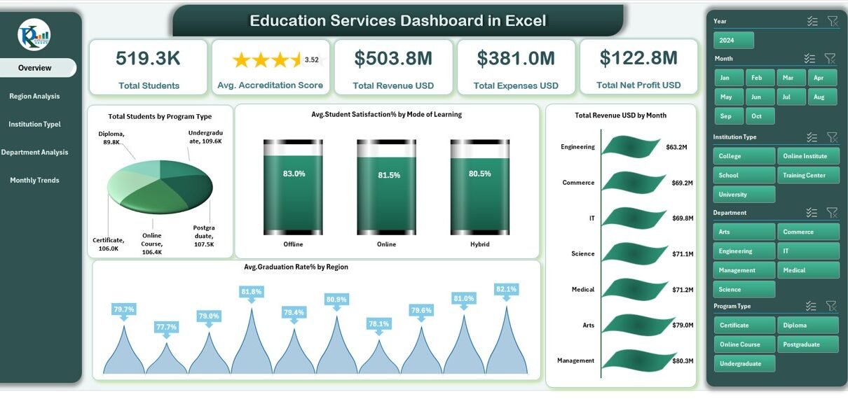
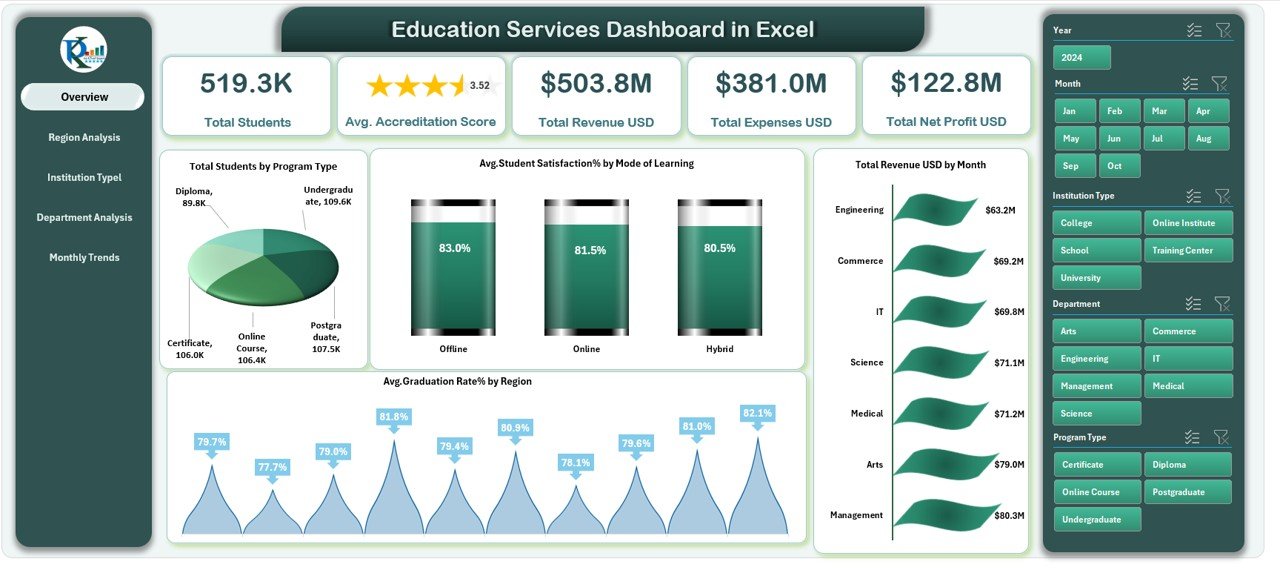
Overview Sheet Tab
The Overview Sheet is the heart of the dashboard. It gives you a high-level snapshot of overall institutional performance.
Cards Displayed:
- Total Students: Displays the total number of students enrolled across programs.
- Average Accreditation Score: Shows the institution’s quality rating or accreditation score.
- Total Revenue (USD): Summarizes all income generated by the institution.
- Total Expenses (USD): Tracks operational and academic expenditures.
- Total Net Profit (USD): Highlights the financial health and profitability.
Charts and Visuals:
- Total Students by Program Type – Visualizes how many students are enrolled in each program (Undergraduate, Postgraduate, Diploma, etc.).
- Average Student Satisfaction (%) by Mode of Learning – Compares satisfaction levels between online, offline, and hybrid learning.
- Average Graduation Rate (%) by Region – Displays how graduation outcomes vary across geographical regions.
- Total Revenue (USD) by Month – Shows monthly revenue trends to track seasonal performance.
Click to buy Education Services Dashboard in Excel
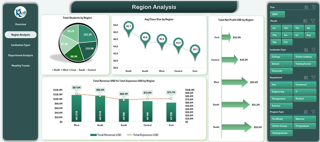
Region Analysis Sheet
Education quality and enrollment often vary by region. The Region Analysis Tab helps you evaluate regional performance in terms of student count, revenue, and operational cost.
Charts Displayed:
- Total Students by Region – Identifies top-performing and low-performing regions.
- Average Class Size by Region – Analyzes student-teacher ratios for better resource planning.
- Total Revenue (USD) vs Total Expenses (USD) by Region – Reveals which regions are most profitable.
- Total Net Profit (USD) by Region – Highlights areas contributing the most to financial success.
Click to buy Education Services Dashboard in Excel
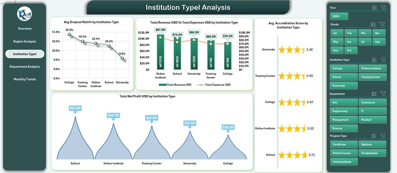
Institution Type Analysis Sheet
Institutions under your education network may include schools, colleges, and specialized training centers. This tab lets you compare performance across these categories.
Charts Displayed:
- Average Dropout Rate (%) by Institution Type – Helps monitor student retention.
- Total Net Profit (USD) by Institution Type – Compares financial success across types.
- Total Revenue (USD) vs Total Expenses (USD) by Institution Type – Evaluates cost efficiency.
- Average Accreditation Score by Institution Type – Measures educational quality consistency.
Click to buy Education Services Dashboard in Excel
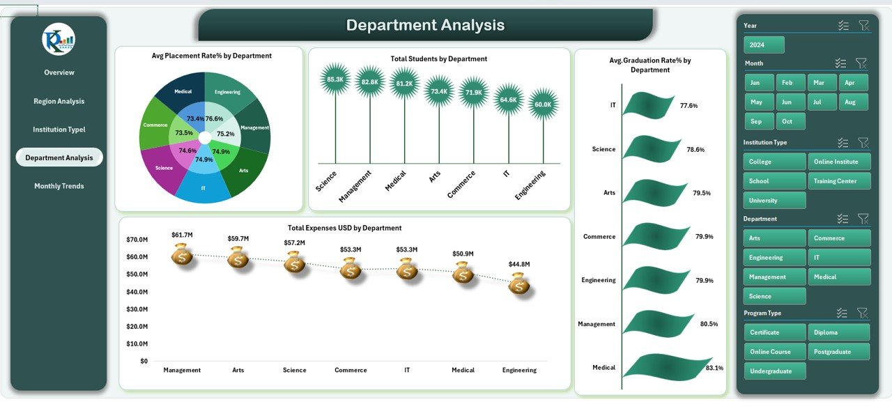
Department Analysis Sheet
Each department plays a unique role in institutional success. The Department Analysis Sheet provides performance insights at the department level.
Charts Displayed:
- Average Placement Rate (%) by Department – Shows how effectively each department helps students secure employment.
- Total Expenses (USD) by Department – Tracks resource allocation and spending.
- Total Students by Department – Displays enrollment distribution to balance class loads.
- Average Graduation Rate (%) by Department – Indicates academic success levels.
Click to buy Education Services Dashboard in Excel
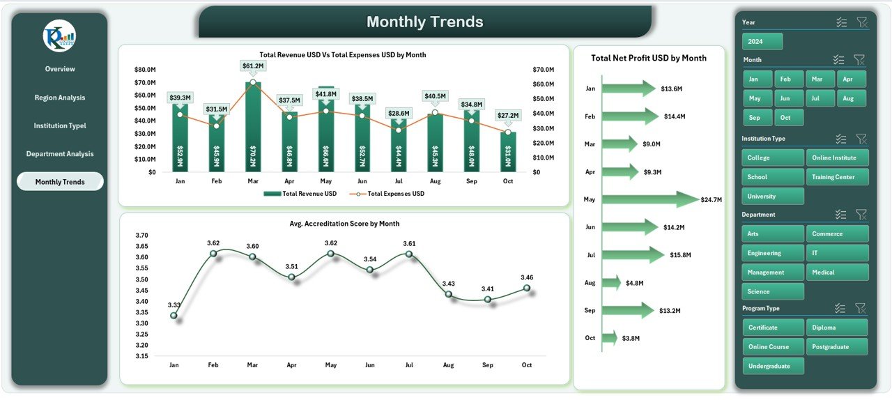
Monthly Trends Sheet
The Monthly Trends Sheet focuses on performance over time, helping management identify growth patterns and predict future trends.
Charts Displayed:
- Total Revenue (USD) vs Total Expenses (USD) by Month – Monitors profitability trends.
- Total Net Profit (USD) by Month – Shows monthly profit variation.
- Average Accreditation Score by Month – Tracks changes in quality standards.
- Average Student Satisfaction (%) by Month – Reveals improvement in student experience.
Click to buy Education Services Dashboard in Excel
Data Sheet Tab
The Data Sheet serves as the backbone of the dashboard. It stores all raw data — including student records, revenue figures, and expense details — that feed into the dashboard visuals. It allows users to update information easily and ensures real-time updates across all sheets.
Key Objectives of the Education Services Dashboard
This dashboard is designed to:
- Provide a 360° view of institutional performance.
- Enable data-driven decision-making in education management.
- Track both academic and financial KPIs.
- Promote transparency and accountability among departments.
- Support strategic planning for growth and improvement.
Why Educational Institutions Need a Dashboard in Excel
Education involves complex data — enrollment figures, budgets, satisfaction scores, graduation rates, and more. Without a centralized system, managing this data can be overwhelming. The Education Services Dashboard in Excel solves this problem by:
- Automating manual reporting processes.
- Presenting real-time, easy-to-understand visuals.
- Allowing department heads to focus on improvement rather than number-crunching.
- Enhancing collaboration through data sharing.
How to Use the Education Services Dashboard in Excel
- Input Your Data: Enter all student, financial, and institutional data in the Data Sheet.
- Select Filters: Use dropdowns and slicers to filter by year, department, or region.
- View Instant Results: Watch charts, cards, and tables update automatically.
- Analyze Trends: Identify growth opportunities and problem areas.
- Export Reports: Share data summaries for meetings or accreditation reviews.
Advantages of Education Services Dashboard in Excel
Let’s look at the key benefits this dashboard offers:
- Simplified Data Management
No need for complex software. Excel provides a simple, accessible platform to organize, analyze, and visualize data efficiently.
- Real-Time Insights
As soon as new data is entered, charts and KPIs update automatically. This ensures you always have up-to-date information.
- Cost-Effective Solution
Unlike expensive ERP or BI tools, Excel is affordable, widely available, and customizable.
- Visual Representation
Interactive visuals make data easier to interpret, helping management make faster, evidence-based decisions.
- Departmental Transparency
Department heads can see their performance metrics clearly, encouraging healthy competition and accountability.
- Improved Decision-Making
With all KPIs visible in one place, leaders can prioritize actions that drive student success and financial sustainability.
- User-Friendly Interface
Anyone familiar with Excel can use this dashboard. It requires no coding or technical skills.
Best Practices for Using the Education Services Dashboard in Excel
Follow these best practices to get the most out of your dashboard:
- Keep Data Clean and Consistent:
Regularly verify data accuracy to ensure reliable results. - Update Monthly:
Refresh your data at the end of each month to monitor trends effectively. - Use Conditional Formatting:
Highlight performance thresholds visually to spot outliers easily. - Incorporate Slicers:
Allow users to interactively filter data by department, region, or time period. - Automate Data Import:
Use Excel’s data connection tools to fetch updated data automatically. - Maintain Data Security:
Protect sensitive student and financial information using password protection. - Review KPIs Periodically:
Align metrics with evolving institutional goals. - Visual Clarity Matters:
Avoid clutter; use clean charts, readable fonts, and consistent colors.
Conclusion
The Education Services Dashboard in Excel is more than just a reporting tool — it’s a strategic decision-making partner. It empowers educators, administrators, and finance teams to collaborate effectively, make informed choices, and continuously improve institutional performance.
By visualizing KPIs such as student satisfaction, accreditation scores, revenue, and graduation rates, this dashboard transforms complex educational data into simple, meaningful insights. Whether you run a small college or a large university network, this Excel-based dashboard provides everything you need to track, analyze, and grow efficiently.
Frequently Asked Questions (FAQs)
- What is the purpose of the Education Services Dashboard in Excel?
The purpose is to provide a unified platform to track academic, operational, and financial KPIs, allowing education administrators to make informed decisions quickly.
- Who can use this dashboard?
It is ideal for educational institutions, universities, colleges, training centers, and online learning platforms looking to monitor and improve their performance.
- Does it require advanced Excel skills?
No. The dashboard is designed to be ready-to-use and user-friendly. Basic Excel knowledge is enough to operate it efficiently.
- Can I add my own KPIs?
Yes, you can fully customize the dashboard to include any KPIs specific to your organization’s needs.
- How often should I update the data?
For accurate trend analysis, update data at least once a month or after every major reporting period.
- Can this dashboard handle multiple campuses or branches?
Absolutely. The Region and Institution Type analysis sheets make it ideal for multi-campus institutions.
- Is it suitable for both academic and financial tracking?
Yes, it integrates both educational performance metrics and financial indicators in one platform.
- How can I visualize year-over-year progress?
Use slicers and comparative charts within the dashboard to switch between yearly datasets easily.
- Can I share this dashboard with my team?
Yes. You can share the Excel file or export visual summaries as PDFs for management reporting.
- What makes this dashboard different from others?
Unlike generic dashboards, this one focuses on the education sector, offering tailored visuals and KPIs designed for institutional needs.
Visit our YouTube channel to learn step-by-step video tutorials
Watch the step-by-step video tutorial:
Click to buy Education Services Dashboard in Excel