In today’s fast-evolving healthcare industry, hearing aid service providers must track performance with precision. Audiology clinics manage patient consultations, hearing tests, device fittings, follow-ups, and revenue operations daily. However, many clinics still rely on manual spreadsheets or disconnected systems. As a result, they often miss key insights and struggle to improve service quality.
Therefore, healthcare providers now adopt data-driven dashboards to monitor performance effectively. One of the most powerful tools is the Hearing Aid Services KPI Dashboard in Power BI.
This dashboard provides a centralized platform to track key performance indicators (KPIs), analyze trends, and improve decision-making. In this detailed guide, you will learn everything about the Hearing Aid Services KPI Dashboard in Power BI, including its features, structure, benefits, best practices, and FAQs.
What is a Hearing Aid Services KPI Dashboard in Power BI?
A Hearing Aid Services KPI Dashboard in Power BI is an interactive reporting tool designed to track and analyze performance metrics in audiology clinics and hearing aid service centers.
It collects data from Excel and transforms it into visual insights such as:
- KPI cards
- Trend charts
- Performance comparisons
- Target vs actual analysis
Because the dashboard centralizes all data, users can monitor clinic performance in real time. Moreover, it helps professionals make faster and smarter decisions.
Why Do Hearing Aid Clinics Need a KPI Dashboard?
Click to Buy Hearing Aid Services KPI Dashboard in Power BI
Managing a hearing aid service business involves multiple activities. Clinics must track patient appointments, hearing tests, device sales, and follow-ups. However, manual tracking creates delays and errors.
Therefore, a KPI dashboard becomes essential.
Hearing aid clinics need a dashboard because it helps to:
- Monitor patient service quality
- Track device sales and revenue
- Evaluate staff performance
- Identify operational inefficiencies
- Improve patient satisfaction
As a result, clinics can deliver better services and increase profitability.
Key Features of the Hearing Aid Services KPI Dashboard in Power BI
The dashboard is designed with three powerful pages, each offering a different level of analysis.
1. Summary Page – Central Performance Overview
The Summary Page is the main dashboard that provides a quick overview of all KPIs.
Interactive Filters
At the top, users can select:
-
Month slicer
-
KPI Group slicer
Because of these filters, users can analyze data for specific periods and KPI categories.
KPI Cards
The dashboard displays three key performance indicators:
-
Total KPIs Count
-
MTD Target Meet Count
-
MTD Target Missed Count
These cards instantly show whether clinic performance meets targets.
Detailed KPI Table
Click to Buy Hearing Aid Services KPI Dashboard in Power BI
The table below the cards provides in-depth KPI insights.
KPI Number
Represents the sequence number of each KPI.
KPI Group
Defines the category, such as:
-
Patient services
-
Sales performance
-
Operational efficiency
KPI Name
Displays the KPI being tracked.
Unit
Shows measurement units like:
-
Percentage
-
Count
-
Revenue
KPI Type
Indicates KPI nature:
-
LTB (Lower the Better)
-
UTB (Upper the Better)
Month-To-Date (MTD) Metrics
Actual CY MTD
Shows the current month’s actual performance.
Target CY MTD
Displays the target value for the current month.
MTD Icon
-
▲ Green → Target achieved
-
▼ Red → Target missed
Therefore, users can quickly identify performance status.
Target vs Actual (MTD)
Formula:
Actual / Target
PY MTD
Shows previous year’s same month value.
CY vs PY (MTD)
Formula:
Current Year / Previous Year
Because of this, clinics can track growth trends.
Year-To-Date (YTD) Metrics
Click to Buy Hearing Aid Services KPI Dashboard in Power BI
Actual CY YTD
Displays cumulative current year performance.
Target CY YTD
Shows yearly targets.
YTD Icon
-
▲ Green → Good performance
-
▼ Red → Needs improvement
Target vs Actual (YTD)
Formula:
Actual YTD / Target YTD
PY YTD
Previous year cumulative data.
CY vs PY (YTD)
Compares yearly performance trends.
Click to Buy Hearing Aid Services KPI Dashboard in Power BI
2. KPI Trend Page – Performance Analysis Over Time
The KPI Trend Page helps users analyze trends visually.
Features of this page:
-
Two combo charts
Comparison of:
- Current Year
- Previous Year
- Target values
KPI Selection Slicer
Users can select any KPI from the slicer.
As a result, they can:
- Identify performance patterns
- Detect seasonal changes
- Analyze improvement trends
Click to Buy Hearing Aid Services KPI Dashboard in Power BI
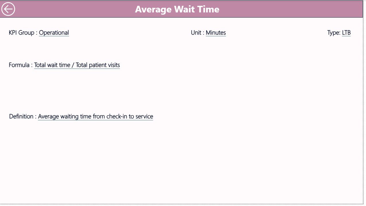
3. KPI Definition Page – Detailed KPI Information
This page provides complete KPI documentation.
It is a drill-through page, which means:
- Users access it from the Summary Page
- It remains hidden by default
It includes:
- KPI Number
- KPI Group
- KPI Name
- Unit
- Formula
- Definition
- KPI Type
Because of this page, users clearly understand how each KPI works.
Click to Buy Hearing Aid Services KPI Dashboard in Power BI
Excel Data Source Structure
The dashboard uses an Excel file with three worksheets.
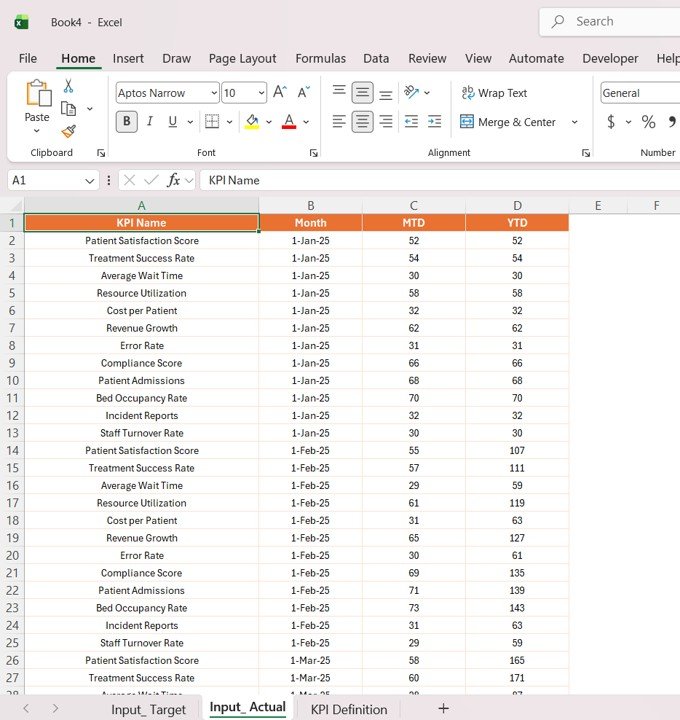
1. Input_Actual Sheet
This sheet contains actual performance data.
Required fields:
- KPI Name
- Month (first date)
- MTD values
- YTD values
Click to Buy Hearing Aid Services KPI Dashboard in Power BI
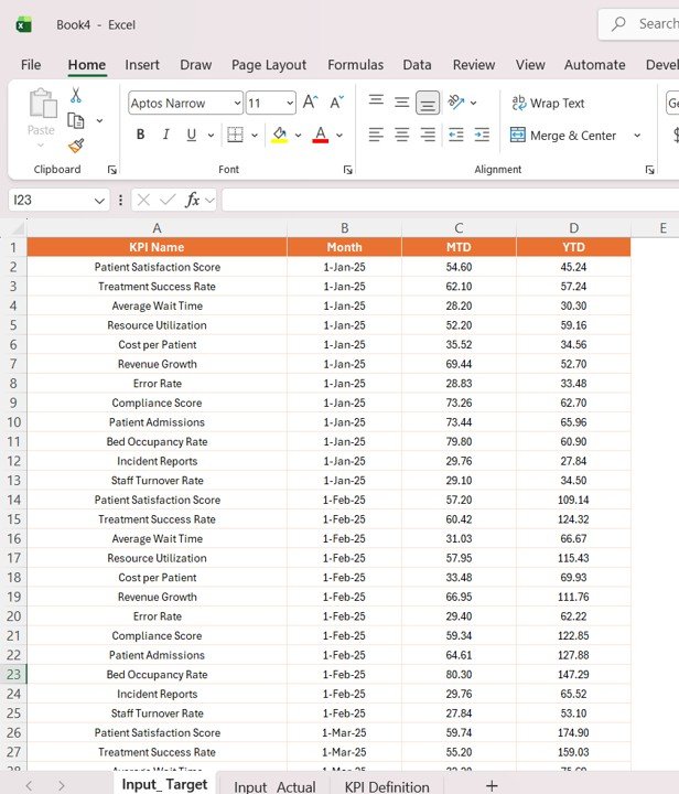
2. Input_Target Sheet
This sheet includes KPI targets.
Fields:
- KPI Name
- Month
- Target MTD
- Target YTD
Click to Buy Hearing Aid Services KPI Dashboard in Power BI
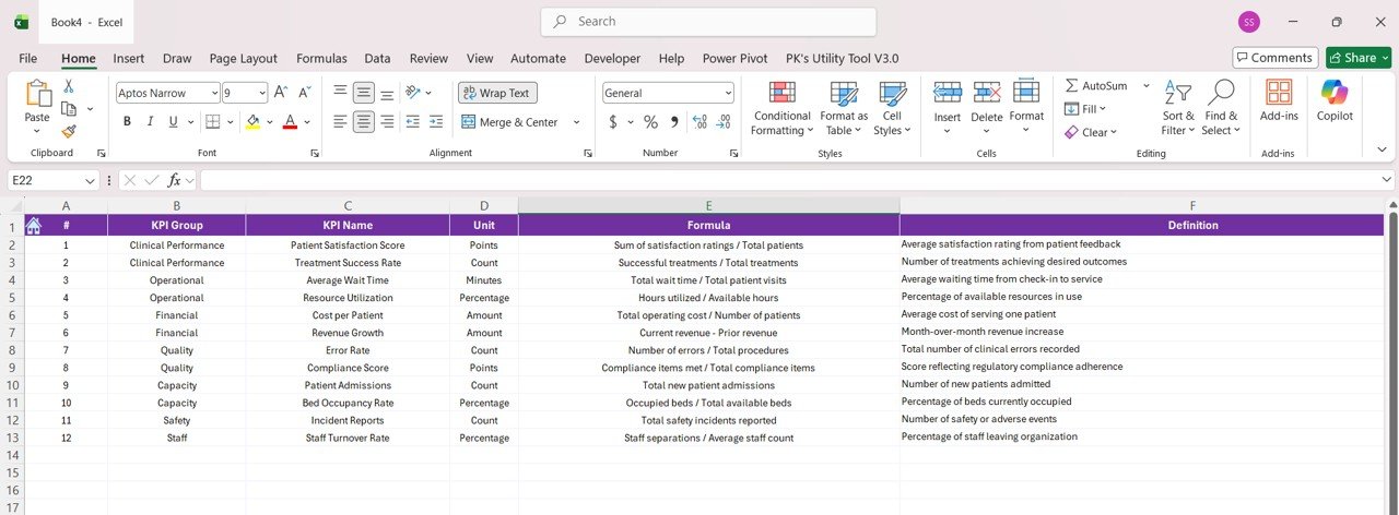
3. KPI Definition Sheet
This sheet stores KPI metadata.
Fields:
- KPI Number
- KPI Group
- KPI Name
- Unit
- Formula
- Definition
- Type (LTB/UTB)
Click to Buy Hearing Aid Services KPI Dashboard in Power BI
Advantages of Hearing Aid Services KPI Dashboard in Power BI
Using this dashboard offers several benefits.
1. Centralized Data Management
All clinic data stays in one place. Therefore, users avoid confusion and duplication.
2. Better Decision-Making
Because the dashboard provides clear visuals, managers make faster decisions.
3. Real-Time Performance Tracking
Users can update Excel data and instantly view results in Power BI.
4. Improved Patient Service
Tracking KPIs helps clinics improve service quality and patient satisfaction.
5. Easy Trend Analysis
Trend charts allow users to identify growth patterns and performance gaps.
Opportunities for Improvement in Hearing Aid KPI Tracking
Although the dashboard is powerful, clinics can further improve performance.
Key improvement areas include:
- Automating data collection systems
- Integrating CRM and billing software
- Tracking patient feedback scores
- Monitoring device usage trends
- Enhancing follow-up tracking
By focusing on these areas, clinics can achieve better results.
Best Practices for the Hearing Aid Services KPI Dashboard
Click to Buy Hearing Aid Services KPI Dashboard in Power BI
To maximize the dashboard’s effectiveness, follow these best practices.
1. Define Clear KPIs
Choose relevant KPIs such as:
-
Patient conversion rate
-
Hearing aid sales
-
Follow-up success rate
-
Appointment completion rate
2. Maintain Accurate Data
Always ensure data accuracy. Because incorrect data leads to wrong insights.
3. Update Data Regularly
Update data weekly or monthly to keep reports relevant.
4. Use Consistent KPI Definitions
Ensure each KPI has a clear formula and definition.
5. Train Staff on Dashboard Usage
Train employees to use slicers, filters, and drill-through features.
Who Can Use This Dashboard?
This dashboard is useful for:
- Hearing aid clinics
- Audiology centers
- Healthcare managers
- Medical device companies
- Hospital administrators
How Does This Dashboard Improve Clinic Performance?
Click to Buy Hearing Aid Services KPI Dashboard in Power BI
The dashboard improves performance by:
- Monitoring KPIs continuously
- Identifying performance gaps
- Tracking revenue and service metrics
- Supporting data-driven decisions
As a result, clinics can improve both operational efficiency and patient satisfaction.
Conclusion
The Hearing Aid Services KPI Dashboard in Power BI is a powerful tool for modern audiology clinics. It simplifies performance tracking, improves data visibility, and enhances decision-making.
Because the dashboard integrates Excel data with Power BI visuals, it offers flexibility and ease of use. Moreover, its interactive features allow users to explore insights quickly.
Therefore, clinics that adopt this dashboard can improve service quality, increase efficiency, and drive business growth.
Visit our YouTube channel to learn step-by-step video tutorials
Click to Buy Hearing Aid Services KPI Dashboard in Power BI