Managing office utility costs has become more important than ever. Electricity bills, water expenses, internet charges, maintenance costs, taxes, and invoices can quickly increase if organizations do not track them properly. However, many companies still depend on scattered spreadsheets and manual calculations. As a result, cost visibility reduces, errors increase, and decisions slow down.
That is exactly where an Office Utility Cost Dashboard in Excel becomes a powerful and practical solution.
In this detailed and SEO-friendly article, you will learn what an Office Utility Cost Dashboard in Excel is, why organizations need it, how it works, its sheet-wise structure, key metrics, advantages, best practices, and frequently asked questions. Moreover, the article uses simple language, clear explanations, strong transitions, and active voice to ensure easy understanding and maximum SEO impact.
Click to buy Office Utility Cost Dashboard in Excel
What Is an Office Utility Cost Dashboard in Excel?
An Office Utility Cost Dashboard in Excel is a centralized and interactive reporting tool designed to track, analyze, and visualize office-related utility costs and financial metrics in one place.
Instead of reviewing multiple Excel sheets for revenue, expenses, invoices, taxes, assets, and liabilities, this dashboard brings everything together into a single visual interface. Consequently, finance teams, facility managers, and business leaders can monitor performance quickly and accurately.
Because Excel supports formulas, pivot tables, slicers, and charts, this dashboard updates automatically when new data is added. As a result, users gain real-time insights without complex software or high costs.
Why Do Organizations Need an Office Utility Cost Dashboard in Excel?
Office utility costs directly impact operational budgets and profitability. However, without a structured tracking system, organizations struggle to control spending.
Here is why an Office Utility Cost Dashboard in Excel becomes essential:
- It provides complete visibility into utility spending
- It helps identify cost leakages and inefficiencies
- It improves invoice tracking and payment management
- It supports budget planning and forecasting
- It enables data-driven decisions for cost optimization
Moreover, Excel remains widely used across industries. Therefore, organizations can implement this dashboard quickly without additional training or tools.
How Does an Office Utility Cost Dashboard in Excel Work?
The Office Utility Cost Dashboard in Excel works by connecting structured data tables with visual dashboard sheets.
First, users enter or import data related to revenue, expenses, invoices, departments, regions, payment methods, assets, liabilities, and taxes. Then, Excel formulas and pivot tables process this data. Finally, charts, cards, and indicators display the insights visually.
Because of this flow, users can:
- Filter data by department, region, or month
- Compare paid vs unpaid invoices
- Track revenue and expense trends
- Monitor asset and liability distribution
- Analyze tax amounts and overdue invoices
As a result, the dashboard transforms raw numbers into actionable insights.
What Sheets Are Included in the Office Utility Cost Dashboard in Excel?
This ready-to-use dashboard contains multiple structured sheet tabs, each designed for a specific analysis purpose. Let us explore each sheet in detail.
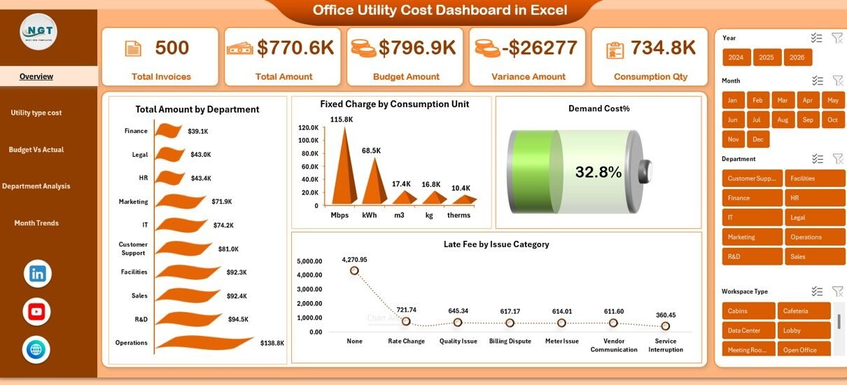
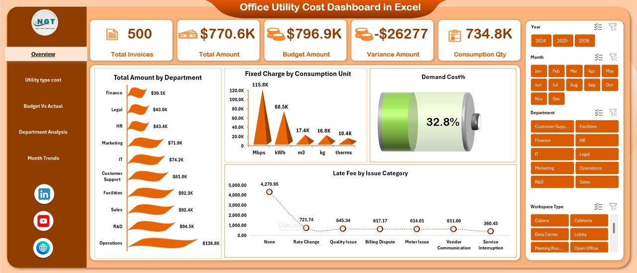
Overview Sheet
The Overview sheet serves as the main landing page of the dashboard. It provides a high-level snapshot of office utility and financial performance.
Key Metrics on the Overview Sheet
- Revenue Amount
- Expense Amount
- Asset Amount
- Liability Amount
- Tax %
These KPI cards immediately show the overall financial position. Therefore, decision-makers can quickly understand whether costs remain under control.
Charts on the Overview Sheet
- Paid Invoice by Department
Helps identify which departments clear invoices on time. - Expense Amount by Region
Shows regional cost distribution and highlights high-expense locations. - Paid Invoice by Payment Method
Displays how invoices get paid, such as bank transfer, cash, or card. - Paid Invoice Status
Provides visibility into overall invoice payment performance.
Because all key indicators appear on one screen, the overview sheet saves time and improves clarity.\
Click to buy Office Utility Cost Dashboard in Excel
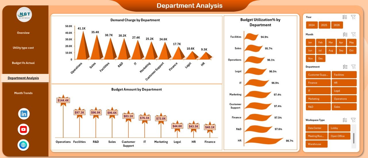
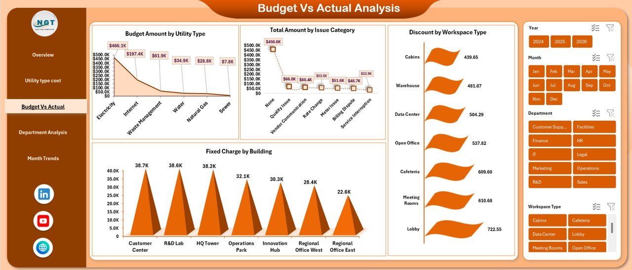
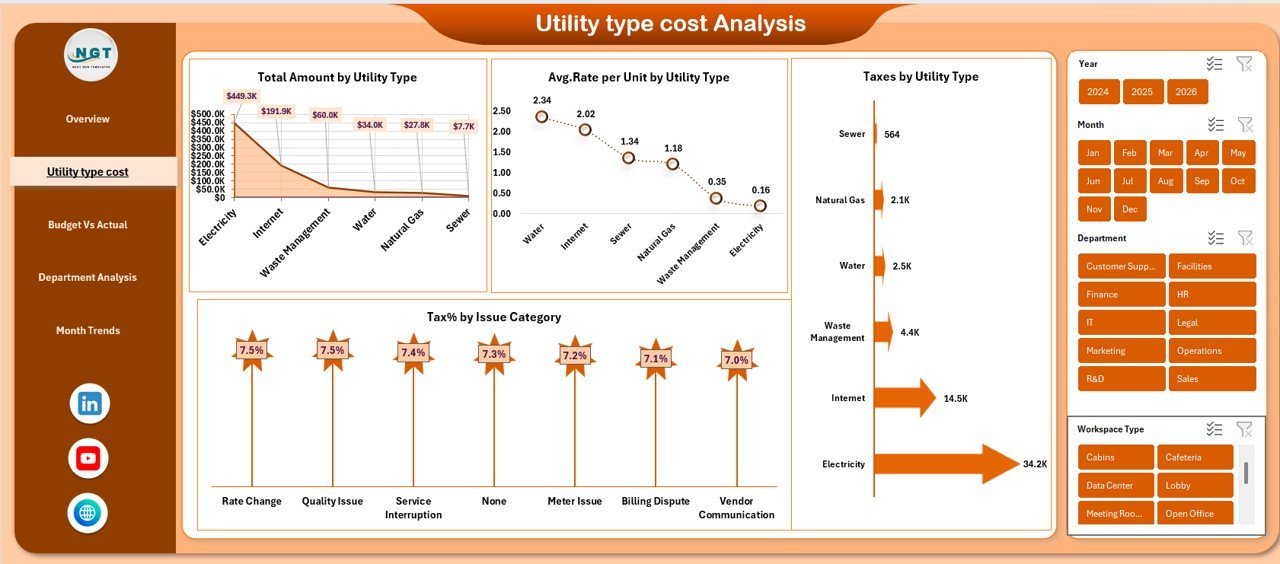
Department Analysis Sheet
The Department Analysis sheet focuses on invoice and tax performance at the department level. This sheet supports accountability and cost control.
Key Metrics in Department Analysis
- Unpaid Invoice by Department
- Tax Amount USD by Department
- Overdue Invoice by Department
- Overdue Invoice % by Department
Through this analysis, finance teams can immediately identify departments with delayed payments or high tax burdens. As a result, corrective actions become easier and faster.
Click to buy Office Utility Cost Dashboard in Excel
Revenue & Expense Analysis
The Revenue & Expense Analysis sheet compares income and spending patterns across departments, regions, and payment methods.
Revenue Analysis Charts
- Revenue Amount by Department
- Revenue Amount by Region
These charts help organizations understand which departments or regions generate higher revenue.
Expense Analysis Charts
- Expense Amount by Department
- Expense Amount by Payment Method
With this view, managers can identify cost-heavy departments or inefficient payment methods. Consequently, they can optimize spending strategies.
Click to buy Office Utility Cost Dashboard in Excel
Liability & Asset Analysis Sheet
The Liability & Asset Analysis sheet focuses on balance-sheet-related metrics. This sheet supports long-term financial planning and risk management.
Key Charts in Liability & Asset Analysis
- Asset Amount by Department
- Liability Amount by Region
- Liability Amount by Payment Method
- Asset Amount by Payment Status
These insights help organizations track asset utilization and liability exposure. Therefore, finance teams can plan investments and reduce risks effectively.
Click to buy Office Utility Cost Dashboard in Excel
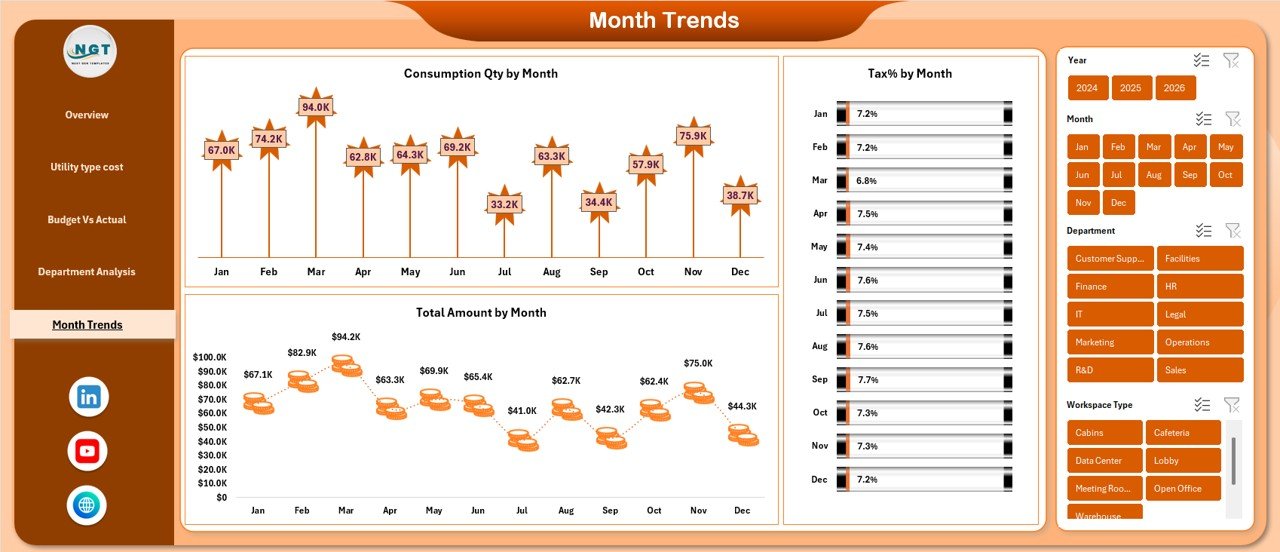
Monthly Trends Sheet
The Monthly Trends sheet highlights performance changes over time. This sheet helps identify seasonal patterns and cost fluctuations.
Monthly Trend Charts
- Revenue Amount by Month
- Paid Invoice % by Month
- Tax Amount USD by Month
Because trends appear month-wise, organizations can easily compare periods, forecast future costs, and prepare budgets more accurately.
Click to buy Office Utility Cost Dashboard in Excel
Advantages of an Office Utility Cost Dashboard in Excel
An Office Utility Cost Dashboard in Excel offers several practical and strategic advantages.
Key Advantages
- Centralized Cost Management
All utility-related data stays in one place. - Improved Cost Visibility
Visual charts highlight spending patterns clearly. - Better Invoice Control
Paid, unpaid, and overdue invoices become easy to track. - Department-Wise Accountability
Each department’s performance stays transparent. - Faster Decision-Making
Managers analyze data instantly without manual reports. - Budget Planning Support
Monthly trends improve forecasting accuracy. - No Additional Software Cost
Excel-based dashboards reduce implementation expenses.
Because of these benefits, organizations across industries adopt Excel dashboards for utility cost control.
Who Can Use an Office Utility Cost Dashboard in Excel?
This dashboard suits a wide range of users and industries.
Ideal Users
- Finance and accounting teams
- Facility and operations managers
- Administrative departments
- Business owners and executives
- Corporate offices and shared workspaces
- Educational institutions
- Healthcare facilities
Since Excel remains familiar to most professionals, adoption becomes smooth and quick.
Best Practices for the Office Utility Cost Dashboard in Excel
To maximize the value of your Office Utility Cost Dashboard in Excel, follow these best practices.
Data Management Best Practices
- Keep source data clean and structured
- Use consistent department and region names
- Update invoice status regularly
- Validate tax percentages carefully
Dashboard Design Best Practices
- Use clear labels and titles for charts
- Avoid overcrowding visuals
- Use consistent color themes
- Highlight key KPIs at the top
Usage Best Practices
- Review the dashboard monthly
- Share insights with department heads
- Compare trends before finalizing budgets
- Use filters to drill down into problem areas
By following these best practices, organizations ensure accuracy, clarity, and long-term usability.
Common Challenges and How to Overcome Them
Even with a strong dashboard, some challenges may arise. However, proper planning helps overcome them easily.
Common Challenges
- Inconsistent data entry
- Delayed invoice updates
- Overloaded dashboards
- Lack of regular reviews
Practical Solutions
- Standardize data entry templates
- Assign ownership for invoice updates
- Limit visuals to essential KPIs
- Schedule monthly dashboard reviews
As a result, the dashboard remains reliable and effective.
How Does an Office Utility Cost Dashboard Improve Cost Optimization?
Cost optimization becomes easier when organizations understand where money goes.
This dashboard:
- Highlights high-expense departments
- Shows inefficient payment methods
- Tracks overdue invoices
- Identifies rising monthly costs
Therefore, managers can take timely actions such as renegotiating contracts, adjusting budgets, or improving payment processes.
Conclusion: Why Should You Use an Office Utility Cost Dashboard in Excel?
An Office Utility Cost Dashboard in Excel transforms complex financial and utility data into clear, actionable insights. Instead of spending hours preparing reports, teams can focus on analyzing performance and controlling costs.
Because the dashboard provides centralized tracking, visual clarity, and trend analysis, it supports smarter financial decisions. Moreover, its Excel-based design makes it cost-effective, flexible, and easy to use.
If your organization wants better control over office utility costs, invoices, assets, liabilities, and taxes, this dashboard becomes an essential tool.
Frequently Asked Questions (FAQs)
What is the main purpose of an Office Utility Cost Dashboard in Excel?
The main purpose is to track, analyze, and visualize office utility costs, revenue, invoices, assets, liabilities, and taxes in one centralized Excel dashboard.
Can small businesses use this dashboard effectively?
Yes, small businesses can use it easily because Excel requires no advanced technical skills or expensive software.
How often should data be updated in the dashboard?
Organizations should update data monthly or weekly, depending on invoice volume and reporting needs.
Does this dashboard support department-wise analysis?
Yes, it provides detailed department-wise insights for expenses, revenue, taxes, and invoice status.
Can this dashboard help with budgeting?
Yes, monthly trend analysis and historical data support accurate budget planning and forecasting.
Is customization possible in this Excel dashboard?
Yes, users can customize charts, KPIs, filters, and layouts based on organizational requirements.
Does the dashboard reduce manual reporting effort?
Yes, automated calculations and visuals significantly reduce manual work and reporting time.
Visit our YouTube channel to learn step-by-step video tutorials
Watch the step-by-step video tutorial:
Click to buy Office Utility Cost Dashboard in Excel