The oil and gas industry runs on complex operations, high-risk activities, heavy investments, and strict compliance rules. Because of this, companies cannot depend on slow manual reporting or scattered spreadsheets. They need a fast and clear view of performance. They also need real-time insights that help leaders make informed decisions. An Oil & Gas KPI Dashboard in Power BI solves this challenge with powerful visual analytics.
This article explains everything about the Oil & Gas KPI Dashboard, how it works, how Power BI transforms raw data into smart insights, and why every oil and gas company should use such a dashboard. You will learn about its features, benefits, best practices, and frequently asked questions.
Click to buy Oil & Gas KPI Dashboard in Power BI
What Is an Oil & Gas KPI Dashboard in Power BI?
An Oil & Gas KPI Dashboard in Power BI is a ready-to-use business intelligence solution that tracks essential operational, financial, and safety metrics in one place. It converts large datasets into clean, interactive visuals so leaders can measure performance across drilling operations, production, pipeline maintenance, safety standards, workforce efficiency, and more.
The dashboard uses Excel data as the source and then displays KPIs in Power BI using charts, trend lines, tables, slicers, and smart icons. This makes it easier for teams to monitor progress month-to-date (MTD), year-to-date (YTD), and compare performance with previous years.
Because oil and gas operations move fast, having a real-time dashboard improves decision-making and reduces risks.
Why Do Oil & Gas Companies Need a KPI Dashboard?
The oil and gas environment changes every day. Prices fluctuate, production rates shift, and safety rules evolve. Therefore, teams need a simple way to track everything without wasting time on manual reports.
An Oil & Gas KPI Dashboard in Power BI helps companies:
- Monitor performance in real time
- Identify risks before they cause damage
- Improve operational efficiency
- Track production KPIs daily, weekly, and monthly
- Compare current results with targets
- Meet compliance and safety standards
Since all important KPIs appear on one screen, managers can act quickly and confidently.
Key Features of the Oil & Gas KPI Dashboard in Power BI
This dashboard includes three main pages:
- Summary Page
- KPI Trend Page
- KPI Definition Page
Each page plays a unique role in reporting.
- Summary Page – The Central View of All KPIs
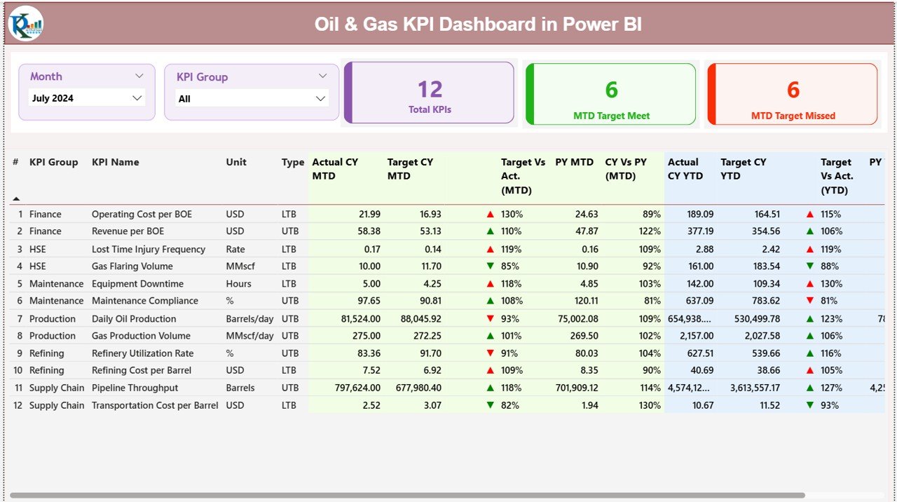
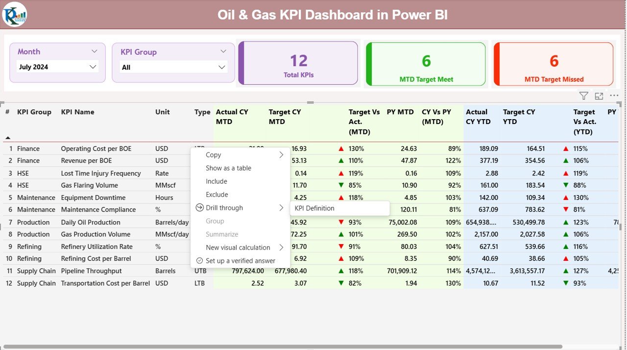
The Summary Page is the first and most important section. It gives a complete overview of oil and gas performance. This page includes:
Month Slicer and KPI Group Slicer
You can filter data by month or KPI group. This helps you focus on specific areas like drilling, production, maintenance, safety, or costs.
Smart KPI Cards
The top section displays three important KPI cards:
- Total KPIs Count
- MTD Target Met
- MTD Target Missed
These small visuals offer instant insight into overall performance.
Detailed KPI Table
The table shows all essential KPI details, such as:
- KPI Number
- KPI Group
- KPI Name
- Unit of Measurement
- Type (LTB or UTB)
- Actual CY MTD
- Target CY MTD
- MTD Icon (▲ / ▼)
- Target vs Actual (MTD %)
- Previous Year MTD
- CY vs PY MTD %
- Actual CY YTD
- Target CY YTD
- YTD Icon (▲ / ▼)
- Target vs Actual (YTD %)
- Previous Year YTD
- CY vs PY YTD %
Each column gives clear insight into how performance shifts month by month and year by year.
Smart Red and Green Icons
The dashboard shows icons:
- ▲ (Green) when performance meets or exceeds target
- ▼ (Red) when performance misses the target
This helps users understand performance at a glance without calculations.
Click to buy Oil & Gas KPI Dashboard in Power BI
KPI Trend Page – Visual Comparison of Past and Present
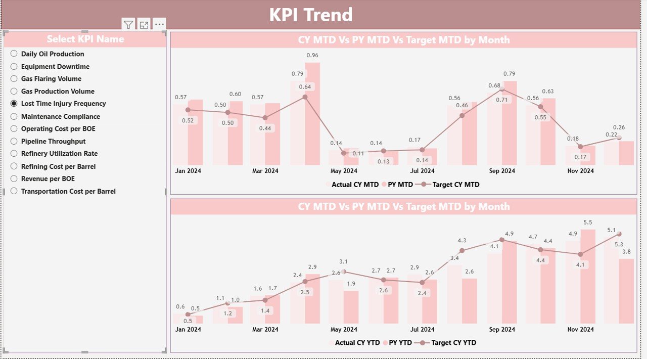
The KPI Trend Page shows changes in performance using combo charts. These visuals include:
- Actual numbers for the current year
- Actual numbers for the previous year
- Target values
A slicer allows users to select any KPI and see how it has changed over time. This is helpful for understanding seasonal patterns, production cycles, and historical performance changes.
Click to buy Oil & Gas KPI Dashboard in Power BI
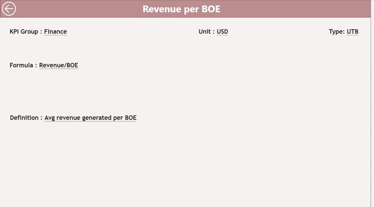
KPI Definition Page – Complete Details of Each KPI
This page is a drill-through page, which means it is hidden and opens only when users click on a KPI in the summary page. It shows:
- KPI Number
- KPI Group
- KPI Name
- Unit
- Formula
- Full KPI Definition
- Type (LTB or UTB)
This page helps teams understand what each KPI means and how it is calculated. Since oil and gas KPIs are technical, this page ensures clarity.
Click to buy Oil & Gas KPI Dashboard in Power BI
How the Excel Data Source Works
The dashboard uses an Excel file with three important sheets:
- Input_Actual Sheet
This sheet stores actual performance numbers, including:
- KPI Name
- Month (use first date of month)
- MTD Value
- YTD Value
- Input_Target Sheet
This sheet stores all target values, such as:
- KPI Name
- Month
- MTD Target
- YTD Target
- KPI Definition Sheet
This sheet includes:
- KPI Number
- KPI Group
- KPI Name
- Unit
- Formula
- Definition
- Type (LTB / UTB)
This structure keeps the data organized and easy to maintain.
Click to buy Oil & Gas KPI Dashboard in Power BI
Important KPIs Monitored in Oil & Gas Dashboard
Every company chooses different KPIs. However, some of the most common KPIs in oil and gas include:
Operational KPIs
- Production Volume
- Drilling Efficiency
- Well Downtime
- Equipment Utilization
- Pipeline Throughput
Health, Safety & Environment (HSE) KPIs
- Total Recordable Incident Rate (TRIR)
- Lost Time Injury Frequency (LTIF)
- Environmental Compliance Rate
- Safety Training Hours
Financial KPIs
- Cost per Barrel
- Operating Expenses
- Profit per Well
- Maintenance Cost Variance
Supply Chain KPIs
- Inventory Turnover
- Delivery Timeliness
- Supplier Performance Index
Power BI makes it easy to display all of these KPIs in interactive visuals.
How Power BI Helps Oil & Gas Companies Improve Results
Power BI offers several advantages:
- Real-time reports
- Automatic data refresh
- Drill-down analysis
- Clear performance visuals
- Mobile-friendly dashboards
- Easy sharing with teams
Because of these features, oil and gas companies move from slow reporting to quick insights.
Advantages of the Oil & Gas KPI Dashboard in Power BI
Faster Decision-Making
Teams get instant insights without waiting for manual reports.
Better Safety Compliance
HSE KPIs are visible in real-time, helping reduce workplace incidents.
Improved Operational Efficiency
Production issues and delays become visible early, helping teams act quickly.
Accurate Financial Tracking
The dashboard tracks costs, targets, and variances clearly.
Easy Data Comparison
Users can compare current performance with previous year trends.
Smart Visualization Using Icons
Green and red icons show performance instantly.
Centralized Reporting
All KPIs appear in one place, making teamwork easier.
Best Practices for Building an Oil & Gas KPI Dashboard in Power BI
Select Clear KPIs
Use KPIs that match business goals such as production quality, safety, or cost efficiency.
Keep Dashboard Layout Clean
Organize visuals so users can understand the report quickly.
Use Consistent Colors
Always use green for good performance and red for issues. This improves clarity.
Automate Data Refresh
Set scheduled refresh so data stays accurate.
Avoid Overcrowded Visuals
Use fewer visuals per page to improve readability.
Add Drill-Through Pages
This helps users analyze KPI definitions and formulas in detail.
Keep Data Organized in Excel
Follow a structured format for Actual, Target, and Definition sheets.
Test the Dashboard with Users
Ask operations, engineering, and finance teams for input before finalizing.
How to Read the KPI Results in the Dashboard
Because oil and gas KPIs use numbers, percentages, and icons, users must understand how to analyze results. Here is a quick guide:
MTD Values
These show performance from the start of the month to the current date.
YTD Values
These show cumulative performance from the beginning of the year.
CY vs PY Comparison
This helps you understand if performance has improved from last year.
Target vs Actual
If the ratio is above 100%, performance exceeded the target.
Icons
- ▲ Green: Good performance
- ▼ Red: Needs improvement
This visual system makes interpretation fast and simple.
How Oil & Gas Teams Use This Dashboard
Different oil and gas departments use the dashboard in different ways:
Production Teams
Track daily output, downtime, and well efficiency.
Maintenance Teams
Monitor equipment performance and minimize failures.
Safety Teams
Review incident rates and ensure safe operations.
Finance Teams
Track costs, variances, and overall expenses.
Management
Monitor business goals and make strategic decisions.
Since everyone sees the same data, communication becomes smooth.
Common Challenges Solved by Using Power BI Dashboards
- Delayed Reporting
Manual spreadsheets cause slow decisions. Power BI solves this with real-time updates.
- Data Errors
Automatic Excel integration reduces manual mistakes.
- Poor Visibility
All KPIs appear in one place for easier monitoring.
- No Trend Analysis
Combo charts show how performance changes over time.
- Hard-to-understand KPI Definitions
Drill-through pages explain everything clearly.
Conclusion
The Oil & Gas KPI Dashboard in Power BI offers a powerful and simple way to track performance, reduce risk, and improve results. It gives a complete view of operations, safety, finance, and efficiency in a single dashboard. Because the dashboard uses data from Excel, it is easy to maintain and update. With real-time insights, oil and gas companies can react faster, make better decisions, and achieve higher productivity.
This dashboard becomes an essential tool for every oil and gas business that wants to grow with confidence.
Frequently Asked Questions (FAQ)
- What is the purpose of an Oil & Gas KPI Dashboard?
The dashboard tracks key performance indicators for production, safety, finance, and operations. It offers real-time insights that help teams make better decisions.
- Can I customize the KPIs in the dashboard?
Yes. You can add, remove, or modify KPIs based on your business needs.
- Does this dashboard support real-time data?
Power BI supports scheduled refresh. If your data source updates frequently, the dashboard also shows near real-time results.
- How many KPIs can I track?
You can track as many KPIs as needed. However, keeping the dashboard clean improves readability.
- Is Excel required for this dashboard?
Yes. The dashboard uses Excel as the data source. You must fill values in three sheets: Actual, Target, and KPI Definition.
- Can non-technical users understand this dashboard?
Absolutely. The visuals, icons, and layout make it easy for anyone to use.
- Can I share this dashboard with my entire team?
Yes. Power BI allows sharing reports with your organization for easy collaboration.
Visit our YouTube channel to learn step-by-step video tutorials
Click to buy Oil & Gas KPI Dashboard in Power BI


