Radio stations and podcasting teams handle thousands of minutes of audio content every month. They manage listener engagement, advertising performance, show ratings, and episode quality. When this data stays scattered across files or tracked manually, teams struggle to understand what works and what needs improvement. Because of this, a Radio & Podcasts KPI Dashboard in Excel becomes a powerful tool that brings clarity and control to your content performance.
In this detailed guide, you will learn everything about using a KPI dashboard specifically designed for radio and podcast analytics. You will also explore its unique features, key benefits, best practices, and answers to common questions. This article explains how you can use Excel to build a structured and data-driven monitoring system for all your radio and podcast KPIs.
Click to buy Radio & Podcasts KPI Dashboard in Excel
What Is a Radio & Podcasts KPI Dashboard in Excel?
A Radio & Podcasts KPI Dashboard in Excel is a ready-to-use tracking system that helps stations, podcasters, and audio content creators monitor their key performance indicators. It provides a complete view of listener behavior, content reach, show performance, revenue insights, and monthly trends. Because the dashboard is built in Excel, you can use slicers, charts, and pivot tables to analyze the data quickly and visually.
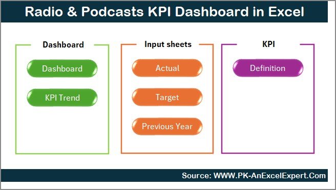
The dashboard includes seven important worksheet tabs—each built for a specific purpose. With these sheets, you can track MTD (Month-to-Date), YTD (Year-to-Date), targets, previous year trends, and KPI definitions in one structured file.
Why Do Radio & Podcast Teams Need a KPI Dashboard?
Radio and podcasting depend on consistent performance. Teams often ask questions like:
- Are listeners growing month by month?
- Is the audience finishing full episodes?
- Are advertisement slots delivering good revenue?
- Which show performs better in ratings?
- Which episodes drive the highest engagement?
A KPI dashboard answers all these questions in one place. It brings together data from different sources and displays it visually so teams can make faster decisions.
Key Features of the Radio & Podcasts KPI Dashboard in Excel
The dashboard includes seven structured worksheets, each designed to help you manage and analyze KPIs effectively. Below is a complete explanation of each sheet.
Summary Page — Your Navigation Center
The Summary Page acts as an index page that helps you jump to different sheets instantly.
You will get six navigation buttons that take you to:
- Dashboard
- Trend Analysis
- Actual Numbers Input
- Target Sheet
- Previous Year Sheet
- KPI Definition Sheet
This page improves user experience and helps teams move between sheets quickly.
Click to buy Radio & Podcasts KPI Dashboard in Excel
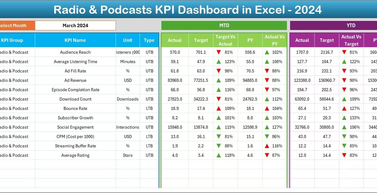
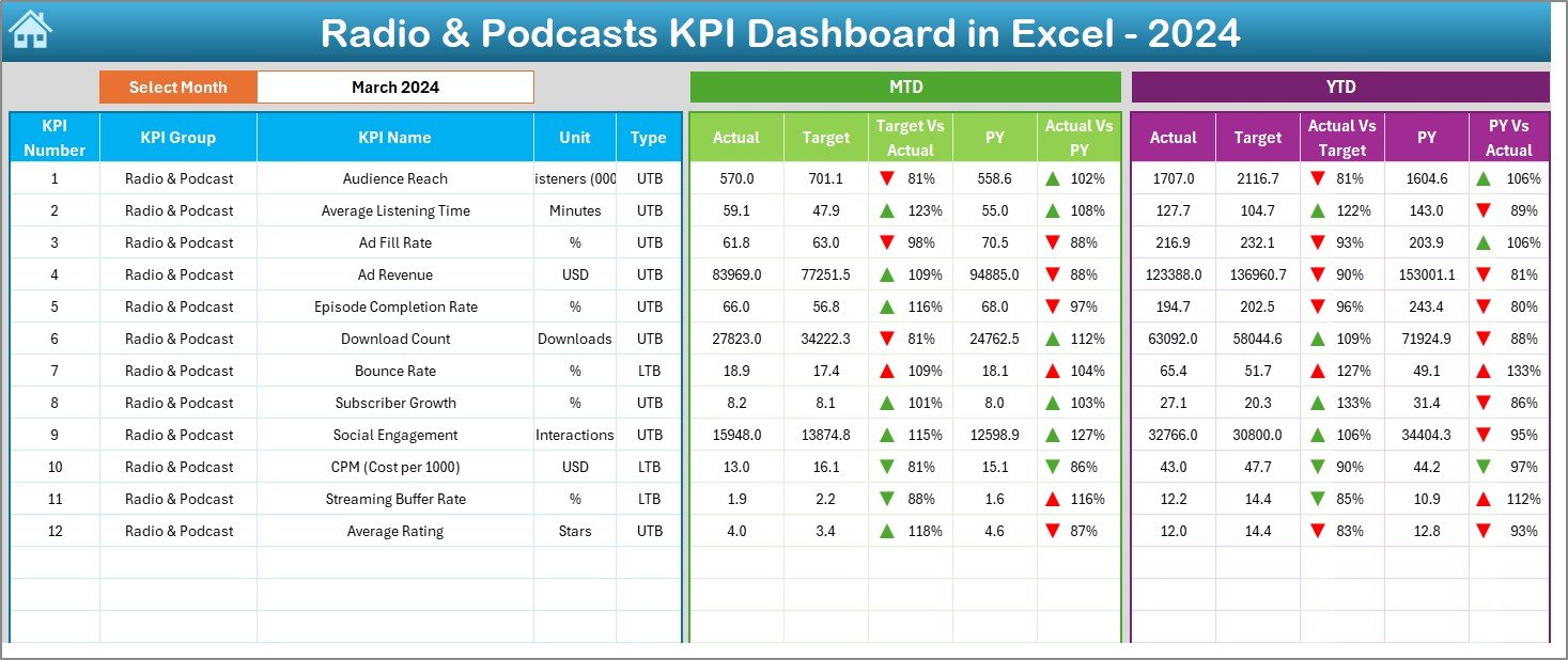
Dashboard Page — The Main KPI Display
The Dashboard sheet tab is the heart of this KPI dashboard. It displays all KPIs with a clear visual structure. Monthly Slicer
You can select the month from the drop-down in cell D3.
When you pick a month, the dashboard updates all KPI values immediately.
KPI Metrics Displayed
For every KPI, the dashboard shows:
- MTD Actual
- MTD Target
- MTD Previous Year
- Target vs Actual (%)
- PY vs Actual (%)
It also includes up/down conditional formatting arrows to show improvement or decline.
YTD Section
You can also compare:
- YTD Actual
- YTD Target
- YTD Previous Year
- YTD Target vs Actual
- YTD PY vs Actual
This sheet gives you a complete overview of the current month and the full year’s progress.
Click to buy Radio & Podcasts KPI Dashboard in Excel
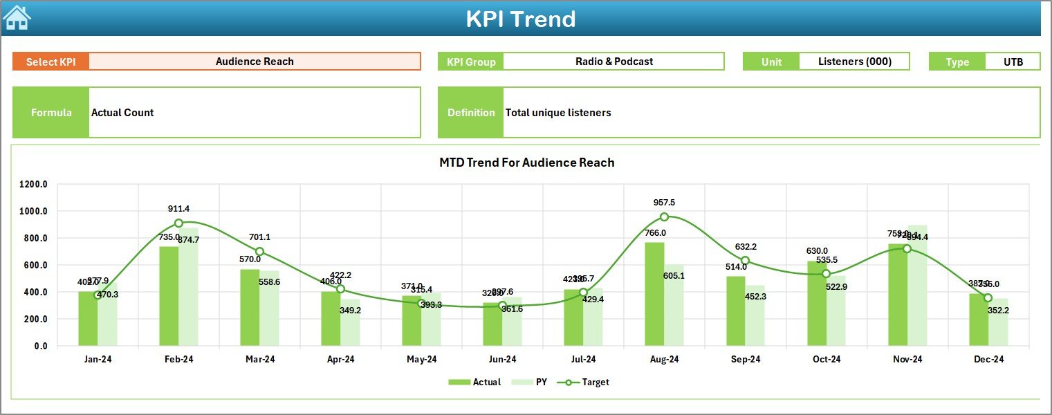
Trend Analysis Page — Visual Monthly KPI Trends
The Trend sheet tab helps you dive deep into each KPI.
Drop-Down for KPI Selection
Select any KPI from the drop-down in cell C3.
The sheet shows:
- KPI Group
- Unit
- KPI Type (UTB or LTB)
- KPI Formula
- KPI Definition
Trend Charts
Two trend charts are available for:
- MTD (Actual, Target, PY)
- YTD (Actual, Target, PY)
These charts help you understand how the KPI moves over time.
Click to buy Radio & Podcasts KPI Dashboard in Excel
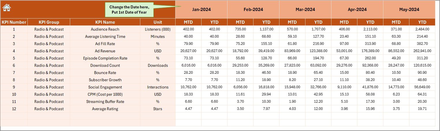
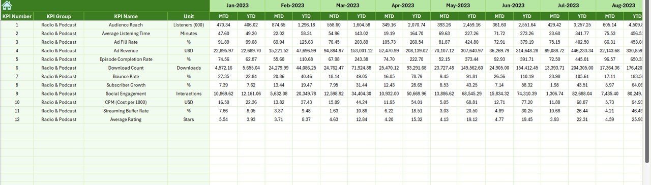
Actual Numbers Input Sheet — Enter Monthly Actuals
In this sheet, you enter monthly actual values.
Flexible Starting Month
Set the first month of the year in cell E1.
Then fill:
- MTD Actual
- YTD Actual
This sheet drives the entire dashboard.
Click to buy Radio & Podcasts KPI Dashboard in Excel
Target Sheet — Set KPI Targets Easily
Here, you enter the MTD and YTD Target numbers for each KPI.
This is the backbone of calculating achievement percentages.
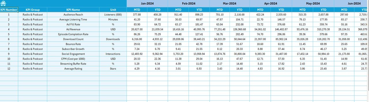
Previous Year Numbers Sheet — Compare with Last Year
You will enter:
- MTD values
- YTD values
for the previous year.
This comparison helps you understand whether your content performance is improving or declining.
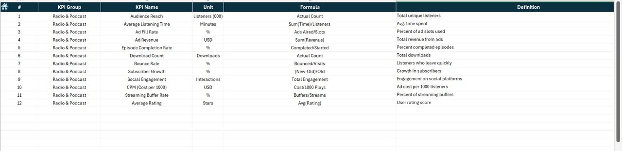
KPI Definition Sheet — Complete KPI Dictionary
This sheet includes:
- KPI Number
- KPI Group
- KPI Name
- Unit
- Formula
- KPI Definition
- Type (UTB / LTB)
This page ensures that every team member understands each KPI clearly.
What KPIs Should a Radio & Podcasts Dashboard Track?
Below are some important KPIs you may track:
Audience & Reach Metrics
- Monthly Listener Count
- Unique Listeners
- Total Plays
- Total Downloads
Engagement Metrics
- Average Listen Duration
- Listener Retention Rate
- Episode Completion Rate
- Bounce Rate
- Play-to-Download Ratio
Quality & Performance Metrics
- Episode Rating
- Show Rating
- Content Quality Score
- Listener Feedback Count
Revenue & Monetization Metrics
- Ad Revenue
- Sponsorship Revenue
- Cost Per Episode
- Revenue Per Listener
You can add more KPIs based on your radio or podcast business model.
Advantages of a Radio & Podcasts KPI Dashboard in Excel
A dedicated KPI dashboard offers many benefits.
- Easy to Use for All Teams
Excel is simple. Every team member can understand it and use the dashboard without learning a new tool.
- Clear Visibility of Content Performance
You can see:
- What works
- What needs improvement
- Which episodes perform better
- Which KPIs are declining
This helps you make real-time improvements.
- Better Decision-Making
You can take strong decisions based on data, not assumptions.
- Faster Reporting
Instead of manual reports, the dashboard calculates:
- MTD
- YTD
- Target vs Actual
- PY vs Actual
This saves hours every month.
- Helps Improve Listener Engagement
You can track retention and completion trends and improve your content strategy.
- Supports Revenue Planning
If ad revenue or show ratings drop, you know exactly where to act.
Opportunities for Improvement in Radio & Podcast Analytics
Even with a dashboard, teams can make improvements:
Add more listener segmentation
Analyze listeners by:
- Age
- Region
- Devices
- Time slots
Track marketing and promotion efforts
Include data for:
- Promo campaigns
- Social media reach
- Ad spend
More advanced forecasting
Use YTD trends to predict:
- Upcoming listener growth
- Expected revenue
- Show performance
Combine multiple platforms
Include data from:
- Spotify
- Apple Podcasts
- YouTube
- Radio broadcast logs
This makes the dashboard even stronger.
Best Practices for Using the Radio & Podcasts KPI Dashboard in Excel
Follow these practices to get the best results.
- Update Actual Numbers Monthly
Enter actual values every month to keep the dashboard accurate.
- Set Realistic Targets
Make sure the targets match:
- Past performance
- Audience size
- Advertising reach
- Review Trend Charts Every Month
Trends show whether performance is improving.
- Keep KPI Definitions Clear
Ensure every KPI has:
- A precise formula
- A clear unit
- A simple definition
- Use Conditional Formatting Wisely
Up and down arrows help users instantly understand performance changes.
- Keep the Dashboard Clean
Avoid cluttering the dashboard with too many KPIs.
Focus on the most important ones.
How the Dashboard Helps Different Teams
Content Creators
They understand which episodes perform better.
Marketing Teams
They analyze listener growth and campaign impact.
Sales Teams
They track ad revenue and sponsorship performance.
Management
They get a high-level view of show performance.
Conclusion
A Radio & Podcasts KPI Dashboard in Excel helps teams understand content reach, listener engagement, and revenue performance. It offers a full view of monthly and yearly trends and supports strong decision-making. Because the dashboard is simple to use, every team member can benefit from it without learning new software. When you update actual numbers regularly and follow best practices, your radio and podcast business grows with clarity and confidence.
Frequently Asked Questions
- What is a Radio & Podcasts KPI Dashboard in Excel?
It is a structured Excel file that tracks listener metrics, revenue, engagement, and monthly performance.
- Who can use this dashboard?
Radio stations, podcast creators, marketing teams, content managers, and media organizations.
- Does the dashboard track monthly and yearly trends?
Yes. It tracks both MTD and YTD trends with interactive charts.
- Do I need advanced Excel skills to use it?
No. The dashboard is easy to use with simple drop-downs and slicers.
- What KPIs can I track?
You can track listener count, downloads, episode ratings, ad revenue, retention rate, and many more.
- Can I customize the KPI list?
Yes. You can add, remove, or modify KPIs based on your business needs.
- How often should I update data?
Update actual values every month for accurate reporting.
- Is this dashboard useful for small podcasters?
Yes. Both small and large audio creators can use it to improve performance.
Visit our YouTube channel to learn step-by-step video tutorials
Watch the step-by-step video tutorial:
Click to buy Radio & Podcasts KPI Dashboard in Excel