Railway operations change every day. Trains move across long routes, stations manage thousands of passengers, and teams try to maintain high safety standards. Because of these fast changes, railway managers need clear data and simple insights. A Railways KPI Dashboard in Excel solves this challenge. It tracks all important performance indicators in one place and helps teams improve service reliability, safety, punctuality, and operational output.
In this complete guide, you will learn everything about creating and using a Railways KPI Dashboard in Excel. You will also understand how each sheet works, how KPIs help railway teams, and how this template supports precise decision-making. The goal is to help you use railway performance data with confidence.
Click to buy Railways KPI Dashboard in Excel
What Is a Railways KPI Dashboard in Excel?
A Railways KPI Dashboard in Excel is a ready-to-use performance tracking system that shows important indicators for railway operations. Railway teams can track monthly and yearly performance, compare actual values with targets, and see trends in a visual format. The dashboard uses simple Excel formulas, conditional formatting, and slicers to create a clean and interactive reporting system.
Because the dashboard works on Excel, teams can update the data without technical skills. They can control the entire performance cycle by entering Actual, Target, and Previous Year values.
Why Do Railways Need a KPI Dashboard?
Railway systems cover many functions such as:
- Train operations
- Passenger management
- Safety and compliance
- Maintenance activities
- Revenue and ticketing performance
- Resource allocation
- Infrastructure management
These functions generate large amounts of data. However, if the data lives in multiple spreadsheets, teams fail to understand the full performance picture.
A KPI Dashboard brings everything into a single view. As a result, teams track performance faster, make decisions on time, and respond to issues early.
How Does the Railways KPI Dashboard in Excel Work?
The dashboard includes 7 important worksheets, and each sheet supports a specific part of the reporting workflow. Because of this structure, you can track KPIs month-wise, year-wise, and category-wise with ease.
Below is the complete breakdown of all seven sheets.
Summary Page – The Central Navigation Hub
The Summary Page works like the homepage of your dashboard. It includes the buttons that help you jump to any worksheet instantly. As a result, you save time, and the dashboard becomes easy to use for all team members.
This page includes:
- Buttons for Dashboard
- Buttons for Trend Sheet
- Buttons for Input Section
- Buttons for Target Sheet
- Buttons for Previous Year Sheet
- Buttons for KPI Definition sheet
Because the Summary Page works as an index, the entire dashboard feels organized and structured.

Click to buy Railways KPI Dashboard in Excel
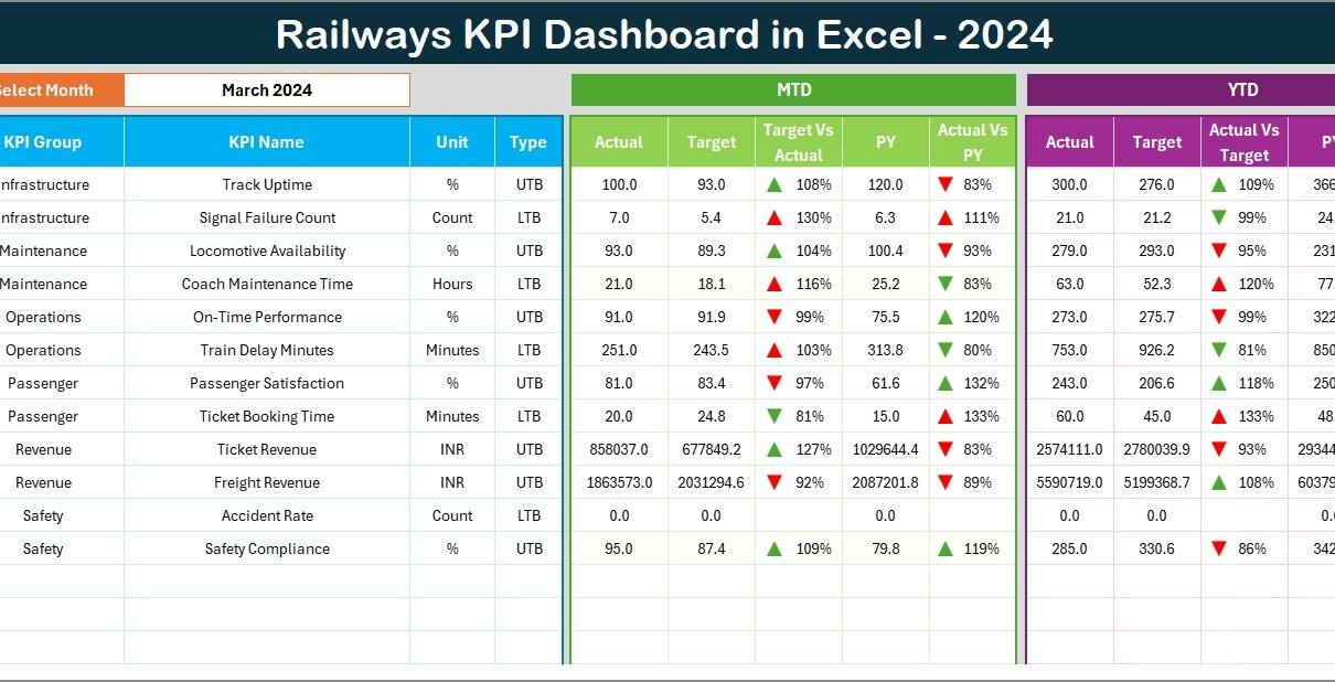
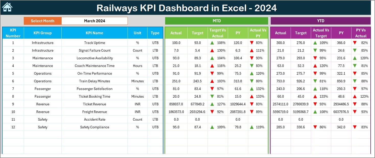
Dashboard Sheet – The Main KPI Reporting Page
The Dashboard Sheet acts as the main output page. It displays all railway KPIs in a clean and interactive format.
Key Features of the Dashboard Sheet
Month Selector at Cell D3
You can pick any month from the drop-down, and the entire dashboard updates instantly.
MTD (Month-to-Date) Insights
You will see:
- Actual MTD
- Target MTD
- Previous Year MTD
- Target vs Actual Comparison
- PY vs Actual Comparison
Conditional formatting shows up-arrow or down-arrow icons to help teams understand whether performance improves or declines.
YTD (Year-to-Date) Insights
You will see:
- Actual YTD
- Target YTD
- Previous Year YTD
- Target vs Actual Comparison
- PY vs Actual Comparison
These comparisons help you understand long-term railway performance throughout the year.
Because the Dashboard Sheet updates based on user input, decision-makers always see real-time results.
Click to buy Railways KPI Dashboard in Excel
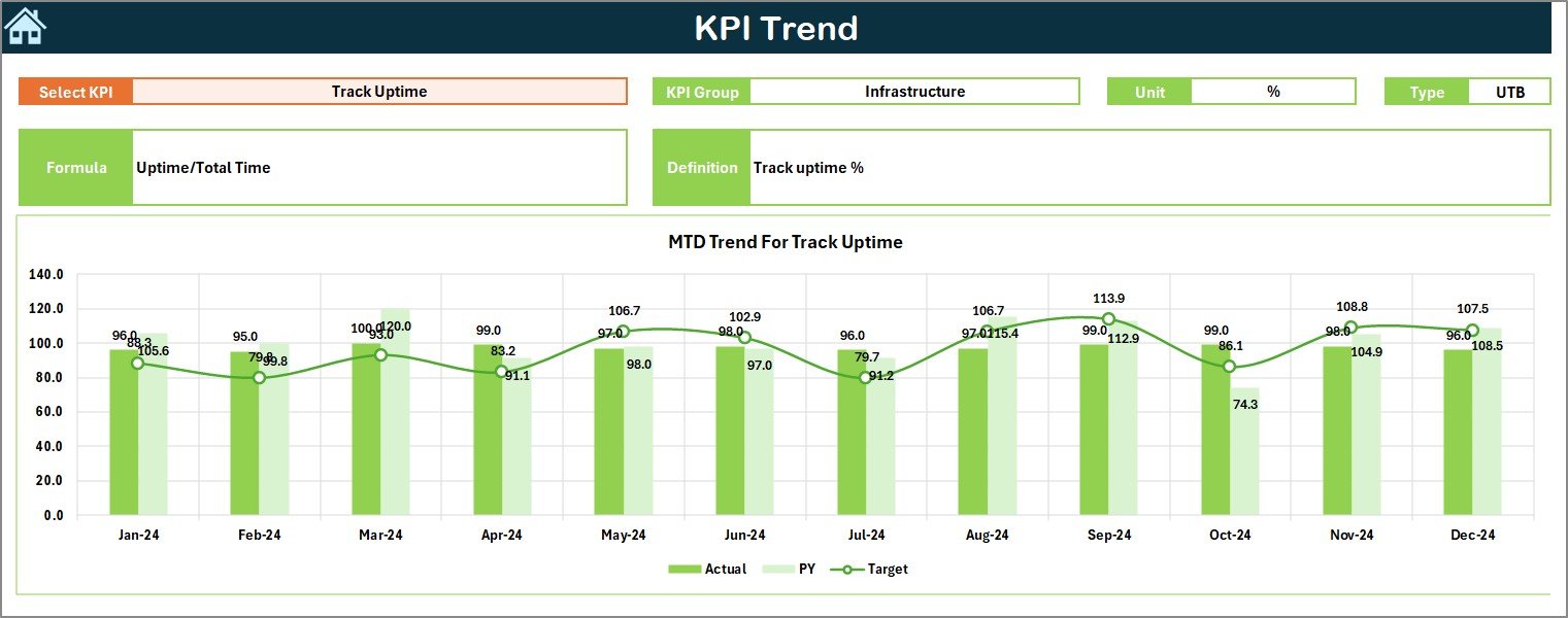
Trend Sheet – Detailed KPI Trends and Charts
The Trend Sheet helps teams analyze long-term patterns. You can choose any KPI Name from the drop-down at cell C3, and the sheet updates all charts and details related to that KPI.
Information Displayed in the Trend Sheet
- KPI Name
- KPI Group
- KPI Unit (such as %, hours, trains, passengers, etc.)
- KPI Type (LTB – Lower the Better, UTB – Upper the Better)
- KPI Formula
- KPI Definition
Trend Charts Displayed
The sheet also shows:
- MTD Trend Chart
- YTD Trend Chart
- Actual vs Target Trend
- Current Year vs Previous Year Trend
Because of these charts, railway teams catch performance issues at the right time.
Click to buy Railways KPI Dashboard in Excel
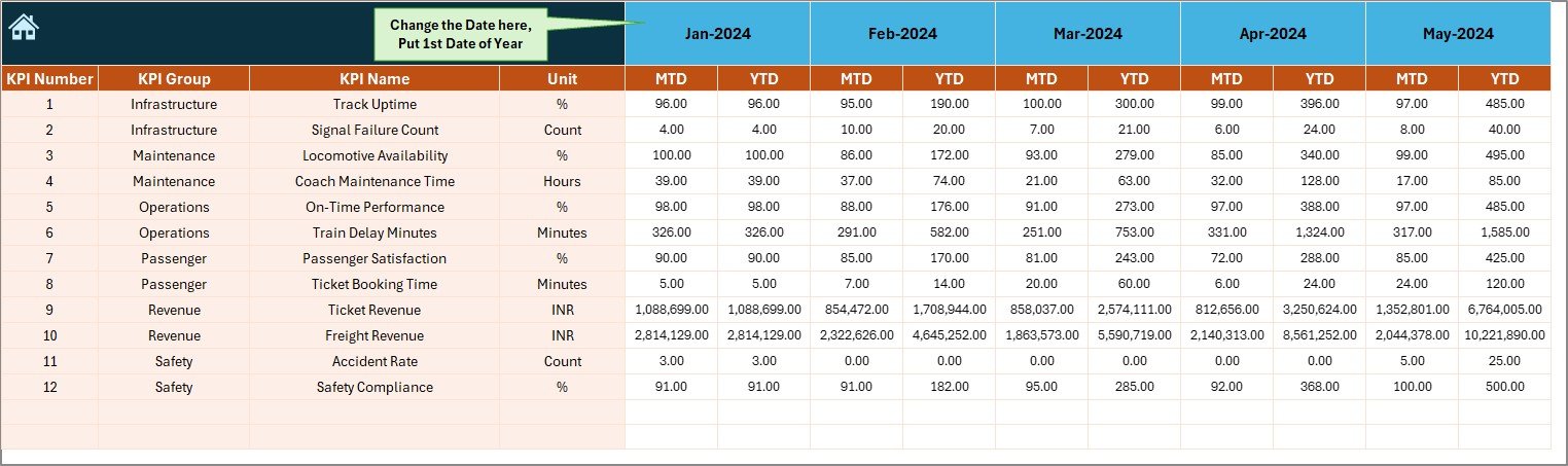
Actual Numbers Input Sheet – Enter Actual Performance Data
This sheet collects all Actual values for both MTD and YTD numbers.
How It Works
- Enter the Actual KPIs for each month
- Select the first month of the year from cell E1
- The dashboard uses these actual values to calculate performance results
Because this is a simple data entry sheet, any user can update it without technical knowledge.
Click to buy Railways KPI Dashboard in Excel
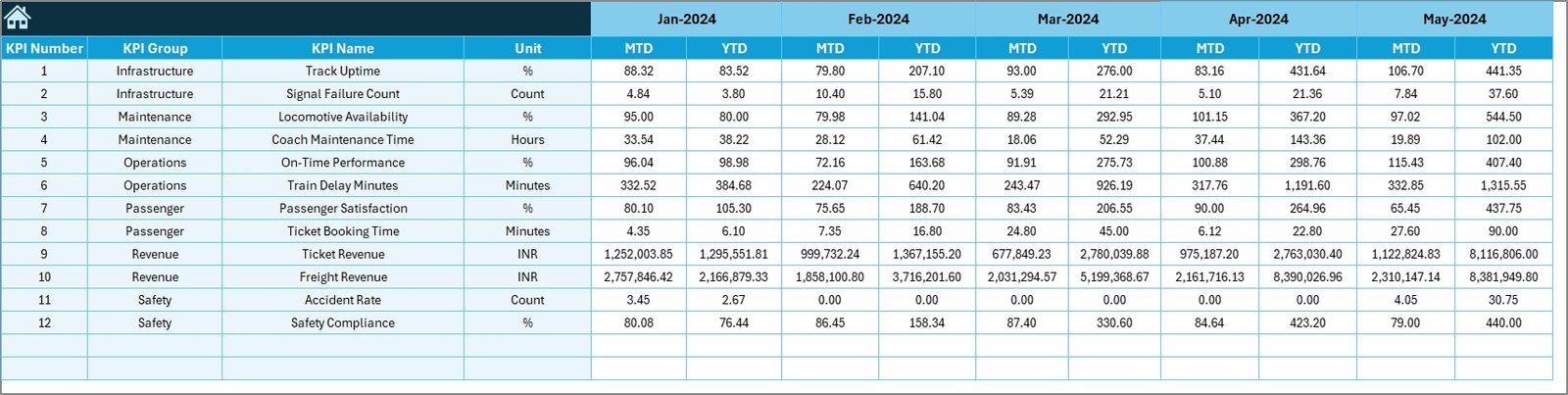
Target Sheet – Enter Monthly and Yearly KPI Targets
The Target Sheet allows teams to set performance goals for every KPI. You can enter:
- MTD Target
- YTD Target
These targets act as the benchmark for performance measurement. When the dashboard compares Actual vs Target, it uses these numbers.
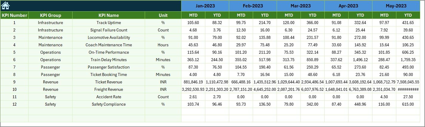
Previous Year Number Sheet – Compare CY with PY Performance
Railway teams need to know whether they perform better than the last year. This sheet collects all Previous Year values for each KPI.
Because the dashboard compares the Current Year and Previous Year, teams get a clear view of growth or decline.
Click to buy Railways KPI Dashboard in Excel
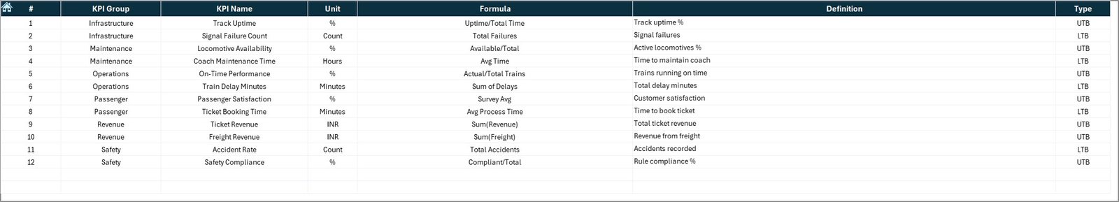
KPI Definition Sheet – Define KPI Logic Clearly
This sheet includes:
- KPI Name
- KPI Group
- KPI Unit
- KPI Formula
- KPI Definition
- KPI Type (LTB or UTB)
Because all KPIs stay documented, users understand exactly how each KPI works.
What KPIs Can Railways Track in This Dashboard?
Railway operations include several important performance areas. You can track KPIs such as:
Operational KPIs
- Train Punctuality
- Average Delay Minutes
- Trip Completion Rate
- Train Utilization Rate
- Freight Tonnage
- Passenger Load Factor
Safety KPIs
- Number of Incidents
- Number of Accidents
- Safety Compliance Score
- Maintenance Completion Rate
Infrastructure KPIs
- Track Availability
- Signal Failure Count
- Rolling Stock Availability
Customer Service KPIs
- Passenger Satisfaction Score
- Ticket Booking Efficiency
- Complaint Resolution Time
Financial KPIs
- Revenue per Passenger
- Cost per KM
- Operating Ratio
Because the dashboard supports MTD and YTD trends, railway leaders understand both short-term and long-term results.
Why Does a Railways KPI Dashboard in Excel Matter?
Railway systems deal with large networks, high-volume operations, and tight schedules. Because of this complexity, managers need clear visibility.
A KPI Dashboard helps in:
Faster decision-making
Better accuracy
Improved safety and compliance
Increased operational efficiency
Higher customer satisfaction
Strong cost control
Without a dashboard, teams work with assumptions instead of data.
Advantages of a Railways KPI Dashboard in Excel
Below are the top advantages of using this dashboard:
- Clear and Simple Reporting
The dashboard summarizes complex railway data in easy visuals. Teams understand performance without reading long spreadsheets.
- Real-time Insights
When you update data, the dashboard changes instantly. Because of this, leaders track ongoing performance every day.
- Zero Technical Skills Needed
Any team member can use the dashboard. Excel makes the process easy and familiar.
- Strong Decision-Making Power
The dashboard highlights strengths and weaknesses. Managers take corrective actions early.
- Detailed Trend Analysis
MTD and YTD charts help users understand long-term patterns.
- Better Annual Planning
Previous Year comparisons help teams set better goals for the future.
- Full Customization
You can add more KPIs, new sheets, or new visuals as your railway system grows.
Best Practices for Using the Railways KPI Dashboard in Excel
Follow these best practices to get maximum value:
- Update Data Every Month
Regular updates help you maintain accurate performance tracking.
- Keep KPIs Clear and Meaningful
Use simple KPI names that represent real operational activities.
- Use the Correct KPI Type (LTB/UTB)
Choose “Lower the Better” or “Upper the Better” correctly because it controls performance icons.
- Validate Target Values
Keep the Targets realistic and aligned with operational goals.
- Use Conditional Formatting Wisely
Icons help users view performance quickly, so maintain them properly.
- Review Trend Charts Often
Trends reveal hidden patterns that normal tables cannot show.
- Train Your Team
Help your team understand the dashboard structure before using it.
Conclusion
Railway operations depend on accuracy, speed, and safety. Because conditions change every day, railway teams need a simple and trusted reporting tool. The Railways KPI Dashboard in Excel gives them everything in one place. It helps teams track monthly and yearly performance, compare results, and understand trends with clarity.
The dashboard uses seven structured sheets that support data entry, visualization, comparison, and decision-making. As a result, railway leaders act faster, improve service quality, and achieve operational excellence.
When you use this dashboard correctly, you get a strong and reliable foundation for continuous improvement.
Frequently Asked Questions (FAQs)
- What is a Railways KPI Dashboard in Excel?
It is a performance tracking system that displays railway KPIs using simple Excel features such as formulas, charts, drop-downs, and conditional formatting.
- Why should railway teams use this dashboard?
It helps teams track MTD and YTD performance, compare results, and take timely actions.
- Do I need advanced Excel skills to use this dashboard?
No. The dashboard works with basic Excel knowledge.
- Can I add more KPIs to the dashboard?
Yes. You can add unlimited KPIs to the KPI Definition Sheet and link them to data sheets.
- Does the dashboard support visual trend analysis?
Yes. The Trend Sheet includes charts for MTD and YTD performance for Actual, Target, and Previous Year numbers.
- Can this dashboard be customized for freight or passenger operations?
Yes. You can design custom KPI groups for both freight and passenger divisions.
- Does the dashboard compare Current Year and Previous Year data?
Yes. It uses the Previous Year sheet for direct performance comparison.
- Can I use this dashboard for multiple regions or zones?
Yes. You can add new columns or filters to expand the dashboard.
Visit our YouTube channel to learn step-by-step video tutorials
Watch the step-by-step video tutorial:
Click to buy Railways KPI Dashboard in Excel