Improving Research & Development (R&D) performance takes clarity, strong monitoring, and timely decisions. R&D teams work on multiple projects, experiments, prototypes, and innovations at the same time. As a result, managers want a simple way to track every KPI that impacts product development, cost, quality, cycle time, and team efficiency. However, data usually stays spread across different Excel files, disconnected systems, and manual sheets. Because of this, teams struggle to see progress in real time.
A Research & Development (R&D) KPI Dashboard in Power BI solves this challenge. It brings all important KPIs onto one clean and interactive screen. You track MTD performance, YTD results, previous year performance, and target achievements within seconds. You also compare project-level KPIs, innovation metrics, research timelines, testing success rates, and cost trends without switching between files.
This detailed guide explains everything about the R&D KPI Dashboard in Power BI. You will learn how the dashboard works, what it shows, why it helps R&D teams, and the best ways to use it. You will also read about the KPI definition structure, trend analysis, benefits, and common questions.
Click to buy Research & Development (R&D) KPI Dashboard in Power BI
What Is an R&D KPI Dashboard in Power BI?
A Research & Development (R&D) KPI Dashboard in Power BI is a ready-to-use performance management dashboard built for R&D teams, innovation departments, engineering units, product development teams, and research labs. It shows MTD and YTD performance, KPI trends, actual vs target results, and previous year comparisons in a simple, visual, and interactive layout.
It helps you track:
- Project progress
- Prototype success rate
- Experiment cycle time
- Testing results
- Innovation output
- Cost performance
- Monthly development capacity
- Research efficiency
- Quality improvements
- Target achievements
Because this dashboard runs on Power BI, you enjoy automated data refresh, strong visuals, drill-through capabilities, and real-time insights. You also manage your KPIs in a single Excel file, so you do not struggle with multiple manual reports.
Why Do R&D Teams Need a Power BI KPI Dashboard?
R&D is one of the most complex functions inside any organization. It deals with innovation, new ideas, research challenges, unpredictable timelines, and heavy project workloads. Teams want clarity, yet they often use scattered data.
The dashboard helps because:
- It merges all KPIs into one view.
- It shows the real performance of every KPI.
- It increases transparency across research work.
- It supports faster and smarter decision-making.
- It highlights areas that need improvement.
- It reduces manual reporting time.
Since all information stays visible on a single screen, R&D leaders respond faster to delays, challenges, and performance gaps.
Key Features of the R&D KPI Dashboard in Power BI
This dashboard includes 3 pages, each designed to give a complete understanding of every KPI.
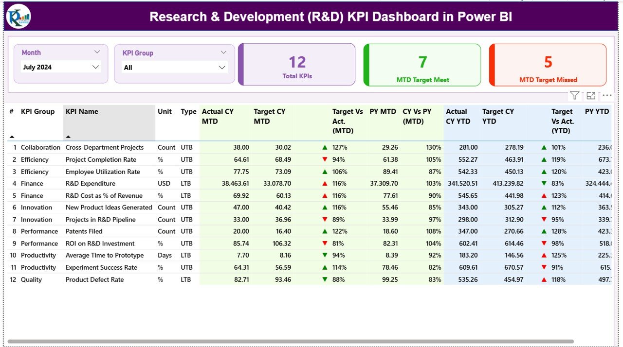
Summary Page – Your Main Control Center
The Summary Page is the heart of the dashboard. It shows all important KPIs with real-time filters and visual indicators.
Top Filters
- Month slicer
- KPI Group slicer
You select a month and a KPI category to view focused performance.
Performance Cards
The page displays 3 high-level cards:
- Total KPIs Count
- MTD Target Met Count
- MTD Target Missed Count
These cards help you understand in one glance whether performance is moving in the right direction.
Detailed KPI Table
Below the cards, you see a full KPI table with:
- KPI Number – unique KPI identifier
- KPI Group – innovation, testing, cycle time, cost, etc.
- KPI Name – name of the performance indicator
- Unit – percentage, hours, count, cost, etc.
- Type – LTB (Lower the Better) or UTB (Upper the Better)
- Actual CY MTD – current month-to-date actual value
- Target CY MTD – current month-to-date target
- MTD Icon – green ▲ or red ▼ based on target achievement
- Target vs Actual (MTD) – % achievement
- PY MTD – previous year MTD value
- CY vs PY (MTD) – % comparison against last year
- Actual CY YTD – current YTD actual
- Target CY YTD – current YTD target
- YTD Icon – green ▲ or red ▼ for YTD status
- Target vs Actual (YTD) – % achievement
- PY YTD – previous year YTD value
- CY vs PY (YTD) – % comparison
The visual indicators make it easy to understand which KPIs perform well and which require attention.
Click to buy Research & Development (R&D) KPI Dashboard in Power BI
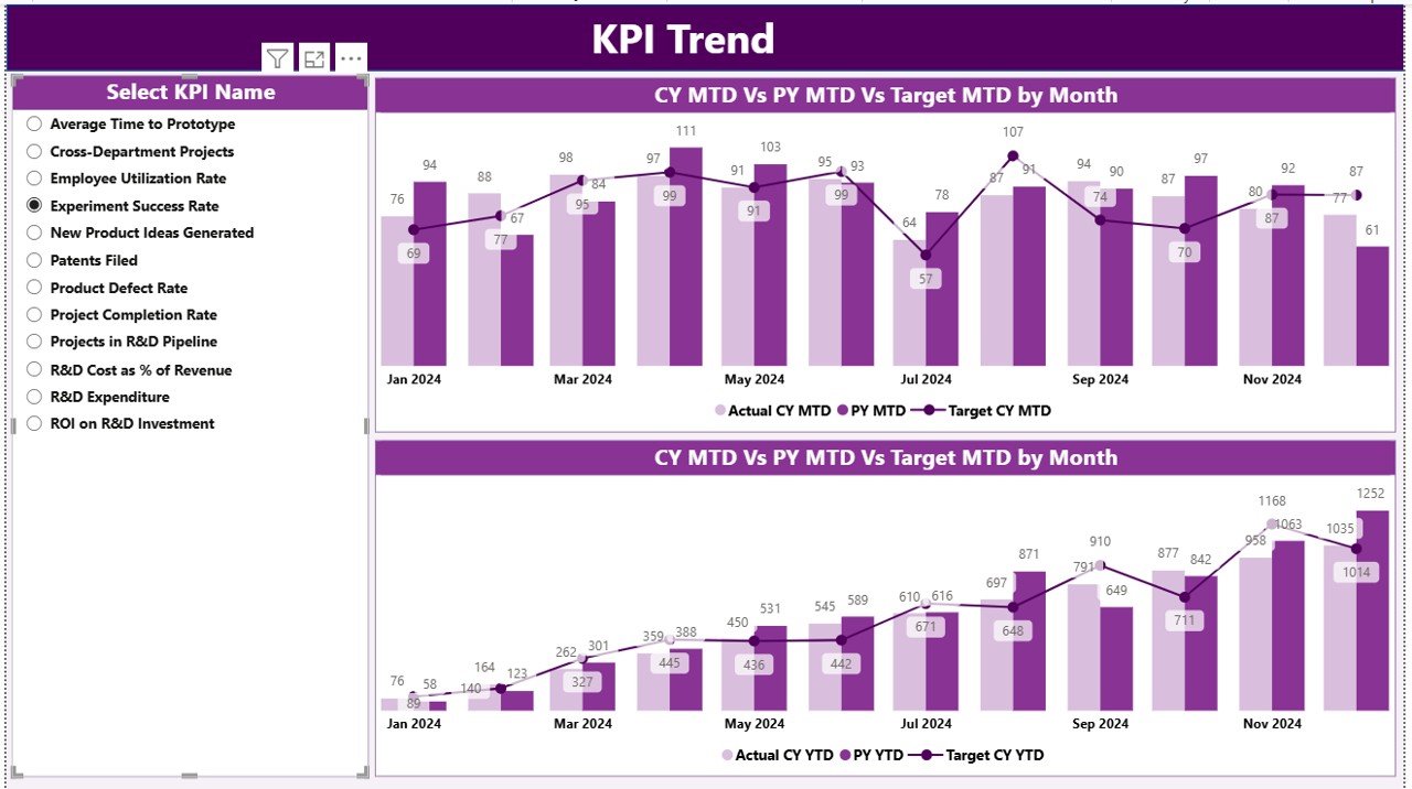
KPI Trend Page – Understand Performance Trends
The KPI Trend Page allows you to view performance trends for MTD and YTD values.
You select a KPI from the slicer on the left, and the page shows:
- MTD Actual
- MTD Target
- MTD Previous Year
- YTD Actual
- YTD Target
- YTD Previous Year
The combo charts help you understand:
- Is performance improving?
- Is the team reaching targets?
- Is the current year better than last year?
- Are there any repeated performance gaps?
- Are seasonal trends visible?
This page gives leadership a deeper understanding of KPI movement across the year.
Click to buy Research & Development (R&D) KPI Dashboard in Power BI
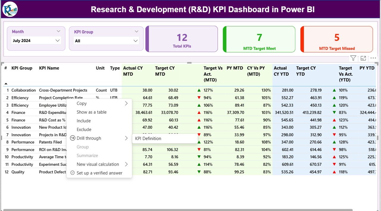
KPI Definition Page – Complete KPI Details
The KPI Definition Page is a hidden drill-through page. You reach it by selecting any KPI on the Summary Page and choosing “Drill Through”.
This page shows:
- KPI Number
- KPI Group
- KPI Name
- Unit
- Formula
- Definition
- Type (LTB or UTB)
It helps managers and analysts understand the logic behind the KPI.
Power BI includes a back button on the top-left corner to return to the Summary Page instantly.
Click to buy Research & Development (R&D) KPI Dashboard in Power BI
How the Excel Data Structure Works
The dashboard uses one Excel file with three worksheets:
Input_Actual Sheet
You fill:
- KPI Name
- Month (first date of the month)
- MTD Actual
- YTD Actual
This sheet captures real performance numbers.
Input_Target Sheet
You fill:
- KPI Name
- Month
- MTD Target
- YTD Target
This sheet captures performance goals.
KPI Definition Sheet
You define:
- KPI Number
- KPI Group
- KPI Name
- Unit
- Formula
- Definition
- Type (LTB / UTB)
This sheet provides the logic behind every KPI.
Because all data stays in Excel, even non-technical users manage it easily. Power BI picks updated values with one refresh.
Advantages of an R&D KPI Dashboard in Power BI
- You Improve Innovation Output
The dashboard shows which research areas perform well and which need improvement. As a result, you manage innovation more effectively.
- You Track KPIs in Real Time
You no longer wait for weekly or monthly manual reports.
- You Reduce Cost and Waste
You track cost KPIs, testing efficiency, cycle time, and delay factors. This ensures better project budgeting.
- You Increase Team Accountability
Clear KPIs mean clear expectations. Teams understand what they must deliver and how they perform.
- You Improve Decision-Making
- With clear visual indicators, managers act faster and more confidently.
- You Simplify Reporting
- Instead of maintaining many Excel files, you use one dashboard to view everything.
- You Compare Current vs Previous Year
- The dashboard gives a strong time-based analysis, which helps in long-term planning.
- You Track Monthly and Yearly Goals
MTD and YTD comparisons make it easy to see overall performance status.
What KPIs Should an R&D Team Track?
Here are the most important R&D KPIs:
- Prototype Success Rate
- Research Cycle Time
- Product Development Cost
- Testing Success Ratio
- Innovation Pipeline Count
- Patent Filing Count
- R&D Budget Utilization
- Experiment Failure Rate (LTB)
- On-Time Project Completion Rate
- Team Productivity Score
- No. of Experiments Conducted
- Quality Improvement Ratio
These KPIs help teams improve every part of the research lifecycle.
How This Dashboard Helps R&D Leaders
Leaders often struggle to:
- See which projects face delays
- Track cost consumption
- Evaluate research priorities
- Compare performance across teams
- Measure return on research investments
This dashboard removes those gaps. It keeps the entire R&D function aligned with strategy, goals, innovation, and timelines.
Best Practices for Using an R&D KPI Dashboard
- Keep KPIs Clear and Simple
Avoid complex KPIs that confuse the team. Define every KPI in the KPI Definition sheet.
- Refresh Data Regularly
Daily or weekly refresh ensures correct insights.
- Use Consistent Units
Use percentage, count, hours, or cost units consistently across KPIs.
- Review Trend Pages Every Month
Trend pages show slow-moving risks early.
- Update Targets Every Quarter
R&D priorities shift fast, so targets must reflect that.
- Conduct KPI Review Meetings
Use the Summary Page in team meetings to align teams.
- Share the Dashboard with Key Stakeholders
Allow leadership to view real-time R&D performance anytime.
- Avoid Too Many KPIs
Track only KPIs that support decision-making.
- Maintain the Excel File Carefully
Clean and structured data leads to accurate dashboard results.
Conclusion
A Research & Development (R&D) KPI Dashboard in Power BI brings clarity, speed, and accuracy into the R&D function. It unifies all KPIs, reduces manual work, highlights performance gaps, and helps leadership take better decisions. With its Summary Page, KPI Trend Page, and KPI Definition Page, you get a complete view of research outcomes, testing efficiency, innovation performance, and yearly progress. Because it runs on Power BI, the dashboard becomes simple, interactive, automated, and easy to scale.
R&D teams that use this dashboard work faster, innovate better, and achieve targets more consistently.
Frequently Asked Questions (FAQs)
- What is an R&D KPI Dashboard in Power BI?
It is a ready-to-use dashboard that tracks all R&D performance KPIs like cycle time, testing success rate, cost utilization, and innovation output.
- Who can use this dashboard?
R&D teams, engineering departments, innovation units, product development teams, and research labs.
- What data source does this dashboard use?
An Excel file with Actual, Target, and KPI Definition sheets.
- Can I add more KPIs later?
Yes, you add new KPIs to the Excel file, and Power BI will automatically pick them after refresh.
- Does the dashboard show trends?
Yes, the KPI Trend Page shows MTD and YTD trends for current year, previous year, and targets.
- Is the dashboard easy to maintain?
Yes, even non-technical users can manage it by updating three Excel sheets.
- Can I customize the dashboard colors and layout?
Yes, Power BI allows full customization based on your theme or company branding.
- Does it support drill-through insights?
Yes, the KPI Definition Page provides detailed KPI formulas and definitions through drill-through.
Visit our YouTube channel to learn step-by-step video tutorials
Watch the step-by-step video tutorial:
Click to buy Research & Development (R&D) KPI Dashboard in Power BI