In today’s digital era, brands no longer rely only on traditional surveys or feedback forms to understand their audience. Instead, they listen — not with ears, but through data. Social listening is the modern tool that helps businesses monitor online conversations, measure sentiment, and make informed marketing decisions.
However, tracking all this data manually can be overwhelming. That’s why a Social Listening KPI Dashboard in Power BI is the perfect solution. It transforms raw data from social media platforms into clean, visual, and actionable insights.
In this article, you’ll discover what this dashboard is, how it works, its structure, and why it’s essential for any modern marketing team.
Click to buy Social Listening KPI Dashboard in Power BI
What Is a Social Listening KPI Dashboard in Power BI.
A Social Listening KPI Dashboard in Power BI is an analytical tool that consolidates and visualizes data from various social media and online platforms. It helps marketers monitor brand mentions, sentiment, engagement, and campaign effectiveness — all in one centralized Excel or Power BI environment.
Instead of jumping between multiple tools, teams can view real-time key performance indicators (KPIs) and evaluate both Month-to-Date (MTD) and Year-to-Date (YTD) trends.Social Listening KPI Dashboard in Excel
This dashboard empowers decision-makers to identify:
- What people are saying about the brand.
- How campaigns perform across platforms.
- Which metrics need immediate improvement.
Structure of the Dashboard
The Social Listening KPI Dashboard in Power BI is simple, yet incredibly powerful. It contains three main pages — each serving a unique analytical purpose.Social Listening KPI Dashboard in Excel
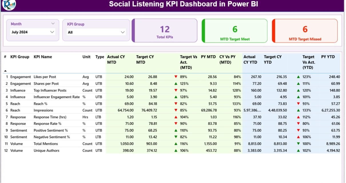
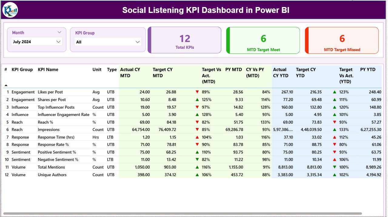
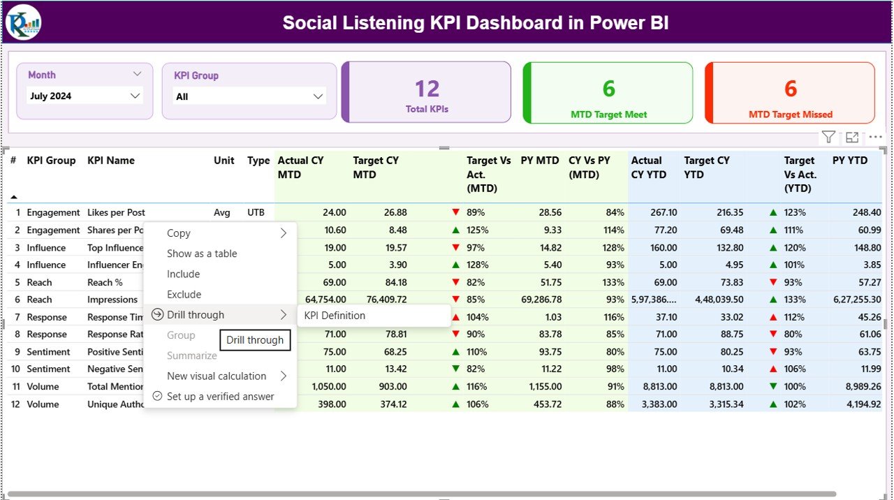
Summary Page
The Summary Page acts as the control center of the dashboard. It gives an at-a-glance overview of all social listening KPIs and their performance.
Key Features:
- Interactive Slicers: Filter results by month and KPI group.
- Performance Cards:
- Total KPIs count
- MTD Target Met count
- MTD Target Missed count
- Dynamic KPI Table: Displays:
- KPI Number & Group: For categorization.
- KPI Name & Unit: Clarifies what each KPI represents.
- Type (LTB/UTB): Indicates if a higher or lower value is better.
- Actual CY MTD / Target CY MTD: Displays the current month’s actual vs. target performance.
- MTD Icons: Green ▲ or Red ▼ icons quickly show if the target is met or missed.
- Target vs. Actual (MTD): Ratio of actual to target (Actual ÷ Target).
- PY MTD: Previous year’s Month-to-Date numbers for comparison.
- CY vs. PY (MTD): Growth or decline compared to last year.
- YTD Metrics: Similar comparisons but for Year-to-Date.
This layout allows users to instantly identify performance trends, target gaps, and year-over-year improvements.
Click to buy Social Listening KPI Dashboard in Power BI
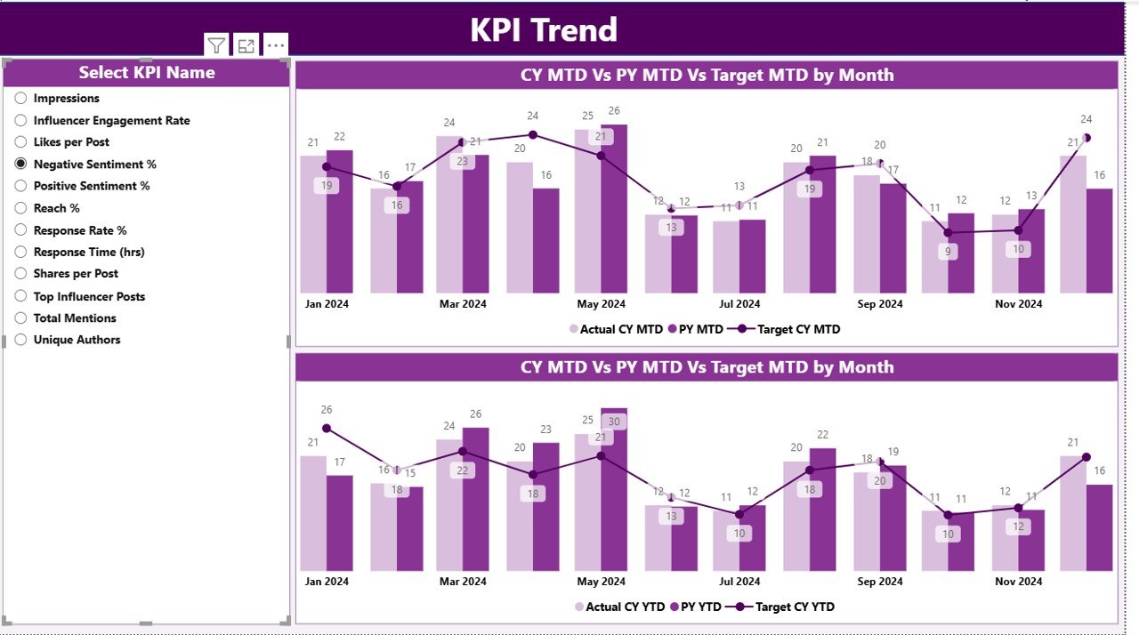
KPI Trend Page
The KPI Trend Page offers a deeper look into data patterns. It displays combo charts that visualize:
- Actual numbers of the current year.
- Targets and previous year values for both MTD and YTD.
Users can choose specific KPIs using the slicer on the left panel. These charts help reveal:
- Seasonal patterns.
- Monthly performance progressions.
- Areas where marketing efforts need adjustments.
Click to buy Social Listening KPI Dashboard in Power BI
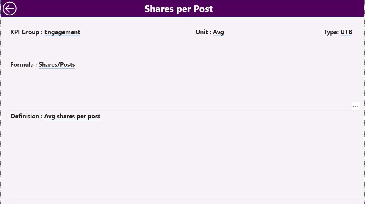
KPI Definition Page
The KPI Definition Page serves as a reference guide. It’s a hidden drill-through page accessible from the Summary Page. When users click on a specific KPI, they can view:
- The formula used to calculate it.
- A short definition describing its purpose.
- The type (LTB or UTB) indicator.
This transparency helps everyone — from analysts to marketers — understand how each metric contributes to overall brand performance.
Click to buy Social Listening KPI Dashboard in Power BI
Excel Data Structure
The data foundation of this dashboard lies in three key Power BI worksheets that feed the Power BI or Excel visualization:
Input_Actual Sheet
Captures actual numbers for each KPI.
Columns include:
- KPI Name
- Month (use the first day of each month for consistency)
- MTD Value
- YTD Value
Input_Target Sheet
Stores the target values for each KPI.
Columns include:
- KPI Name
- Month
- MTD Target
- YTD Target
Click to buy Social Listening KPI Dashboard in Power BI
KPI Definition Sheet
Contains metadata for each KPI.
Columns include:
- KPI Number
- KPI Group
- KPI Name
- Unit of Measurement
- Formula
- Short Definition
- Type (LTB or UTB)
These structured sheets make the dashboard dynamic and easily refreshable whenever new data arrives.
Why Social Listening Matters for Businesses
Social listening goes beyond tracking likes or comments. It’s about understanding public perception, detecting trends early, and responding effectively.
Key Benefits of Social Listening:
- Detect emerging customer needs and complaints.
- Identify influencer or competitor activity.
- Manage brand reputation through real-time alerts.
- Analyze sentiment to measure campaign success.
- Align content strategy with audience interests.
A well-designed dashboard in Excel helps translate this complex data into meaningful visuals and KPIs.
Advantages of the Social Listening KPI Dashboard in Power BI.
Let’s explore how this dashboard transforms social media monitoring into actionable insight:
Centralized View of Data
All KPIs are visible on one screen — from engagement metrics to sentiment trends. This eliminates manual reporting and reduces time spent switching between tools.
Real-Time Performance Tracking
With MTD and YTD analysis, users can track how performance evolves over time and make immediate corrections.
Interactive Analysis
Filters, slicers, and drill-throughs make analysis flexible. Users can explore performance at any level — by month, KPI type, or campaign.
Data Transparency
The KPI Definition Page ensures everyone understands how each KPI is calculated, promoting trust and collaboration across teams.
Visual Insights
Charts, icons, and conditional formatting make complex numbers intuitive. Managers can see instantly where performance excels or lags.
With this dashboard, analysts can perform various performance analyses:
- MTD vs. Target Analysis – Identify which KPIs are meeting goals and which need intervention.
- YTD Growth Analysis – Track long-term progress and compare across years.
- Sentiment Shift Analysis – See how public perception changes after campaigns or announcements.
- Platform Comparison – Compare engagement performance across Twitter, Instagram, LinkedIn, and others.
- Crisis Monitoring – Quickly spot spikes in negative sentiment or mentions.
Opportunities for Improvement
Even with a well-structured dashboard, there’s always room for enhancement.
- Automate Data Updates: Connect Excel with APIs or Power Query to import social data automatically.
- Add Predictive Analytics: Include trendlines or forecasting for upcoming months.
- Integrate Real-Time Feeds: Use connectors to pull live social data for more frequent updates.
- Enhance Visual Appeal: Apply theme-based color coding for sentiment or brand categories.
- Expand KPI Coverage: Include influencer engagement, viral content tracking, or sentiment by region.
Best Practices for the Social Listening KPI Dashboard in Power BI?
To ensure the dashboard remains accurate, actionable, and relevant, follow these best practices:
Keep the Data Clean
Regularly validate KPI names, dates, and units to prevent errors in charts or formulas.
Define KPIs Clearly
Each KPI should have a short, understandable definition and a formula documented on the KPI Definition Sheet.
Use Conditional Formatting
Color codes and icons (▲▼) provide visual clarity on performance status.
Create a Version Control System
Maintain a backup of the Excel data each month to track changes and progress historically.
Link with Power BI for Advanced Visualization
While the base data resides in Excel, connecting it with Power BI enhances visual storytelling.
Involve Multiple Stakeholders
Encourage input from marketing, customer service, and data teams to refine KPIs and align goals.
Conclusion
The Social Listening KPI Dashboard in Excel empowers businesses to listen intelligently, act decisively, and grow strategically. By consolidating social data into one easy-to-use interface, teams gain complete visibility over brand perception and campaign performance.
Whether you’re tracking sentiment, mentions, or engagement, this Excel-based tool transforms data into direction — helping organizations strengthen their brand presence in the noisy digital world.
Frequently Asked Questions (FAQs)
- What is the purpose of a Social Listening KPI Dashboard?
It helps businesses monitor online conversations and understand audience sentiment, enabling data-driven marketing and reputation management.
- Can this dashboard connect to social media platforms automatically?
Yes, by using Power Query or APIs, you can automate data imports from Twitter, Facebook, or LinkedIn directly into Excel.
- What are the most important KPIs for social listening?
Key KPIs include sentiment score, total mentions, engagement rate, share of voice, and response time.
- Who should use this dashboard?
Marketing, PR, analytics, and customer support teams can all benefit from this tool to make informed decisions and track performance.
- Is Power BI required to use this dashboard?
No. While Power BI enhances visualization, the entire system works efficiently within Excel for users preferring spreadsheet environments.
- How often should the data be updated?
For accurate tracking, update data monthly — though weekly updates are ideal for fast-moving brands.
- Can this dashboard be customized for specific industries?
Absolutely. You can modify KPI names, units, and categories to suit sectors like e-commerce, hospitality, healthcare, or tech.
- How does this dashboard help improve brand reputation?
It identifies spikes in negative sentiment early, allowing proactive engagement and corrective actions before issues escalate.
Visit our YouTube channel to learn step-by-step video tutorials
Watch the step-by-step video tutorial:
Click to buy Social Listening KPI Dashboard in Power BI