In today’s fast-paced business environment, collaboration plays a key role in driving efficiency, productivity, and innovation. Teams that communicate well and work together seamlessly often outperform those that operate in silos. However, measuring collaboration can be challenging without the right tools.
This is where a Team Collaboration KPI Dashboard in Excel comes into play. By tracking key performance indicators (KPIs) related to teamwork, communication, and shared goals, organizations can ensure that collaboration remains strong and measurable.
In this article, we will explore everything you need to know about this dashboard—its structure, features, benefits, best practices, and even real-world applications.
Click to buy Team Collaboration KPI Dashboard in Excel
What Is a Team Collaboration KPI Dashboard in Excel?
A Team Collaboration KPI Dashboard in Excel is a ready-to-use tool that consolidates collaboration-related metrics in one interactive platform. It allows managers, team leaders, and executives to visualize progress, compare performance across periods, and identify gaps in teamwork.
Instead of dealing with scattered reports or manual updates, this Excel dashboard provides a single source of truth where collaboration KPIs can be monitored monthly, quarterly, or annually.
With drop-down menus, charts, conditional formatting, and interactive buttons, this dashboard is not just a reporting tool but a decision-making partner.
Key Features of the Team Collaboration KPI Dashboard
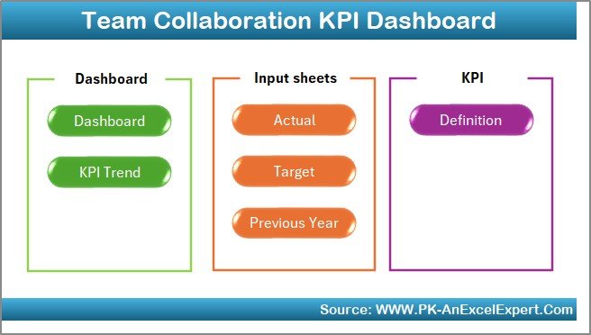
This prebuilt dashboard comes with seven well-structured worksheets, each serving a specific purpose. Let’s break them down:
Home Sheet
- Acts as the index page for the entire dashboard.
- Includes six navigation buttons to quickly jump to the respective sheets.
- Saves time and improves user experience.
Click to buy Team Collaboration KPI Dashboard in Excel
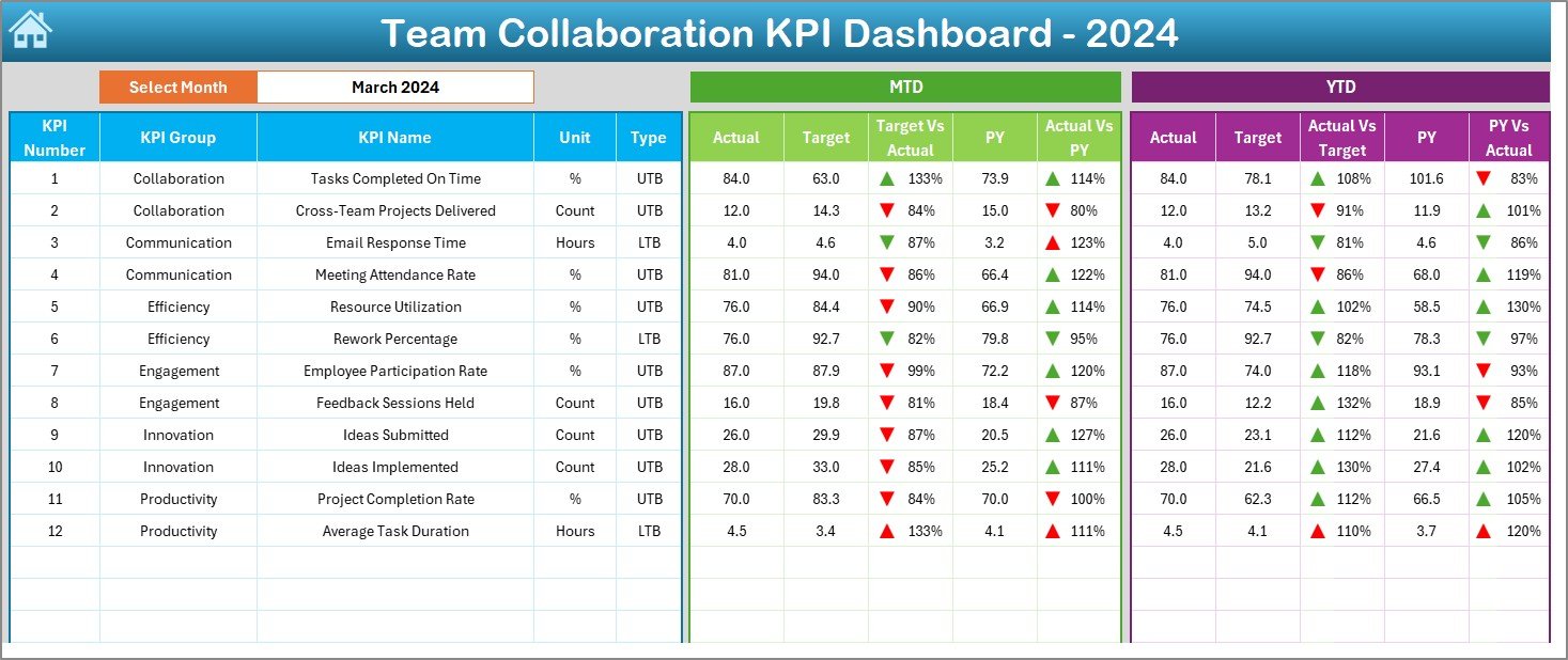
- Dashboard Sheet
- The main control center of the dashboard.
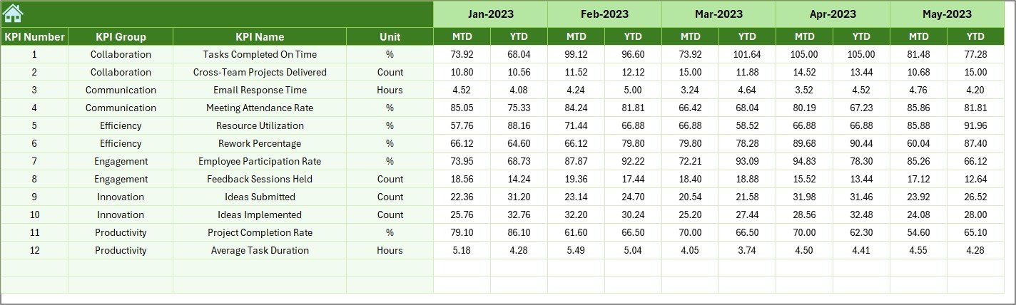
- Allows users to select a month from a drop-down (cell D3) to refresh all charts and numbers automatically.
- Displays both Month-to-Date (MTD) and Year-to-Date (YTD) data.
- Compares Actual vs. Target and Actual vs. Previous Year (PY) with up and down arrows for quick insights.
- Highlights team performance trends using conditional formatting.
Click to buy Team Collaboration KPI Dashboard in Excel
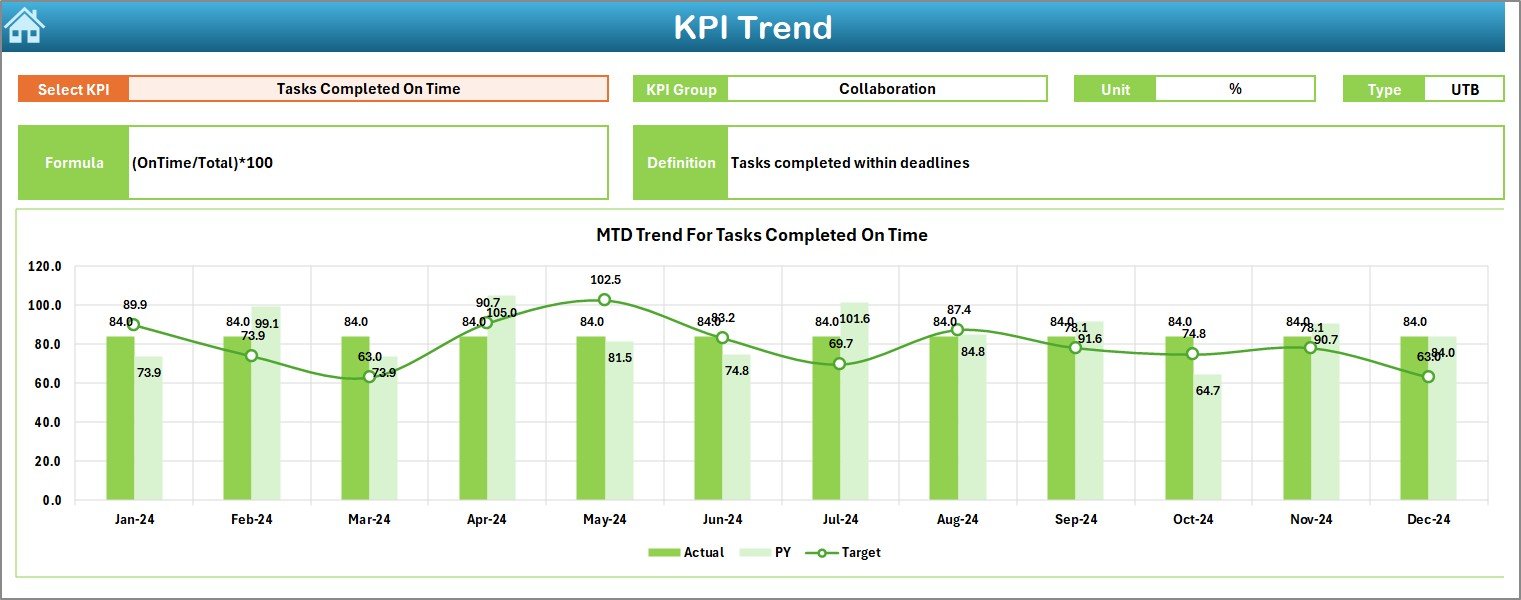
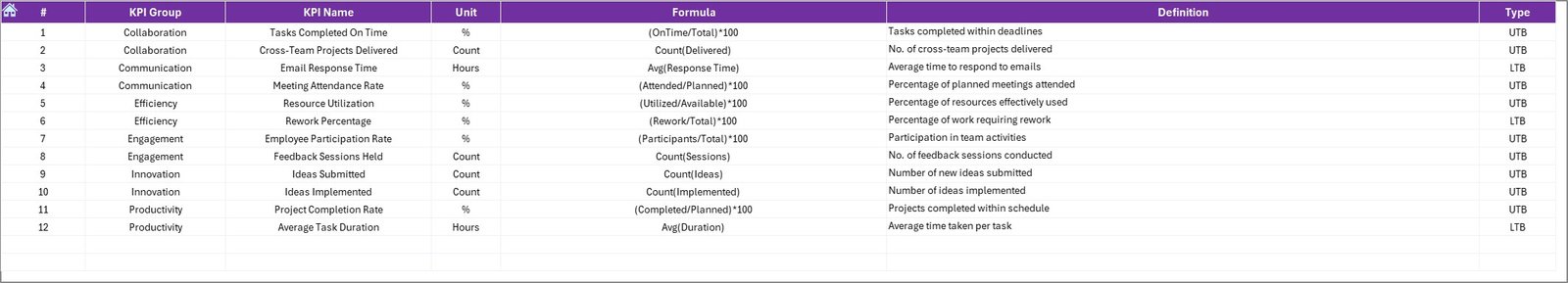
- KPI Trend Sheet
- Provides a deeper dive into individual KPIs.
- Drop-down selection (cell C3) helps you choose any KPI to analyze.
- Displays KPI details including:
- Group
- Unit
- Type (Lower the Better or Upper the Better)
- Formula
- Definition
- Includes MTD and YTD trend charts for Actual, Target, and PY data.
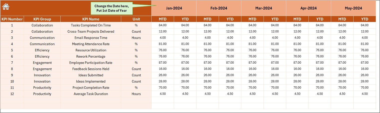
- Actual Numbers Input Sheet
- The sheet where you enter the actual performance values.
- MTD and YTD values can be added for each KPI.
- Allows month selection (cell E1) to align data entry with the calendar year.
Click to buy Team Collaboration KPI Dashboard in Excel
- Target Sheet
- Used to set target values for each KPI.
- Separate fields for MTD and YTD targets.
- Ensures benchmarking against clear performance expectations.
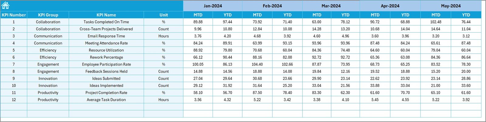
- Previous Year Number Sheet
- Stores historical performance values.
- Useful for comparing growth and identifying collaboration improvements.
- KPI Definition Sheet
- Contains the blueprint of every KPI being tracked.
- Includes KPI Name, Group, Unit, Formula, and Definition.
- Promotes clarity and ensures all stakeholders understand how each metric is measured.
Why Do Teams Need a Collaboration KPI Dashboard?
Teams often rely on subjective feedback to measure collaboration. While feedback is important, it does not provide a full picture. This dashboard bridges that gap by offering quantitative insights into teamwork.
With measurable KPIs like task completion rates, cross-department collaboration hours, meeting efficiency, and shared project success rates, leaders can see where collaboration is thriving and where it needs attention.
Examples of Team Collaboration KPIs You Can Track
Here are some common KPIs that organizations include in this dashboard:
- Meeting Effectiveness (%) – Tracks how productive meetings are.
- Task Completion Rate (%) – Measures how many team tasks are completed on time.
- Cross-Team Collaboration Hours – Quantifies hours spent working with other teams.
- Project Success Rate (%) – Percentage of projects completed successfully due to collaboration.
- Response Time to Team Queries – Measures how quickly team members respond to requests.
- Employee Engagement Score – Shows how engaged employees feel when working in teams.
- Collaboration Tool Usage – Tracks adoption of tools like Slack, Teams, or Trello.
Advantages of a Team Collaboration KPI Dashboard in Excel
Using this dashboard has several benefits that go beyond simple reporting:
- Centralized Insights: Combines all collaboration KPIs in one place.
- Time-Saving: Automates calculations with drop-downs and dynamic charts.
- Target Tracking: Compares actual performance against both targets and historical numbers.
- Enhanced Team Alignment: Keeps everyone on the same page about progress.
- Improved Transparency: Reduces confusion about roles, responsibilities, and performance.
- Data-Driven Decisions: Helps leaders focus on weak areas of collaboration.
Opportunities for Improvement with Collaboration Dashboards
Although this dashboard is powerful, organizations can still improve its impact by:
- Automating Data Entry: Linking Excel with other tools (e.g., project management software).
- Cloud Integration: Using Excel Online or Google Sheets for real-time updates.
- Mobile Accessibility: Making the dashboard accessible on smartphones.
- Adding Qualitative Metrics: Including survey results to capture employee sentiment.
- Expanding KPI Library: Tracking industry-specific collaboration KPIs.
Best Practices for Using the Team Collaboration KPI Dashboard
To get maximum value, follow these best practices:
- Define Clear KPIs – Choose collaboration KPIs relevant to your organization.
- Update Regularly – Input data consistently to keep insights accurate.
- Use Visuals Effectively – Leverage charts, arrows, and progress bars for quick interpretation.
- Encourage Transparency – Share the dashboard with all team members.
- Review Monthly – Conduct review meetings using the dashboard as the main reference.
- Combine with Feedback – Pair quantitative data with team surveys for a complete picture.
How to Build a Team Collaboration KPI Dashboard in Excel
While this article focuses on the prebuilt template, here are the steps if you want to build your own:
- Identify Collaboration KPIs – Select measurable indicators like meetings, tasks, and response times.
- Design the Layout – Include a home sheet, dashboard, KPI trend view, and input sheets.
- Set Up Data Entry Sheets – Add Actual, Target, and Previous Year data tabs.
- Apply Conditional Formatting – Use arrows, traffic lights, or progress bars.
- Add Drop-Down Menus – Allow users to select months and KPIs.
- Create Charts – Use line charts, bar graphs, and pie charts for visualization.
- Validate and Test – Ensure calculations and visualizations update correctly.
Real-World Applications of Collaboration Dashboards
Organizations across industries can benefit from this tool:
- Corporate Teams – Improve inter-department communication.
- Educational Institutions – Track collaboration between faculty, staff, and students.
- Healthcare Teams – Monitor collaboration between doctors, nurses, and support staff.
- Nonprofits – Measure volunteer collaboration and project outcomes.
- Startups – Ensure new teams are working together effectively from day one.
Conclusion
Collaboration is the backbone of successful organizations. Without measurable insights, it becomes difficult to know whether teams are working together effectively. A Team Collaboration KPI Dashboard in Excel solves this by offering an interactive, easy-to-use, and customizable platform to track and improve teamwork.
By adopting this tool, organizations can align their teams, enhance transparency, and foster a culture of data-driven collaboration.
Frequently Asked Questions (FAQs)
- What is a Team Collaboration KPI Dashboard in Excel?
It is an Excel-based reporting tool designed to measure, track, and improve collaboration across teams by consolidating KPIs into one dashboard.
- Can I customize the KPIs in this dashboard?
Yes, you can easily modify or add KPIs in the KPI Definition sheet to match your organization’s needs.
- Do I need advanced Excel skills to use this dashboard?
No, the template is designed for ease of use. Basic Excel knowledge is enough to navigate, input data, and interpret results.
- How often should I update the dashboard?
It is best to update it monthly for accurate MTD and YTD performance insights.
- Can this dashboard be used by remote teams?
Yes, especially if you integrate it with cloud storage like OneDrive or SharePoint for shared access.
- What types of organizations benefit most from this dashboard?
Any organization that values teamwork and collaboration—including corporates, NGOs, healthcare, and education sectors—can benefit.
- Does the dashboard support visual comparisons?
Yes, it includes charts, conditional formatting, and arrows to visualize differences between actual, target, and previous year data.
- Is it possible to automate the data entry process?
Yes, by linking the dashboard with external project management or HR tools through Power Query or VBA automation.
Visit our YouTube channel to learn step-by-step video tutorials
Watch the step-by-step video tutorial:
Click to buy Team Collaboration KPI Dashboard in Excel