Nonprofit organizations run with a mission-driven mindset, but they still need strong performance tracking to grow. Every donation, every program, every volunteer effort, and every outreach activity must create measurable impact. However, many nonprofits still use scattered spreadsheets or manual records to track their performance. Because of this, they often struggle to measure progress, monitor goals, and make data-driven decisions on time.
A Nonprofit Organizations KPI Dashboard in Power BI solves all these challenges. It converts scattered data into clean visuals, helps leaders measure performance quickly, and creates clarity across all departments. When nonprofits use a dashboard, they see their progress in seconds instead of spending hours analyzing spreadsheets.
This article explains the complete concept of a nonprofit KPI dashboard. You will learn what it is, how it works, why nonprofits need it, and how every page of the dashboard supports performance tracking. You will also find its advantages, best practices, and frequently asked questions.
Click to buy Nonprofit Organizations KPI Dashboard in Power BI
What Is a Nonprofit Organizations KPI Dashboard in Power BI?
A Nonprofit Organizations KPI Dashboard in Power BI is a ready-to-use performance management tool that helps nonprofits track their key metrics. These KPIs may include:
- Donations received
- Fundraising performance
- Program outcomes
- Volunteer engagement
- Beneficiary reach
- Cost efficiency
- Grant performance
- Year-over-year growth
This dashboard connects to an Excel-based data source. You only fill the data, and Power BI automatically updates all visuals. Because of this, nonprofit teams save time, avoid errors, and focus on improvement rather than manual reporting.
The dashboard includes three main pages:
- Summary Page
- KPI Trend Page
- KPI Definition Page
Each page offers a different type of analysis, and together they give a complete 360° view of nonprofit performance.
Why Do Nonprofit Organizations Need a KPI Dashboard?
Nonprofit organizations work in a highly dynamic environment. Donor expectations change, program needs shift, and teams must justify every budget decision. When nonprofits track KPIs through a dashboard, they:
- Understand real-time performance
- Identify improvement opportunities
- Compare current performance with past results
- Measure program impact
- Increase accountability
- Improve transparency
- Gain donor trust
- Make informed decisions faster
Because of this, a KPI dashboard becomes an essential tool for nonprofit leaders.
What Are the Key Features of the Nonprofit Organizations KPI Dashboard in Power BI?
This dashboard comes with a list of powerful features designed specifically for nonprofit teams. You can track KPIs in a structured way and monitor progress every month.
Here are the major features:
- Month and KPI Group slicers
- Total KPIs count
- MTD (Month-to-Date) performance
- YTD (Year-to-Date) performance
- KPI cards with color-coded icons
- MTD and YTD variance calculations
- CY vs PY comparison for MTD and YTD
- Detailed KPI tables
- KPI trend charts
- Drill-through views for KPI definitions
- Excel-based data entry (Actuals, Targets, Definitions)
These features make reporting simple, visual, and error-free.
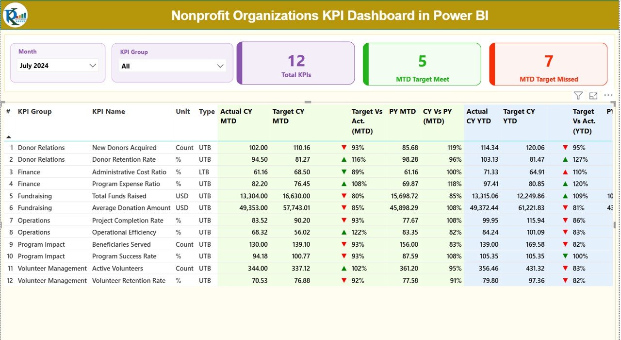
Summary Page
The Summary Page is the heart of the Nonprofit Organizations KPI Dashboard. You see all KPIs in one place, along with their status, trends, and comparisons.
- Slicers for Month and KPI Group
On the top of this page, you see:
- Month slicer: Choose the month to analyze data for that period.
- KPI Group slicer: Filter KPIs by category (fundraising, operations, volunteer engagement, etc.).
These slicers help you switch your view instantly.
- KPI Cards
Three KPI cards appear under the slicers:
- Total KPIs count
- MTD Target Met count
- MTD Target Missed count
These cards give a quick health check of nonprofit performance.
- Detailed KPI Table
Below the cards, you see a detailed KPI table with the following columns (rewritten explanation):
KPI Number
This is the unique sequence number for each KPI.
KPI Group
This shows the category of the KPI, such as fundraising, outreach, or operations.
KPI Name
This is the specific name of the KPI you are tracking.
Unit
The measurement unit, such as %, number, USD, hours, etc.
Type (LTB or UTB)
- LTB (Lower the Better) like Cost per Beneficiary
- UTB (Upper the Better) like Number of Volunteers
Actual CY MTD
This shows the actual performance of the current year (Month-to-Date).
Target CY MTD
This shows the target for the same period.
MTD Icon
Red or green ▲ ▼ icons show whether the KPI met the target.
Target Vs Actual (MTD)
This percentage shows how much of the target the actual value achieved.
Formula: Actual MTD / Target MTD
PY MTD
Previous Year MTD value for comparison.
CY Vs PY (MTD)
This percentage compares Current Year MTD vs Previous Year MTD.
Actual CY YTD
Actual KPI performance for the current year (Year-to-Date).
Target CY YTD
The YTD target for the KPI.
YTD Icon
Green ▲ or red ▼ icons show YTD performance vs target.
Target Vs Actual (YTD)
This percentage shows YTD achievement.
Formula: Actual YTD / Target YTD
PY YTD
Previous Year YTD numbers.
CY Vs PY (YTD)
This compares current YTD value vs previous YTD value.
This entire table helps nonprofit leadership understand exactly where they stand.
Click to buy Nonprofit Organizations KPI Dashboard in Power BI
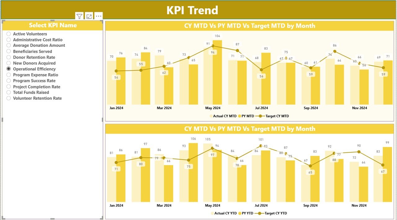
KPI Trend Page
The KPI Trend Page helps you analyze performance trends for each KPI. Instead of looking at static numbers, you see how KPIs move across months.
This page includes:
- A KPI selector (slicer) on the left
- Two combo charts for MTD and YTD
These charts show:
- Actual values for the Current Year
- Actual values for the Previous Year
- Target values
Because of this, nonprofit leaders see:
- Growth trends
- Seasonality
- Achievement percentage
- Slowing or improving performance
This page helps teams take timely decisions instead of waiting for year-end reports.
Click to buy Nonprofit Organizations KPI Dashboard in Power BI
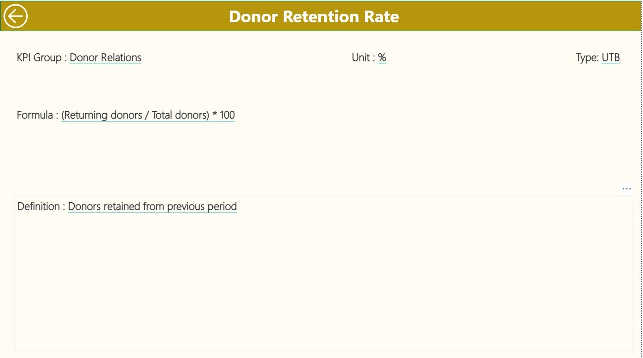
KPI Definition Page
The KPI Definition Page is a drill-through page. You reach this page by right-clicking on a KPI from the Summary Page.
This page displays:
- KPI Number
- KPI Group
- KPI Name
- Unit
- Formula
- Definition
- Type (LTB or UTB)
This page helps team members understand the logic behind every KPI. Since the KPI definition stays transparent, new team members adapt faster.
You can click the Back button on the top-left corner to return to the Summary Page.
Click to buy Nonprofit Organizations KPI Dashboard in Power BI
How Does the Excel Data Source Work?
This dashboard connects to three Excel sheets. You fill these sheets, and Power BI updates all visuals automatically.
Input_Actual Sheet
You fill:
- KPI Name
- Month (first date of the month, like 1-Jan-2024)
- MTD Actual
- YTD Actual
Input_Target Sheet
You fill:
- KPI Name
- Month
- MTD Target
- YTD Target
KPI Definition Sheet
You fill:
- KPI Number
- KPI Group
- KPI Name
- Unit
- Formula
- Definition
- Type (LTB or UTB)
Because of this structure, even beginners can update the dashboard without any confusion.
Click to buy Nonprofit Organizations KPI Dashboard in Power BI
Which KPIs Can a Nonprofit Track in This Dashboard?
Here are some common nonprofit KPIs:
Fundraising KPIs
- Total Donations
- Number of Donors
- Fundraising Growth %
- Cost per Dollar Raised
Program KPIs
- Beneficiaries Served
- Program Completion %
- Impact Score
- Program Efficiency Ratio
Volunteer KPIs
- Active Volunteers
- Volunteer Hours
- Volunteer Retention %
Marketing & Outreach KPIs
- Event Attendance
- Website Engagement
- Lead-to-Donor Conversion %
Finance KPIs
- Budget Utilization
- Operating Expense %
- Grant Allocation %
The dashboard allows you to track any KPI you want.
Advantages of the Nonprofit Organizations KPI Dashboard in Power BI
Nonprofit teams get several benefits when they use this dashboard. Here are the top advantages:
- Complete Visibility of Performance
You see every important KPI in one place. You understand progress, trends, and gaps quickly.
- Accurate and Real-Time Reporting
The dashboard updates every time you refresh the Excel file. You always see the latest numbers.
- Better Decision-Making
Teams take quick and informed decisions because the visuals make everything clear.
- Increased Accountability
Every KPI shows actual vs target, which increases responsibility across teams.
- Donor Transparency
When you show performance through visuals, donors trust your work more.
- Easy for Non-Technical Users
You only fill data in Excel. Power BI does the rest.
- Professional and Presentable Reports
The dashboard creates clean visuals that you can use in board meetings, donor presentations, and annual reports.
Best Practices for the Nonprofit Organizations KPI Dashboard in Power BI
To get the best results from your dashboard, follow these practices:
- Update Your Data Regularly
- Update your Actual and Target sheets every month so your visuals stay accurate.
- Define KPIs Clearly
- Use the KPI Definition page to maintain clarity. Everyone must understand what each KPI means.
- Use Consistent Units
- Avoid mixing %, numbers, dollars, and hours in confusing ways.
- Track Both MTD and YTD
MTD shows short-term performance.
YTD shows long-term stability.
Track both to understand the full picture.
- Compare CY and PY
Learn from previous year performance. Identify growth as well as areas of concern.
- Use Slicers Smartly
Filter by month or group to focus on specific performance areas.
- Review Trends Before Decision-Making
Always check the KPI Trend page before making program or fundraising decisions.
Conclusion
A Nonprofit Organizations KPI Dashboard in Power BI helps nonprofit leaders track performance, measure impact, and improve decision-making. It brings clarity to fundraising, program operations, volunteer engagement, and financial performance. Since the dashboard uses an Excel-based data source, nonprofit teams find it easy to update and use.
With real-time visuals, MTD/YTD comparisons, color-coded insights, and drill-through features, this dashboard becomes a complete performance management tool for any nonprofit organization.
Frequently Asked Questions (FAQs)
- What is a KPI dashboard for nonprofit organizations?
A KPI dashboard for nonprofits tracks performance metrics related to fundraising, program impact, donor engagement, volunteers, and financial health.
- Why should nonprofits use Power BI for KPIs?
Power BI creates clean visuals, refreshes data quickly, and offers smart filtering options. Because of this, nonprofits get faster insights.
- Which data source does this dashboard use?
The dashboard uses an Excel file that includes Actuals, Targets, and KPI Definitions.
- Can beginners use this dashboard?
Yes. You only fill data in Excel. All visuals update automatically.
- Can I add more KPIs to the dashboard?
Yes. You can add more KPIs in the KPI Definition sheet and update the Actual/Target sheets.
- Does the dashboard show year-over-year comparisons?
Yes. It shows CY vs PY comparisons for both MTD and YTD.
- Can this dashboard help in donor reporting?
Absolutely. It creates clear visuals that you can use in donor reports and presentations.
- How often should we update the dashboard?
Update it every month to maintain accuracy.
- Does the dashboard include drill-through views?
Yes. You can drill through from Summary Page to the KPI Definition Page.
- Can we share this dashboard with our team?
Yes. You can publish it in Power BI Service and share with stakeholders.
Visit our YouTube channel to learn step-by-step video tutorials
Watch the step-by-step video tutorial:
Click to buy Nonprofit Organizations KPI Dashboard in Power BI