Efficient airport management depends on clear insights, accurate metrics, and real-time visibility. Airports handle thousands of passengers, flights, and operational processes every single day. Because of this high level of activity, managers need a simple way to track performance, compare results, and make quick decisions. An Airports KPI Dashboard in Excel solves this problem with a structured and visual approach.
In this detailed guide, you will learn everything about this Excel-based dashboard, how it works, its features, its benefits, and how airport teams use it to monitor operations. You will also explore its worksheet structure, best practices, and important questions that people frequently ask about Airport KPIs.
Click to buy Airports KPI Dashboard in Excel
What Is an Airports KPI Dashboard in Excel?
An Airports KPI Dashboard in Excel is a ready-to-use template that tracks all important airport performance metrics in one place. It uses charts, summary cards, data tables, and slicers to display real-time insights on passenger flow, flight operations, safety, on-time performance, baggage handling, staff efficiency, and many other KPIs.
The dashboard converts large datasets into easy-to-read visuals. As a result, airport managers get a clear picture of monthly, quarterly, and yearly performance without scrolling through long spreadsheets.
This dashboard works inside Excel, so teams do not need special software or complex installations. Users only enter the actual data, target values, and previous year numbers. The dashboard automatically updates all visuals and KPIs.
Why Do Airports Need a KPI Dashboard in Excel?
Airports manage several activities at the same time. Passenger services, arrivals and departures, safety, regulatory compliance, ground handling, security checks, retail operations, and cargo movement must run smoothly. Any small delay or failure can impact thousands of people.
An Airports KPI Dashboard helps because:
- It shows the performance of all areas in one place.
- It highlights issues before they grow.
- It supports data-driven decision-making.
- It reduces manual work.
- It increases accuracy and transparency.
When airport leaders see the real-time trend of each KPI, they take quick action to improve performance and customer experience.
Key Features of the Airports KPI Dashboard in Excel
The Airports KPI Dashboard includes seven well-organized worksheets, each designed for a specific purpose. These sheets interact with each other and update automatically when you change the inputs.
Let’s look at each sheet in detail.
Summary Page: Your Central Navigation Hub
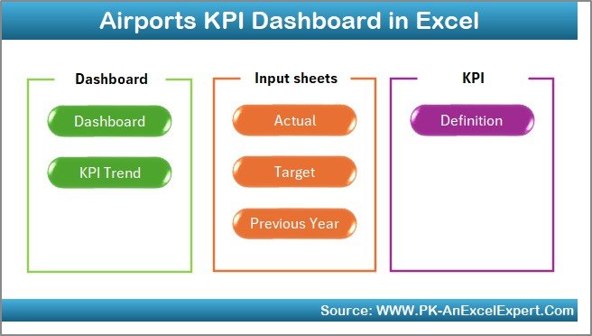
The Summary Page works like an index page. Here, you will see six buttons that help you move to any major sheet with a single click.
You can quickly jump to:
- Dashboard
- Trend
- Actual Numbers Input
- Target Sheet
- Previous Year Numbers
- KPI Definitions
This page saves time because users no longer scroll through multiple sheets. The navigation is clean, simple, and intuitive
Click to buy Airports KPI Dashboard in Excel
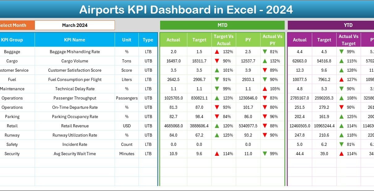
Dashboard Sheet: The Heart of Airport Performance Tracking
This is the most important page. It presents the complete airport KPI performance in a visual format.
Key Highlights of the Dashboard Sheet
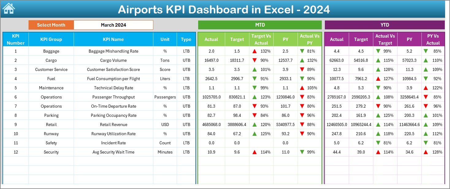
Month Selector
You select the month from the drop-down at cell D3, and the entire dashboard automatically updates.
MTD (Month-to-Date) KPI Tracking
For every KPI, you see:
- MTD Actual
- MTD Target
- MTD Previous Year
- Comparison of Actual vs Target
- Comparison of Actual vs Previous Year
Up and down arrows highlight performance. Positive performance shows an upward arrow, and negative performance shows a downward arrow. This visual formatting makes it easy to understand the trend at a glance.
YTD (Year-to-Date) KPI Tracking
You also see:
- YTD Actual
- YTD Target
- YTD Previous Year
- YTD comparisons with arrows
This helps the team see long-term performance and not only monthly results.
Clean Visual Layout
The dashboard layout includes:
- KPI cards
- Side-by-side comparisons
- Conditional formatting
- Clear data labels
- Attractive color coding
The Dashboard sheet works as the real-time control center for all airport KPIs.
Click to buy Airports KPI Dashboard in Excel
Trend Sheet: Deep Analysis of KPI Patterns
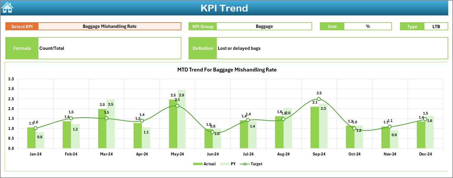
The Trend sheet allows users to view detailed trends of each KPI across the year.
Select a KPI from the Drop-Down
At cell C3, you select the KPI name. Immediately, the sheet displays:
- KPI Group
- Unit
- KPI Type (UTB or LTB)
- Formula
- KPI Definition
This makes the sheet perfect for analysis as well as training new team members.
Powerful Trend Charts
The sheet shows two main charts:
- MTD Trend Chart → Displays Actual, Target, and Previous Year
- YTD Trend Chart → Shows long-term comparisons
These charts help airport leaders understand:
- Seasonal patterns
- Performance gaps
- Areas that need improvement
- KPIs that are growing or declining
Because the visuals update automatically, users can quickly analyze any KPI.
Click to buy Airports KPI Dashboard in Excel
Actual Numbers Input Sheet: Enter the Real Data Easily
This sheet is simple and user-friendly.
Select the Starting Month
You select the first month of the year using cell E1.
Enter MTD and YTD Values
You enter:
- Monthly Actual numbers (MTD)
- Year-to-Date Actual numbers (YTD)
The system uses these values to update all other sheets.
Flexible and Dynamic
Even if your airport tracks custom KPIs, you can modify the sheet structure without affecting the dashboard.

Click to buy Airports KPI Dashboard in Excel
Target Sheet: Set Monthly and YTD Goals
In this sheet, you enter:
- Monthly Target values
- YTD Target values
This is critical because:
- Targets define performance standards.
- Targets help measure achievement levels.
- Targets allow accurate comparisons across months.
Managers update this sheet at the start of each year or quarter.

Click to buy Airports KPI Dashboard in Excel
Previous Year Numbers Sheet: Compare with Past Performance
This worksheet stores the KPI values from the previous year.
Why This Matters
Comparing current performance with previous year results helps managers understand:
- Improvement rate
- Decline in performance
- Impact of new processes
- Seasonal patterns
The dashboard highlights these comparisons using conditional formatting and arrows.

Click to buy Airports KPI Dashboard in Excel
KPI Definition Sheet: Clear Reference for All Users
This sheet includes essential information for every KPI:
- KPI Name
- KPI Group
- Unit
- Formula
- KPI Definition
- KPI Type (UTB or LTB)
This sheet acts as a knowledge base. New employees or analysts understand each KPI clearly.

Click to buy Airports KPI Dashboard in Excel
Advantages of Using an Airports KPI Dashboard in Excel
An Airports KPI Dashboard provides several important benefits. Let’s explore them in detail.
- Real-Time Visibility of Airport Operations
Managers get instant updates about:
- Passenger flow
- Baggage handling
- Staff performance
- Flight operations
- Safety and security checks
Quick visibility supports fast decisions.
- Easy to Use and No Technical Skills Required
The dashboard works in Excel, so there is:
- No additional software
- No coding requirement
- No complex setup
Anyone with basic Excel knowledge can use it.
Improves Accuracy and Reduces Manual Errors
The automated formulas reduce mistakes. The template calculates every KPI and updates all visuals instantly.
- Helps Track MTD and YTD Performance Together
Many dashboards only show monthly performance.
But this dashboard shows:
- Month-to-Date performance
- Year-to-Date performance
This gives a complete picture of airport operations.
- Supports Better Planning and Forecasting
Because the template shows trends and comparisons, teams make better plans for:
- Staffing
- Passenger flow management
- Gate assignments
- Cargo handling
- Retail operations
Forecasting becomes much easier.
- Reduces Time Spent on Reporting
Instead of spending hours preparing Excel charts every month, the dashboard automates everything.
- Improves Team Communication
All teams—operations, finance, retail, safety, security—share the same KPIs.
This improves transparency and collaboration.
Best Practices for Using an Airports KPI Dashboard in Excel
To get the best results, follow these practical tips.
- Maintain Accurate Input Data
Always enter correct MTD and YTD numbers. Even a small mistake can change the dashboard results.
- Review KPI Definitions Regularly
Airport operations change often, so update:
- KPI definitions
- KPI formulas
- KPI targets
when required.
- Use Drop-Down Selections Carefully
Always choose the correct month and KPI from the drop-down lists. This keeps the analysis accurate.
- Standardize Data Entry Formats
Use the same units every month.
For example:
- Minutes
- Passengers
- Kilograms
- Percentage
A standardized format reduces confusion.
- Update Targets at the Start of the Year
Set realistic targets. Review them quarterly to stay aligned with business goals.
- Save a Backup Copy Every Month
This helps track historical changes and protects your data.
- Train Your Team to Use the Dashboard
Brief training sessions help everyone understand:
- KPI meanings
- Trends
- Targets
- How to enter data
When everyone understands the dashboard, decision-making becomes stronger.
Conclusion
An Airports KPI Dashboard in Excel is one of the most powerful tools for airport operations. It brings all critical KPIs into one place and allows managers to understand real-time performance with clarity. With features like trend charts, MTD and YTD comparisons, drop-down selections, conditional formatting, and KPI definitions, this dashboard supports accurate decisions and better planning.
Airport operations depend on speed, coordination, and efficiency.
A well-structured KPI dashboard makes this possible.
Whether you manage flight operations, passenger services, safety, cargo, or retail operations, this template helps you monitor performance, improve processes, and deliver a higher level of service.
Frequently Asked Questions (FAQs)
- What KPIs are important for airport performance?
Airports usually track KPIs like on-time arrivals, on-time departures, passenger wait time, baggage claim time, safety incidents, fuel usage, load factor, staff productivity, and customer satisfaction.
- Do I need Excel skills to use this dashboard?
No. Anyone with basic Excel knowledge can use the dashboard. The template handles all calculations automatically.
- Can I add more KPIs to the dashboard?
Yes. You can add KPIs by updating the KPI Definition sheet and input sheets. The dashboard will automatically update.
- Can I customize the visuals?
Yes. You can change colors, fonts, chart types, and layouts based on your reporting needs.
- Does the dashboard support monthly and yearly analysis?
Yes. You can track MTD, YTD, and Previous Year values for every KPI.
- Is this dashboard useful for small airports?
Absolutely. Both small and large airports benefit from KPI tracking. Clear metrics improve operations for all airport sizes.
Visit our YouTube channel to learn step-by-step video tutorials
Watch the step-by-step video tutorial:
Click to buy Airports KPI Dashboard in Excel
