Student exchange programs play a vital role in global education. They promote cultural understanding, academic collaboration, and international exposure for students. However, managing and monitoring these programs without structured data becomes difficult. Therefore, institutions need a clear, reliable, and easy-to-use performance tracking system.
That is exactly where a Student Exchange Programs KPI Dashboard in Excel becomes a powerful solution.
In this detailed article, you will learn what a Student Exchange Programs KPI Dashboard in Excel is, why it is important, how it works, sheet-wise dashboard structure, key KPIs, advantages, best practices, and frequently asked questions. Moreover, this guide uses clear language, smooth transitions, and practical explanations to ensure both usability and SEO effectiveness.
Click to buy Student Exchange Programs KPI Dashboard in Excel
What Is a Student Exchange Programs KPI Dashboard in Excel?
A Student Exchange Programs KPI Dashboard in Excel is a ready-to-use analytical tool designed to track, monitor, and evaluate the performance of student exchange initiatives using key performance indicators (KPIs).
Instead of managing scattered spreadsheets for applications, approvals, enrollments, destinations, costs, and outcomes, this dashboard consolidates all critical data into one structured Excel file. As a result, administrators, international offices, and academic leaders gain instant visibility into program performance.
Because the dashboard runs in Excel, users can easily update data, customize KPIs, and analyze trends without technical complexity. Moreover, Excel ensures flexibility, cost-effectiveness, and widespread usability across institutions.
Why Do Educational Institutions Need a Student Exchange KPI Dashboard?
Managing student exchange programs involves multiple stakeholders, timelines, and performance metrics. Therefore, manual tracking often leads to errors, delays, and poor decision-making.
A Student Exchange Programs KPI Dashboard in Excel solves these challenges effectively.
Key reasons institutions need this dashboard include:
- It centralizes exchange program performance data
- It tracks progress against targets clearly
- It improves reporting accuracy and consistency
- It supports strategic planning and forecasting
- It enhances transparency for management and stakeholders
As a result, institutions move from reactive reporting to proactive performance management.
How Does the Student Exchange Programs KPI Dashboard in Excel Work?
The dashboard follows a structured and logical workflow. First, users define KPIs. Then, they enter actual, target, and previous-year data. Finally, the dashboard automatically calculates variances and displays insights visually.
Because everything works through formulas, pivot tables, and conditional formatting, users get instant updates when they change inputs. Moreover, slicers and drop-downs allow quick filtering by month or KPI.
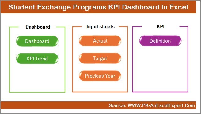
Overview of Worksheets in the Student Exchange Programs KPI Dashboard in Excel
This dashboard includes 7 well-designed worksheets, each serving a specific purpose. Together, they create a complete performance management system.
Summary Page – Why Is It the Navigation Hub?
The Summary Page acts as an index or home page for the dashboard.
Key features of the Summary Page include:
- Clean layout with professional design
- Six navigation buttons
- One-click access to all major sheets
- Easy usability for first-time users
Because of this structure, users save time and navigate the dashboard efficiently. Moreover, decision-makers can jump directly to the required analysis without searching through tabs.
Click to buy Student Exchange Programs KPI Dashboard in Excel
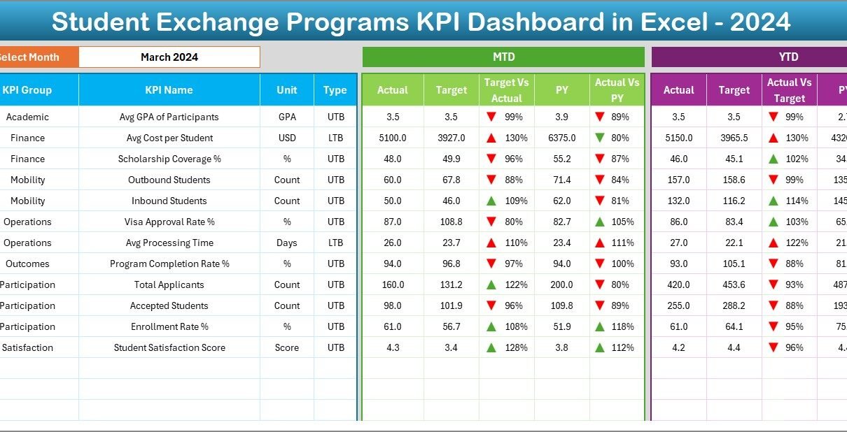
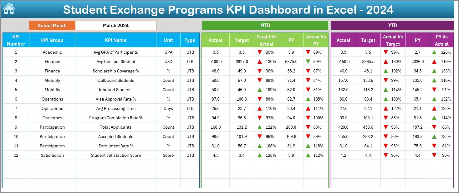
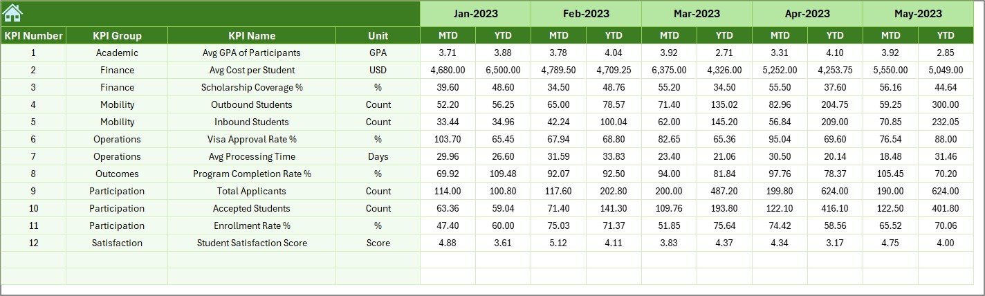
Dashboard Sheet – How Does It Show KPI Performance?
The Dashboard Sheet is the main analytical view of the entire system.
Key features of the Dashboard Sheet include:
- Month selection drop-down on cell D3
- Dynamic update of all KPI values based on selected month
- Clear presentation of MTD (Month-to-Date) performance
- Clear presentation of YTD (Year-to-Date) performance
KPIs displayed in this sheet:
- MTD Actual
- MTD Target
- MTD Previous Year
- Target vs Actual variance
- Previous Year vs Actual variance
- YTD Actual
- YTD Target
- YTD Previous Year
- YTD variance analysis
Moreover, the dashboard uses conditional formatting arrows to show performance direction clearly. As a result, users can instantly identify improvement or decline without reading numbers in detail.
Click to buy Student Exchange Programs KPI Dashboard in Excel
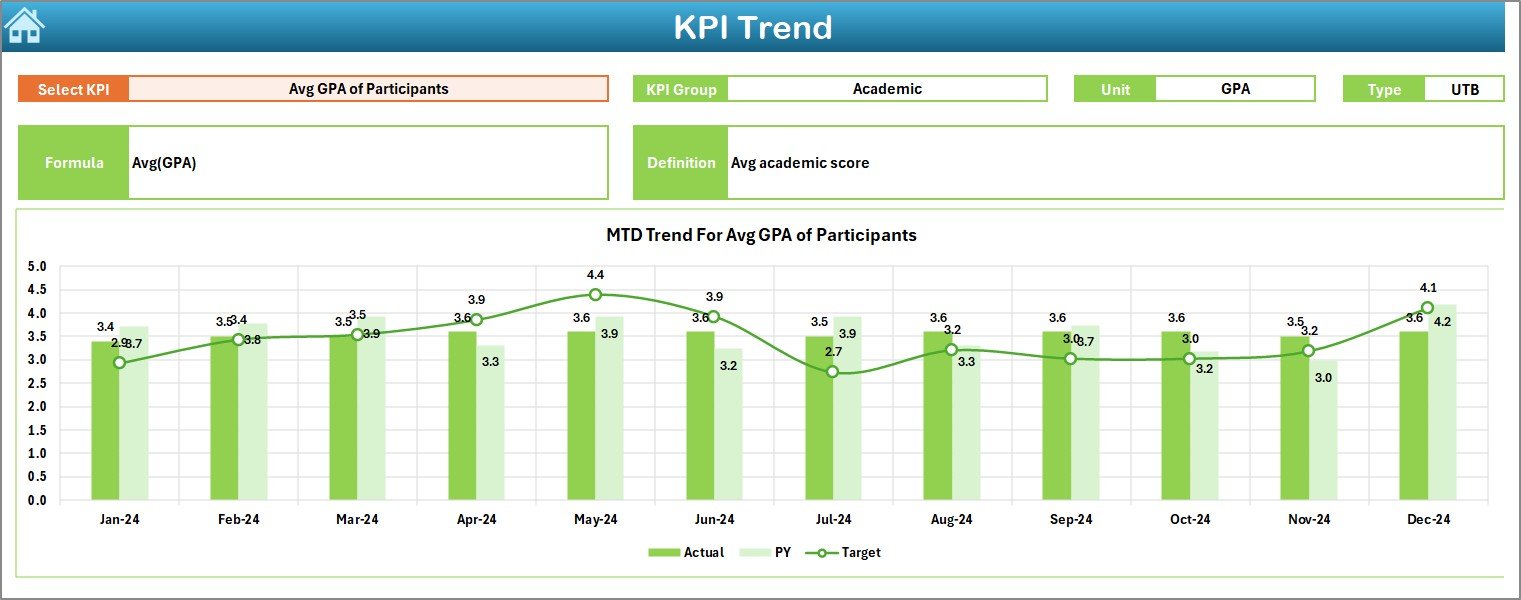
Trend Sheet – How Can You Analyze KPI Trends?
The Trend Sheet focuses on deep KPI analysis over time.
Key functionalities include:
- KPI selection drop-down in cell C3
- Automatic display of KPI Group
- Display of KPI Unit
- Display of KPI Type (UTB or LTB)
- Display of KPI Formula
- Display of KPI Definition
In addition, this sheet shows MTD and YTD trend charts for:
- Actual values
- Target values
- Previous Year values
Because of this visual representation, users easily understand historical patterns and performance direction. Moreover, trend analysis supports forecasting and improvement planning.
Click to buy Student Exchange Programs KPI Dashboard in Excel
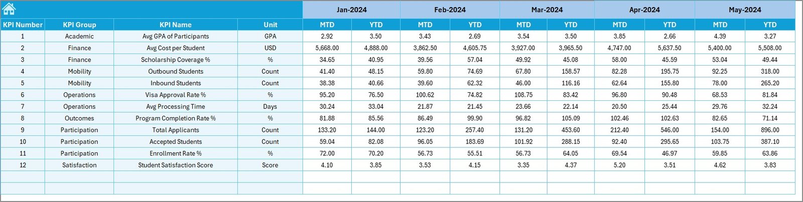
Actual Numbers Input Sheet – How Do You Enter Real Data?
The Actual Numbers Input Sheet serves as the data entry point for current performance.
Key features include:
- Month selector on cell E1
- Entry of MTD Actual values
- Entry of YTD Actual values
- Structured input layout for error reduction
Users only need to enter data once. After that, all dashboard visuals update automatically. Therefore, the system remains simple yet powerful.
Click to buy Student Exchange Programs KPI Dashboard in Excel
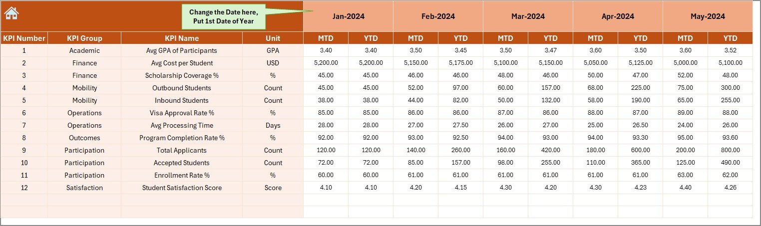
Target Sheet – How Are Performance Goals Managed?
The Target Sheet defines expected performance for each KPI.
This sheet allows users to:
- Enter monthly MTD targets
- Enter cumulative YTD targets
- Align KPIs with institutional goals
Because targets drive performance evaluation, this sheet plays a critical role in accountability and planning.
Click to buy Student Exchange Programs KPI Dashboard in Excel
Previous Year Number Sheet – Why Is Historical Comparison Important?
The Previous Year Number Sheet stores last year’s KPI values.
Benefits of this sheet include:
- Year-over-year comparison
- Performance benchmarking
- Trend validation
By comparing current performance with previous year data, institutions identify long-term improvements or declines effectively.
Click to buy Student Exchange Programs KPI Dashboard in Excel
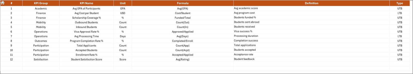
KPI Definition Sheet – How Does It Maintain KPI Consistency?
The KPI Definition Sheet acts as the foundation of the dashboard.
Information maintained in this sheet includes:
- KPI Name
- KPI Group
- Unit of Measurement
- Formula
- KPI Definition
- KPI Type (Upper the Better or Lower the Better)
Because of this centralized definition system, users avoid confusion, maintain consistency, and ensure accurate reporting across departments.
Click to buy Student Exchange Programs KPI Dashboard in Excel
What Types of KPIs Can Be Tracked in This Dashboard?
This dashboard supports a wide range of student exchange KPIs, including:
- Number of outgoing students
- Number of incoming students
- Exchange program participation rate
- Application approval rate
- Program completion rate
- Average exchange duration
- Country or university coverage
- Cost per exchange student
- Scholarship utilization rate
- Student satisfaction score
Moreover, institutions can easily add or modify KPIs based on their unique requirements.
Advantages of Student Exchange Programs KPI Dashboard in Excel
Using this dashboard provides significant operational and strategic benefits.
Key advantages include:
- Centralized performance tracking
- Time savings through automation
- Clear visibility of trends and gaps
- Strong alignment with institutional goals
- Better data-driven decision-making
- Cost-effective compared to BI tools
- Fully customizable KPI structure
As a result, institutions gain control, clarity, and confidence in managing exchange programs.
Opportunities for Improvement in Student Exchange KPI Management
Although this dashboard offers powerful insights, institutions should continuously improve their data practices.
Key improvement areas include:
- Standardizing data collection methods
- Improving data accuracy at source
- Training staff on KPI interpretation
- Expanding KPIs to include outcomes
- Integrating feedback metrics
By addressing these areas, institutions can maximize the dashboard’s value.
Best Practices for the Student Exchange Programs KPI Dashboard in Excel
Following best practices ensures long-term success and accuracy.
Recommended best practices include:
- Update actual data monthly without delay
- Review KPIs regularly with stakeholders
- Validate data before entry
- Keep KPI definitions clear and simple
- Use trend charts for strategic reviews
- Avoid overloading the dashboard with too many KPIs
- Archive historical data annually
When institutions follow these practices, the dashboard remains reliable and impactful.
Who Can Benefit from This KPI Dashboard?
This dashboard benefits a wide range of users, such as:
- International relations offices
- University administrators
- Exchange program coordinators
- Academic leadership teams
- Strategic planning departments
Because of its flexibility, both small institutions and large universities can use it effectively.
Conclusion: Why Should You Use a Student Exchange Programs KPI Dashboard in Excel?
Student exchange programs require accurate monitoring, timely insights, and strategic alignment. Without structured reporting, institutions struggle to measure success and identify improvement areas.
A Student Exchange Programs KPI Dashboard in Excel provides a practical, powerful, and user-friendly solution. It transforms raw data into actionable insights, improves accountability, and supports better decision-making.
Therefore, institutions that adopt this dashboard gain a competitive advantage in managing and expanding global education initiatives.
Frequently Asked Questions (FAQs)
- What is a Student Exchange Programs KPI Dashboard in Excel?
It is an Excel-based tool that tracks and analyzes key performance indicators related to student exchange programs in a structured and visual format.
- Can this dashboard handle multiple years of data?
Yes, the dashboard supports year-to-year comparison through the Previous Year Number Sheet.
- Do I need advanced Excel skills to use this dashboard?
No, basic Excel knowledge is sufficient. The dashboard uses simple inputs and automated calculations.
- Can institutions customize KPIs in this dashboard?
Yes, users can add, modify, or remove KPIs easily using the KPI Definition Sheet.
- How often should data be updated?
Institutions should update actual data monthly to maintain accuracy and relevance.
- Is this dashboard suitable for small institutions?
Yes, it works well for both small and large institutions due to its flexible design.
- Can this dashboard support strategic planning?
Absolutely. Trend analysis, variance tracking, and KPI comparisons support long-term planning and improvement.
Visit our YouTube channel to learn step-by-step video tutorials
Watch the step-by-step video tutorial:
Click to buy Student Exchange Programs KPI Dashboard in Excel