An Education Dashboard in Excel provides a powerful way to track and visualize academic performance, attendance, and other key data points. By using Excel’s built-in features like charts, slicers, and cards, this dashboard enables educational institutions, instructors, and administrators to make data-driven decisions. Whether you are a teacher, school administrator, or education consultant, this guide will show you how to create an easy-to-use Education Dashboard in Excel.
Why Create an Education Dashboard in Excel?
An Education Dashboard helps monitor the overall performance of students and track important metrics, including:
-
Attendance percentage
-
Assignment and exam scores
-
GPA (Grade Point Average)
-
Pass rates by department, course, and instructor
By having all this data in one place, decision-makers can identify trends, areas for improvement, and student performance gaps quickly and effectively. This article will explain the essential components of an Education Dashboard in Excel, covering everything from the basic setup to advanced features like slicers and charts.
Key Components of the Education Dashboard
Click to buy Education Dashboard in Excel
An Education Dashboard typically includes multiple sheets and sections that focus on different aspects of student performance and data analysis. Here’s a breakdown of the main sections in the Education Dashboard:
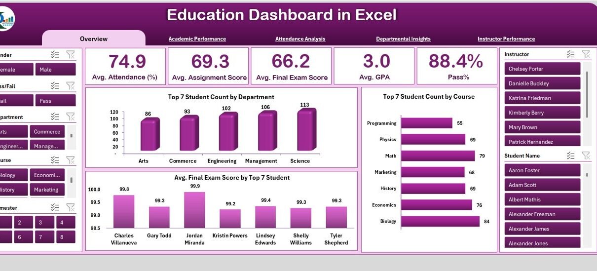
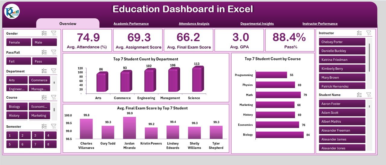
1. Overview Sheet Tab: The Summary View
The Overview Sheet Tab is the first place to look when accessing the dashboard. It provides a high-level summary of student performance across various metrics, using cards, charts, and slicers.
Card Section: Key Metrics Displayed
-
Avg. Attendance (%): The average percentage of attendance for all students across all courses.
-
Avg. Assignment Score: The average score achieved by students on assignments.
-
Avg. Final Exam Score: The average final exam score across all students.
-
Avg. GPA: The average GPA (Grade Point Average) of all students.
-
Pass %: The percentage of students who passed the courses.
Chart Section: Visualizing the Data
The chart section visually represents key data points, making it easy to analyze and compare results. Charts displayed include:
-
Student Count by Department: A bar chart that shows the number of students in each department.
-
Student Count by Course: A chart representing the number of students in each course.
-
Avg. Final Exam Score by Top 7 Student Names: A chart showing the final exam scores of the top 7 students in each course.
-
Academic Performance: A section that tracks how students performed in each course.
Click to buy Education Dashboard in Excel
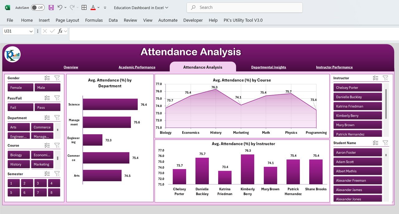
2. Attendance Analysis: Tracking Student Attendance
Attendance plays a significant role in determining a student’s academic success. The Attendance Analysis section of the dashboard provides insights into attendance patterns, which can help identify students at risk.
Charts in the Attendance Analysis Section:
-
Avg. Attendance (%) by Department: Displays the average attendance percentage for each department.
-
Avg. Attendance (%) by Course: Shows attendance rates for each course.
-
Avg. Attendance (%) by Instructor: Tracks attendance rates for each instructor’s classes.
Click to buy Education Dashboard in Excel
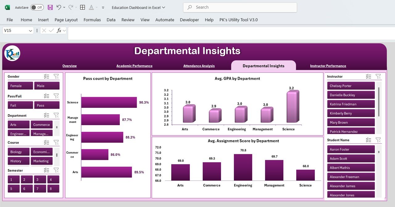
3. Departmental Insights: Analyzing Department-Wise Data
The Departmental Insights section of the dashboard helps assess the performance of each department. It includes charts for the following data points:
-
Pass Count by Department: A chart that displays the number of students who passed each department’s courses.
-
Avg. GPA by Department: Shows the average GPA of students in each department.
-
Avg. Assignment Score by Department: Tracks the average assignment score for each department.
Click to buy Education Dashboard in Excel
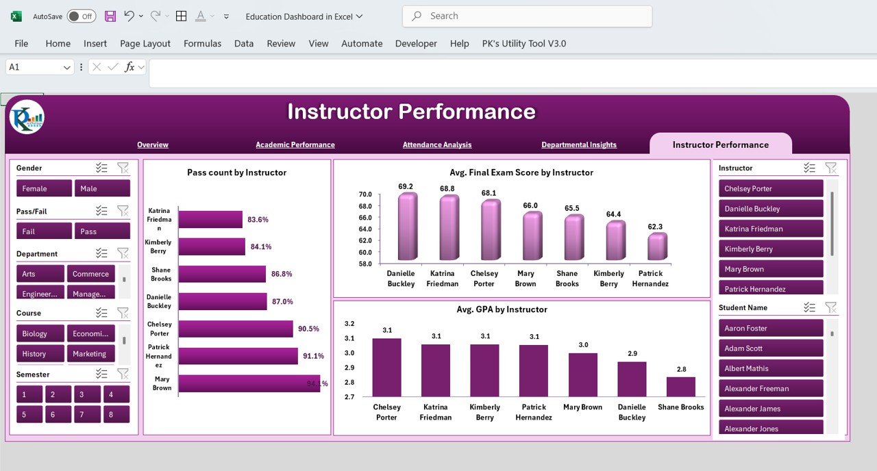
4. Instructor Performance: Evaluating Teaching Effectiveness
Instructor performance is a crucial factor in student success. The Instructor Performance section helps evaluate instructors based on their students’ results.
Charts in the Instructor Performance Section:
-
Pass Count by Instructor: This chart displays how many students passed in each instructor’s course.
-
Avg. Final Exam Score by Instructor: Tracks the average final exam score for students taught by each instructor.
-
Avg. GPA by Instructor: Shows the average GPA of students under each instructor’s guidance.
Click to buy Education Dashboard in Excel
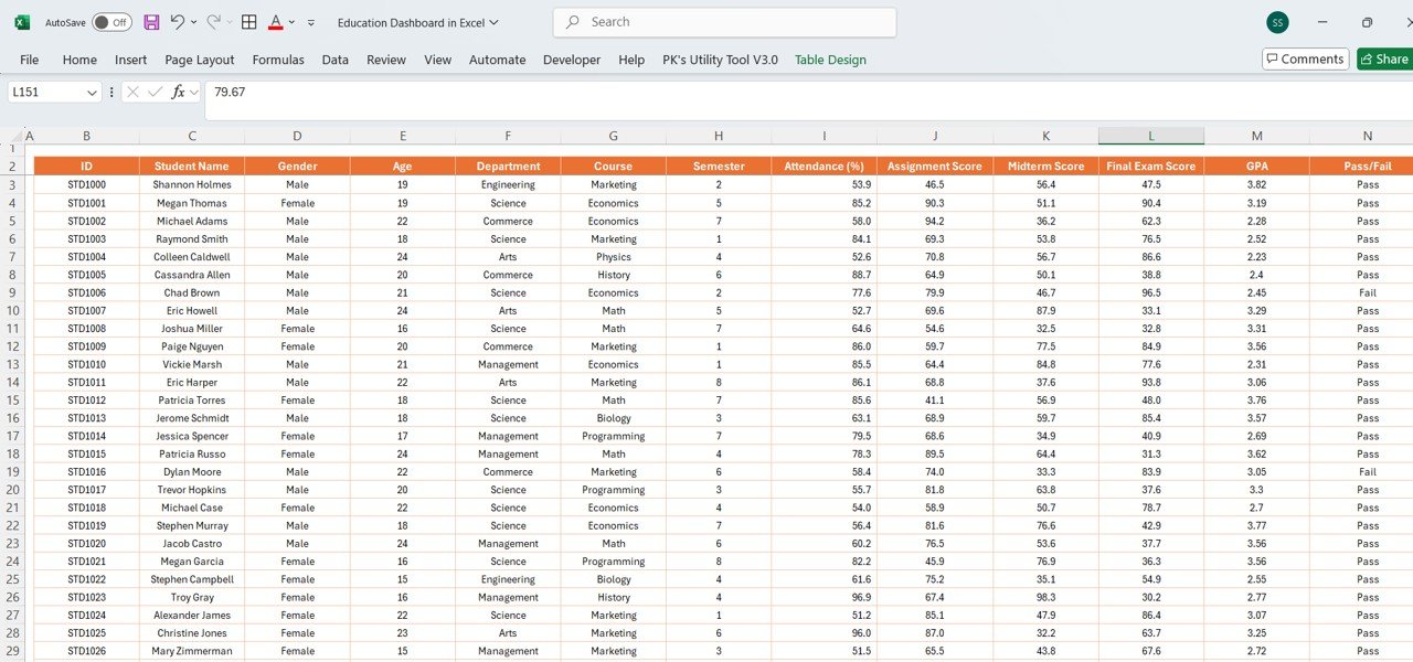
5. Data Sheet Tab: Inputting the Raw Data
The Data Sheet Tab is the backbone of your Education Dashboard. Here, all raw data is input, and it drives the various charts, metrics, and KPIs in the dashboard. This sheet should contain all relevant student information.
Columns in the Data Sheet Tab:
-
ID: A unique identifier for each student.
-
Student Name: The name of the student.
-
Gender: The gender of the student.
-
Age: The student’s age.
-
Department: The department to which the student belongs.
-
Course: The course in which the student is enrolled.
-
Semester: The current semester in which the student is studying.
-
Attendance (%): The student’s attendance percentage.
-
Assignment Score: The score achieved by the student on assignments.
-
Midterm Score: The student’s score on the midterm exam.
-
Final Exam Score: The student’s score on the final exam.
-
GPA: The student’s Grade Point Average.
-
Pass/Fail: Whether the student passed or failed the course.
-
Instructor: The name of the instructor for the course.
-
Pass: The number of students who passed.
-
Fail: The number of students who failed.
By regularly updating the data sheet, you ensure that your dashboard remains dynamic and reflects the most current information.
Click to buy Education Dashboard in Excel
Advantages of Using an Education Dashboard in Excel
Creating and using an Education Dashboard in Excel offers numerous advantages, including:
-
Centralized Data Management: The dashboard consolidates all academic data in one place, making it easier to monitor performance across various dimensions (attendance, GPA, etc.).
-
Visual Representation: Charts, graphs, and slicers visually present data, helping users quickly identify trends, strengths, and areas for improvement.
-
Improved Decision-Making: With a comprehensive overview of student performance, school administrators and instructors can make data-driven decisions about teaching methods, student support, and curriculum adjustments.
-
Time-Saving: The automated nature of the dashboard reduces manual tracking and reporting, allowing educators to focus more on teaching.
Opportunities to Improve the Education Dashboard
Although the Education Dashboard in Excel is a powerful tool, there are always opportunities for improvement. Here are some suggestions:
-
Integrating More Data Sources: To enhance the dashboard, consider integrating external data sources such as student feedback, extracurricular activities, or standardized test results.
-
Improving Data Input Automation: Automating the data entry process by importing data from student management systems can save time and reduce errors.
-
Adding Predictive Analysis: Using Excel’s built-in predictive tools or adding basic machine learning features can help forecast student performance trends, allowing for proactive interventions.
-
Customizing Visual Elements: Improving the design and layout of the dashboard by adding colors, logos, or personalized formatting can enhance user experience and readability.
Best Practices for Creating an Education Dashboard
Click to buy Education Dashboard in Excel
To ensure that your Education Dashboard is effective and useful, follow these best practices:
-
Keep It Simple: Avoid overwhelming users with too many metrics or overly complicated charts. Focus on the key indicators that matter the most.
-
Use Slicers and Filters: Incorporating slicers and filters enables users to explore data by specific variables like department, course, or instructor.
-
Ensure Data Accuracy: Regularly update the data sheet and check for any inconsistencies or errors to ensure that the dashboard reflects accurate information.
-
Make It User-Friendly: Design the dashboard in a way that even non-technical users can understand. Use intuitive charts, clear headings, and easy-to-read labels.
-
Monitor Performance Over Time: Regularly track the changes and trends over time to understand how student performance is evolving. This can provide valuable insights into areas that need attention.
Conclusion
An Education Dashboard in Excel is an essential tool for managing and analyzing student data. It simplifies the process of tracking attendance, performance, and other key academic metrics. By using charts, slicers, and cards, the dashboard provides a clear and actionable overview of student progress. With regular updates and proper maintenance, this tool can empower educators and administrators to make informed decisions and foster better student outcomes.
Frequently Asked Questions (FAQ)
1. What is an Education Dashboard in Excel?
An Education Dashboard in Excel is a tool that visualizes key academic metrics such as attendance, grades, and GPA using charts and graphs. It helps educators and administrators track student performance effectively.
2. What are the key features of the Education Dashboard?
The key features include:
-
Attendance analysis
-
GPA tracking
-
Pass/fail percentages
-
Charts for department-wise and instructor-wise insights
-
Slicers for filtering data based on variables like department, course, or instructor
3. How do I input data into the Education Dashboard?
Data is inputted into the Data Sheet Tab where information such as student names, attendance, assignment scores, and exam results are entered. This raw data feeds into the charts and visualizations on other sheets.
4. Can I customize the Education Dashboard?
Yes, the dashboard is customizable. You can modify the charts, add new metrics, or change the design to better suit your needs.
5. Is the Education Dashboard suitable for all educational institutions?
Yes, the dashboard can be adapted to any educational institution. You can customize the dashboard to track specific metrics relevant to your institution, such as course completion rates or extracurricular involvement.
Visit our YouTube channel to learn step-by-step video tutorials
Watch the step-by-step video tutorial:
Click to buy Education Dashboard in Excel