An Employee Productivity Dashboard in Excel is a dynamic and interactive tool that helps organizations monitor the productivity of their workforce. It consolidates essential data points like total employees, hours worked, errors made, tasks completed, and efficiency percentages into visual reports and performance charts.
This Excel-based dashboard is perfect for organizations looking for a cost-effective, user-friendly, and customizable way to manage employee performance. You don’t need to invest in expensive software—Excel provides all the flexibility and features needed for comprehensive productivity tracking.
Key Features of the Dashboard
The Employee Productivity Dashboard includes multiple worksheet tabs, each designed for specific insights. Below is a breakdown of these sheets and their functions:
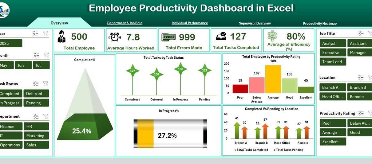
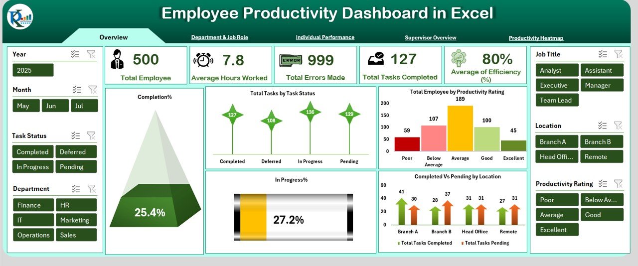
Overview Sheet Tab
This is the main landing page of the dashboard. It provides a high-level summary of workforce productivity.
Cards Displayed:
-
Total Employees
-
Average Hours Worked
-
Total Errors Made
-
Total Tasks Completed
-
Average Efficiency (%)
Charts:
-
Completion Percentage
-
Total Tasks by Task Status
-
Total Employees by Productivity Rating
-
In Progress %
-
Completed vs Pending by Location
These visuals provide instant insights into overall performance and help identify trends across the organization.
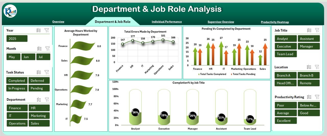
Department & Job Role Analysis
This tab breaks down productivity based on departmental and job-specific metrics.
Charts:
-
Average Hours Worked by Department
-
Total Errors Made by Department
-
Pending vs Completed by Department
-
Completion % by Job Title
This analysis is essential for identifying which departments or job roles may require support or intervention.
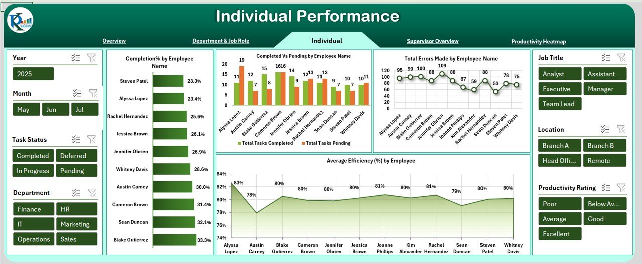
Individual Performance
Here, the dashboard evaluates each employee’s contributions.
Charts:
-
Completion % by Employee Name
-
Completed vs Pending by Employee Name
-
Total Errors Made by Employee Name
-
Average Efficiency (%) by Employee
This tab helps managers recognize high performers and identify those who may need additional training.
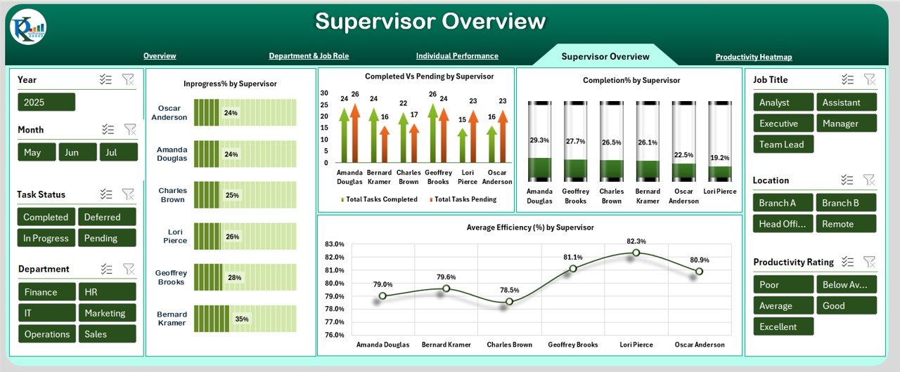
Supervisor Overview
Understand how productivity varies under different supervisors.
Charts:
-
Completed vs Pending by Supervisor
-
Completion % by Supervisor
-
Average Efficiency (%) by Supervisor
-
In Progress % by Supervisor
This insight can support performance reviews and managerial coaching efforts.
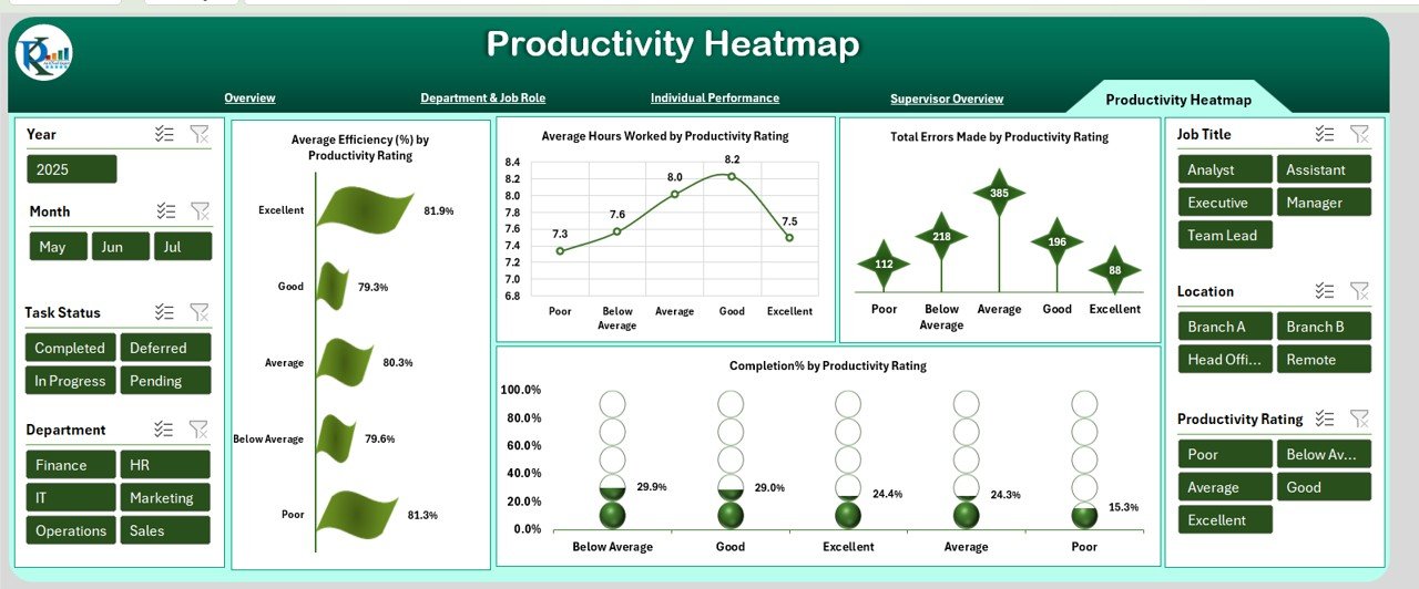
Productivity Heatmap
This tab presents a visual heatmap of various performance metrics by productivity rating.
Charts:
-
Average Efficiency (%) by Rating
-
Average Hours Worked by Rating
-
Total Errors Made by Rating
-
Completion % by Rating
It’s an excellent way to visually spot productivity clusters and performance gaps
Advantages of Using an Employee Productivity Dashboard in Excel
Using this dashboard can bring several benefits to your team and organization. Here are the top advantages:
-
Better Decision-Making: View key productivity metrics in real time.
-
Performance Insights: Drill down into departments, supervisors, or employees.
-
Cost-Effective: No expensive software required—built using Microsoft Excel.
-
Easy Updates: Add or update data regularly with minimal effort.
-
Visual Reporting: Use charts and visuals to make data easier to interpret.
-
Customization: Modify fields, formulas, and visuals to match your needs.
-
Time-Saving: Reduces manual effort in compiling performance reports.
-
Sharing Made Simple: Easily export charts and data for meetings or email updates.
Opportunity for Improvement in Employee Productivity Dashboards
While Excel dashboards are powerful, there are still some opportunities for enhancement:
-
Data Security: Without proper protection, sensitive employee data can be exposed.
-
Real-Time Syncing: Excel does not sync in real time unless connected to Power BI or cloud sources.
-
Mobile Compatibility: Excel dashboards are not as mobile-friendly as web dashboards.
-
Advanced Analytics: Lacks machine learning or predictive analytics features.
-
Collaboration Limits: Multiple users editing simultaneously can cause version conflicts.
Organizations looking for a more advanced solution can consider integrating Excel with tools like Power BI, SharePoint, or cloud-based databases to overcome these limitations.
Best Practices for Creating and Using an Employee Productivity Dashboard
To make the most of your Excel dashboard, follow these expert tips:
-
Define Clear KPIs: Decide on the key productivity indicators before building the dashboard.
-
Keep Your Data Organized: Maintain a clean and structured data source sheet.
-
Use Conditional Formatting: Highlight performance gaps and achievements visually.
-
Update Data Regularly: Ensure data freshness for accurate reporting.
-
Protect Sensitive Info: Use password protection and restrict editing where needed.
-
Automate Where Possible: Use formulas, pivot tables, and VBA to reduce manual tasks.
-
Train Team Members: Ensure users understand how to use and interpret the dashboard.
-
Review and Improve: Periodically review the dashboard to add new metrics or remove outdated ones.
Who Should Use the Employee Productivity Dashboard?
This dashboard is ideal for:
-
HR Teams tracking employee performance and engagement
-
Project Managers monitoring task completion rates
-
Team Leads reviewing workload distribution
-
Executives looking for high-level performance overviews
-
SMEs and Startups needing affordable performance tracking solutions
Conclusion
The Employee Productivity Dashboard in Excel is a must-have for any business that wants to improve performance tracking without breaking the bank. It brings visibility, accountability, and clarity to employee performance management. With a structured approach and the best practices outlined in this article, you can transform raw data into meaningful insights.
Whether you’re running a startup or a large organization, this tool offers flexibility, scalability, and a path toward greater productivity.
Frequently Asked Questions (FAQs)
1. What is the purpose of an Employee Productivity Dashboard?
An Employee Productivity Dashboard tracks employee performance using visual reports, helping businesses understand who is performing well and who may need support.
2. Can I use this dashboard without advanced Excel skills?
Yes! The dashboard is designed to be user-friendly. You can operate it using basic Excel knowledge.
3. Is it possible to add more KPIs to the dashboard?
Absolutely. You can customize it by adding new fields or metrics as per your business needs.
4. Can I track remote and onsite employees separately?
Yes. You can add a column to differentiate between remote and onsite employees and filter reports accordingly.
5. How frequently should I update the dashboard?
Ideally, update the data weekly or bi-weekly. Consistent updates keep the insights relevant and actionable.
6. Can I link the dashboard to an external database?
Yes. With some technical setup, you can link Excel to databases or tools like SharePoint, Access, or Power BI.
7. Is this dashboard mobile-friendly?
While basic viewing is possible on mobile, for full interactivity, it’s best used on a desktop or laptop.
8. How can I protect employee data in this Excel file?
You can use password protection, restrict editing, or save the file on secure, access-controlled locations.
9. What is considered a good employee efficiency percentage?
This varies by industry, but generally, an efficiency score above 80% is considered good.
10. Can this dashboard replace performance review tools?
It complements performance reviews by offering data-backed insights but does not entirely replace HR software or formal appraisal systems.
Visit our YouTube channel to learn step-by-step video tutorials