In today’s energy industry, monitoring and managing performance is essential for maintaining efficiency, reducing downtime, and minimizing emissions. The Energy & Utility Dashboard in Power BI is a comprehensive tool designed to help energy companies track vital metrics, improve performance, and stay compliant with environmental regulations. This ready-to-use dashboard offers an easy-to-use interface for analyzing data related to energy production, efficiency, emissions, and downtime.
In this article, we will provide a detailed overview of the Energy & Utility Dashboard in Power BI, including its key features and functionalities.
What is the Energy & Utility Dashboard in Power BI?
The Energy & Utility Dashboard in Power BI is a powerful tool that enables energy companies to visualize and analyze their data, track their performance, and make data-driven decisions. This dashboard comes with multiple pages that display important metrics, including energy output, downtime, emissions, efficiency, and more.
Key Features of the Energy & Utility Dashboard in Power BI
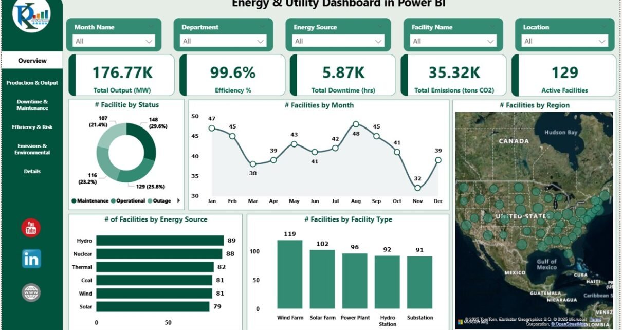
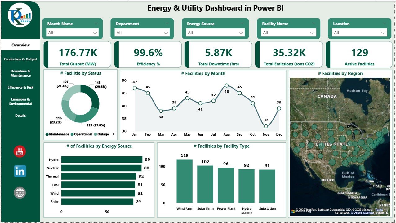
1) Overview Page: A High-Level View of Key Metrics
The Overview Page provides an at-a-glance view of the most important metrics for monitoring energy and utility operations. Features include:
Cards:
- Total Output (MW): Displays the total energy output in megawatts.
- Efficiency (%): Shows the overall efficiency of energy production.
- Total Downtime: Displays the total downtime (in hours) across all facilities.
- Total Emissions (tons CO2): Tracks the total emissions generated in tons of CO2.
- Active Facilities: Shows the number of active facilities producing energy.
Charts:
- # of Facilities by Status: Displays the count of facilities based on their operational status (e.g., active, inactive).
- # of Facilities by Month: Tracks the number of facilities operational each month.
- # of Facilities by Facility Type: Categorizes facilities based on their type (e.g., solar, wind, thermal).
- # of Facilities by Energy Source: Categorizes facilities based on the type of energy they produce.
- # of Facilities by Region: Tracks the number of facilities by geographical region.
This page helps users get an overview of their energy operations, identifying areas for improvement and trends over time.
Click to buy Energy & Utility Dashboard in Power BI
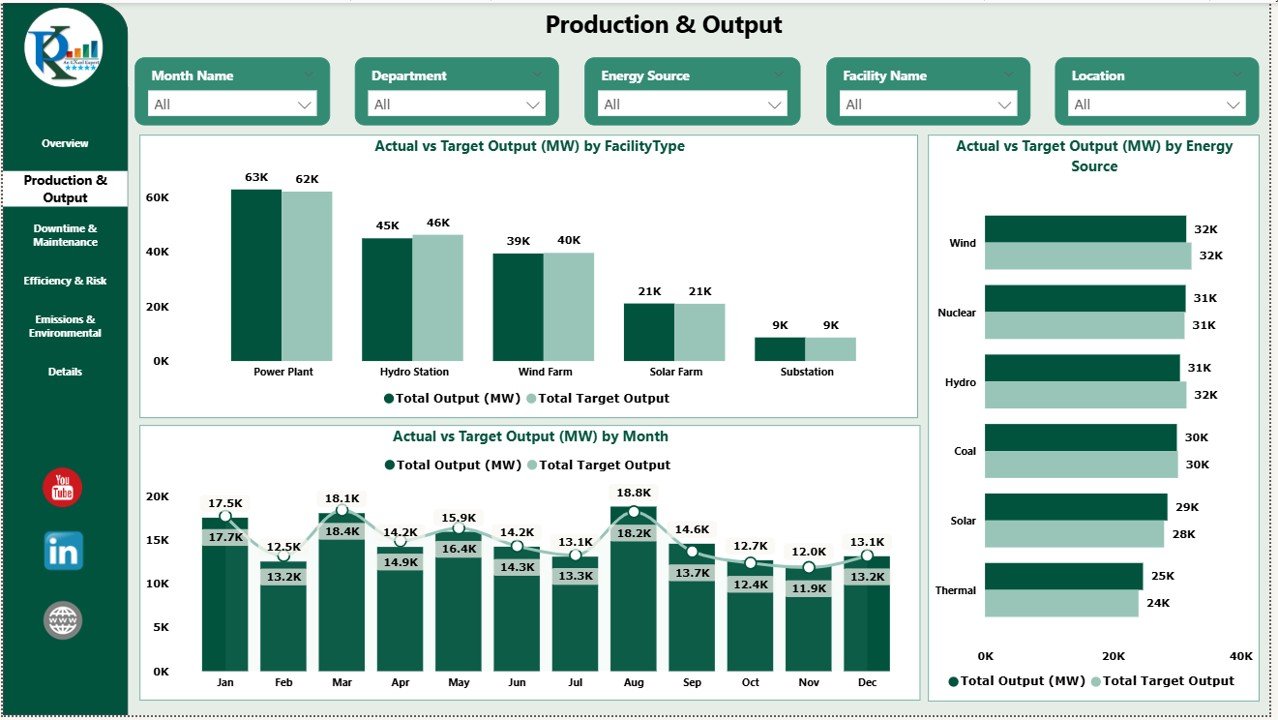
2) Production & Output: Tracking Energy Production Performance
The Production & Output page is focused on tracking energy production across various facilities and energy sources. Features include:
Charts:
- Actual vs Target Output (MW) by Facility Type: Compares the actual output to the target output by facility type (e.g., wind, solar, thermal).
- Actual vs Target Output (MW) by Energy Source: Compares the actual output to the target output based on the type of energy produced.
- Actual vs Target Output (MW) by Month: Tracks actual energy output against the target output on a monthly basis.
This page provides insights into how well each facility is performing against its production targets, allowing management to identify areas for improvement.
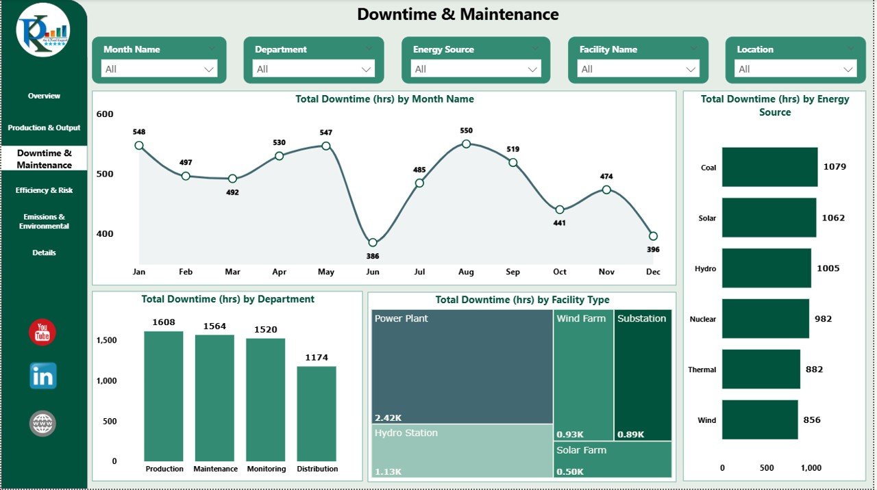
3) Downtime & Maintenance: Monitoring Downtime and Maintenance
The Downtime & Maintenance page helps you track the downtime experienced by your energy facilities and understand its impact on operations. Features include:
Charts:
- Total Downtime (hrs) by Month Name: Displays the total downtime for each month, helping you identify patterns or trends in downtime.
- Total Downtime (hrs) by Energy Source: Shows downtime by energy source, highlighting which sources experience more downtime.
- Total Downtime (hrs) by Facility Type: Displays downtime by facility type (e.g., solar, wind, thermal).
- Total Downtime (hrs) by Department: Breaks down downtime by department, allowing you to understand where operational bottlenecks may occur.
This page allows you to monitor downtime efficiently, helping to reduce the impact of maintenance and operational disruptions.
Click to buy Energy & Utility Dashboard in Power BI
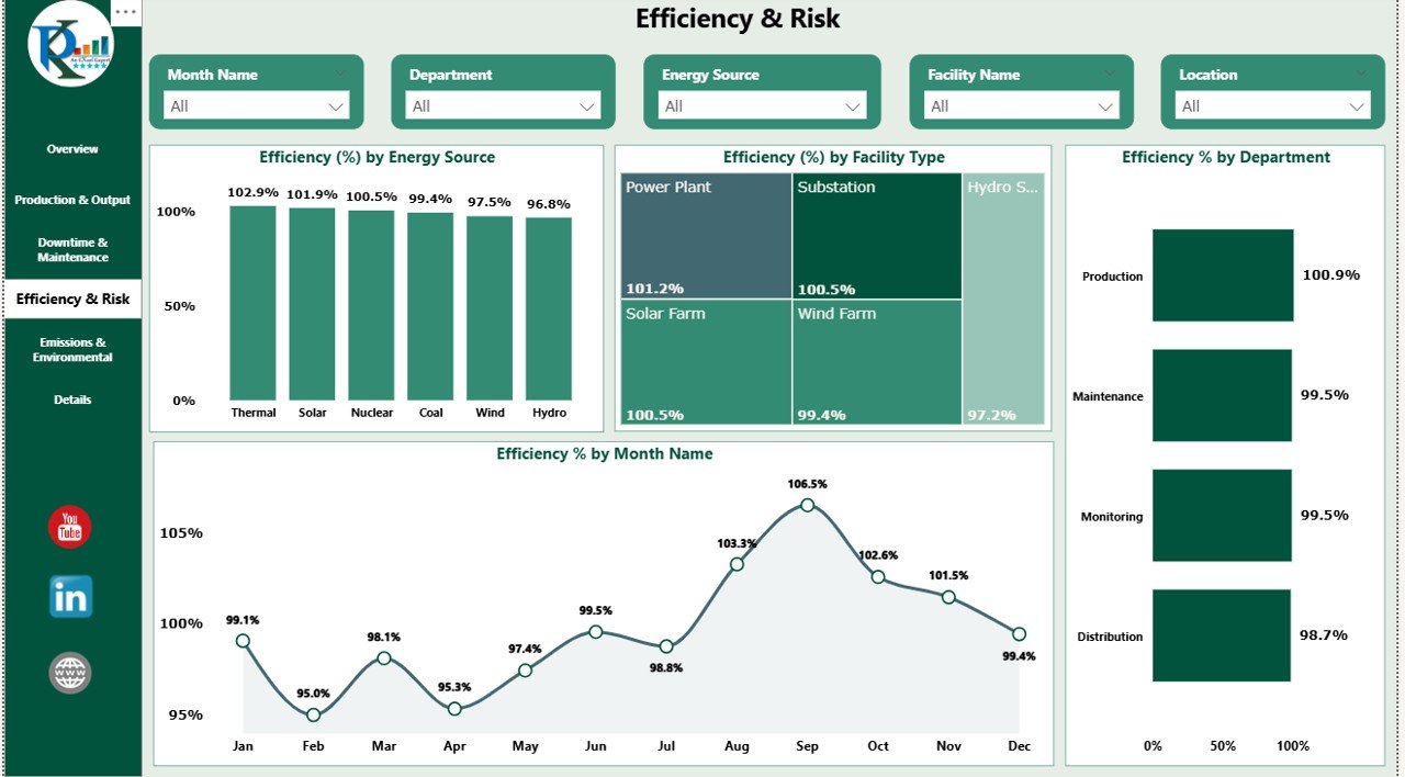
4) Efficiency & Risk: Assessing Operational Efficiency and Risk
The Efficiency & Risk page helps you evaluate the efficiency of your energy production processes and assess the risks involved. Features include:
Charts:
- Efficiency (%) by Energy Source: Shows the efficiency of energy production by energy source (e.g., wind, solar, thermal).
- Efficiency (%) by Facility Type: Tracks the efficiency of different types of facilities.
- Efficiency (%) by Department: Shows the efficiency of energy production within each department.
- Efficiency (%) by Month Name: Monitors the efficiency of operations across different months.
This page helps you assess operational efficiency and identify areas where improvements can be made.
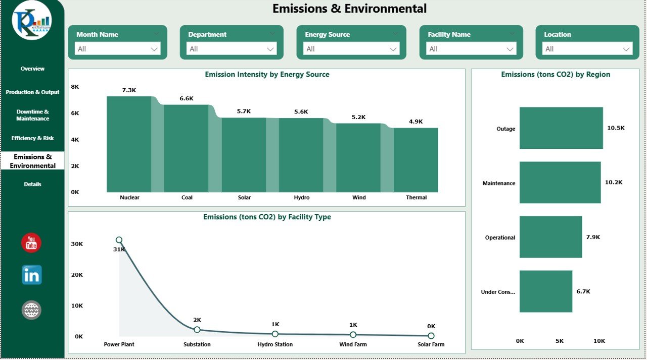
5) Emissions & Environmental: Environmental Impact Tracking
The Emissions & Environmental page tracks the environmental impact of energy production, focusing on emissions and sustainability. Features include:
Charts:
- Emission Intensity by Energy Source: Tracks the emissions produced per unit of energy for different energy sources.
- Emissions (tons CO2) by Region: Shows the emissions produced by region, helping you assess your geographical environmental footprint.
- Emissions (tons CO2) by Facility Type: Breaks down emissions by the type of facility producing the energy.
This page is critical for businesses that want to monitor their environmental impact and ensure they are meeting regulatory compliance and sustainability goals.
Click to buy Energy & Utility Dashboard in Power BI
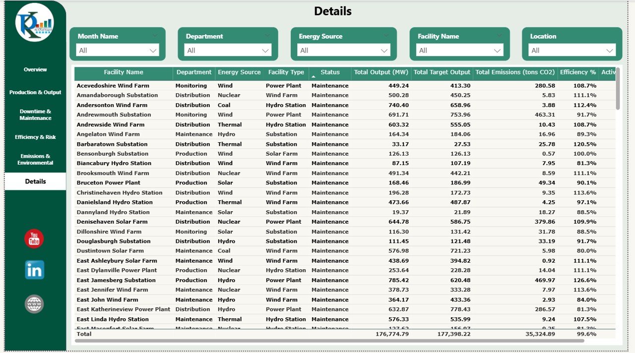
6) Details: A Comprehensive Data Table
The Details page provides a comprehensive table containing all relevant data for detailed analysis. This page allows you to view the raw data behind the charts and make more granular decisions.
Benefits of Using the Energy & Utility Dashboard in Power BI
The Energy & Utility Dashboard in Power BI offers several key advantages:
-
Centralized Data Management: All performance data is centralized in one place, making it easier to track key metrics and make data-driven decisions.
-
Real-Time Insights: The dashboard is powered by real-time data, giving you up-to-date insights into your operations.
-
Customizable: The dashboard can be customized to fit your specific business needs, such as adding new metrics or changing the layout.
-
Data Visualization: The integrated charts and cards make it easy to visualize performance trends and identify key areas for improvement.
-
Improved Decision Making: With all relevant metrics displayed in one place, you can make faster, more informed decisions that improve operational efficiency.
Best Practices for Using the Energy & Utility Dashboard
Click to buy Energy & Utility Dashboard in Power BI
To maximize the value of the Energy & Utility Dashboard, consider these best practices:
-
Update the Data Regularly: Ensure that your data is regularly updated to provide accurate insights.
-
Monitor Key Metrics: Pay close attention to key performance indicators (KPIs) like Efficiency, Emissions, and Downtime to identify areas for improvement.
-
Utilize the Charts: Use the charts to monitor trends over time and make adjustments based on the data.
-
Customize for Specific Needs: Adjust the dashboard to fit the unique requirements of your business, such as adding more energy sources or facility types.
-
Share Insights Across Teams: Share the dashboard with different teams to ensure everyone has access to the same data and can work towards common goals.
Conclusion
The Energy & Utility Dashboard in Power BI is an essential tool for energy and utility companies looking to monitor performance, reduce downtime, and minimize their environmental impact. By providing a comprehensive view of key metrics, including energy output, downtime, emissions, and efficiency, this dashboard helps you make data-driven decisions that improve operational efficiency and meet sustainability goals.
Frequently Asked Questions (FAQs)
Click to buy Energy & Utility Dashboard in Power BI
1. How do I update the data in the dashboard?
You can update the data by importing new data into Power BI. The dashboard will automatically reflect any changes in the data.
2. Can I customize the dashboard for my specific energy source?
Yes, you can customize the dashboard to include new energy sources or facility types to match your organization’s needs.
3. How do I track downtime for specific departments?
The Downtime & Maintenance page allows you to view downtime by department, helping you monitor where downtime is occurring within the organization.
4. Can I integrate this dashboard with other data sources?
Yes, Power BI allows you to integrate data from other sources, so you can combine data from multiple platforms into a single dashboard.
5. How can I share the dashboard with my team?
You can share the dashboard directly through Power BI by sending a link or embedding it into a shared workspace.
Visit our YouTube channel to learn step-by-step video tutorials
Watch the step-by-step video Demo:
Click to buy Energy & Utility Dashboard in Power BI