In today’s fast-moving business world, productivity plays a critical role in the success of every organization. Whether you manage a corporate team, a manufacturing unit, or a service-based company, measuring how long it takes new employees or projects to reach optimal productivity levels can make a huge difference in efficiency and profitability.
To achieve this, you need an easy-to-use, data-driven, and interactive tool — and that’s where the Time-to-Productivity KPI Dashboard in Excel comes in. This ready-to-use dashboard helps managers, HR professionals, and business leaders analyze performance trends, identify improvement areas, and make data-based decisions quickly.
This article explores everything about the Time-to-Productivity KPI Dashboard in Excel, including its structure, purpose, key features, advantages, best practices, and frequently asked questions.
Click to buy Time-to-Productivity KPI Dashboard in Excel
What Is a Time-to-Productivity KPI Dashboard in Excel?
A Time-to-Productivity KPI Dashboard is a visual performance-tracking tool that helps organizations measure how long employees, teams, or departments take to become fully productive. It transforms complex HR and operational data into clear, actionable visuals that support decision-making.
Built entirely in Microsoft Excel, this dashboard combines ease of use with automation. Users can monitor key performance indicators (KPIs), analyze Month-to-Date (MTD) and Year-to-Date (YTD) performance, and compare current achievements against targets or previous year results — all in a single, unified interface.
This Excel dashboard provides insightful analytics such as:
- Average Time-to-Productivity by Department
- Onboarding Completion Rate
- Training Efficiency Score
- Productivity Growth Rate
- Comparison of Actual vs Target performance
With these insights, businesses can identify which departments or processes take longer to reach productivity goals and take corrective actions faster.
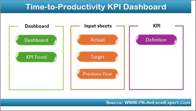
Structure of the Time-to-Productivity KPI Dashboard
The dashboard contains seven worksheet tabs, each serving a specific purpose to make the analysis structured, interactive, and efficient.
Home Sheet
The Home sheet serves as the dashboard’s main navigation hub. It includes six buttons that link to different sections of the workbook, allowing users to move seamlessly between pages.
Click to buy Time-to-Productivity KPI Dashboard in Excel
Key Highlights:
- Easy navigation using clickable buttons
- Professional design with company branding options
- Instructional notes for first-time users
- A clean interface for better user experience
This sheet ensures that even beginners can use the dashboard without needing advanced Excel knowledge.
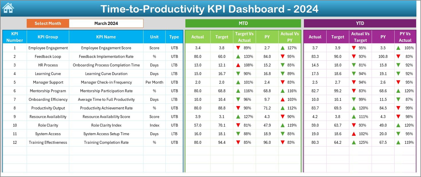
Dashboard Sheet Tab
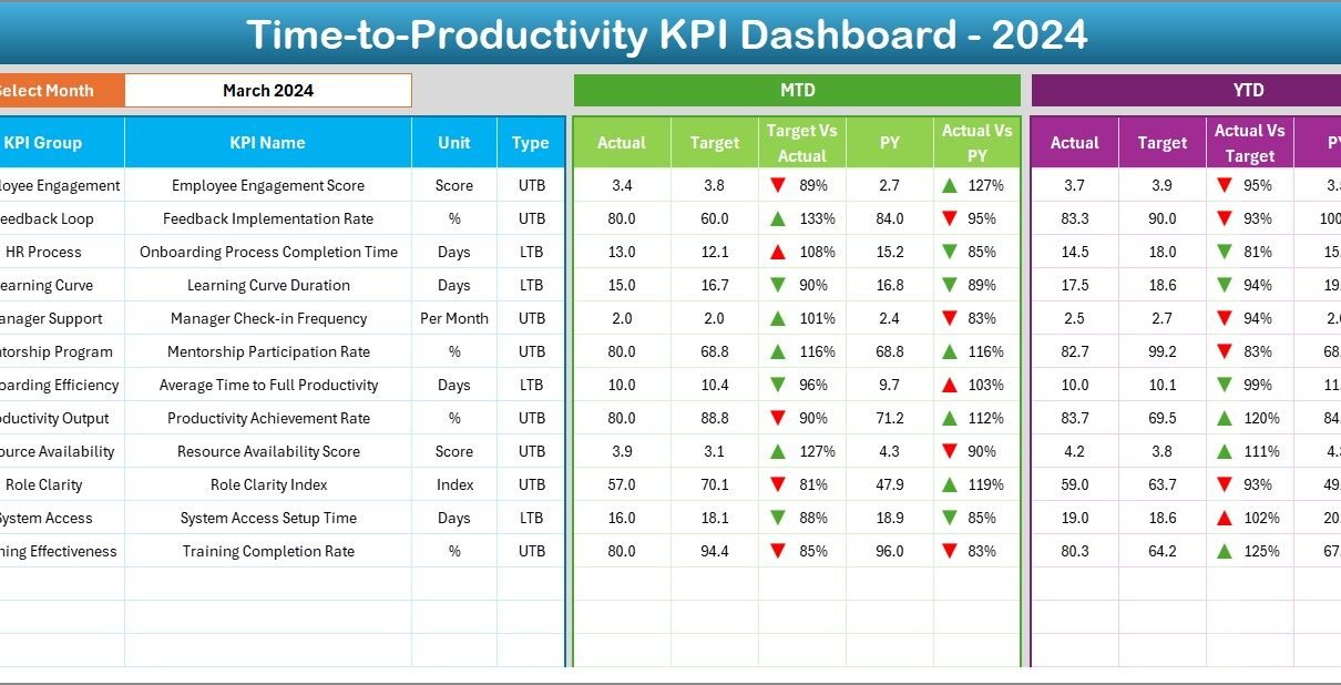
The Dashboard is the centerpiece of this Excel tool. It provides a complete overview of performance metrics, allowing users to analyze both MTD and YTD data dynamically.
Key Features:
- Dropdown menu in cell D3 to select the month
- Automatic update of all KPI cards and charts based on the selected month
- Visual indicators (✅⬆️ for improvement and 🔻 for decline)
- MTD and YTD comparisons for Actual, Target, and Previous Year values
- Conditional formatting to highlight performance gaps
This sheet helps managers instantly understand where performance stands relative to goals.
Click to buy Time-to-Productivity KPI Dashboard in Excel
KPI Trend Sheet Tab
The KPI Trend sheet provides an in-depth view of each KPI’s monthly performance. By selecting the KPI name from a dropdown menu in cell C3, you can explore detailed trends and variations.
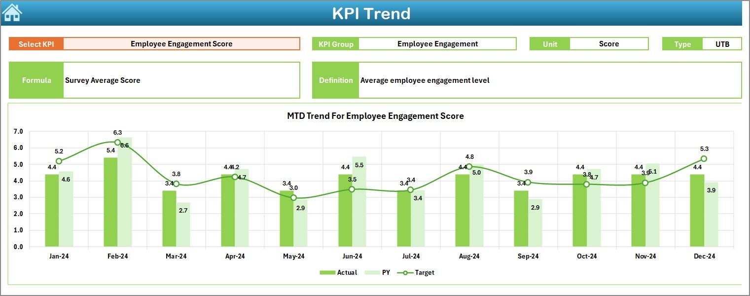
Displayed Data Includes:
- KPI Group
- Unit of Measurement
- Type of KPI: (Lower the Better — LTB / Upper the Better — UTB)
- Formula and Definition
- Trend Charts for MTD and YTD performance
This feature allows businesses to track productivity improvement over time and spot long-term patterns.
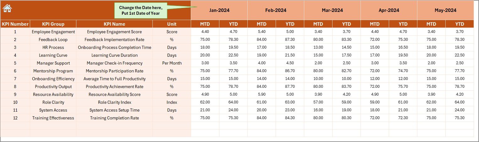
Actual Numbers Input Sheet
The Actual Numbers Input sheet is where users manually enter monthly data. You can choose the first month of the year in cell E1, and the sheet automatically adjusts to display relevant months.
Purpose:
- Record monthly MTD and YTD actual data
- Provide flexibility to update performance manually
- Support structured data storage for accurate chart calculations
By entering updated actual values, all dashboard visuals and metrics refresh automatically.
Click to buy Time-to-Productivity KPI Dashboard in Excel
Target Sheet Tab
This sheet allows organizations to define monthly and annual productivity targets for each KPI.
Highlights:
- Input both MTD and YTD Target values
- Align departmental goals with company objectives
- Enable automated variance analysis in the Dashboard
Setting realistic targets ensures clear expectations and accurate performance evaluation.
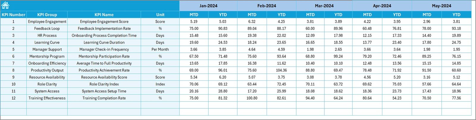
Previous Year Numbers Sheet
Historical comparison is key to understanding progress. This sheet stores previous year data for all KPIs — both MTD and YTD.
Benefits:
- Enables year-over-year (YoY) performance comparison
- Tracks improvement trends
- Provides baseline metrics for forecasting future results
Such comparisons motivate teams to continually enhance productivity.
KPI Definition Sheet Tab
This is the foundation sheet of the entire dashboard. It defines each KPI clearly so users understand what they are tracking.
Information Included:
- KPI Name
- KPI Group
- Unit of Measurement
- Formula
- KPI Definition
These details help standardize performance measurement across the organization, reducing confusion and maintaining consistency.
Why Is Time-to-Productivity Important?
Time-to-Productivity is a crucial performance metric that indicates how quickly an employee or team reaches expected efficiency after onboarding, training, or project initiation.
Key Reasons It Matters:
- Faster Onboarding: Shorter time-to-productivity means employees become effective sooner.
- Higher ROI: Reduces costs associated with unproductive time.
- Improved Planning: Helps HR forecast training needs and workforce readiness.
- Better Engagement: Employees who reach productivity quickly feel more confident and engaged.
By monitoring this KPI regularly, organizations can design smarter training programs, optimize workflows, and maintain long-term performance stability.
How Does the Time-to-Productivity KPI Dashboard Work?
The dashboard functions as a data-driven performance management system. Once the user inputs actual, target, and previous year values, the dashboard automatically calculates variances and updates charts.
Workflow Overview:
- Enter Actual Data in the Actual Numbers Input sheet.
- Define Targets in the Target sheet.
- Add Previous Year data for historical context.
- Select a Month from the Dashboard dropdown.
- View real-time performance analysis using MTD and YTD comparisons.
The built-in formulas and conditional formatting make it easy to see where performance exceeds or falls short of expectations.
Key Features of the Time-to-Productivity KPI Dashboard
This Excel-based dashboard combines powerful features with simplicity. Here are the most notable ones:
- Interactive Interface
Users can interact with dropdowns and buttons for a seamless experience without needing any macros or coding knowledge.
- Dynamic Charts and Cards
The dashboard automatically updates KPI cards and charts when the user changes the selected month.
- Conditional Formatting
Visual cues like green and red arrows instantly highlight areas that are over-performing or under-performing.
- MTD and YTD Comparisons
Both Month-to-Date and Year-to-Date analyses help in understanding short-term and long-term performance trends.
- Historical Performance View
By comparing against previous year values, users can measure true growth or identify recurring issues.
- Clear KPI Documentation
The KPI Definition sheet maintains transparency and uniformity across reporting standards.
Advantages of Using the Time-to-Productivity KPI Dashboard in Excel
This ready-to-use Excel tool offers multiple benefits for organizations of all sizes.
- Centralized Performance Tracking
Consolidates all KPI data into one place, eliminating scattered spreadsheets.
- Improved Decision-Making
Real-time metrics empower leaders to make informed, data-driven decisions.
- Enhanced Employee Efficiency
Identifies departments or individuals needing support or training.
- Visual and Interactive Reporting
Charts, arrows, and cards simplify interpretation of complex data.
- Time and Cost Efficiency
Reduces manual reporting and data-processing time significantly.
- Customization Flexibility
Organizations can modify KPIs, units, or visual themes to match business needs.
- Easy Integration
Since it’s Excel-based, it integrates smoothly with existing company data systems.
Opportunities for Improvement
Although the Time-to-Productivity KPI Dashboard is a powerful tool, it can always evolve further.
- Automation: Linking to live data sources (e.g., HR or ERP systems) can make updates automatic.
- Advanced Visuals: Integration with Power BI or Excel Power Query could add deeper insights.
- Predictive Analysis: Using statistical functions can forecast future performance trends.
- Mobile Optimization: Making the dashboard responsive for tablets and smartphones improves accessibility.
- Team Collaboration: Cloud-based sharing (via OneDrive or SharePoint) could enhance multi-user collaboration.
Best Practices for the Time-to-Productivity KPI Dashboard
To maximize the value of this dashboard, follow these best practices:
- Update Data Regularly: Enter actual numbers monthly to maintain accuracy.
- Use Consistent Units: Ensure all KPIs use standardized units and formats.
- Set Realistic Targets: Base targets on previous data and industry benchmarks.
- Review Trends: Use the KPI Trend sheet to monitor progress over time.
- Encourage Accountability: Assign responsibility for each KPI to a specific manager or team.
- Visualize Effectively: Keep charts clean and avoid cluttered visuals.
- Document Changes: Log any adjustments in KPIs or targets for future reference.
- Train Users: Ensure all users understand how to navigate and update the dashboard.
These practices help maintain reliability, consistency, and strategic clarity.
Who Can Benefit from This Dashboard?
The Time-to-Productivity KPI Dashboard in Excel is versatile and suitable for multiple audiences:
- Human Resources Managers: To track onboarding and training efficiency.
- Department Heads: To monitor team productivity and time-to-goal achievement.
- Project Managers: To evaluate how quickly project teams reach optimal performance.
- Executives and Analysts: To get a quick overview of organizational productivity trends.
It’s a perfect fit for organizations looking for a low-cost yet high-impact analytics solution.
How to Use the Time-to-Productivity KPI Dashboard
Follow these simple steps to start using the dashboard effectively:
- Open the Excel dashboard file.
- Navigate to the KPI Definition tab to review KPI details.
- Enter actual performance values in the Actual Numbers Input sheet.
- Input targets in the Target sheet.
- Record last year’s data in the Previous Year sheet.
- Return to the Dashboard sheet and select a month.
- Review performance visuals, trends, and comparisons.
Within minutes, you’ll have a clear, interactive view of how your organization performs against its productivity goals.
Conclusion
The Time-to-Productivity KPI Dashboard in Excel transforms the way organizations measure and monitor workforce effectiveness. With its structured layout, automation, and interactive visuals, it simplifies the complex process of tracking how quickly employees and teams reach full productivity.
By combining data accuracy with visual clarity, this tool enables faster decision-making, improved accountability, and long-term operational excellence. Whether you manage a small business or a large enterprise, this dashboard ensures that every minute spent translates into measurable results.
Frequently Asked Questions (FAQs)
- What is Time-to-Productivity in HR terms?
Time-to-Productivity measures how long it takes for a new hire or team to achieve expected performance levels after starting a job or project.
- Why should I use Excel for a KPI Dashboard?
Excel offers flexibility, ease of customization, and compatibility with most business systems — making it perfect for organizations that prefer quick, cost-effective analytics solutions.
- Can I add more KPIs to the dashboard?
Yes. You can add additional KPIs by updating the KPI Definition and corresponding Target and Actual sheets.
- Does this dashboard require Excel macros?
No. The dashboard works using standard Excel formulas, dropdowns, and conditional formatting — no VBA is required.
- How often should I update the data?
It’s best to update data monthly for MTD performance and quarterly or annually for YTD summaries.
- Can I connect this dashboard to Power BI?
Yes. You can import the Excel data into Power BI for more advanced visualization and interactive dashboards.
- Who should maintain this dashboard?
Typically, HR analytics or performance management teams maintain and update the dashboard regularly.
Visit our YouTube channel to learn step-by-step video tutorials
Click to buy Time-to-Productivity KPI Dashboard in Excel
Watch the step-by-step video tutorial: