Managing app performance in today’s competitive marketplace demands clarity, precision, and real-time insight. App developers, marketers, and analysts constantly monitor metrics like downloads, ratings, engagement, and conversion rates — but juggling these data points across multiple platforms can be overwhelming.
That’s where the App Store Optimization (ASO) KPI Dashboard in Power BI comes in. This ready-to-use analytical solution consolidates all your ASO performance metrics into a single, interactive view. Built entirely in Microsoft Power BI, it allows teams to measure, monitor, and improve app visibility and user acquisition efficiently.
Click to buy App Store Optimization KPI Dashboard in Power BI
What Is an App Store Optimization KPI Dashboard in Power BI?
An App Store Optimization KPI Dashboard is a data-driven reporting system designed to track, analyze, and visualize the performance of mobile apps across app stores. It consolidates data from sources like Excel, Google Play Console, or App Store Connect into a single dashboard, helping decision-makers understand what drives downloads, engagement, and retention.
Unlike static spreadsheets, this Power BI dashboard uses interactive visuals, drill-throughs, and slicers to let users dynamically explore ASO metrics. Whether you want to analyze keyword performance, app ratings, or user behavior, you can do it all in one place — without switching between tools or reports.
Key Objectives of the ASO KPI Dashboard
- Track and measure all major ASO metrics (downloads, CTRs, ratings, etc.)
- Compare current vs previous year performance
- Identify high-performing keywords and regions
- Visualize KPIs through clear, colorful charts and trendlines
- Improve app visibility and conversion through data-based insights
Dashboard Structure Overview
This Power BI dashboard consists of three main pages and connects seamlessly with an Excel-based data source. Each page offers a distinct analytical view designed to support data-driven ASO strategies.
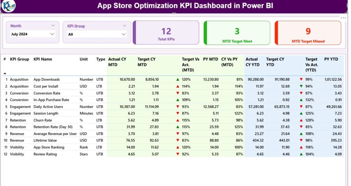
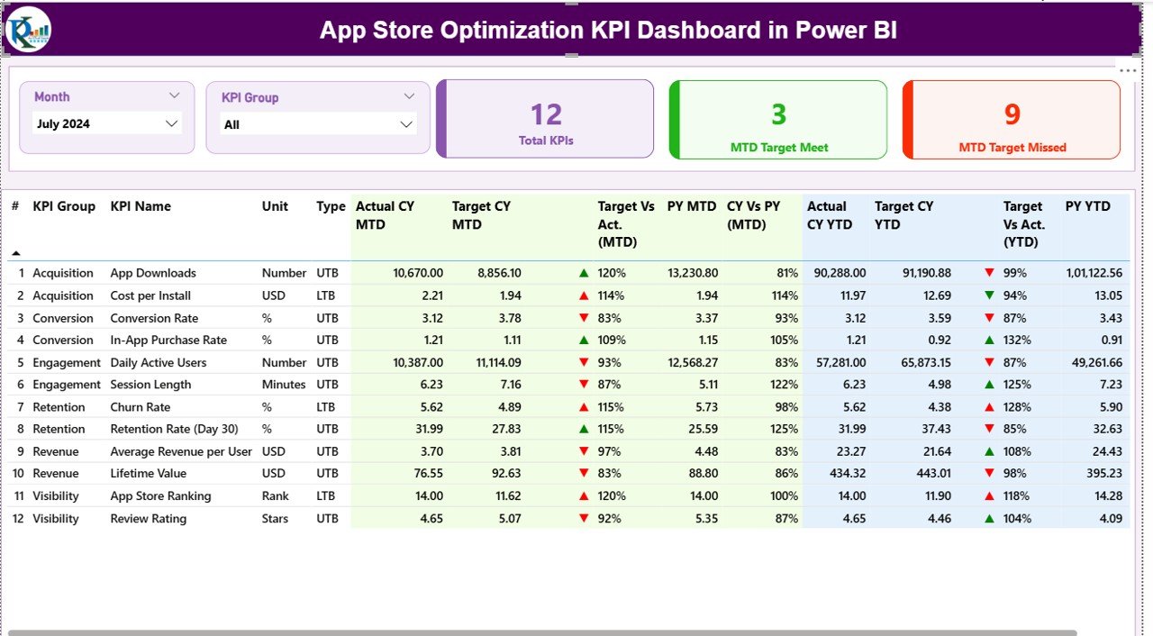
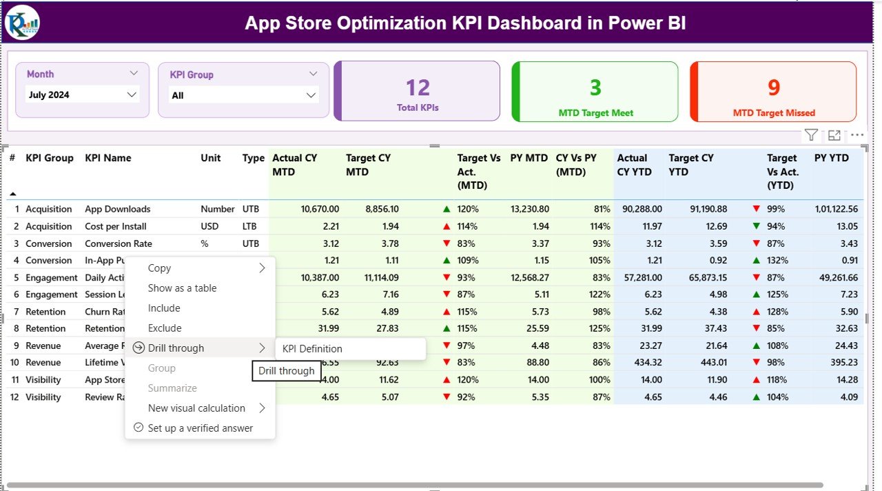
Summary Page
The Summary Page serves as the main control center of the dashboard. It gives users a comprehensive overview of all ASO-related KPIs at a glance.
Key Elements:
- Slicers: Month and KPI Group filters on top to dynamically switch between time periods and KPI categories.
- Cards:
- Total KPIs Count — Displays the total number of KPIs being tracked.
- MTD Target Met Count — Highlights how many KPIs have achieved their current month targets.
- MTD Target Missed Count — Shows the number of KPIs underperforming.
- Detailed KPI Table:
The central table provides insights into each KPI, including: - KPI Number and Name
- KPI Group
- Unit of Measurement
- KPI Type (Upper the Better or Lower the Better)
- Actual vs Target (MTD and YTD)
- Icons (▲/▼) with red and green indicators for performance comparison
Previous Year Comparison (MTD & YTD)
This structured table helps you quickly identify which KPIs are on track and which require immediate action.
Click to buy App Store Optimization KPI Dashboard in Power BI
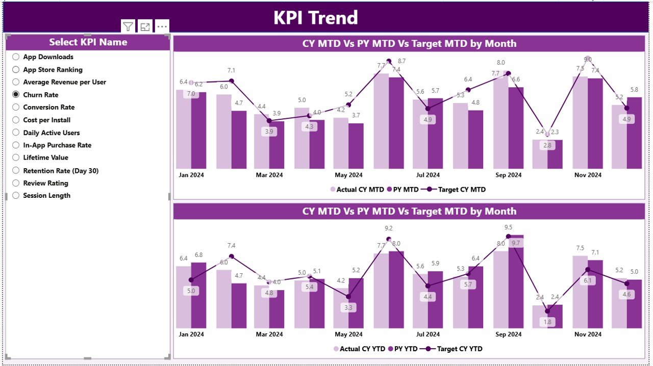
KPI Trend Page
The KPI Trend Page visualizes performance trends through interactive combo charts. It helps users track how ASO metrics evolve month-over-month and year-over-year.
Main Components:
- Slicer: A drop-down selector for KPI names, allowing users to isolate and analyze individual metrics.
- Combo Charts: Two combination charts comparing:
- Actual (Current Year) vs Target vs Previous Year (MTD)
- Actual (Current Year) vs Target vs Previous Year (YTD)
- These visuals make it easy to spot performance trends, seasonality effects, or patterns that influence app growth.
Click to buy App Store Optimization KPI Dashboard in Power BI
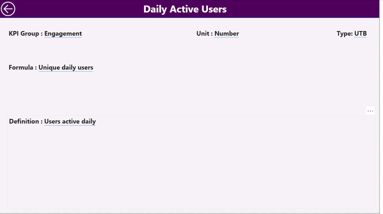
KPI Definition Page
The KPI Definition Page acts as a drill-through page for users seeking deeper context. When you right-click a KPI from the summary view and choose Drill Through, Power BI takes you here to see:
- KPI formula
- KPI definition
- Unit type
- Performance classification (UTB/LTB)
This page remains hidden for streamlined navigation, with a back button at the top-left corner for easy return to the main dashboard.
Click to buy App Store Optimization KPI Dashboard in Power BI
Excel Data Source and Structure
This dashboard integrates seamlessly with an Excel workbook that serves as the data source. It contains three worksheets — each essential for updating the dashboard’s visuals.
- Input_Actual Sheet:
Enter monthly Actual Numbers (MTD/YTD) for each KPI and month.
Columns include: KPI Name, Month (first day of each month), MTD, YTD. - Input_Target Sheet:
Enter corresponding Target Numbers for each KPI and time period using the same structure as the actual sheet. - KPI Definition Sheet:
Define each KPI with columns for:
- KPI Number
- KPI Group
- KPI Name
- Unit
- Formula
- Definition
- Type (LTB/UTB)
This simple Excel setup makes data management easy for non-technical users while allowing Power BI to update reports automatically with just a data refresh.
Click to buy App Store Optimization KPI Dashboard in Power BI
Advantages of App Store Optimization KPI Dashboard in Power BI
The dashboard provides a range of advantages that empower data-driven app marketers and developers.
- Centralized Performance Tracking
Instead of managing scattered reports and spreadsheets, this dashboard consolidates all ASO metrics in one interactive Power BI file.
- Real-Time Insights
With automatic updates from Excel, you can view live performance metrics without re-building reports manually.
- KPI-Based Decision-Making
Every metric has clear visibility—helping identify areas where performance meets or falls short of the target.
- Visual Clarity
Charts, slicers, and icons make it easy to interpret complex data quickly — ideal for management reporting and presentations.
- Year-Over-Year Comparison
Comparing current and previous year data highlights progress and helps forecast future performance trends.
- Easy to Customize
Add or modify KPIs, colors, or visuals to fit your app’s tracking needs. It’s a flexible Power BI solution for any ASO strategy.
- Saves Time and Effort
The dashboard automates reporting, reducing the manual workload for data teams and analysts.
Why Use Power BI for App Store Optimization?
Power BI is one of the most powerful business intelligence tools available. For ASO tracking, it offers:
- Seamless data connectivity with Excel and other sources
- Interactive filtering through slicers
- Dynamic visuals like combo charts, cards, and gauges
- Drill-through capabilities for in-depth analysis
- Customizable design for professional reporting
It transforms complex app data into clear, actionable insights that help businesses improve downloads, conversions, and revenue.
Opportunities for Improvement
While the dashboard offers robust features, continuous improvement enhances long-term performance.
- Automate Data Imports: Connect directly to APIs like App Store Connect or Google Play Console to reduce manual entry.
- Add Engagement KPIs: Include metrics like session duration, churn rate, or daily active users for deeper insights.
- Integrate Marketing Data: Merge campaign spend, impressions, and ROI data for complete ASO visibility.
- Include Predictive Analytics: Use Power BI’s AI visuals to forecast download trends or ratings.
- Add Alert Systems: Conditional formatting and notifications can highlight anomalies instantly.
Best Practices for App Store Optimization KPI Dashboards
- Maintain Clean and Updated Data
Ensure the Excel data source is regularly updated. Inaccurate or outdated data leads to incorrect decisions.
- Standardize KPI Definitions
Each KPI should have a consistent formula and definition to avoid confusion among stakeholders.
- Use Clear Visuals
Avoid cluttered visuals. Use cards for summary metrics and combo charts for trend analysis.
- Highlight Key Insights
Add conditional formatting to show positive (green) or negative (red) performance shifts clearly.
- Simplify Navigation
Provide a home or back button for intuitive navigation between pages.
- Refresh Data Regularly
Schedule Power BI refreshes to keep metrics live and accurate.
- Integrate with Marketing Dashboards
Combine ASO data with marketing dashboards for complete performance visibility across channels.
How to Use the Dashboard Effectively
- Open the Power BI File: Launch the .pbix file in Power BI Desktop.
- Connect Excel Data Source: Ensure the Excel file paths for Actuals, Targets, and Definitions are correct.
- Select Time Period: Use the Month slicer to analyze specific periods.
- View KPI Summary: Review which KPIs met or missed targets.
- Drill Through: Click on any KPI to explore detailed formula or definition.
- Compare Trends: Navigate to the KPI Trend page to analyze month-wise performance.
- Generate Reports: Export visuals to PowerPoint or PDF for presentations.
By following these steps, you can analyze app store performance and optimize growth decisions effectively.
Conclusion
The App Store Optimization KPI Dashboard in Power BI empowers app managers, marketers, and developers to take control of their performance metrics. It unifies complex ASO data into one clean, visual, and interactive interface — making data-driven decision-making simpler than ever.
Whether you’re tracking downloads, ratings, or user engagement, this dashboard gives you the insights you need to improve visibility, attract more users, and grow your app sustainably. With Power BI’s interactive power, the entire ASO analysis process becomes faster, smarter, and more efficient.
Frequently Asked Questions (FAQs)
- What is an App Store Optimization KPI Dashboard?
It’s a Power BI-based analytics tool that helps track and visualize app performance metrics such as downloads, conversion rates, ratings, and user retention.
- Who should use this dashboard?
App developers, marketing teams, and ASO specialists can use this dashboard to monitor app performance, identify improvement areas, and optimize store presence.
- Can I modify or add my own KPIs?
Yes. You can easily edit the KPI Definition sheet in Excel and refresh the Power BI dashboard to reflect new metrics.
- What are the data requirements for this dashboard?
You’ll need an Excel file with three worksheets: Input_Actual, Input_Target, and KPI_Definition.
- Does this dashboard support drill-through analysis?
Yes. You can drill through from the summary page to the KPI Definition page to view formulas and definitions.
- How often should I refresh the dashboard?
Refresh it weekly or monthly depending on your app update frequency and data availability.
- Can this dashboard work for both Android and iOS apps?
Absolutely. It can consolidate data from both Google Play and App Store platforms for a unified performance view.
Visit our YouTube channel to learn step-by-step video tutorials
Watch the step-by-step video tutorial:
Click to buy App Store Optimization KPI Dashboard in Power BI