In today’s hyper-competitive telecom industry, retaining customers is far more valuable than acquiring new ones. With rising customer expectations, shifting pricing models, and emerging competitors, telecom providers must track customer satisfaction, churn rates, and loyalty metrics closely. That’s exactly where the Telecom Customer Retention KPI Dashboard in Power BI comes in — a ready-to-use analytics solution designed to help telecom professionals monitor key performance indicators (KPIs) that directly impact customer loyalty and profitability.
This dashboard transforms raw data into meaningful insights. It enables telecom companies to understand customer behavior, evaluate retention strategies, and visualize trends in one central, easy-to-use Power BI file. Let’s explore what makes this tool powerful and how it can revolutionize your data-driven decision-making.
Click to buy Telecom Customer Retention KPI Dashboard in Power BI
What Is a Telecom Customer Retention KPI Dashboard?
A Telecom Customer Retention KPI Dashboard is an interactive reporting system built in Power BI that helps telecom organizations track their customer retention metrics over time. It consolidates data from multiple sources — customer feedback, churn records, and performance targets — and displays the insights visually.
With built-in slicers, filters, and color-coded icons, the dashboard allows teams to measure Month-to-Date (MTD) and Year-to-Date (YTD) performance, identify gaps between targets and actuals, and take proactive actions to improve customer experience.
This dashboard is powered by Excel-based data inputs and designed for easy integration into Power BI, making it suitable for managers, analysts, and executives alike.
Key Features of the Telecom Customer Retention KPI Dashboard
The dashboard is built with three key analytical pages, each serving a unique purpose.
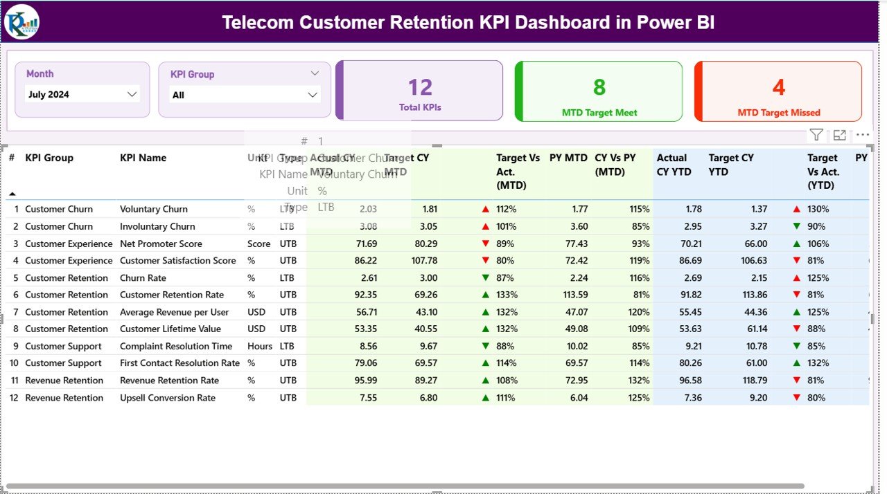
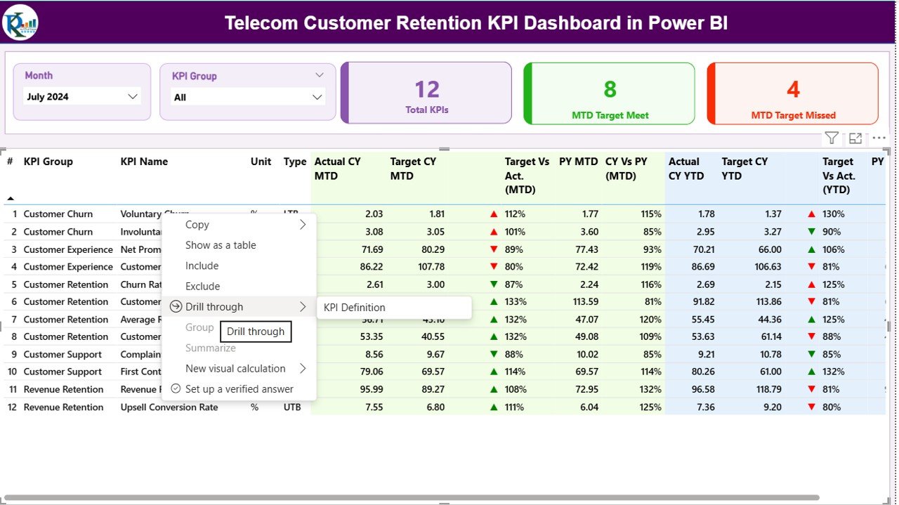
Summary Page – The Command Center
The Summary Page serves as the main hub of the dashboard. It gives an instant snapshot of overall KPI performance.
Highlights of the Summary Page:
- Dynamic Slicers: At the top, users can filter data by Month and KPI Group for focused analysis.
- Performance Cards:
- Total KPIs Count – Displays how many KPIs are being tracked.
- MTD Target Met Count – Shows how many KPIs have achieved their monthly targets.
- MTD Target Missed Count – Highlights the KPIs that need attention.
Below these cards lies a detailed KPI performance table, featuring all relevant metrics:
- KPI Number: Sequential identifier for each KPI.
- KPI Group: Logical grouping of KPIs (e.g., Customer Satisfaction, Service Quality).
- KPI Name: Specific metric name such as “Customer Churn Rate” or “Average Call Resolution Time.”
- Unit: The unit of measurement (%, Count, Seconds, etc.).
- Type: Indicates whether the metric is UTB (Upper the Better) or LTB (Lower the Better).
- Actual CY MTD: Actual value achieved for the current month.
- Target CY MTD: Target value set for the same period.
- MTD Icon: A green ▲ or red ▼ icon visually represents whether performance meets or misses the target.
- Target vs Actual (MTD): Displays performance percentage using the formula (Actual ÷ Target).
- PY MTD: Previous Year’s MTD performance for comparison.
- CY vs PY (MTD): Shows how this year’s performance compares to last year’s using the formula (Current ÷ Previous).
- Actual CY YTD / Target CY YTD: Shows cumulative yearly actuals and targets.
- YTD Icon: Visual indicator for YTD goal achievement.
- Target vs Actual (YTD): Uses the formula (Actual ÷ Target).
- PY YTD / CY vs PY (YTD): Enables historical trend comparison.
This structure gives managers a bird’s-eye view of customer retention metrics — instantly showing which KPIs need urgent attention.
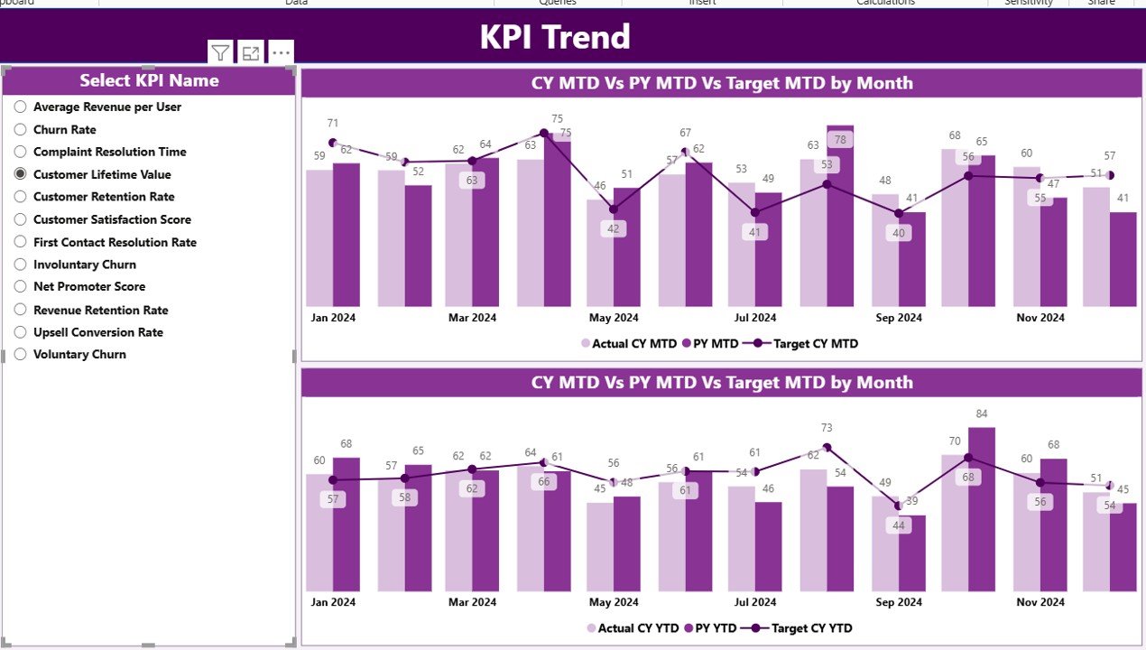
KPI Trend Page – Visual Performance Insights
The KPI Trend Page provides an in-depth analysis of performance over time. It allows users to track trends for both MTD and YTD values.
Main elements:
- KPI Selector Slicer: A drop-down on the left allows users to choose a specific KPI for analysis.
- Combo Charts: Two combination charts display:
- Actual vs Target vs Previous Year for MTD
- Actual vs Target vs Previous Year for YTD
These charts make it easy to spot seasonal fluctuations, performance improvements, or declining trends. Analysts can quickly identify whether retention efforts — such as loyalty programs or pricing adjustments — are working.
Click to buy Telecom Customer Retention KPI Dashboard in Power BI
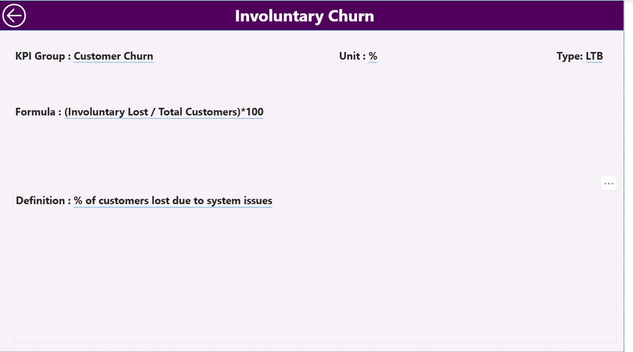
KPI Definition Page – Detailed KPI Understanding
The KPI Definition Page serves as a reference library for every KPI used in the dashboard. It is a hidden drill-through page accessible from the Summary Page.
When users right-click a KPI on the summary table and select “Drill Through,” they can see:
- KPI Number
- KPI Group
- KPI Name
- Unit
- Formula
- Definition
- Type (LTB or UTB)
This page promotes transparency by clarifying how each KPI is calculated and what business aspect it represents. A Back button at the top lets users easily return to the main dashboard.
Click to buy Telecom Customer Retention KPI Dashboard in Power BI
Excel Data Structure Behind the Dashboard
The dashboard connects directly to an Excel data source containing three key worksheets:
- Input_Actual Sheet Tab:
Enter the monthly actual performance values for each KPI. - Columns include: KPI Name, Month (first date of the month), MTD Value, YTD Value.
- Input_Target Sheet Tab:
Record the target values for each KPI in the same structure as the actual sheet. - Columns include: KPI Name, Month, MTD Target, YTD Target.
- KPI_Definition Sheet Tab:
Define the KPIs by listing: KPI Number, Group, Name, Unit, Formula, Definition, and Type (UTB/LTB). - This data model ensures that Power BI automatically refreshes when new data is entered — keeping your reports up to date without manual intervention.
Why Do Telecom Companies Need a Retention Dashboard?
Customer retention is the lifeline of telecom profitability. With increasing competition, retaining an existing customer costs significantly less than acquiring a new one. The Telecom Customer Retention Dashboard empowers companies to:
- Track churn rate and loyalty drivers.
- Measure customer satisfaction (CSAT/NPS).
- Compare target vs. actual retention metrics.
- Identify underperforming service areas.
- Make data-driven decisions faster.
Without a central dashboard, telecom teams often work with scattered spreadsheets and reports. Power BI brings all this data together, offering a unified visual story of performance.
Advantages of Telecom Customer Retention KPI Dashboard in Power BI
Implementing this Power BI dashboard delivers measurable advantages for telecom businesses:
- Enhanced Visibility
It consolidates every important KPI — from churn rate to average resolution time — into one dashboard, helping leadership monitor overall customer health at a glance.
- Real-Time Decision Making
As soon as you update the Excel data source, Power BI refreshes the visuals automatically, allowing teams to act on the most recent information.
- Customizable and Scalable
The dashboard accommodates any telecom structure — whether for regional performance, product categories, or service channels — with minimal adjustments.
- Early Warning System
Visual red and green icons immediately indicate which KPIs fall below target, enabling timely corrective action.
- Improved Collaboration
Different departments — such as Customer Support, Marketing, and Sales — can access the same data model, ensuring consistency and cross-functional alignment.
- Cost Efficiency
Building a dashboard in Power BI with Excel data avoids expensive software solutions while providing enterprise-level analytics.
- Historical Trend Tracking
Comparing Current Year vs. Previous Year data helps organizations understand long-term retention trends.
How to Use the Telecom Customer Retention Dashboard Effectively
To get the most from your dashboard, follow these practical steps:
- Prepare Your Data:
Collect customer retention metrics such as churn percentage, average contract duration, and satisfaction scores. - Populate the Excel Templates:
Fill in the Input_Actual and Input_Target sheets monthly. Consistency in naming and date formatting is critical. - Load Data into Power BI:
Open the Power BI file, refresh the data model, and validate the visuals. - Use Slicers Smartly:
Filter by month or KPI group to identify weak performing areas quickly. - Drill-Through for Deeper Insights:
Explore KPI formulas and definitions for clarity on calculations. - Share Reports Securely:
Publish your dashboard to Power BI Service for real-time access by executives or team members.
Common KPIs to Track in Telecom Customer Retention
Every telecom company has unique priorities, but the following KPIs are standard across the industry:
- Customer Churn Rate (%) – Measures how many customers discontinue service.
- Customer Lifetime Value (CLV) – Total revenue expected from a customer.
- Net Promoter Score (NPS) – Gauges customer satisfaction and loyalty.
- Average Revenue Per User (ARPU) – Indicates revenue per active customer.
- First Contact Resolution Rate (%) – Measures how efficiently support issues are resolved.
- Service Downtime (Minutes) – Tracks network reliability and service quality.
- Complaint Resolution Time (Hours) – Average time to resolve customer complaints.
- Renewal Rate (%) – Percentage of customers who renew subscriptions.
These metrics, when visualized dynamically, reveal actionable insights that help reduce churn and strengthen relationships.
Best Practices for the Telecom Customer Retention Dashboard
Implementing best practices ensures your dashboard stays effective and reliable.
- Keep KPI Definitions Clear
Every team member should understand how KPIs are calculated. The KPI Definition page ensures transparency.
- Update Data Regularly
Upload the latest monthly data without fail. Automating data refresh enhances real-time accuracy.
- Use Conditional Formatting Wisely
Icons and color codes quickly communicate performance trends — but avoid overloading visuals.
- Segment Your Analysis
Use filters to view data by customer type, geography, or service package. This segmentation reveals patterns often hidden in aggregated data.
- Focus on Actionable Insights
Highlight KPIs that require action rather than overloading the report with too many metrics.
- Monitor Trends Over Time
Year-to-Year comparison visuals help you detect early signs of churn or satisfaction dips.
- Keep Design Simple
A clean layout improves readability. The dashboard should tell a story, not confuse with unnecessary visuals.
Practical Applications in Telecom Operations
Here’s how different departments in a telecom company benefit from this dashboard:
- Customer Care Teams: Identify which service areas or agents cause low satisfaction.
- Marketing Teams: Evaluate campaign effectiveness in retaining customers.
- Finance Teams: Monitor revenue retention and the cost of churn.
- Executives: Get a high-level performance view with drill-down options for specifics.
This shared visibility fosters accountability across teams and ensures data-driven collaboration.
Conclusion
The Telecom Customer Retention KPI Dashboard in Power BI is not just a reporting tool — it’s a strategic asset. It enables telecom companies to transition from reactive decision-making to proactive retention strategies. With an easy-to-update Excel backend and a beautifully visual Power BI front end, it bridges the gap between raw data and strategic insight.
By tracking metrics like churn rate, NPS, and ARPU in real time, telecom providers can strengthen customer relationships, minimize losses, and boost profitability. In a fast-evolving digital era, such dashboards are the key to maintaining competitive advantage.
Frequently Asked Questions (FAQs)
- What is a Customer Retention KPI Dashboard in Power BI?
It’s a Power BI solution that tracks and visualizes key metrics related to customer loyalty and churn, helping telecom companies monitor performance in real time.
- How does this dashboard help reduce churn?
By highlighting underperforming KPIs and showing trend comparisons, teams can take immediate corrective actions to retain customers.
- Can I connect this dashboard to live databases?
Yes. Although the default version uses Excel data, Power BI allows connections to SQL, cloud, or API data sources.
- What are the key KPIs included?
Churn Rate, Customer Lifetime Value, NPS, ARPU, Complaint Resolution Time, and Renewal Rate are commonly tracked.
- Do I need Power BI Pro to use this dashboard?
You can use it in Power BI Desktop for free. However, sharing it across teams requires Power BI Pro or Power BI Service.
- Is this dashboard customizable?
Absolutely. You can easily modify visuals, add KPIs, or change color themes based on organizational needs.
- How often should I update the data?
Ideally every month, or more frequently if you track weekly metrics.
Visit our YouTube channel to learn step-by-step video tutorials
Watch the step-by-step video tutorial:
Click to buy Telecom Customer Retention KPI Dashboard in Power BI