Managing employee performance throughout the year feels challenging for many organizations. You track KPIs, ratings, monthly performance, department trends, and manager-wise results. Because this information stays scattered across multiple Excel sheets, managers struggle to get a quick and clear view of annual performance. As a result, decision-making becomes slow, and performance reviews take more time than expected.
An Annual Performance Summary Dashboard in Excel solves this problem. It brings all performance-related data into one interactive and structured dashboard. You view KPIs, rating patterns, monthly performance trends, department results, and designation-wise insights in seconds. Since the dashboard uses Excel, you enjoy flexibility, full control, and ease of customization.
This detailed guide explains everything about the Annual Performance Summary Dashboard in Excel. You will learn its structure, features, advantages, best practices, and answers to common questions. You will also see why every HR team and manager must use this dashboard to improve annual performance evaluation.
Click to buy Annual Performance Summary Dashboard in Excel
What Is an Annual Performance Summary Dashboard in Excel?
An Annual Performance Summary Dashboard in Excel is a ready-to-use performance reporting tool that summarizes all yearly employee performance insights in one place. It shows KPIs, ratings, department-wise performance, designation-level results, manager-wise achievements, and monthly trends with the help of interactive charts and cards.
The dashboard works for any type of organization because it follows a simple and universal performance structure. Whether you run an IT company, a retail business, a manufacturing unit, or a consulting firm, this dashboard helps you evaluate yearly performance in a structured and visual manner.
Why Do Companies Need an Annual Performance Summary Dashboard?
Organizations evaluate performance every year, but manual reporting takes too much time. You search for KPI files, check rating sheets, combine data, and prepare charts manually. This process leads to confusion and delays.
The Annual Performance Summary Dashboard in Excel removes these problems. It gives you:
- A single view of all KPIs
- A clear comparison between Excellent, Good, Average, and Poor ratings
- Department-level insights
- Designation-level analysis
- Monthly performance patterns
- Manager-wise rating distribution
Because everything appears visually, managers understand patterns quickly and take better decisions.
Key Features of the Annual Performance Summary Dashboard in Excel
This dashboard includes multiple analytical sheets, each designed for performance tracking, review, and comparison. Below is a detailed breakdown of all pages and insights.
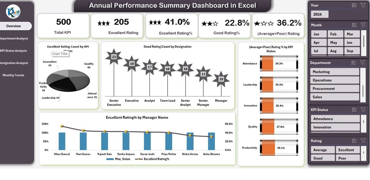
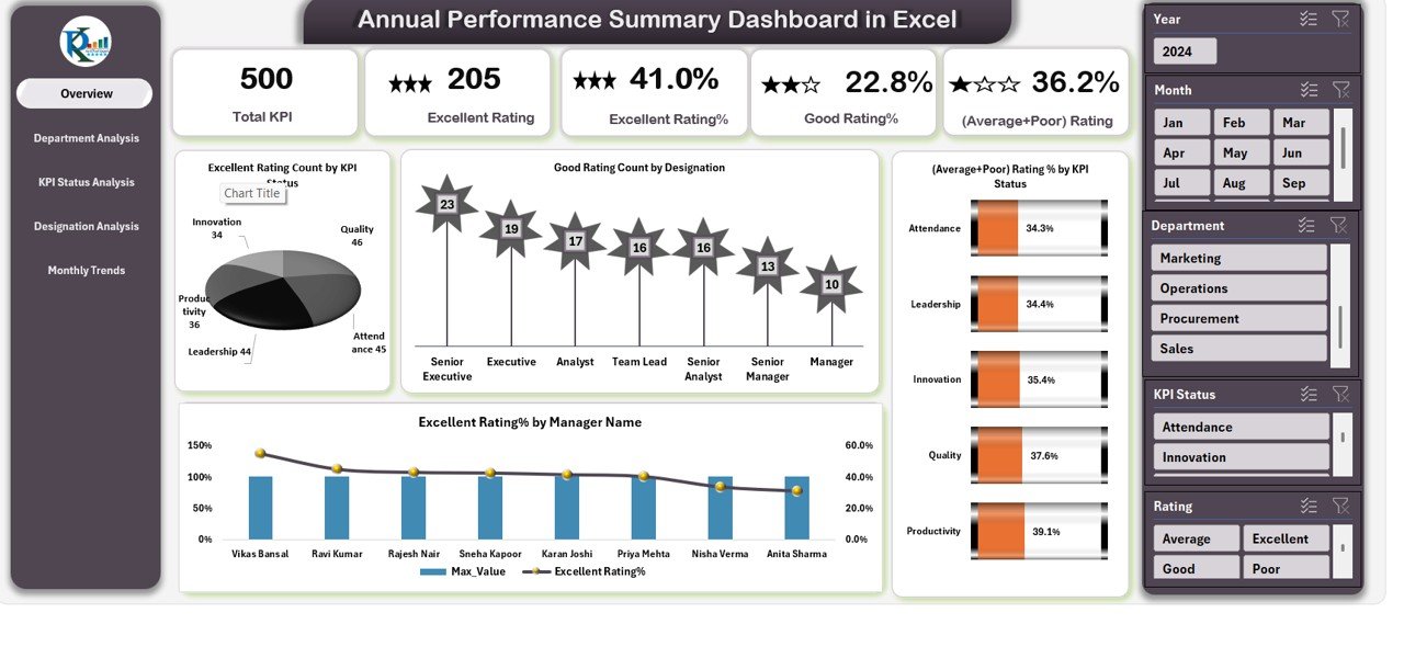
Overview Sheet
The Overview Sheet acts as the main page of the dashboard. It provides a quick summary of annual performance using cards and charts. Users can view:
Cards
- Total KPI – Total number of KPIs measured in the year
- Excellent Rating % – Percentage of KPIs with Excellent performance
- Good Rating % – Percentage of KPIs with Good performance
- (Average + Poor) Rating % – Combined percentage of Average and Poor ratings
Charts
- Excellent Rating Count by KPI Status – Shows how many KPIs received Excellent ratings
- Good Rating Count by Designation – Highlights designation-level Good performance
- Excellent Rating % by Manager Name – Shows which manager achieved higher performance
- (Average + Poor) Rating % by KPI Status – Shows weak areas requiring improvement
This page helps management understand overall performance in a few seconds.
Click to buy Annual Performance Summary Dashboard in Excel
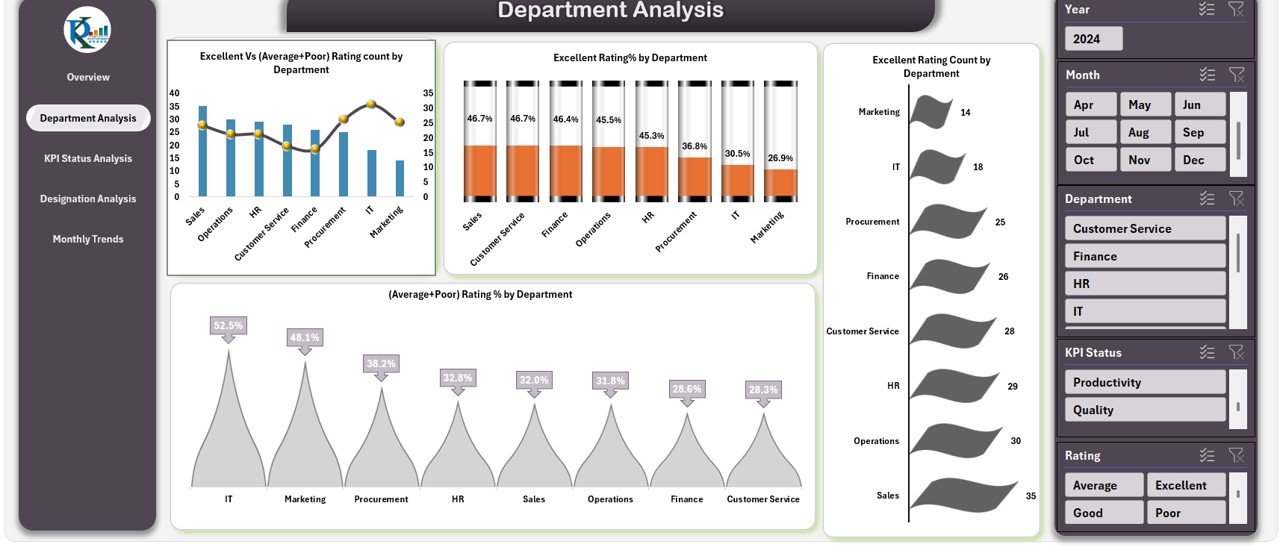
Department Analysis
The Department Analysis Sheet focuses on department-wise performance. It helps HR teams compare results across all functions.
You will see:
- Excellent vs (Average + Poor) Rating Count by Department
- Excellent Rating % by Department
- (Average + Poor) Rating % by Department
- Excellent Rating Count by Department
These insights help management understand which departments perform well and which ones need coaching or support.
Click to buy Annual Performance Summary Dashboard in Excel
KPI Status Analysis
The KPI Status Analysis Sheet breaks down performance by KPI rating categories. It shows performance distribution across:
- Excellent Rating % by KPI Status
- Good Rating % by KPI Status
- Average + Poor Rating Count by KPI Status
- Total KPI by KPI Status
This sheet helps users identify where performance is strong and where KPIs need revision or improvement.
Click to buy Annual Performance Summary Dashboard in Excel
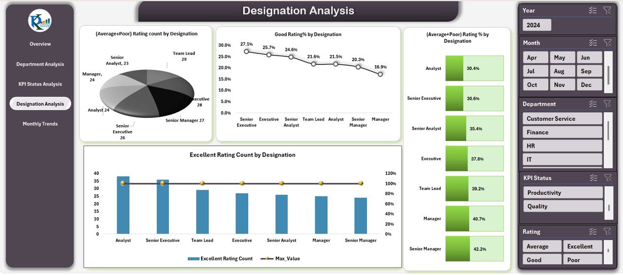
Designation Analysis
The Designation Analysis Sheet shows how employees at different levels perform. It includes:
- Average + Poor Rating Count by Designation
- Good Rating % by Designation
- Excellent Rating Count by Designation
- (Average + Poor) Rating % by Designation
This page helps you understand performance gaps based on job levels. For example, junior-level roles may struggle, while senior-level roles may excel.
Click to buy Annual Performance Summary Dashboard in Excel
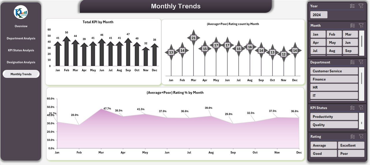
Monthly Trends
The Monthly Trends Sheet displays how performance changes month by month. It includes:
- Total KPI by Month
- (Average + Poor) Rating % by Month
- (Average + Poor) Rating Count by Month
This sheet helps you identify seasonal trends, recurring issues, and continuous improvement opportunities.
Why Does an Annual Performance Dashboard Matter?
An Annual Performance Summary Dashboard helps organizations:
- Review yearly performance faster
- Identify trends instantly
- Detect weak areas and skills gaps
- Compare departments and designations
- Plan training and development programs
- Make fair and data-driven appraisal decisions
It replaces manual reports with visual insights and gives management accurate information for strategic decisions.
Advantages of an Annual Performance Summary Dashboard in Excel
Below are the major benefits organizations experience after using this dashboard:
- Faster Decision-Making
Managers do not waste time searching for data. The dashboard shows all performance insights instantly.
- Accurate and Reliable Evaluation
Since the dashboard uses formulas and structured data, you avoid errors that usually occur in manual reporting.
- Better Planning and Strategy
HR teams use insights to:
- Plan training
- Improve weak KPIs
- Reward high performers
- Identify skill gaps
This helps organizations grow with better talent management.
- Complete Transparency
Everyone sees clear and unbiased performance data. This improves trust and fairness in the appraisal process.
- Easy to Use and Customizable
Excel allows you to customize:
- KPIs
- Rating categories
- Charts and visuals
- Filters and dropdowns
You can modify the dashboard based on company requirements.
How Does This Dashboard Improve HR Efficiency?
HR teams often spend hours preparing performance reports. With this dashboard, they complete the same work in minutes.
It improves efficiency because:
- All pages update automatically
- Charts refresh without manual calculations
- HR teams get a quick snapshot of performance
- Managers get real-time insights during reviews
This reduces workload and speeds up appraisal cycles.
Who Should Use the Annual Performance Summary Dashboard?
This dashboard works for:
HR Teams
They use it for annual reviews, performance analysis, and report creation.
Department Managers
They track team performance, identify gaps, and plan improvements.
Senior Management
They view high-level trends and make strategic decisions.
Business Owners
They get a clear picture of how employees perform across the company.
Performance Analysts
They use insights to improve performance frameworks and KPIs.
Best Practices for the Annual Performance Summary Dashboard in Excel
To get the best results from this dashboard, follow these practices:
Use Clean and Validated Data
Always update the dashboard with:
- Clean
- Verified
- Error-free
data.
This improves accuracy.
Update Monthly Trends Regularly
Keep monthly performance updated. This helps you track progress and intervene early.
Keep KPIs Clear and Measurable
Do not use vague KPIs. Use clear, measurable KPIs that reflect employee performance.
- Review Department Trends Frequently
Department-level insights help you:
- Identify weak areas
- Improve processes
- Support low-performing teams
Refresh Pivot Tables Before Reviews
Refresh all pivot tables after updating data so the dashboard displays the latest information.
Use Conditional Formatting
Use color coding for:
- Excellent
- Good
- Average
- Poor
This helps users understand performance faster.
Keep Rating Criteria Consistent
Use the same rating pattern across:
- Departments
- Managers
- Designations
Consistency improves fairness.
Conclusion
The Annual Performance Summary Dashboard in Excel is a powerful tool that helps organizations manage yearly performance in a structured and visual way. It simplifies evaluation, improves decision-making, and helps HR teams analyze performance trends without manual effort. The dashboard includes pages for Overview, Department Analysis, KPI Status Analysis, Designation Analysis, and Monthly Trends — giving you complete visibility of performance across the organization.
Whether you run a small business or a large company, this dashboard saves time, improves transparency, and supports better talent management. When you use clean data and follow best practices, this dashboard becomes one of the most valuable tools for performance evaluation.
Frequently Asked Questions (FAQs)
- What is an Annual Performance Summary Dashboard in Excel?
It is a ready-to-use Excel dashboard that shows yearly employee performance using charts, KPIs, and rating insights.
- Who can use this dashboard?
HR teams, managers, leadership teams, business owners, and performance analysts can use it.
- Does this dashboard work for any industry?
Yes. It works for IT, retail, manufacturing, consulting, and many other industries.
- Can I customize the KPIs?
Yes. You can add, remove, or modify KPIs based on your company’s performance structure.
- How often should I update the dashboard?
You should update it monthly to maintain accurate year-end reports.
- Do I need advanced Excel skills to use it?
No. Basic Excel knowledge is enough. The dashboard is simple and user-friendly.
- Can I export reports from this dashboard?
Yes. You can export charts and summaries for meetings, reviews, or presentations.
Visit our YouTube channel to learn step-by-step video tutorials
Watch the step-by-step video tutorial:
Click to buy Annual Performance Summary Dashboard in Excel