In today’s unpredictable business environment, disruptions can occur at any time. Natural disasters, cyberattacks, supply chain failures, system outages, or workforce unavailability can quickly bring operations to a halt. Therefore, organizations must plan, monitor, and improve their preparedness continuously. That is exactly where a Business Continuity Planning KPI Dashboard in Excel becomes a powerful and practical solution.
This article explains everything you need to know about a Business Continuity Planning KPI Dashboard in Excel, including what it is, why it matters, how it works, its advantages, best practices, and common questions. Moreover, the explanation uses simple language, clear structure, and real-world logic so that professionals at any level can easily implement it.
Click to buy Business Continuity Planning KPI Dashboard in Excel
What Is a Business Continuity Planning KPI Dashboard in Excel?
A Business Continuity Planning KPI Dashboard in Excel is a structured and interactive Excel-based reporting tool designed to track, measure, and analyze key performance indicators related to business continuity and resilience.
Instead of managing scattered spreadsheets or static reports, this dashboard consolidates all critical continuity KPIs into one centralized and automated view. As a result, decision-makers can monitor preparedness levels, recovery performance, and risk exposure in real time.
Most importantly, since it is built entirely in Microsoft Excel, organizations do not need expensive software or advanced technical skills to use it effectively.
Why Is Business Continuity Planning Important for Organizations?
Business continuity planning ensures that organizations can continue operating during and after disruptions. However, planning alone is not enough. Teams must also measure performance and identify gaps regularly.
Here is why business continuity planning matters:
- Disruptions can cause financial loss and reputational damage
- Regulatory bodies often require documented continuity plans
- Customers expect uninterrupted service
- Employees need clarity during emergencies
- Leadership requires data-driven insights to improve preparedness
Therefore, when organizations track KPIs through a dedicated dashboard, they gain visibility, control, and confidence.
How Does a KPI Dashboard Improve Business Continuity Planning?
A KPI dashboard transforms raw continuity data into meaningful insights. Instead of guessing readiness levels, organizations can clearly see what works and what needs improvement.
With a Business Continuity Planning KPI Dashboard in Excel, teams can:
- Monitor preparedness across departments
- Compare actual performance against targets
- Track improvement over time
- Identify weak areas before disruptions occur
- Support audits and compliance reporting
As a result, business continuity shifts from a reactive activity to a proactive strategy.
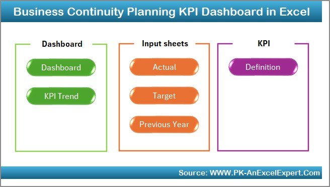
Overview of the Business Continuity Planning KPI Dashboard in Excel
In this template, we have created a ready-to-use Business Continuity Planning KPI Dashboard in Excel that focuses on simplicity, clarity, and usability.
The dashboard contains 7 well-structured worksheets, each designed for a specific purpose. Together, they form a complete KPI monitoring system for continuity planning.
What Are the Worksheets Included in This Dashboard?
Summary Page (Index Sheet)
The Summary Page acts as the entry point of the dashboard.
Key highlights of this page:
- Clean index layout
- 6 navigation buttons
- One-click access to all major sheets
- User-friendly design for executives
Because of this layout, users can quickly move to any section without searching through multiple tabs.
Click to buy Business Continuity Planning KPI Dashboard in Excel
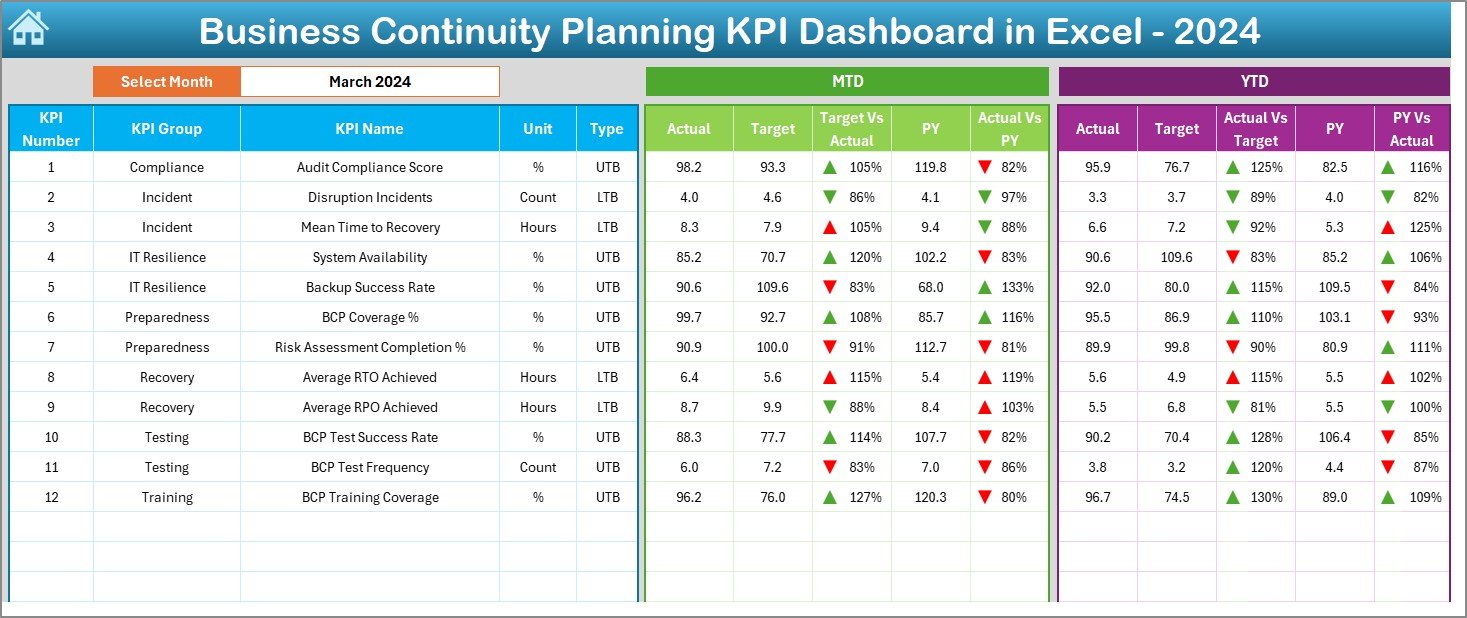
Dashboard Sheet – The Main KPI View
The Dashboard sheet is the core of the entire system. It displays all KPI performance in one consolidated view.
Key features of the Dashboard sheet include:
- Month selection dropdown (Cell D3)
- Automatic data refresh based on selected month
- MTD (Month-to-Date) performance
- YTD (Year-to-Date) performance
Moreover, the dashboard displays:
- Actual values
- Target values
- Previous Year (PY) values
To improve clarity, it also includes:
- Target vs Actual comparison
- Previous Year vs Actual comparison
- Conditional formatting with up and down arrows
As a result, users can instantly identify whether KPIs improve or decline.
Click to buy Business Continuity Planning KPI Dashboard in Excel
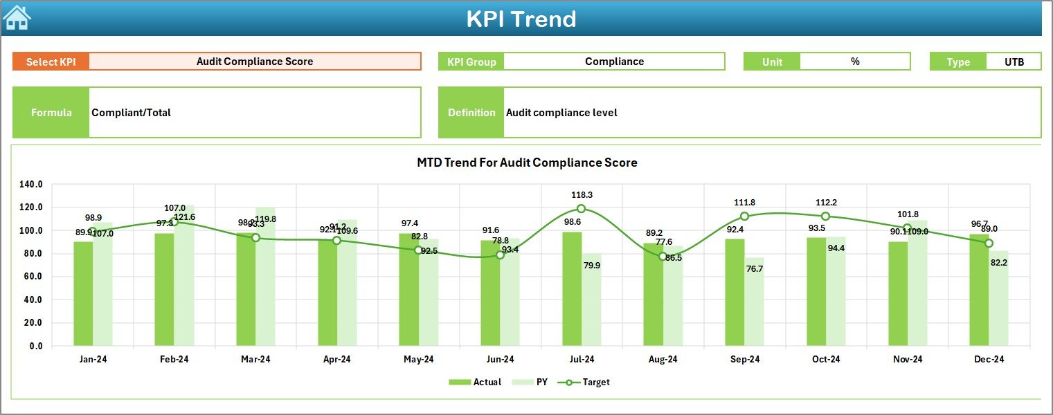
Trend Sheet – KPI Performance Over Time
The Trend sheet helps users analyze how each KPI performs over time.
Here, users can select a KPI Name from the dropdown in cell C3. Based on this selection, the dashboard displays:
- KPI Group
- Unit of measurement
- KPI Type (Lower the Better or Upper the Better)
- KPI Formula
- KPI Definition
In addition, the sheet shows:
- MTD trend chart
- YTD trend chart
- Actual vs Target vs Previous Year trends
Because of this structure, users can easily understand historical patterns and performance consistency.
Click to buy Business Continuity Planning KPI Dashboard in Excel
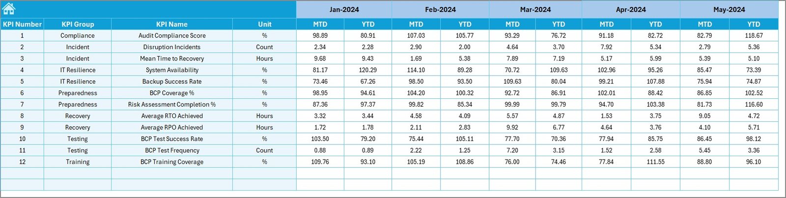
Actual Numbers Input Sheet
The Actual Numbers Input sheet allows users to enter real performance data.
How this sheet works:
- Enter the first month of the year in cell E1
- Input MTD and YTD actual values for each KPI
- Change months dynamically
Since the dashboard connects directly to this sheet, all visuals update automatically.

Click to buy Business Continuity Planning KPI Dashboard in Excel
Target Sheet – KPI Goals and Benchmarks
The Target sheet stores KPI target values.
Here, users enter:
- Monthly targets (MTD)
- Cumulative targets (YTD)
By maintaining targets separately, organizations can update goals without disturbing historical data.
Click to buy Business Continuity Planning KPI Dashboard in Excel
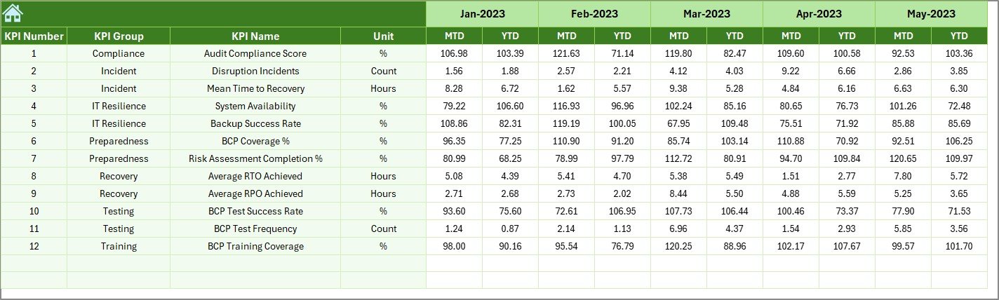
Previous Year Number Sheet
The Previous Year Number sheet stores historical data for comparison.
Users enter:
- Previous year MTD values
- Previous year YTD values
This comparison helps identify improvement trends and long-term progress.
Click to buy Business Continuity Planning KPI Dashboard in Excel
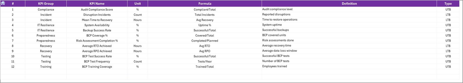
KPI Definition Sheet
The KPI Definition sheet acts as the foundation of the dashboard.
This sheet includes:
- KPI Name
- KPI Group
- Unit of measurement
- Formula
- KPI definition
Because of this structure, all stakeholders clearly understand what each KPI measures and how it is calculated.
Click to buy Business Continuity Planning KPI Dashboard in Excel
What Types of KPIs Can You Track in This Dashboard?
A Business Continuity Planning KPI Dashboard can track a wide range of metrics, such as:
- Disaster recovery time
- System availability percentage
- Backup success rate
- Incident response time
- Business impact analysis completion rate
- Continuity plan testing frequency
- Training completion rate
By customizing KPIs, organizations can align the dashboard with their specific risk profile.
Advantages of Business Continuity Planning KPI Dashboard in Excel
Using this dashboard offers several practical benefits.
Key Advantages
- Centralized KPI tracking in one file
- No dependency on costly BI tools
- Easy to customize and scale
- Clear visibility of risks and readiness
- Supports audits and compliance reviews
- Improves decision-making through data
- User-friendly navigation and layout
As a result, teams save time while improving preparedness.
Opportunities for Improvement Using This Dashboard
While the dashboard already delivers strong value, organizations can enhance its impact further.
Improvement Opportunities
- Add department-level slicers for deeper analysis
- Include risk heat maps for visual risk scoring
- Automate data input using Power Query
- Integrate testing schedules and reminders
- Link evidence documents for audits
By continuously improving the dashboard, organizations strengthen resilience year after year.
How Does This Dashboard Support Decision-Making?
The dashboard supports leadership decisions in several ways.
- It highlights weak continuity areas
- It shows whether targets are achievable
- It reveals trends across months and years
- It supports investment justification for risk mitigation
- It enables proactive corrective actions
Therefore, leadership can act before disruptions cause damage.
Best Practices for the Business Continuity Planning KPI Dashboard in Excel
To get maximum value, organizations should follow proven best practices.
Best Practices
- Define KPIs clearly before implementation
- Keep KPI definitions simple and measurable
- Update actual data on a fixed schedule
- Review trends monthly and quarterly
- Validate targets annually
- Use conditional formatting consistently
- Train users on dashboard interpretation
Following these practices ensures reliable and meaningful insights.
Who Can Use This Business Continuity KPI Dashboard?
This dashboard suits a wide range of professionals.
- Business continuity managers
- Risk and compliance teams
- IT and disaster recovery teams
- Operations managers
- Internal auditors
- Senior leadership
Since it uses Excel, almost anyone can adopt it quickly.
Why Choose Excel for Business Continuity KPI Tracking?
Excel remains one of the most trusted tools for business reporting.
Here’s why Excel works perfectly for this dashboard:
- Widely available and familiar
- Highly flexible and customizable
- No licensing complexity
- Strong charting and formatting options
- Easy integration with other data sources
Therefore, Excel delivers both power and simplicity.
How to Get Started with This KPI Dashboard?
Getting started is simple.
- Define your continuity KPIs
- Enter KPI definitions in the KPI Definition sheet
- Input targets and previous year data
- Update actual numbers monthly
- Review dashboard insights regularly
With these steps, organizations can quickly implement a professional KPI system.
Conclusion
A Business Continuity Planning KPI Dashboard in Excel is more than just a reporting tool. It acts as a strategic asset that helps organizations prepare for uncertainty, monitor resilience, and improve response capability.
By using a structured Excel dashboard with clear KPIs, automated calculations, trend analysis, and visual indicators, organizations gain clarity and confidence. Moreover, since the dashboard remains easy to use and customize, teams can continuously improve it as risks evolve.
In a world where disruptions remain unavoidable, strong visibility and data-driven decisions make all the difference.
Frequently Asked Questions (FAQs)
What is the purpose of a Business Continuity KPI Dashboard in Excel?
The purpose is to monitor, analyze, and improve business continuity performance using measurable KPIs in a centralized Excel dashboard.
Can small businesses use this dashboard?
Yes, small and medium-sized businesses can easily use this dashboard because it requires only Excel and basic data entry.
Does this dashboard support monthly and yearly analysis?
Yes, it supports both MTD and YTD analysis along with previous year comparisons.
Can I customize KPIs in this dashboard?
Absolutely. Users can add, remove, or modify KPIs using the KPI Definition sheet.
Is technical knowledge required to use this dashboard?
No, basic Excel knowledge is enough to operate and maintain the dashboard.
How often should KPI data be updated?
Organizations should update actual KPI data monthly or after major continuity tests.
Can this dashboard support audits?
Yes, it supports audits by providing structured KPI data, trends, and documented definitions.
Visit our YouTube channel to learn step-by-step video tutorials
Watch the step-by-step video tutorial:
Click to buy Business Continuity Planning KPI Dashboard in Excel