In today’s rapidly evolving business environment, managing organizational change effectively determines long-term success. Whether a company is implementing new technology, restructuring teams, or adapting to new regulations, change must be measured, monitored, and optimized. This is where the Change Management KPI Dashboard in Power BI becomes a game-changer.
Built with the power of Microsoft Power BI and fueled by Excel data, this dashboard gives leaders real-time visibility into the performance of change initiatives. It converts raw data into meaningful visuals, allowing management teams to make data-driven decisions with clarity and confidence.
Click to buy Change Management KPI Dashboard in Power BI
What Is a Change Management KPI Dashboard in Power BI?
A Change Management KPI Dashboard in Power BI is a powerful visualization tool that tracks key performance indicators (KPIs) related to organizational change. It helps stakeholders evaluate whether the changes being implemented are effective, sustainable, and aligned with company goals.
Instead of manually compiling reports from multiple spreadsheets, this dashboard automates the entire process. It connects directly to Excel data, updates visuals dynamically, and offers interactive filters that let users explore every angle of change performance — from monthly targets to year-to-date (YTD) trends.
Why Organizations Need Change Management Dashboards
Change initiatives often fail because progress is not tracked effectively. Managers may struggle to understand whether employees have adapted, if targets are being met, or if the overall transformation is moving in the right direction.
The Change Management KPI Dashboard in Power BI eliminates these challenges by:
- Providing a single source of truth for all change-related KPIs
- Offering visual performance insights through cards, charts, and icons
- Enabling MTD (Month-to-Date) and YTD (Year-to-Date) analysis
- Allowing easy comparisons between current year and previous year performance
- Displaying target vs actual metrics in real time
Structure of the Dashboard
This Power BI dashboard includes three key pages designed to offer both summary and detailed views of your data. Each page has specific functionality and visualizations that make it intuitive and powerful.
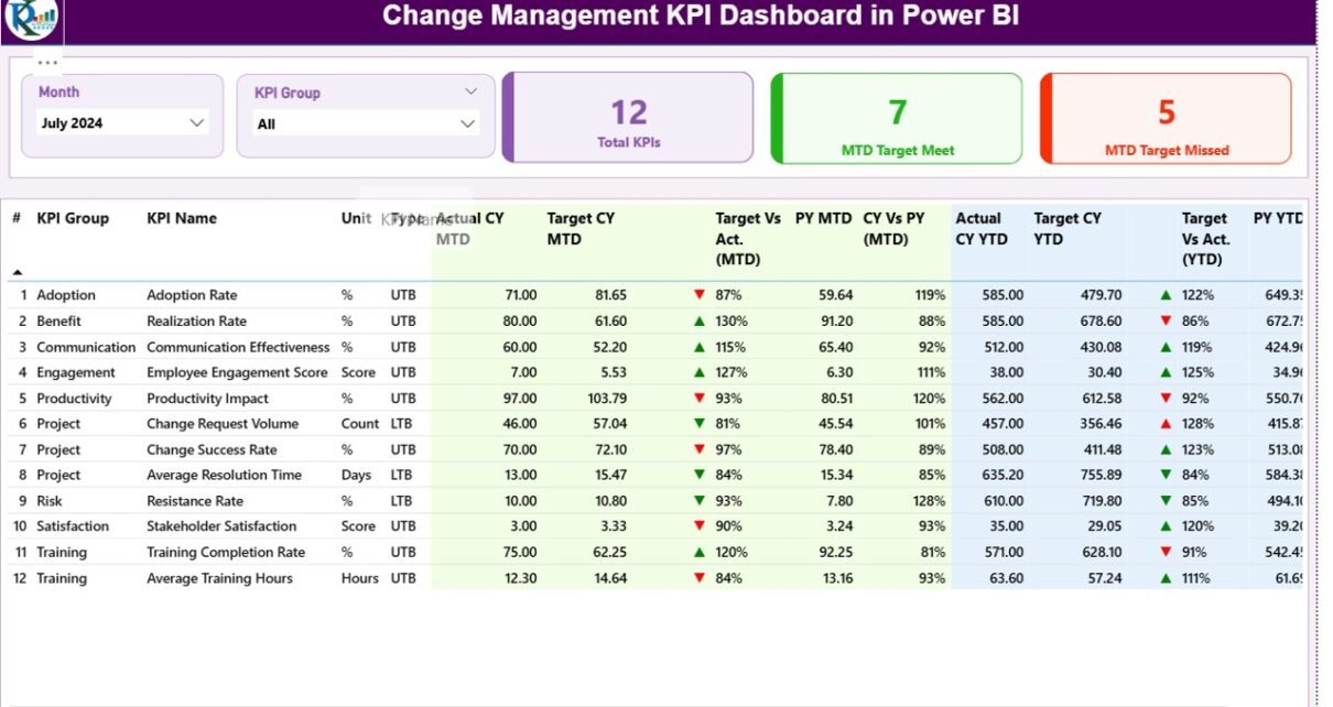
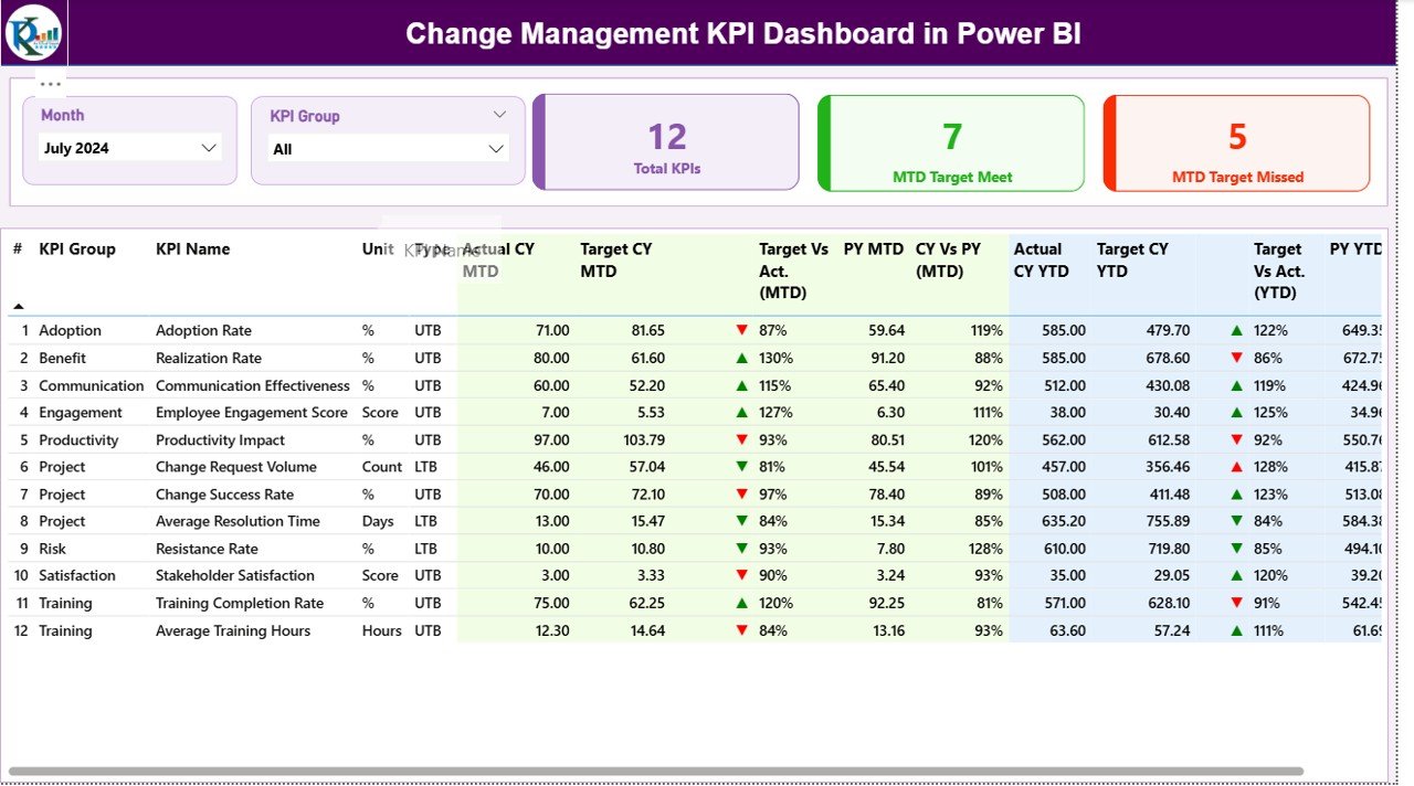
Summary Page — Your Central Command Center
The Summary Page acts as the main interface for tracking all KPIs in one place.
At the top of the page, you’ll find Month and KPI Group slicers, which allow you to filter data dynamically. Below them are three high-level KPI cards that instantly summarize your progress:
- Total KPIs Count
- MTD Target Met Count
- MTD Target Missed Count
These cards give a snapshot of your performance without requiring manual calculations.These elements collectively offer a complete 360-degree view of performance for every KPI.
Click to buy Change Management KPI Dashboard in Power BI
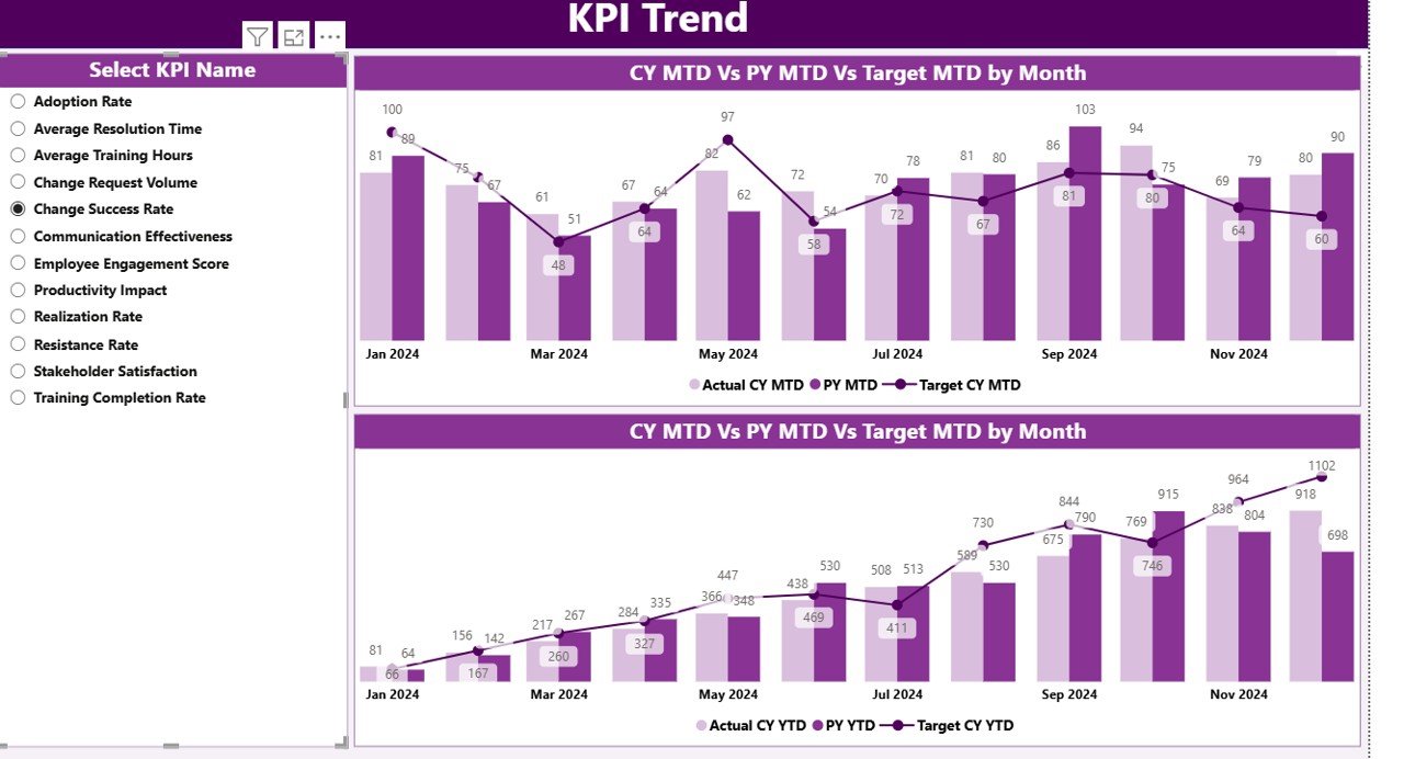
KPI Trend Page — Analyzing Patterns Over Time
The KPI Trend Page focuses on visualization and trend analysis. This page contains two combo charts — one for MTD and one for YTD — displaying:
- Actual Numbers (Current Year)
- Target Values
- Previous Year Numbers
Users can select any KPI name from the slicer on the left to see performance trends. This dynamic filtering enables quick, data-driven insights into improvement areas.
The visual comparison between actual vs target and current vs previous year performance highlights which KPIs are improving and which need attention.
Click to buy Change Management KPI Dashboard in Power BI
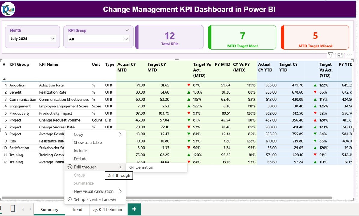
KPI Definition Page — Understanding the Metrics
The KPI Definition Page is a drill-through page, designed to provide in-depth context for each metric.
By right-clicking on any KPI from the summary page, users can drill through to see detailed information such as:
- KPI Formula
- Definition and Calculation Method
- Unit of Measurement
- Type (UTB or LTB)
This hidden page ensures the dashboard remains clean while still offering transparency for those who need deeper understanding. To return to the main summary, simply click the Back button on the top-left corner.
Excel Data Source Structure
The Power BI dashboard is powered by an Excel workbook that includes three key worksheet tabs. Maintaining this data structure ensures accurate and automatic updates in Power BI.
Input_Actual Sheet Tab
This sheet captures the actual performance numbers for each KPI.
Columns include:
- KPI Name
- Month (use the first date of the month)
- MTD Number
- YTD Number
Input_Target Sheet Tab
This sheet contains the target figures for each KPI.
Columns include:
- KPI Name
- Month (use the first date of the month)
- MTD Target
- YTD Target
KPI Definition Sheet Tab
This sheet defines all KPIs and their metadata.
Benefits of Using a Change Management KPI Dashboard
Using Power BI for change management tracking provides a long list of tangible and strategic benefits:
Real-Time Insights
Monitor progress instantly with automated updates and live visuals.
Improved Decision-Making
Visual comparisons between targets and actuals allow faster and smarter business decisions.
Transparent Communication
All stakeholders can access the same data, fostering accountability and transparency.
Efficiency and Time Savings
Eliminate manual reporting by automating data collection and visualization.
Enhanced Performance Tracking
Identify underperforming areas early and take corrective action before it’s too late.
Advantages of Change Management KPI Dashboard in Power BI
Here are the major advantages of implementing this dashboard across your organization:
- Centralized Performance Monitoring — View all KPIs on one screen.
- Customizable Visuals — Modify slicers, charts, or colors easily based on preferences.
- Data Accuracy — Automated data pulls from Excel minimize manual entry errors.
- Comprehensive Analysis — Compare MTD and YTD trends with historical context.
- Scalability — Add or remove KPIs without redesigning the dashboard.
- User-Friendly Navigation — Interactive drill-through and back navigation make it intuitive even for non-technical users.
Best Practices for the Change Management KPI Dashboard in Power BI
To get the best results from this dashboard, follow these proven best practices:
1. Maintain Consistent Data Entry
Always use the first day of the month in date columns and ensure KPI names match exactly between Actual and Target sheets.
2. Keep KPI Definitions Updated
When business goals evolve, update the KPI definition sheet accordingly to maintain relevance.
3. Refresh the Dashboard Regularly
Schedule data refreshes in Power BI to ensure that stakeholders always view the latest information.
4. Use Conditional Formatting Wisely
Leverage green and red icons effectively to highlight performance trends. Avoid over-formatting that can distract users.
5. Segment KPIs by Category
Group KPIs logically (e.g., Process, People, Technology) to simplify analysis.
6. Integrate Role-Based Access
Restrict access to sensitive data if multiple teams use the dashboard.
7. Review KPIs Periodically
Ensure each KPI still aligns with business strategy. Retire outdated metrics and introduce new ones as needed.
How to Interpret the Dashboard Results
Interpreting the dashboard correctly is key to driving meaningful change.
- A green ▲ icon indicates performance meeting or exceeding the target.
- A red ▼ icon signals underperformance or a need for corrective action.
- MTD numbers highlight short-term effectiveness of initiatives.
- YTD numbers provide a long-term view of progress.
- CY vs PY comparisons reveal year-over-year improvement trends.
By reading these visuals carefully, decision-makers can focus efforts where they’ll have the most impact.
Real-World Use Cases
Organizations across industries can benefit from the Change Management KPI Dashboard:
Corporate Transformations
Track adoption rates, training completion, and system usage during enterprise transitions.
Healthcare Institutions
Monitor process improvement initiatives like digital record management or patient flow optimization.
Educational Institutions
Evaluate staff adoption of new learning management systems or policy changes.
Financial Services
Measure compliance process changes or new software integration performance.
Manufacturing
Track equipment upgrades, process automation, and workforce adaptation rates.
Why Power BI Is Perfect for Change Management
Power BI is not just a visualization tool — it’s a strategic advantage. It provides the flexibility, scalability, and automation needed for enterprise-level change management reporting.
Some of its standout features include:
- Seamless integration with Excel
- Interactive dashboards with filters, slicers, and drill-downs
- Automated refresh schedules for live data
- Secure sharing through Power BI Service
- Customizable visuals and themes to match organizational branding
These capabilities make Power BI the most efficient and accessible platform for managing change analytics.
Conclusion
The Change Management KPI Dashboard in Power BI empowers organizations to take a structured, data-driven approach to managing transformation.
By combining Excel’s simplicity with Power BI’s dynamic visuals, this dashboard ensures that leaders have the right information at the right time. Whether you’re tracking cultural shifts, digital adoption, or process reengineering, this tool provides everything you need to measure success and drive continuous improvement.
When used strategically, it not only tracks performance but also inspires progress — helping organizations evolve smarter, faster, and more efficiently.
Frequently Asked Questions (FAQs)
- What is a Change Management KPI Dashboard?
It’s a Power BI tool that tracks and visualizes key metrics for monitoring change initiatives and transformation effectiveness.
- What data sources does it use?
The dashboard is powered by an Excel workbook containing Actuals, Targets, and KPI Definitions.
- How often should I update the data?
You should update monthly or after every major change cycle to keep insights relevant.
- Can non-technical users use this dashboard?
Yes. It includes user-friendly slicers, icons, and drill-through options that anyone can navigate easily.
- What are the main benefits of using Power BI for change management?
The main benefits are real-time insights, automation, improved communication, and faster decision-making.
- Is this dashboard customizable?
Absolutely. You can modify visuals, add new KPIs, or adjust slicers based on your organization’s needs.
- What KPIs should I track in change management?
Typical KPIs include adoption rate, training completion rate, stakeholder satisfaction, and project completion time.
- Can it compare current vs previous performance?
Yes. It displays comparisons for both MTD and YTD values against previous year data.
Watch the step-by-step video tutorial:
Visit our YouTube channel to learn step-by-step video tutorials
Click to buy Change Management KPI Dashboard in Power BI

