Corporate Social Responsibility (CSR) has become a major priority for modern organizations because businesses want to create a positive impact on society. Companies want to improve environmental performance, support community programs, strengthen ethical practices, and increase transparency. However, CSR activities create large amounts of data. Teams collect information about compliance, sustainability, employee volunteering, energy usage, diversity ratios, waste recycling, and many other indicators.
When teams track these numbers in separate files, reports become confusing. Therefore, companies need a clear reporting tool that keeps everything in one place. A CSR KPI Dashboard in Power BI does exactly that. It helps you track CSR performance, measure targets, compare results with previous years, and make confident decisions. Power BI makes the data easy to analyze and helps you view every CSR metric in one place.
In this detailed guide, you will learn everything about the CSR dashboard. You will understand how it works, why it is useful, what each page shows, and how companies use it to improve their CSR performance. You will also see the advantages, best practices, and answers to common CSR dashboard questions.
Click to buy Corporate Social Responsibility (CSR) KPI Dashboard in Power BI
What Is a Corporate Social Responsibility (CSR) KPI Dashboard in Power BI?
A CSR KPI Dashboard in Power BI is a ready-to-use reporting solution that tracks all CSR-related KPIs in a structured and visual format. You can view key performance indicators such as:
- Sustainability scores
- CSR program participation
- Environmental metrics
- Community engagement
- Volunteer hours
- Diversity and inclusion ratios
- Recycling rates
- Energy savings
- CSR budget utilization
The dashboard organizes the data in clean visuals, cards, slicers, and interactive charts. Because everything stays in one Power BI file, the user can move through the pages smoothly and understand CSR performance within seconds. The dashboard uses an Excel-based data source, so you only need to fill out three worksheets to refresh the report.
Why Should Businesses Use a CSR KPI Dashboard?
Businesses want to meet CSR goals because it improves brand image, supports government compliance, and builds trust. However, many companies still rely on scattered Excel sheets or manual reports.
A Power BI CSR dashboard helps you:
- Track progress in real time
- Compare current month and previous year performance
- Review gap between actual and target values
- Identify low-performing CSR metrics
- Understand which teams meet their CSR goals
- Make faster and more informed decisions
Since Power BI provides interactive visuals, you can explore the data from multiple angles and take action instantly.
What Are the Main Pages of the CSR KPI Dashboard?
This dashboard comes with three fully designed pages inside Power BI:
- Summary Page
- KPI Trend Page
- KPI Definition Page
Let us explore each part in detail.
Summary Page: What Does the Main Dashboard Show?
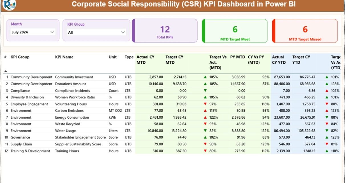
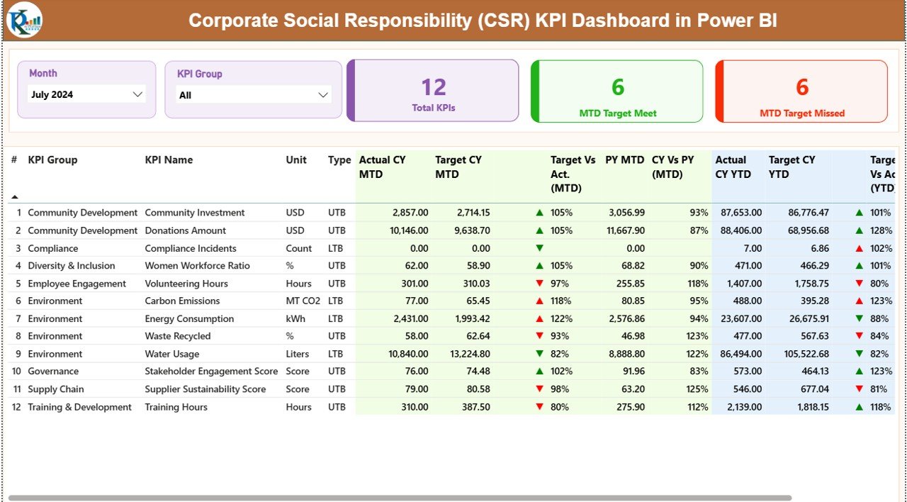
The Summary Page is the central part of the dashboard. You can treat it as the control center because it provides a complete overview of every CSR KPI.
[Insert Screenshot: Summary Page of CSR KPI Dashboard]
This page includes the following components:
Slicers
At the top, you get two slicers:
- Month (to select the analysis period)
- KPI Group (to filter CSR categories such as Environment, Social Responsibility, Workforce Diversity, Community, etc.)
These slicers help you customize the view and focus on your desired CSR area.
What Cards Are Displayed on the Summary Page?
The top of the dashboard includes three KPI cards:
- Total KPI Count
- MTD Target Met Count
- MTD Target Missed Count
These cards help you understand CSR performance at a glance. You can instantly see how many indicators meet the target and how many require attention.
What Does the Detailed KPI Table Show?
Below the cards, you get a fully detailed table that displays every CSR KPI with all essential values. The table includes:
KPI Number
A sequence number to identify every CSR indicator.
KPI Group
This shows the CSR category such as:
- Environmental KPIs
- Social KPIs
- Governance KPIs
- Community KPIs
- Employee Responsibility KPIs
KPI Name
The title of the CSR metric.
Unit
The unit of measurement (Percentage, Hours, Count, Score, Ratio, etc.)
Type (LTB or UTB)
- UTB (Upper the Better) — higher value indicates good performance
- LTB (Lower the Better) — lower value indicates good performance
Actual CY MTD
Current year’s Month-To-Date performance.
Target CY MTD
Target value for the current month.
MTD Icon
Visual indicators:
- ▲ Green Icon → KPI meets target
- ▼ Red Icon → KPI misses target
These icons help you understand CSR performance instantly.
MTD Target vs Actual (%)
Formula:
Actual MTD / Target MTD
You can see the percentage achievement score.
PY MTD
Same month’s value for the previous year.
CY vs PY MTD (%)
Formula:
Current MTD / Previous MTD
This comparison helps you understand growth or decline.
Actual CY YTD
Year-To-Date actual value.
Target CY YTD
Year-To-Date target value.
YTD Icon
Same red and green icons to show whether the KPI meets the YTD target.
YTD Target vs Actual (%)
Formula: Actual YTD / Target YTD
PY YTD
Previous year’s YTD performance.
CY vs PY YTD (%)
Formula: CY YTD / PY YTD
This shows YoY comparison.
Click to buy Corporate Social Responsibility (CSR) KPI Dashboard in Power BI
KPI Trend Page: How Do the Charts Help?
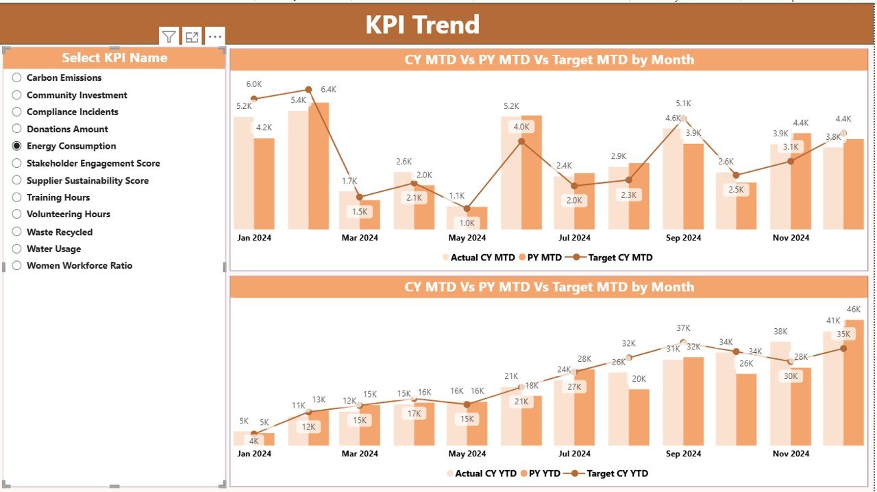
The KPI Trend Page helps you understand CSR progress across time. Instead of viewing one static number, you can see how your KPIs change month by month.
KPI Trend Page of CSR Dashboard]
This page includes:
Two Combo Charts
These charts display:
- Actuals for Current Year (MTD & YTD)
- Actuals for Previous Year (MTD & YTD)
- Current Year Targets (MTD & YTD)
Because the three lines appear together, you can clearly spot trends, gaps, and improvements over time.
KPI Name Slicer
You can select any KPI to view its detailed trend.
For example:
- Carbon emission reduction
- Energy saving score
- Volunteer hours
- Employee training hours
- Recycled waste percentage
- CSR compliance score
This makes it easy to analyze each CSR metric individually.
Click to buy Corporate Social Responsibility (CSR) KPI Dashboard in Power BI
KPI Definition Page: Why Is It Important?
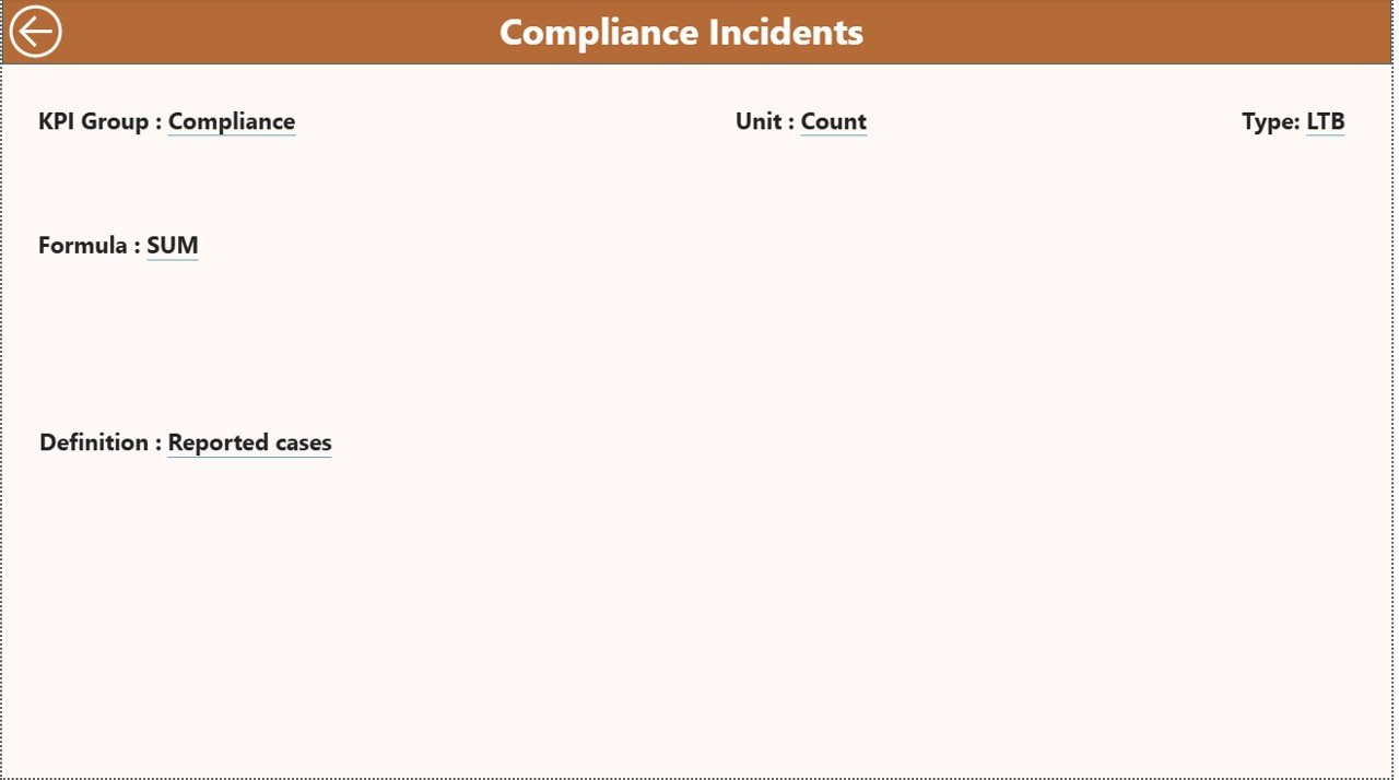
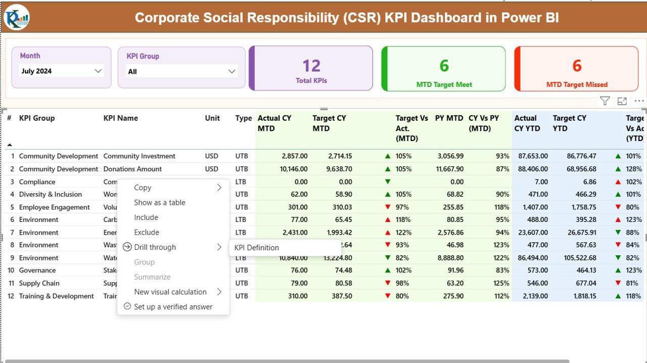
The KPI Definition Page is a hidden drill-through page. It becomes visible only when you select a KPI from the summary page.
[Insert Screenshot: KPI Definition Page – Drill Through]
This page helps you understand:
- KPI Formula
- KPI Definition
- KPI Group
- Unit
- KPI Number
- Type (UTB or LTB)
CSR teams often need this page because it helps ensure everyone understands what each KPI means and how it is calculated.
To return to the summary page, simply click the Back Button on the top-left corner.
Click to buy Corporate Social Responsibility (CSR) KPI Dashboard in Power BI
How Does the Excel Data Source Work?
This CSR dashboard runs on a simple Excel file. You only need to update three sheets:
Input_Actual Sheet
This sheet requires:
- KPI Name
- Month (use 1st date of each month)
- MTD numbers
- YTD numbers
Example:
- Carbon Emission – Jan 2024 – MTD 120 – YTD 120
- Volunteer Hours – Feb 2024 – MTD 58 – YTD 178
Input_Target Sheet
Fill the same structure:
- KPI Name
- Month
- Target MTD
- Target YTD
This helps Power BI compare actual vs target.
KPI Definition Sheet
This sheet defines every CSR KPI with:
- KPI Number
- KPI Group
- KPI Name
- Unit
- Formula
- Definition
- Type (LTB or UTB)
Once the sheets are filled, simply refresh the Power BI file and the dashboard updates automatically.
Click to buy Corporate Social Responsibility (CSR) KPI Dashboard in Power BI
Advantages of a CSR KPI Dashboard in Power BI
Companies use this dashboard because it offers many valuable benefits:
Better Decision-Making
You see accurate CSR numbers, which helps leaders take correct actions.
Clean and Visual Reporting
Power BI visuals make complex CSR data simple to understand.
Real-Time Tracking
You can see up-to-date MTD and YTD performance.
Higher Transparency
CSR results become easy to communicate to stakeholders.
Improved Compliance
The dashboard helps you track environmental and social compliance KPIs.
Stronger CSR Strategy
Teams understand which areas improve and which need attention.
Faster Reporting
You save many hours because the dashboard updates automatically.
Better Year-to-Year Comparison
You can track improvement using simple comparison metrics.
Easy to Use for All Teams
Even non-technical CSR managers can update and analyze results.
Best Practices for Using the CSR KPI Dashboard in Power BI
To get accurate results, follow these best practices:
Keep Data Updated Every Month
Add actual and target numbers on time to maintain correct reporting.
Use Consistent KPI Definitions
Ensure the KPIs stay consistent across time.
Avoid Empty or Missing Values
Missing values reduce reporting quality.
Review KPI Groups Regularly
Make sure all CSR themes are grouped properly.
Train CSR Teams to Use Drill Through
This helps everyone understand definitions clearly.
Use Trend Charts Often
Trend charts help you predict future CSR performance.
Compare MTD and YTD Results
This helps you understand short-term and long-term impact.
Use Icons for Fast Interpretation
Red and green icons help identify problems instantly.
Conclusion
A Corporate Social Responsibility (CSR) KPI Dashboard in Power BI helps organizations track, measure, and improve CSR performance with accuracy and clarity. It transforms raw data into meaningful visuals and helps leaders take responsible actions. Since the dashboard uses a simple Excel data source, you can update it easily and keep the report accurate every month.
CSR reporting becomes easier when everything stays organized. Power BI gives you a complete view of your environmental impact, social contribution, compliance score, and community involvement. With this dashboard, you can build a stronger CSR strategy and achieve your sustainability goals with confidence.
Frequently Asked Questions (FAQs)
- What is a CSR KPI Dashboard?
A CSR KPI Dashboard tracks key CSR indicators using interactive visuals. It helps companies monitor sustainability, community impact, and compliance performance.
- Why should I use Power BI for CSR reporting?
Power BI makes CSR data easy to understand. It offers real-time updates, interactive visuals, and simple navigation.
- What KPIs can I track in the CSR dashboard?
You can track environmental, social, employee responsibility, compliance, and community KPIs.
- How do I update the dashboard?
You only need to update three Excel sheets: Actuals, Targets, and KPI Definitions.
- Can I customize the dashboard?
Yes, you can add new KPIs, change visuals, or add more pages based on business needs.
- Is this dashboard suitable for small organizations?
Yes, it is simple, clean, and easy to manage for small, medium, and large businesses.
- Does the dashboard support MTD and YTD tracking?
Yes, it includes complete Month-to-Date and Year-to-Date analysis.
Visit our YouTube channel to learn step-by-step video tutorials
Watch the step-by-step video tutorial:
Click to buy Corporate Social Responsibility (CSR) KPI Dashboard in Power BI
