In today’s competitive business environment, resolving customer complaints quickly and effectively is essential for maintaining trust, loyalty, and long-term relationships. Companies that handle customer issues with speed and transparency not only protect their reputation but also improve customer satisfaction and operational efficiency.
To achieve this, businesses need a clear and data-driven way to monitor their complaint resolution process. That’s where the Customer Complaint Resolution KPI Dashboard in Power BI becomes a game changer. This powerful and interactive dashboard helps organizations measure key performance indicators (KPIs), identify gaps, and take proactive action to improve complaint management.
Click to buy Customer Complaint Resolution KPI Dashboard in Power BI
What Is a Customer Complaint Resolution KPI Dashboard?
A Customer Complaint Resolution KPI Dashboard is an analytical tool built using Microsoft Power BI that tracks and visualizes key metrics related to customer complaints. It provides a real-time view of how effectively your organization resolves customer issues across different products, departments, and service lines.
Instead of analyzing long spreadsheets, this dashboard consolidates data into dynamic visuals — allowing managers to make faster, smarter decisions. It integrates data from Excel or other sources and presents it in a visually interactive format with slicers, charts, and KPI cards.
Key Features of the Dashboard
The Customer Complaint Resolution KPI Dashboard in Power BI includes three main pages, each designed for a specific purpose — monitoring, trend analysis, and detailed definitions. Let’s explore these pages one by one.
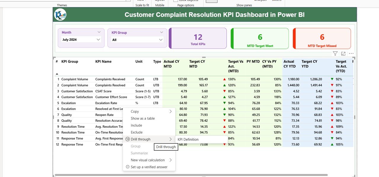
Summary Page
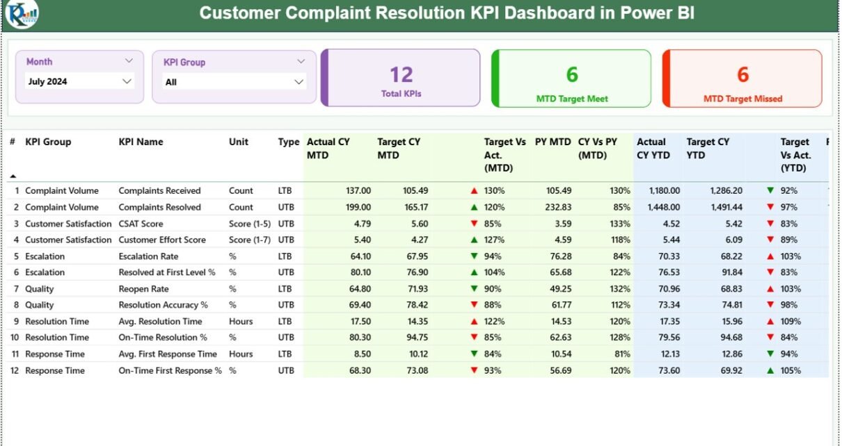
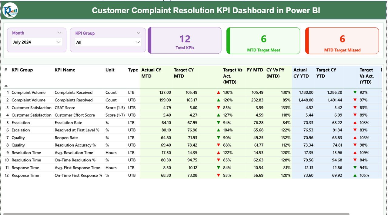
The Summary Page is the main interface of the dashboard — the place where most users will spend their time. It gives a quick overview of complaint resolution performance for the selected month and KPI group.
Key Components:
- Month and KPI Group Slicers:
These slicers allow users to select a specific month and KPI group for analysis. As soon as the selection changes, all visuals on the page update dynamically. - KPI Cards:
Three cards appear at the top of the page showing: - Total number of KPIs
- MTD (Month-to-Date) Target Met Count
- MTD Target Missed Count
- Detailed KPI Table:
Below the cards, a detailed table lists each KPI along with its performance metrics. The table includes: - KPI Number – Sequence number for easy reference.
- KPI Group – Category of the KPI such as Response Time, Complaint Volume, or Resolution Rate.
- KPI Name – Specific performance indicator.
- Unit – Measurement unit (e.g., %, Count, Days).
- Type – Either LTB (Lower the Better) or UTB (Upper the Better).
- Actual CY MTD & Target CY MTD – Actual and target values for the current month.
- MTD Icon – Green ▲ or red ▼ icons indicating performance status.
- Target vs Actual (MTD) – Percentage showing how close the actual performance is to the target.
- PY MTD & CY vs PY (MTD) – Comparison with the same period last year.
- Actual CY YTD & Target CY YTD – Year-to-date values for current year.
- YTD Icon – Visual indicators for YTD performance.
- Target vs Actual (YTD) – YTD percentage performance.
- PY YTD & CY vs PY (YTD) – Comparison with previous year YTD data.
Click to buy Customer Complaint Resolution KPI Dashboard in Power BI
This page instantly communicates which KPIs are performing well and which need immediate attention.
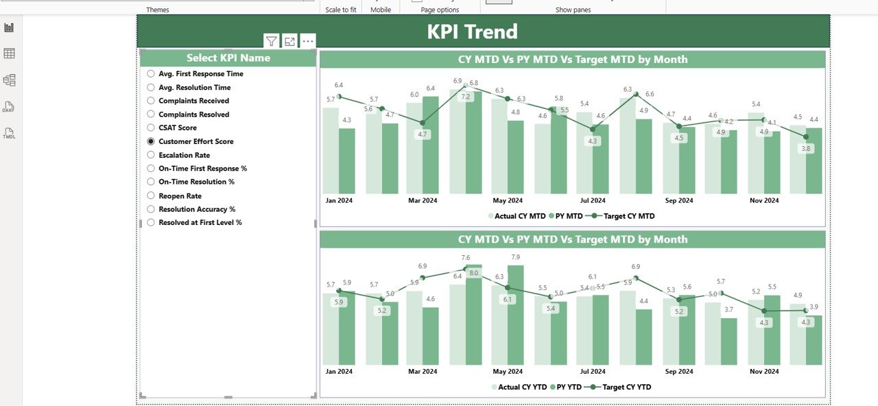
KPI Trend Page
The KPI Trend Page focuses on data visualization over time. It helps users identify performance patterns and trends to support data-driven decisions.
Key Components:
- Combo Charts:
Two combo charts display Actual vs Target vs Previous Year performance for both MTD and YTD data.
These charts show whether performance is improving or declining month by month. - Dynamic Slicer:
A slicer on the left side lets users choose a specific KPI name. Once selected, the charts update automatically to show the historical trend of that particular KPI.
This page makes it easy to visualize whether complaint resolution efficiency is increasing or decreasing and how seasonal trends affect overall performance.
Click to buy Customer Complaint Resolution KPI Dashboard in Power BI
KPI Definition Page
The KPI Definition Page provides transparency and clarity. It includes details about each KPI’s formula, meaning, and type.
This page is designed as a drill-through page, meaning users can right-click on a KPI in the Summary Page and “drill through” to this page to see its definition.
Information Displayed:
- KPI Number
- KPI Group
- KPI Name
- Unit
- Formula
- Definition
- Type (LTB or UTB)
A “Back” button on the top-left corner allows users to return easily to the main dashboard view.
Click to buy Customer Complaint Resolution KPI Dashboard in Power BI
Data Source and Excel Integration
The dashboard uses an Excel workbook as its primary data source. This makes it easy for non-technical users to maintain and update data.
The Excel file contains three worksheets:
- Input_Actual Sheet
- Includes columns for KPI Name, Month, MTD Number, and YTD Number.
- Users update actual results every month.
- Input_Target Sheet
- Includes the same structure as Input_Actual.
- Users fill in monthly and yearly target numbers for each KPI.
- KPI Definition Sheet
- Contains the KPI Number, KPI Group, KPI Name, Unit, Formula, Definition, and Type (LTB/UTB).
Power BI connects to this Excel file and refreshes automatically, ensuring that dashboard visuals always display the latest data.
Why You Need a Customer Complaint Resolution Dashboard
Customer complaints reveal more than just dissatisfaction — they indicate areas where business processes, products, or services can improve. Tracking them with precision ensures continuous enhancement of service quality and customer experience.
Without a proper dashboard, teams often rely on manual reporting, which leads to delays, errors, and poor visibility. A Power BI dashboard automates this entire process.
Benefits Include:
- Faster insight generation
- Real-time data visibility
- Better accountability and ownership
- Enhanced decision-making
- Improved customer experience
Key KPIs to Track in the Dashboard
Advantages of Customer Complaint Resolution KPI Dashboard in Power BI
The dashboard offers multiple operational, strategic, and analytical benefits.
1. Real-Time Visibility
Power BI allows users to view live complaint resolution data. Managers can spot issues as they occur and take corrective actions immediately.
2. Automated Reporting
The dashboard removes the need for manual Excel reports. Data refreshes automatically, saving hours of manual work every month.
3. Improved Decision-Making
By comparing Actual vs Target vs Previous Year, teams can make data-backed decisions for process improvement and resource allocation.
4. Enhanced Accountability
KPIs clearly show which departments or agents meet or miss targets, fostering accountability across teams.
5. Customer Satisfaction Improvement
Tracking trends in resolution time, satisfaction scores, and complaint recurrence leads to proactive improvement in customer experience.
6. Customizable and Scalable
Built in Power BI, the dashboard can be tailored to match any company’s needs — add new KPIs, link to CRM systems, or expand for multi-region reporting.
⚙️ How to Use the Dashboard Effectively
Update Excel Data Regularly:
Enter actual and target values each month before refreshing Power BI.
Use Slicers Smartly:
Filter by KPI Group or Month to focus on specific areas.
Monitor KPI Icons:Red ▼ icons signal performance gaps — act on them quickly.
Compare Trends:
Use the KPI Trend Page to analyze long-term progress and identify root causes for any decline.
Leverage Drill-Through Functionality:
Check KPI definitions to ensure everyone interprets metrics consistently.
Best Practices for Customer Complaint Resolution KPI Dashboard
To make the most of your Power BI dashboard, follow these best practices:
1. Define Clear KPI Ownership
Assign a responsible person or team for each KPI. Ownership ensures consistent updates and faster corrective action.
2. Maintain Data Accuracy
Validate data sources regularly. Inaccurate data can lead to wrong insights and poor business decisions.
3. Keep the Dashboard Simple
Avoid clutter. Focus on visuals that clearly communicate key insights — such as cards, bar charts, and combo charts.
4. Use Conditional Formatting
Use color coding, icons, and thresholds to highlight performance status — green for success, red for issues.
5. Encourage Collaboration
Share the dashboard with all stakeholders. Discuss findings in review meetings to align on improvement plans.
6. Automate Data Refresh
Schedule data refreshes to keep metrics up to date without manual intervention.
7. Continuously Improve KPIs
Review and refine KPIs periodically to align with evolving business objectives.
Common Insights You Can Gain from the Dashboard
By analyzing data through this Power BI dashboard, organizations can uncover valuable insights such as:
- Which departments or regions face higher complaint volumes
- How complaint resolution times vary by month or product
- Whether service quality is improving or declining over time
- How well the company meets customer expectations
- Trends in recurring complaints or customer satisfaction levels
These insights empower leaders to implement targeted solutions and improve operational efficiency.
Real-World Example
Imagine a telecom company receiving thousands of customer complaints every month. Using this dashboard, management can quickly see:
- Resolution Rate: 92% of cases resolved within SLA
- Customer Satisfaction: 4.6/5 average rating
- Repeat Complaints: Down by 18% from last quarter
With such visibility, the company can pinpoint problem areas like call center delays or product issues and take corrective measures promptly.
Conclusion
The Customer Complaint Resolution KPI Dashboard in Power BI transforms how organizations track and manage customer feedback. By consolidating data, automating analysis, and presenting results in an interactive way, it empowers businesses to respond faster, improve service quality, and build stronger relationships with their customers.
Power BI’s visual power, combined with KPI logic and Excel connectivity, makes this dashboard a must-have for any customer-centric organization that values performance visibility and data-driven improvement.
Frequently Asked Questions (FAQs)
- What is a Customer Complaint Resolution KPI Dashboard?
- It’s a Power BI-based tool that tracks, visualizes, and analyzes complaint-related KPIs like resolution time, satisfaction rate, and complaint volume.
- How does Power BI improve complaint management?
- Power BI provides real-time analytics, trend visualization, and interactive filtering, which helps teams act quickly on issues.
- Can I use Excel data as a source for this dashboard?
- Yes. This dashboard connects seamlessly with Excel. You can update Excel sheets monthly, and Power BI will automatically refresh data.
- What KPIs are most important for complaint resolution?
- Key KPIs include resolution rate, first contact resolution, average response time, escalation rate, and customer satisfaction score.
- How often should I update the data?
- Update monthly or weekly depending on your reporting frequency. Automating refresh ensures always up-to-date insights.
- Can this dashboard be customized for different industries?
- Absolutely. You can add new KPIs or categories such as product, location, or department based on your organization’s needs.
- Is this dashboard suitable for small businesses?
- Yes. Even small businesses can benefit by tracking customer issues systematically and improving service delivery.
- Does it require coding skills?
- No. Power BI allows drag-and-drop visualization and Excel integration, making it easy to use without programming.
- Can it compare performance across years?
- Yes. The dashboard includes comparison metrics like CY vs PY for both MTD and YTD performance.
- How can this dashboard improve customer satisfaction?
- By identifying delays, monitoring trends, and ensuring timely resolution, it helps maintain a consistent and positive customer experience.Visit our YouTube channel to learn step-by-step video tutorialsYoutube.com/@PKAnExcelExpert
Watch the step-by-step video tutorial:
Click to buy Customer Complaint Resolution KPI Dashboard in Power BI