The dairy industry operates in a highly competitive, regulated, and cost-sensitive environment. Therefore, dairy companies must monitor production efficiency, quality, costs, sales, and profitability continuously. However, when data stays scattered across Excel files, ERP reports, and manual logs, decision-making becomes slow and reactive.
That is exactly where a Dairy Industry KPI Dashboard in Power BI plays a critical role.
In this detailed, SEO-friendly article, you will learn what a Dairy Industry KPI Dashboard in Power BI is, why it is essential, how it works, its page-wise structure, key KPIs, advantages, best practices, and frequently asked questions. Moreover, the language remains clear, simple, and practical so that dairy owners, plant managers, analysts, and executives can easily understand and implement it.
Click to buy Dairy Industry KPI Dashboard in Power BI
What Is a Dairy Industry KPI Dashboard in Power BI?
A Dairy Industry KPI Dashboard in Power BI is an interactive business intelligence solution designed to track, analyze, and visualize key performance indicators across dairy operations.
Instead of reviewing multiple spreadsheets and static reports, this dashboard consolidates actual data, target data, and previous year data into a single Power BI file. As a result, decision-makers gain real-time visibility into operational and financial performance.
Moreover, this dashboard uses Excel as the data source, which makes data entry simple and familiar for most dairy teams.
Why Does the Dairy Industry Need a KPI Dashboard?
The dairy business involves multiple processes such as milk procurement, processing, quality control, distribution, and sales. Because margins remain thin, even small inefficiencies can lead to major losses.
A Dairy Industry KPI Dashboard helps organizations:
- Track performance daily, monthly, and yearly
- Compare actual results against targets
- Identify underperforming KPIs instantly
- Improve operational efficiency and cost control
- Support faster, data-driven decisions
Therefore, companies that use KPI dashboards stay more agile and competitive.
How Does the Dairy Industry KPI Dashboard in Power BI Work?
The working of the dashboard remains simple, structured, and scalable.
Step 1: Data Entry in Excel
First, users enter data into predefined Excel sheets for actuals, targets, and KPI definitions.
Step 2: Data Model in Power BI
Next, Power BI connects to the Excel file and builds relationships between KPI definitions, actual values, and targets.
Step 3: Automated Calculations
Then, Power BI calculates MTD, YTD, Target vs Actual, and Year-over-Year comparisons automatically.
Step 4: Interactive Visualization
Finally, the dashboard displays all insights through slicers, cards, tables, and combo charts.
As a result, users can analyze performance within seconds.
What Are the Key Pages in the Dairy Industry KPI Dashboard?
This ready-to-use dashboard includes three powerful pages, each designed for a specific purpose.
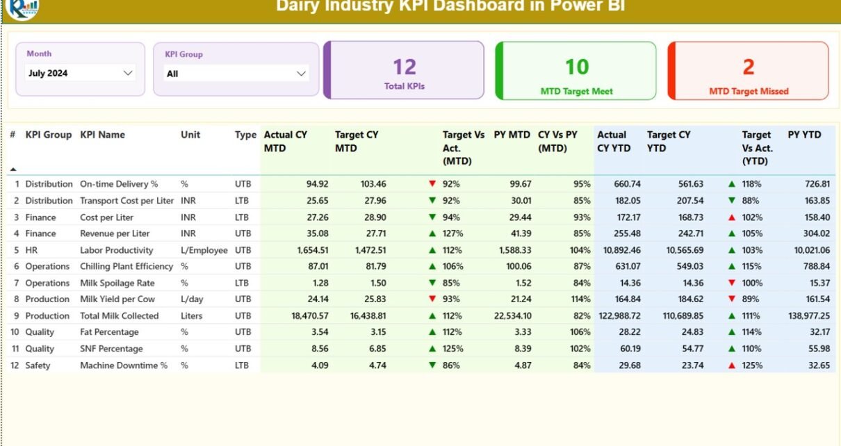
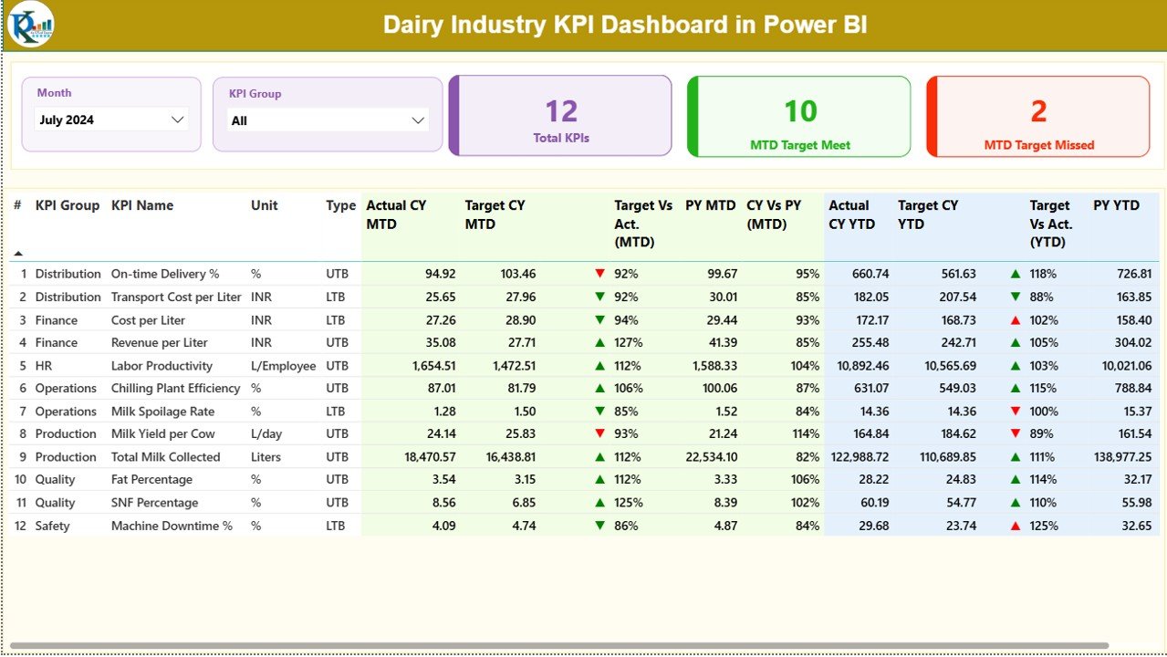
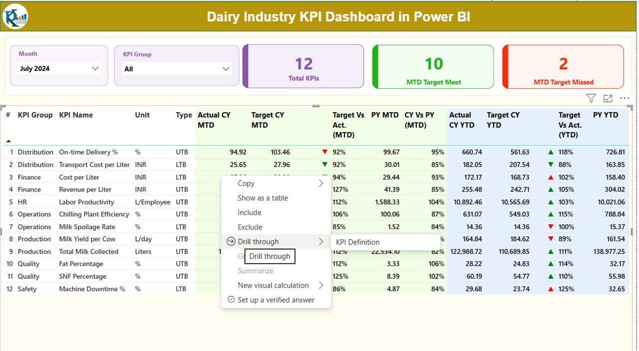
What Is Shown on the Summary Page?
The Summary Page acts as the central control panel of the dashboard.
Top-Level Filters
- Month slicer to analyze any specific month
- KPI Group slicer to focus on a particular category
KPI Summary Cards
- Total KPIs Count
- MTD Target Met Count
- MTD Target Missed Count
These cards immediately highlight overall performance status.
Detailed KPI Performance Table
Below the cards, the dashboard displays a detailed KPI table with the following columns:
- KPI Number – Sequential identifier for each KPI
- KPI Group – Category such as Production, Quality, Finance, Sales
- KPI Name – Name of the KPI
- Unit – Unit of measurement (Liters, %, Cost, etc.)
- Type – LTB (Lower the Better) or UTB (Upper the Better)
- Actual CY MTD – Current Year Month-to-Date actual value
- Target CY MTD – Current Year MTD target
- MTD Status Icon – ▲ or ▼ icons with green/red indicators
- Target vs Actual (MTD) – Actual ÷ Target (MTD)
- PY MTD – Previous Year MTD value
- CY vs PY (MTD) – Current MTD ÷ Previous Year MTD
- Actual CY YTD – Current Year Year-to-Date actual
- Target CY YTD – Current Year YTD target
- YTD Status Icon – ▲ or ▼ indicator for YTD
- Target vs Actual (YTD) – Actual ÷ Target (YTD)
- PY YTD – Previous Year YTD value
- CY vs PY (YTD) – Current YTD ÷ Previous Year YTD
Therefore, users can monitor performance at both monthly and yearly levels.
Click to buy Dairy Industry KPI Dashboard in Power BI
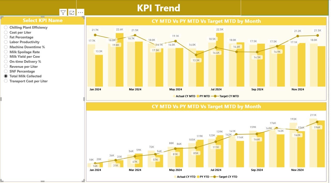
What Insights Does the KPI Trend Page Provide?
The KPI Trend Page focuses on performance movement over time.
Key Features of KPI Trend Page
- Two combo charts for MTD and YTD
- Displays Actual CY, Target, and Previous Year values
- KPI Name slicer on the left for selection
Because of these visuals, users can quickly identify improving or declining trends.
Click to buy Dairy Industry KPI Dashboard in Power BI
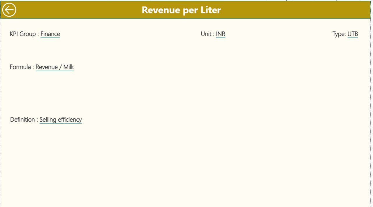
What Is the Purpose of the KPI Definition Page?
The KPI Definition Page acts as a reference and governance layer.
Key Details Shown
- KPI Formula
- KPI Definition
- Unit of Measurement
- KPI Type (LTB or UTB)
This page remains hidden and works as a drill-through page from the Summary Page. Moreover, users can return easily using the back button on the top-left corner.
Click to buy Dairy Industry KPI Dashboard in Power BI
What Excel Sheets Are Used as the Data Source?
The dashboard connects to a structured Excel file with three worksheets.
Input_Actual Sheet?
In this sheet, users enter actual performance data.
Required Columns:
- KPI Name
- Month (First date of the month)
- MTD Value
- YTD Value
the Input_Target Sheet?
This sheet captures target values.
Required Columns:
- KPI Name
- Month (First date of the month)
- MTD Target
- YTD Target
the KPI Definition Sheet?
This sheet defines each KPI clearly.
Required Columns:
- KPI Number
- KPI Group
- KPI Name
- Unit
- Formula
- Definition
- Type (LTB or UTB)
As a result, the dashboard stays standardized and easy to maintain.
Which KPIs Can Be Tracked in a Dairy Industry Dashboard?
A Dairy Industry KPI Dashboard can track KPIs such as:
- Milk Collection Volume
- Milk Yield per Animal
- Fat and SNF Percentage
- Production Cost per Liter
- Processing Loss Percentage
- Quality Rejection Rate
- Energy Consumption per Unit
- Cold Storage Utilization
- Distribution Cost per Liter
- Sales Growth Percentage
- Inventory Turnover
- Profit Margin Percentage
Therefore, the dashboard supports both operational and financial monitoring.
Advantages of Dairy Industry KPI Dashboard in Power BI
Using a Dairy Industry KPI Dashboard delivers multiple benefits.
Centralized Performance Monitoring
All KPIs remain available in one place, which eliminates manual consolidation.
Faster Decision-Making
Real-time visuals help managers act quickly.
Improved Cost Control
Tracking cost KPIs reduces wastage and inefficiencies.
Clear Target Tracking
MTD and YTD comparisons ensure accountability.
Historical Performance Analysis
Year-over-year comparisons highlight long-term trends.
User-Friendly Interface
Slicers, icons, and charts make analysis easy for non-technical users.
Best Practices for the Dairy Industry KPI Dashboard in Power BI
To get maximum value, organizations should follow best practices.
- Define Clear KPIs
Always select KPIs aligned with business goals.
- Maintain Clean Data
Ensure accurate and consistent data entry in Excel.
- Use Proper KPI Types
Correctly classify KPIs as LTB or UTB.
- Review KPIs Regularly
Analyze KPIs monthly and quarterly.
- Train Users
Educate teams on how to read and interpret visuals.
- Update Targets Periodically
Adjust targets based on market and seasonal changes.
- Keep Dashboard Simple
Avoid clutter and focus on actionable metrics.
How Does This Dashboard Support Management and Executives?
Executives gain:
- High-level performance visibility
- Early warning signals for underperformance
- Clear accountability across departments
- Data-backed strategy discussions
As a result, leadership decisions become faster and more confident.
Conclusion: Why Should Dairy Businesses Use a KPI Dashboard in Power BI?
A Dairy Industry KPI Dashboard in Power BI transforms raw data into actionable insights. It simplifies performance tracking, improves transparency, and strengthens decision-making across the organization.
Because dairy operations involve thin margins and complex processes, businesses that adopt KPI dashboards stay ahead of competitors. Moreover, this ready-to-use dashboard structure ensures quick implementation without heavy IT dependency.
Frequently Asked Questions (FAQs)
What is a Dairy Industry KPI Dashboard in Power BI?
It is an interactive reporting tool that tracks dairy KPIs using Power BI visuals.
Can I use Excel as the data source?
Yes, this dashboard uses Excel files for data input.
Does the dashboard support MTD and YTD analysis?
Yes, it includes both MTD and YTD metrics.
Can I customize KPIs?
Absolutely. You can add or modify KPIs using the KPI Definition sheet.
Is this dashboard suitable for small dairy businesses?
Yes, it works well for both small and large dairy operations.
Do I need advanced Power BI skills to use it?
No, basic Power BI knowledge is sufficient.
Can I track previous year performance?
Yes, the dashboard includes PY comparisons.
Does it support drill-through?
Yes, users can drill through to KPI definitions.
Visit our YouTube channel to learn step-by-step video tutorials
Watch the step-by-step video tutorial:
Click to buy Dairy Industry KPI Dashboard in Power BI