Emergency management teams work under pressure. They respond to incidents, coordinate resources, deploy equipment, manage communication, and ensure public safety. Because emergencies happen without warning, teams need accurate performance insights every day. A small delay in information can slow down response efforts and increase risks.
A Emergency Management KPI Dashboard in Power BI helps teams track real-time performance, monitor KPI trends, compare progress with targets, and make data-driven decisions. Moreover, it gives emergency leaders a single place to analyze activities across response teams, equipment units, medical support units, communication lines, and recovery operations.
In this complete guide, you will learn:
- What an Emergency Management KPI Dashboard in Power BI is
- How the dashboard works
- A detailed breakdown of each page
- Key KPIs for emergency operations
- Advantages of using this dashboard
- Best practices for effective use
- Frequently asked questions
Let’s explore the full details step by step.
Click to buy Emergency Management KPI Dashboard in Power BI
What Is an Emergency Management KPI Dashboard in Power BI?
An Emergency Management KPI Dashboard in Power BI is a ready-to-use reporting tool that helps emergency departments track, measure, and analyze operational KPIs in one place. It records real-time performance indicators such as response time, incident count, equipment readiness, resource allocation, medical support efficiency, and communication response rate.
Because the dashboard works in Power BI, teams can visualize trends, compare current performance with targets, and drill through data for deeper insights. Furthermore, the dashboard uses a simple Excel file as its data source, so teams can update numbers easily without technical knowledge.
This dashboard includes:
- A Summary Page for overall KPI performance
- A KPI Trend Page for month-to-month analysis
- A KPI Definition Page for detailed metadata
- Excel-based data entry sheets
It offers the speed, clarity, and accuracy that every emergency management team needs.
Why Do Emergency Teams Need a KPI Dashboard?
Emergency management teams deal with unpredictable situations. However, performance still needs to stay consistent, measurable, and visible across departments. This dashboard helps teams:
- Track response performance every month
- Understand whether teams meet critical targets
- Identify delays and risk areas early
- Allocate resources efficiently
- Strengthen compliance and preparedness
- Improve decision-making with real-time insights
Because everything remains organized in Power BI, teams avoid fragmented reports and manual tracking.
Key Pages Inside the Emergency Management KPI Dashboard in Power BI
This dashboard includes three core pages, each designed to simplify emergency management reporting.
Let’s break them down in detail.
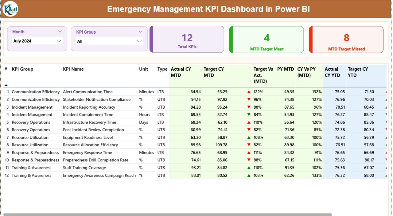
Summary Page – How Does It Help Emergency Teams?
The Summary Page is the main page of the dashboard. It gives a quick view of all Emergency KPIs for the selected month and KPI group. Since emergency teams must take fast decisions, this page helps them understand performance within seconds.
Month Slicer and KPI Group Slicer
At the top, users can select:
- Month
- KPI Group (such as Response KPIs, Communication KPIs, Recovery KPIs, Equipment KPIs, etc.)
This helps teams focus on specific categories like:
- Emergency Response Time
- Resource Utilization
- Equipment Readiness
- Communication Efficiency
- Incident Closure Rate
KPI Performance Cards
Below the slicers, three cards appear:
- Total KPIs Count
- MTD Target Met Count
- MTD Target Missed Count
These cards give an instant view of how emergency teams perform in the selected period.
For example:
- A higher Target Missed Count warns leaders about delays.
- A higher Target Met Count shows strong readiness.
Detailed KPI Table
The core of the summary page is the detailed KPI table. It includes:
- KPI Number
- KPI Group
- KPI Name
- Unit of Measurement
- KPI Type (UTB or LTB)
- Actual CY MTD
- Target CY MTD
- MTD Status Icon (▲ or ▼)
- Target vs Actual (MTD)
- PY MTD (Previous Year)
- CY vs PY (MTD)
- Actual CY YTD
- Target CY YTD
- YTD Status Icon
- Target vs Actual (YTD)
- PY YTD
- CY vs PY (YTD)
How These Metrics Help Emergency Teams
They help teams:
- Compare current month performance with previous year
- Understand MTD and YTD performance gaps
- Track whether KPIs meet UTB/LTB targets
- Spot improvement areas early
- Monitor trends over time
Because each KPI features red/green icons (▼ or ▲), users see performance status instantly.
Click to buy Emergency Management KPI Dashboard in Power BI
KPI Trend Page – Why Trend Analysis Matters in Emergency Operations?
The KPI Trend Page helps teams analyze month-wise KPI performance. Emergency performance changes quickly, so trend charts help teams understand patterns.
What You See on This Page
This page shows:
- Two combo charts
- Slicer to select KPI name
- Actual CY trend
- Previous year trend
- Target trend for MTD
- Target trend for YTD
Why This Trend Page Is Important
Trend charts help teams:
- Track whether response time improves
- Understand if incident count grows
- Identify equipment downtime trends
- Compare current year performance with previous year
- Predict future performance
- Take proactive decisions
For example:
If response time increases for three months, the team investigates resource shortages, training gaps, or equipment failures.
Because Power BI creates visual clarity, leaders make quick and accurate decisions.

Click to buy Emergency Management KPI Dashboard in Power BI
KPI Definition Page – How Does It Improve Data Clarity?
The KPI Definition Page is a hidden drill-through page. From the Summary Page, users can right-click any KPI and open this page.
This page includes:
- KPI Number
- KPI Group
- KPI Name
- Unit
- Formula
- KPI Definition
- KPI Type (LTB or UTB)
This helps maintain data consistency.
Why This Page Matters
Emergency teams need clarity on how each KPI works. When definitions stay clear, reports stay consistent across all departments.
This page helps:
- Reduce confusion
- Create alignment between teams
- Ensure correct KPI calculations
- Improve reporting accuracy
It acts as a KPI reference library inside Power BI.

Click to buy Emergency Management KPI Dashboard in Power BI
Input Data Structure – How to Update the Excel File?
The dashboard works using three Excel worksheets, making data entry simple.
Input_Actual Sheet
Here, users enter:
- KPI Name
- Month (first day of the month)
- Actual CY MTD
- Actual CY YTD
This sheet contains real performance numbers.
Input_Target Sheet
Here, users enter:
- KPI Name
- Month
- Target MTD
- Target YTD
This helps compare actual performance with target goals.
KPI Definition Sheet
Here, users enter:
- KPI Number
- KPI Group
- KPI Name
- Unit
- Formula
- KPI Definition
- Type (UTB or LTB)
This sheet keeps all KPI metadata organized.

Click to buy Emergency Management KPI Dashboard in Power BI
Important KPIs to Track in Emergency Management
This dashboard can track any KPIs you define. But emergency teams usually focus on these important categories.
Response KPIs
- Response Time
- Time to First Action
- Emergency Call Handling Duration
- Incident Detection Time
- Dispatch Time
Resource & Equipment KPIs
- Resource Allocation Efficiency
- Equipment Downtime
- Vehicle Readiness Status
- Inventory Availability
- Crew Availability
Incident Management KPIs
- Number of Incidents per Month
- Severity Level Distribution
- Incident Closure Rate
- Escalation Count
- False Alarm Rate
Medical Support KPIs
- Patient Stabilization Time
- Medical Unit Response Time
- Recovery Time
- Emergency Treatment Time
Communication KPIs
- Communication Response Rate
- Message Delivery Success
- Coordination Time
- Incident Communication Delay
Safety & Compliance KPIs
- Drill Completion Rate
- Compliance Score
- Safety Checklist Completion
- Audit Readiness Score
Tracking these KPIs helps emergency leaders understand real performance and improve future readiness.
Advantages of the Emergency Management KPI Dashboard in Power BI
The dashboard offers many important benefits. Let’s explore them in detail.
- Real-Time Visibility Across Emergency Operations
Teams get instant insights into their response time, resource readiness, equipment status, medical support efficiency, and incident trends.
- Fast Decision-Making During Emergencies
Because the dashboard uses real-time visuals, leaders take decisions faster and avoid delays.
- Easy Navigation Across KPI Categories
With slicers and clear page structure, teams move between KPI groups without confusion.
- Early Detection of Delays and Risks
Red/green icons show performance issues instantly. Teams act before problems grow.
- Improved Reporting Accuracy
Since the data comes from Excel and all KPIs follow clear formulas, reporting becomes consistent.
- Better Resource Allocation
Trend charts help teams understand resource shortages and plan ahead.
- Enhanced Performance Monitoring
Both MTD and YTD numbers help teams track progress throughout the year.
- Complete KPI Documentation
The KPI Definition Page ensures full transparency for KPI formulas and definitions.
Best Practices for Using the Emergency Management KPI Dashboard
Use the practices below to get maximum value from your dashboard.
- Update Excel Data Every Month
Refresh actual and target values regularly to keep reports accurate.
- Review Trend Charts Weekly
Identify whether KPIs move in the right direction or require corrective action.
- Use KPI Groups to Focus on Priority Areas
For example:
- Focus on Response KPIs during peak seasons
- Focus on Resource KPIs during training periods
- Maintain Clear KPI Definitions
Ensure teams follow the same formulas and meanings for all KPIs.
- Compare CY vs PY Performance Often
Understand long-term improvement patterns and emerging issues.
- Conduct Monthly Performance Meetings
Use the data to discuss challenges, delays, and improvement plans.
- Train Team Members on Power BI Navigation
Teach them how to use slicers, cards, drill-through functions, and charts.
- Monitor Target Missed KPIs First
These KPIs often require urgent attention.
Conclusion
An Emergency Management KPI Dashboard in Power BI helps emergency teams track performance, improve coordination, and take faster decisions. It brings all emergency KPIs into one simple and interactive tool. With real-time data, trend analysis, slicers, drill-through pages, and Excel-based data input, teams stay ready for any emergency.
This dashboard improves emergency response, resource allocation, communication efficiency, and recovery performance. When teams follow best practices and update data regularly, they gain full control over their operations.
Frequently Asked Questions (FAQs)
- Who can use the Emergency Management KPI Dashboard in Power BI?
Emergency response teams, medical units, fire departments, police departments, disaster recovery teams, and public safety agencies can use it.
- Do I need technical knowledge to use this dashboard?
No. You only need to fill data in Excel and refresh Power BI.
- Can I add more KPIs to this dashboard?
Yes. You can add unlimited KPIs in the KPI Definition sheet.
- Can we customize KPI groups?
Yes. You can modify KPI groups based on your emergency operations.
- How often should I update the input data?
Update monthly for MTD and YTD performance or weekly if your operations are fast-paced.
- Can this dashboard be used for disaster management?
Yes. It works for natural disasters, fire incidents, medical emergencies, and all crisis-response activities.
Visit our YouTube channel to learn step-by-step video tutorials
Watch the step-by-step video tutorial:
Click to buy Emergency Management KPI Dashboard in Power BI