Healthcare teams work hard every single day. They handle patient care, home visits, scheduling, clinical follow-ups, medication support, therapy sessions, and so much more. Because the work is complex, managers need a simple and clear way to track performance. That is why a Home Healthcare KPI Dashboard in Excel becomes the perfect solution. It keeps your team organized, improves decision-making, and delivers real-time insights on all key metrics.
In this detailed guide, you will learn everything about this dashboard. You will understand its features, structure, benefits, best practices, and the most common questions users ask. As a result, you will feel confident while using this dashboard in your own healthcare operation.\
Click to buy Home Healthcare KPI Dashboard in Excel
What Is a Home Healthcare KPI Dashboard in Excel?
A Home Healthcare KPI Dashboard in Excel tracks important performance indicators for home care services. It converts complex data into simple charts, visual cards, and tables. Because of this, you get clear insights into visits, patient satisfaction, response time, medicine delivery, staff performance, billing cycle, and operational efficiency.
Unlike heavy software tools, this Excel dashboard works with simple formulas and smart visual elements. You can update it quickly, and the dashboard shows real-time insights for every month and every KPI. It helps providers take timely action and improve patient care at home.
Why Do Home Healthcare Providers Need KPI Tracking?
Home healthcare runs on time-bound tasks. A small delay in the visit schedule or therapy session impacts patient health. Similarly, missing important indicators leads to poor service quality. This dashboard solves all these problems because:
- It highlights the current performance.
- It shows whether the target meets or misses.
- It reveals trends month by month.
- It allows review of previous-year performance.
- It supports immediate decision-making.
Because it provides clarity and structure, healthcare managers use this tool every day.
Key Features of the Home Healthcare KPI Dashboard in Excel
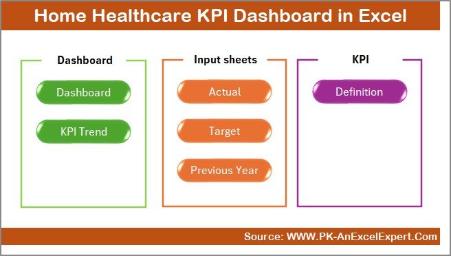
This dashboard comes with 7 powerful worksheets, each created for a specific purpose. Every sheet works together and gives you a complete KPI system. Let’s explore each one in detail.
Summary Page – A Simple Navigation Hub
The Summary Page works like an index. It includes six buttons so you can jump directly to any worksheet in one click. This improves navigation and saves time. You do not scroll or search. Instead, you move to Dashboard, Trend View, Input sheets, or KPI definitions instantly.
Click to buy Home Healthcare KPI Dashboard in Excel
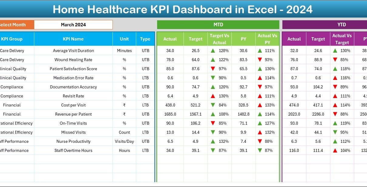
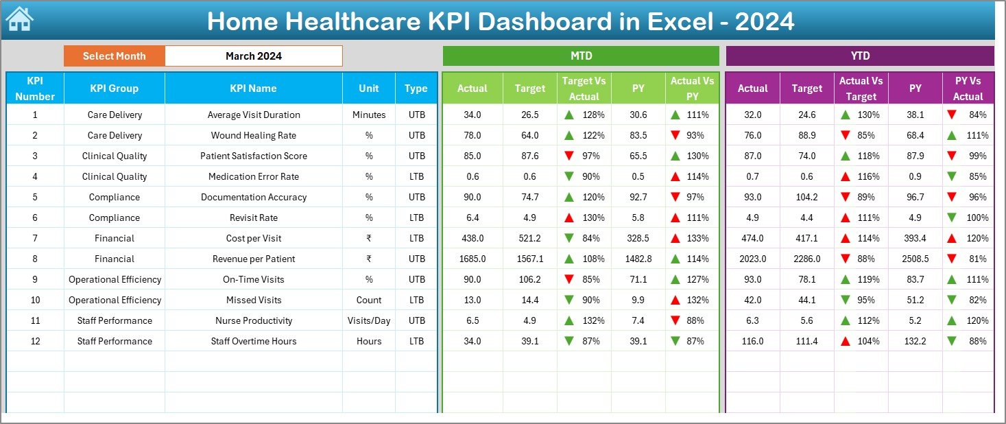
Dashboard Sheet – The Complete KPI View
The Dashboard Sheet is the main working area. It displays all important information on a single screen. On cell D3, you can choose the month from a drop-down. When you select the month, the dashboard instantly updates all KPI values.
This sheet shows:
MTD (Month-to-Date) View
- Actual performance
- Target
- Previous year
- Actual vs Target
- Actual vs Previous Year
- Up and down arrows with conditional formatting
YTD (Year-to-Date) View
- Actual values
- Target
- Previous year
- Actual vs Target
- Actual vs Previous Year
- Up and down arrows for trend direction
Because of this layout, you see everything at a glance. You understand which KPIs are improving and which need immediate attention.
Click to buy Home Healthcare KPI Dashboard in Excel
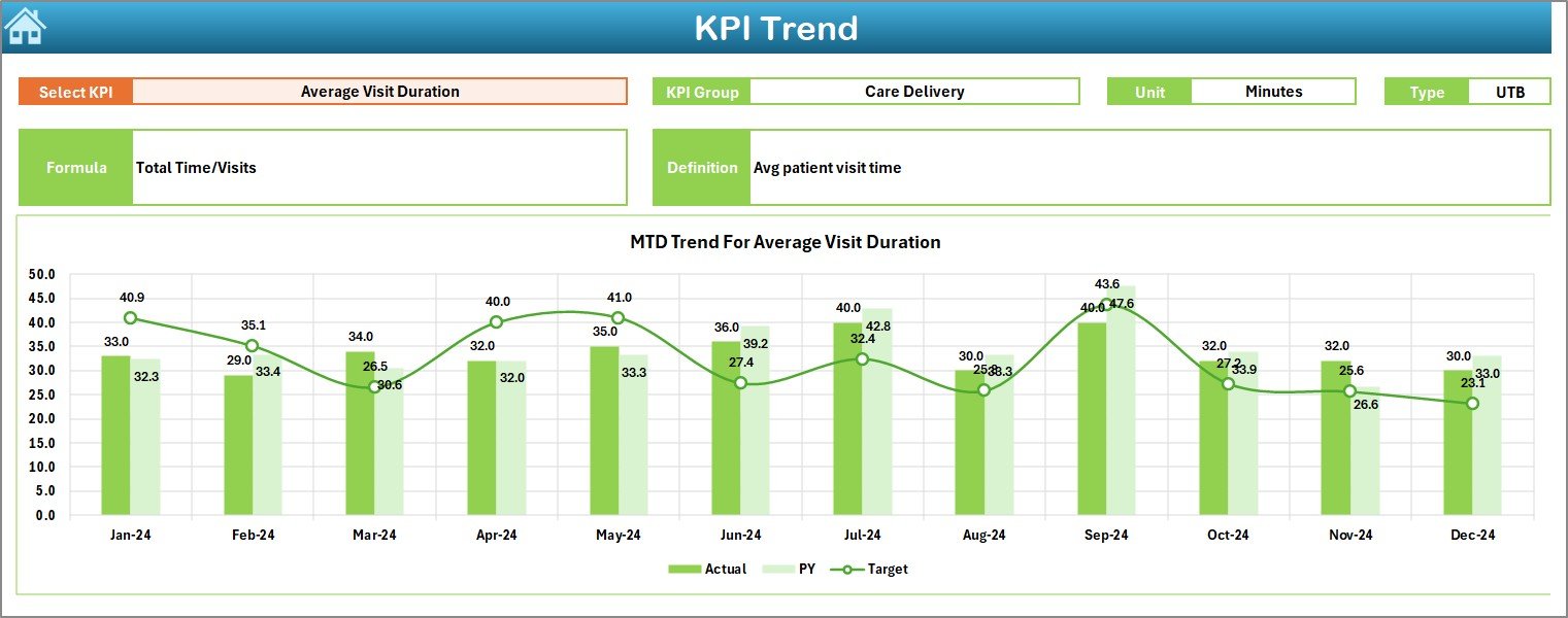
Trend Sheet – Track KPI Trends Over Time
The Trend Sheet helps you understand KPI movement over the months. On cell C3, you can choose any KPI from the list. Once you select it, the sheet displays:
- KPI Group
- Unit of measurement
- KPI Type (Lower the Better / Upper the Better)
- Formula
- Definition
You also see MTD and YTD trend charts for the selected KPI. These charts compare:
- Actual values
- Target values
- Previous year’s values
Because of this, you identify long-term patterns. You also check if the KPI consistently moves in the right direction.
Click to buy Home Healthcare KPI Dashboard in Excel
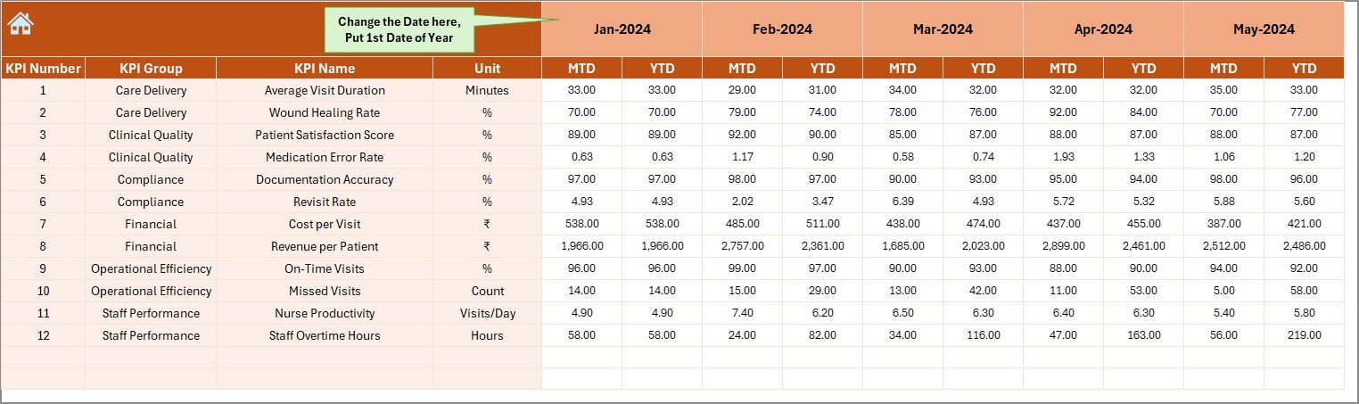
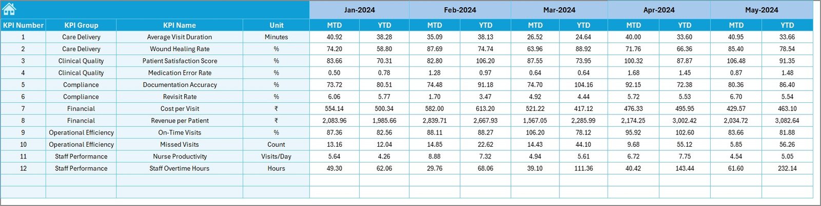
Actual Numbers Input Sheet
This sheet stores actual performance data for each month. You can update MTD and YTD values for every KPI.
You can also change the year’s starting month on cell E1. Once you update it, the entire file adjusts automatically. This helps organizations that use different fiscal year formats.
Target Sheet – Set KPI Goals Easily
The Target Sheet allows you to set monthly targets for each KPI. You can enter:
- MTD Targets
- YTD Targets
Because the dashboard compares Actual vs Target, you must update this sheet every month. These target numbers guide the performance evaluation.
Click to buy Home Healthcare KPI Dashboard in Excel
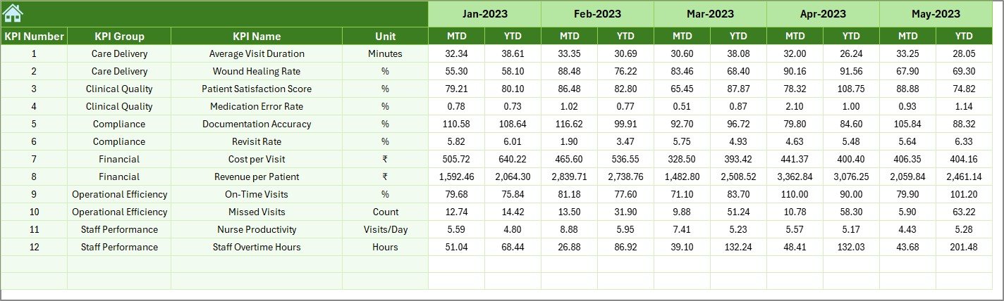
Previous Year Numbers Sheet
This sheet stores the previous year’s data. It works exactly like the actual numbers sheet. You enter the past year’s information for each KPI. The dashboard uses this data to show:
- Year-over-year improvement
- Performance gaps
- Value comparison
This helps managers understand growth and issues over time.
Click to buy Home Healthcare KPI Dashboard in Excel
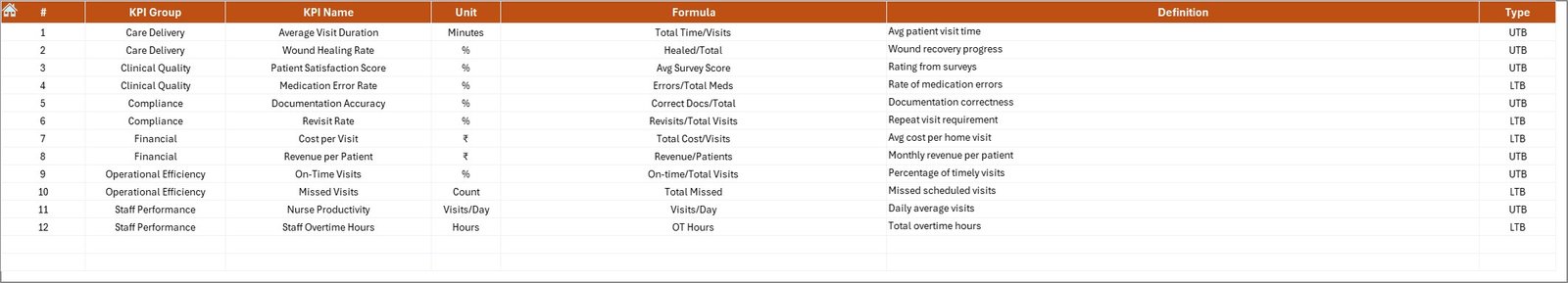
KPI Definition Sheet – Your KPI Reference Book
This sheet contains complete details of every KPI, including:
- KPI Name
- KPI Group
- Unit of measurement
- Formula
- Definition
- KPI Type (LTB/UTB)
When teams work with many KPIs, this sheet provides clarity. It keeps every KPI consistent and standard.
Click to buy Home Healthcare KPI Dashboard in Excel
How Does a Home Healthcare KPI Dashboard Improve Operations?
A well-structured dashboard helps healthcare teams perform better. It gives real insight and increases accountability.
- Faster Decision-Making
Because the dashboard updates instantly, managers take decisions quickly without waiting for weekly reports.
- Higher Patient Satisfaction
Tracking response time, visit adherence, patient follow-ups, and medication accuracy improves care quality.
- Better Staff Productivity
You can measure staff performance by monitoring visits, delays, missed tasks, and monthly KPIs.
- Stronger Compliance
Healthcare standards demand accurate reporting. The dashboard keeps the data clean and organized.
- Improved Forecasting
Trend charts help you forecast needs and plan the next steps.
Advantages of a Home Healthcare KPI Dashboard in Excel
The dashboard offers many benefits, and each one impacts the efficiency of the entire team.
- Easy to Use
Excel is simple. Anyone can use this dashboard without special training.
- Real-Time Insights
The dashboard updates as soon as you change the data.
- Better Transparency
Everyone can see how well the team performs.
- Improved Accountability
Because targets and actuals appear side-by-side, team members stay responsible for their performance.
- Clear Trend Analysis
Charts make it easy to understand long-term performance.
- Low Cost
You do not pay for extra software. Excel handles everything.
- Standardized KPIs
The KPI Definition Sheet keeps every KPI clear and consistent.
What KPIs Should You Track in Home Healthcare?
Every home healthcare team must track specific KPIs regularly. Some examples include:
- Number of home visits
- Visit adherence rate
- Patient wait time
- Medication accuracy
- Therapy session completion rate
- Follow-up timelines
- Revenue per patient
- Patient satisfaction score
- Revisit rate
- Scheduling accuracy
- Emergency response time
These KPIs help evaluate patient care, operations, and financial performance.
Best Practices for Using a Home Healthcare KPI Dashboard in Excel
To get the best results, follow these practices:
- Update Data Every Month
Regular updates maintain the accuracy of the dashboard.
- Review Trends Frequently
Trends highlight early warnings. Respond to them before they become major issues.
Use Simple KPIs
Keep KPIs clear and relevant. Do not add too many.
Set Realistic Targets
Targets should match real conditions and team capability.
- Train Your Staff
Help team members understand how KPIs work and why they matter.
- Review Previous Year Data
Compare performance to track growth.
- Use Conditional Formatting Wisely
Arrows and colors highlight improvement and issues instantly.
- Keep KPI Definitions Standard
Follow the definitions in the KPI definition sheet to avoid confusion.
Common Challenges and How This Dashboard Solves Them
Challenge 1: Too Much Data
Healthcare teams deal with huge amounts of data.
Solution:
This dashboard converts data into simple visuals and tables.
Challenge 2: Tracking Month-to-Month Change
It becomes confusing without consistent structure.
Solution:
MTD and YTD views show clear changes.
Challenge 3: No Trend Visibility
Teams struggle to understand long-term performance.
Solution:
Trend charts show monthly movement of every KPI.
Challenge 4: No Reference for KPI Definitions
Teams interpret KPIs differently.
Solution:
The KPI Definition Sheet provides clarity.
Conclusion
The Home Healthcare KPI Dashboard in Excel gives a complete view of your healthcare performance. It helps you track every important KPI, measure accuracy, compare targets, review trends, and plan improvements. Because it uses simple Excel functions, anyone can use it without complex tools or training.
When home healthcare teams follow these KPIs, they improve patient care, reduce delays, enhance coordination, and boost operational efficiency. This dashboard becomes a strong foundation for better decision-making and long-term growth.
Frequently Asked Questions (FAQ)
- What is a KPI in home healthcare?
A KPI shows the performance of important activities such as visits, response time, therapy sessions, and patient satisfaction.
- Why should we use a KPI dashboard in Excel?
It provides real-time insights, simplifies complex data, and keeps everything organized in one place.
- Do I need Excel skills to use this dashboard?
No. The dashboard runs on simple formulas. Anyone can update it easily.
- Can I add more KPIs to this file?
Yes, you can add more KPIs to the KPI Definition Sheet and update the input sheets.
- Can this dashboard work for different financial years?
Yes. You can change the starting month in the input sheet.
- Does the dashboard show monthly trends?
Yes. The Trend Sheet displays MTD and YTD charts for all KPIs.
- Can I compare performance with the previous year?
Yes. The dashboard includes a specific sheet for previous-year numbers.
Visit our YouTube channel to learn step-by-step video tutorials
Watch the step-by-step video tutorial:
Click to buy Home Healthcare KPI Dashboard in Excel