In today’s fast-paced digital world, tracking IT services’ performance and ensuring customer satisfaction is crucial for businesses. With the growing complexity of IT services, managing requests, monitoring resolution times, and analyzing customer experiences have become essential. One of the most effective tools to accomplish this is a well-designed IT Services Dashboard in Excel. In this article, we’ll explain the key components and features of the IT Services Dashboard in Excel, designed to streamline service tracking, enhance performance analysis, and improve decision-making.
Table of Contents
ToggleOverview of IT Services Dashboard in Excel
The IT Services Dashboard in Excel serves as an all-in-one tool to manage and analyze IT requests, performance, and customer experiences. This dashboard provides a user-friendly interface for IT managers, helping them track critical metrics, identify areas for improvement, and ensure the timely resolution of issues. The dashboard includes several key sheets and charts, each designed to present different aspects of the IT service process.
Key Features:
-
Multiple Sheets: The dashboard is divided into different sheets, each catering to a specific area of IT service tracking.
-
Charts and Slicers: The use of interactive charts and slicers helps users filter data quickly and visually analyze performance.
-
Card Metrics: Key metrics like total requests, resolution times, and SLA breaches are displayed in easy-to-understand cards.
Overview Sheet Tab
The Overview Sheet is the first sheet of the IT Services Dashboard and provides an at-a-glance summary of key performance indicators (KPIs) related to IT services.
Key Metrics on the Overview Sheet:
-
Total Requests: The number of requests made by customers, showing the overall demand for IT services.
-
Avg. Resolution Time (hrs): The average time taken to resolve customer requests, helping to track service efficiency.
-
Avg. Response Time (hrs): The average time taken to respond to customer requests, which is crucial for service-level agreements (SLAs).
-
SLA Breach %: The percentage of requests where the SLA was breached, helping to gauge whether the team is meeting its target resolution times.
Charts on the Overview Sheet:
-
Total Requests by Status: This pie chart gives a visual breakdown of requests based on their status (open, in-progress, resolved, etc.).
-
Total Requests by Region: An arrow chart showing how requests are distributed across various regions.
-
Total Requests by Request Month: A line chart that tracks the number of requests over time, helping to spot seasonal trends.
-
Avg. Customer Rating by Service Type: A star chart that displays average customer ratings by the type of service provided.

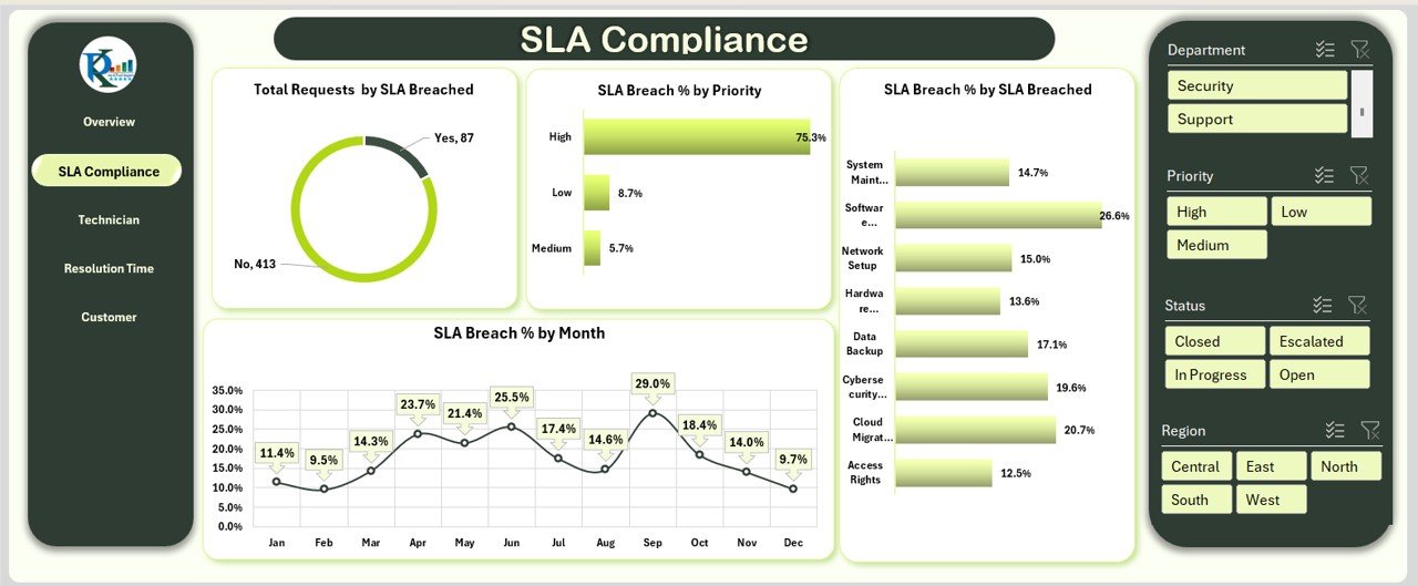
SLA Compliance Sheet Tab
The SLA Compliance Sheet focuses on monitoring service level agreements and how well IT services are meeting customer expectations.
Key Charts on the SLA Compliance Sheet:
-
Total Requests by SLA Breached: A donut chart that shows the percentage of requests where SLAs were breached.
-
SLA Breach % by Priority: A bar chart highlighting SLA breach percentages for different priority levels (high, medium, low).
-
SLA Breach % by Month: A line chart that tracks SLA breaches over time to identify patterns.
-
SLA Breach % by SLA Breached: A bar chart that breaks down SLA breaches further, providing insights into specific causes of delays.
Technician Performance Sheet Tab
The Technician Performance Sheet tab is dedicated to tracking the performance of IT technicians. This sheet is essential for evaluating the efficiency and effectiveness of individual team members.
Key Charts on the Technician Performance Sheet:
-
Avg. Resolution Time by Assigned Technician: An area chart that shows how long each technician takes to resolve requests on average.
-
Total Requests by Assigned Technician: A bar chart displaying the total number of requests handled by each technician.
-
Avg. Customer Rating by Assigned Technician: A flag chart that tracks customer satisfaction by technician, providing insights into individual performance.

Resolution Time Analysis Sheet Tab
The Resolution Time Analysis Sheet provides detailed insights into how long it takes to resolve requests based on different criteria.
Key Charts on the Resolution Time Analysis Sheet:
-
Avg. Resolution Time by Region: An area chart showing the average resolution time for different regions.
-
Avg. Resolution Time by Priority: A bar chart that compares resolution times based on priority levels.
-
Avg. Resolution Time by Department: A column chart that tracks resolution times across various departments within the organization.

Customer Experience Sheet Tab
The Customer Experience Sheet is focused on evaluating customer feedback and satisfaction levels, a crucial aspect of IT services.
Key Charts on the Customer Experience Sheet:
-
Avg. Customer Rating by Department: An arrow chart that tracks customer ratings for different departments.
-
Avg. Customer Rating by Priority: A bar chart that compares customer satisfaction based on the priority level of requests.
-
Avg. Customer Rating by Region: A line chart showing customer satisfaction across different regions.

Data Sheet Tab
The Data Sheet serves as the input sheet for all raw data, where service request information is logged. This tab allows IT managers to manually input or import data related to service requests. The data recorded includes:

Advantages of IT Services Dashboard in Excel
An IT Services Dashboard in Excel offers numerous advantages that can improve the management and performance of IT services.
-
Enhanced Visibility: The dashboard provides a clear and comprehensive view of key IT service metrics, making it easy to spot trends and issues.
-
Improved Decision-Making: With real-time data and visual charts, managers can make informed decisions that improve service delivery and customer satisfaction.
-
Streamlined Reporting: The dashboard simplifies reporting by consolidating data from multiple sources into a single, easy-to-read format.
-
Customizability: Excel’s flexibility allows you to tailor the dashboard to meet the unique needs of your organization.
-
Cost-Effective: Unlike expensive software solutions, an Excel-based dashboard is a low-cost alternative for organizations of all sizes.
Opportunities for Improvement in IT Services
While the IT Services Dashboard in Excel offers several benefits, there are always opportunities for improvement:
-
Automating Data Input: Manual data entry can be time-consuming and error-prone. Implementing data integration or automation could streamline this process.
-
Advanced Analytics: While the dashboard provides basic insights, incorporating advanced analytics (e.g., predictive analysis) could help forecast trends and prevent potential issues.
-
Mobile Compatibility: Making the dashboard mobile-friendly would allow IT managers to access important data while on the go.
-
Advanced Security: Enhancing data security, particularly for sensitive information, would ensure that the dashboard remains secure and compliant with industry standards.
Best Practices for Using an IT Services Dashboard in Excel
To maximize the effectiveness of your IT Services Dashboard in Excel, consider implementing these best practices:
-
Regular Data Updates: Ensure that the data is updated regularly to maintain accuracy and reliability.
-
Use Interactive Features: Leverage slicers and filters to make the dashboard more interactive and user-friendly.
-
Customize for Your Needs: Tailor the dashboard to track the KPIs that matter most to your organization.
-
Provide Training: Ensure that team members understand how to use the dashboard and interpret the data.
-
Monitor Trends Over Time: Regularly review historical data to identify patterns and make improvements in your IT services.
Frequently Asked Questions (FAQs)
1. What is the purpose of the IT Services Dashboard in Excel?
The IT Services Dashboard in Excel is designed to help IT teams track and analyze key metrics, including request volumes, resolution times, SLA compliance, and customer satisfaction.
2. Can I customize the IT Services Dashboard?
Yes, the dashboard is highly customizable. You can modify it to suit your organization’s unique needs, such as adding new charts, KPIs, or adjusting data input fields.
3. How can I automate data entry in the IT Services Dashboard?
You can automate data entry by integrating the dashboard with other systems or using Excel VBA to create data-entry forms and automate data imports.
4. Is the IT Services Dashboard suitable for large organizations?
Yes, it is scalable and can be used by organizations of all sizes. For large organizations, additional customization and integration with other tools may be necessary.
Conclusion
The IT Services Dashboard in Excel is an invaluable tool for IT managers seeking to improve service delivery, streamline processes, and enhance customer satisfaction. By providing detailed insights into key metrics like SLA compliance, resolution times, and customer ratings, the dashboard empowers decision-makers to drive continuous improvement in IT services. With its easy-to-use interface, customizability, and cost-effectiveness, this dashboard proves to be a powerful solution for organizations looking to optimize their IT service management.
Watch the step-by-step video Demo:
Visit our YouTube channel to learn step-by-step video tutorials