In today’s fast-paced logistics and e-commerce environment, last-mile delivery defines customer satisfaction. It’s the final and most crucial step — when a parcel leaves the local hub and reaches the customer’s doorstep. This stage affects cost, speed, and service quality, which directly influence customer trust and brand reputation.
Managing this process efficiently requires data visibility, continuous monitoring, and quick insights. That’s exactly what the Last-Mile Delivery KPI Dashboard in Power BI delivers.
This ready-to-use analytical tool converts raw logistics data into interactive visuals, giving logistics managers and business owners the power to monitor every delivery operation in real time.
Click to buy Last-Mile Delivery KPI Dashboard in Power BI
What Is a Last-Mile Delivery KPI Dashboard in Power BI?
A Last-Mile Delivery KPI Dashboard in Power BI is an analytical reporting tool that tracks and visualizes key performance indicators (KPIs) related to final-stage delivery operations.
It provides a centralized view of important delivery metrics like delivery time, on-time percentage, cost per delivery, success rate, driver performance, and more.
By using Power BI, this dashboard brings your logistics data to life — transforming Excel-based information into dynamic visuals, slicers, and interactive charts that support faster decisions and continuous improvement.
Why Last-Mile KPIs Matter
The last mile accounts for over 50% of total logistics costs in many delivery businesses. Monitoring it with the right KPIs helps you:
- Detect delays or failed deliveries instantly.
- Control costs and optimize routes.
- Measure performance of drivers and hubs.
- Maintain high customer satisfaction.
- Improve forecasting and planning accuracy.
With this Power BI dashboard, teams can see what’s happening right now, compare performance with targets, and drill down to identify causes behind missed targets.
Structure of the Last-Mile Delivery KPI Dashboard
The Last-Mile Delivery KPI Dashboard in Power BI includes three powerful pages that together give a 360-degree view of logistics performance.
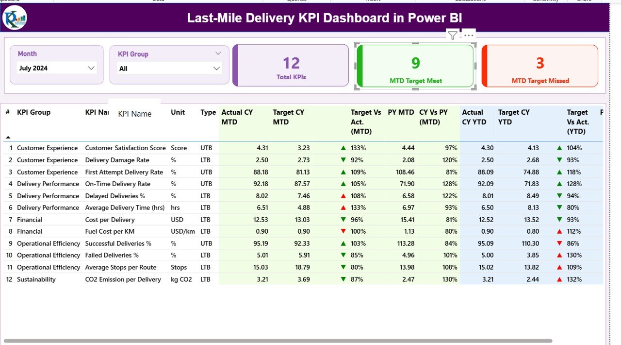
Summary Page — The Central Control Panel
The Summary Page is the main view of the dashboard and acts as a command center for managers.
At the top, you can find:
- Month slicer — to filter all visuals by a selected month.
- KPI Group slicer — to narrow data by categories such as “Delivery Speed,” “Customer Experience,” or “Operational Efficiency.”
Below the slicers, there are three key metric cards:
- Total KPIs Count — Total number of KPIs being monitored.
- MTD Target Met Count — Number of KPIs that met their Month-to-Date targets.
- MTD Target Missed Count — KPIs that failed to meet MTD targets.
Click to buy Last-Mile Delivery KPI Dashboard in Power BI
The Detailed KPI Table
The table below gives complete transparency into every KPI:
- KPI Number: Sequential identifier for each metric.
- KPI Group: The category or business area of the KPI.
- KPI Name: The performance indicator being tracked (e.g., Average Delivery Time, On-Time Rate).
- Unit: Measurement unit (e.g., %, Minutes, USD).
- Type: KPI classification — UTB (Upper the Better) or LTB (Lower the Better).
- Actual CY MTD: Current Year Month-to-Date actual value.
- Target CY MTD: Target value for the current month.
- MTD Icon: ▲ or ▼ icons in green/red colors that instantly show whether the target is achieved or missed.
- Target vs Actual (MTD): Percentage comparison using the formula:
Actual / Target * 100. - PY MTD: Previous Year’s MTD value.
- CY vs PY (MTD): Year-over-year MTD comparison formula:
Current Year MTD / Previous Year MTD * 100. - Actual CY YTD & Target CY YTD: Year-to-Date performance values.
- YTD Icon: Similar up/down indicator for YTD targets.
- Target vs Actual (YTD):
Actual YTD / Target YTD * 100. - PY YTD & CY vs PY (YTD): Compare current year’s YTD with previous year’s to track improvement trends.
This structure provides complete transparency — helping users spot problem areas, track performance patterns, and make data-driven corrections.
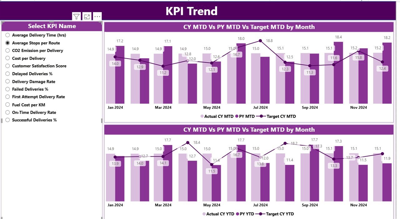
KPI Trend Page — Visualizing Performance Over Time
The KPI Trend Page converts numerical data into visual stories. It includes:
- Two combo charts that compare Current Year, Previous Year, and Target numbers for both MTD and YTD metrics.
- A KPI Name slicer on the left side that lets you choose specific metrics to analyze trends individually.
These visuals make it simple to track seasonality, identify recurring issues, and evaluate consistency across months or years.
For example:
- If Delivery Cost per Package keeps rising quarter over quarter, managers can review fleet efficiency or fuel management practices.
- If On-Time Delivery % improves after implementing route optimization, that success can be scaled across other regions.
KPI Definition Page — The Knowledge Reference
Click to buy Last-Mile Delivery KPI Dashboard in Power BI
The KPI Definition Page acts as a drill-through reference sheet. It stays hidden by default but is accessible through a drill-through action from the Summary Page.
This page stores:
- KPI Number
- KPI Group
- KPI Name
- Unit
- Formula
- Definition
- Type (UTB or LTB)
It provides clarity for all team members — so no one has to guess what a KPI means or how it’s calculated. Every stakeholder, from analysts to delivery managers, can view consistent definitions for accurate performance tracking.
A “Back” button on the top-left corner helps users quickly return to the Summary Page.
Data Source — Excel Integration
The Last-Mile Delivery KPI Dashboard in Power BI uses an Excel file as the data source, making it easy to update and maintain.
It contains three key worksheets:
Input_Actual Sheet
Record the real performance figures here:
- KPI Name
- Month (always use the first date of each month)
- MTD (Month-to-Date)
- YTD (Year-to-Date)
This sheet captures actual logistics data such as total deliveries, average delivery time, customer satisfaction, or cost per delivery.
Input_Target Sheet
Enter target values that represent performance goals:
- KPI Name
- Month
- MTD & YTD targets
These targets help benchmark performance and highlight areas that need attention.
KPI Definition Sheet
Define each KPI with:
- KPI Number
- KPI Group
- KPI Name
- Unit
- Formula
- Definition
- Type (LTB or UTB)
With this simple Excel structure, anyone can update or expand KPI data without needing deep technical skills.
Advantages of the Last-Mile Delivery KPI Dashboard in Power BI
The dashboard offers a wide range of operational and strategic benefits. Let’s explore the most impactful ones:
Real-Time Performance Tracking
Monitor every delivery KPI in real time through visual cards, charts, and tables. Managers get immediate visibility into whether deliveries are on time, late, or failed.
Cost Optimization
By comparing target vs actual data, organizations can detect where costs exceed expectations — whether due to route inefficiencies, idle time, or fuel expenses.
Enhanced Decision-Making
With all KPIs in one place, decision-makers can analyze delivery performance from multiple angles and make fast, data-driven adjustments.
Customer Experience Improvement
High on-time rates and quick resolution of issues directly enhance customer satisfaction and repeat business.
Easy Comparison with Past Performance
YTD and MTD comparisons with previous years make it simple to evaluate growth and operational consistency.
Plug-and-Play Setup
The dashboard uses Excel as its backend, which makes it extremely easy to update — even for users who aren’t Power BI experts.
Scalability and Customization
Users can expand KPI categories or integrate other data sources (e.g., SQL, Google Sheets, ERP systems) as their delivery network grows.
Opportunities for Improvement
While the dashboard is powerful, you can make it even better by applying a few enhancements:
- Add Geo Maps: Visualize delivery hubs, customer density, or route delays.
- Integrate Live APIs: Connect with real-time tracking or fleet management systems.
- Include Predictive Analytics: Use Power BI’s AI features to forecast delivery time or customer satisfaction trends.
- Set Automated Alerts: Trigger email or Teams notifications when KPIs fall below thresholds.
- Mobile Optimization: Ensure the dashboard layout fits small screens for field managers.
Best Practices for Using the Last-Mile Delivery KPI Dashboard in Power BI
To make the most of your dashboard, follow these practical best practices:
Keep Data Updated Regularly
Update your Excel input sheets weekly or monthly to maintain accuracy. Outdated data reduces the effectiveness of visual insights.
Standardize KPI Definitions
Always maintain one source of truth for KPI definitions to ensure team alignment.
Use Meaningful KPI Targets
Set realistic and measurable targets that reflect operational capabilities, not arbitrary goals.
Analyze Both MTD and YTD Trends
Month-to-Date performance helps catch immediate issues, while Year-to-Date analysis shows long-term trends.
Utilize Drill-Throughs
Encourage users to explore the KPI Definition Page for formula transparency and better understanding of metrics.
Customize Slicers and Filters
Empower managers to filter data by region, delivery type, or service partner for deeper analysis.
Automate Data Refresh
If possible, link your Excel sheets to an online data source and set automatic refresh schedules in Power BI Service.
Combine with Other Dashboards
Integrate this dashboard with inventory or warehouse dashboards for a complete logistics intelligence ecosystem.
Use Cases of the Last-Mile Delivery KPI Dashboard
The dashboard serves a wide variety of logistics operations, including:
- E-Commerce Companies: Tracking delivery speed, failed deliveries, and regional performance.
- Courier & Parcel Services: Monitoring on-time rates, cost per route, and customer feedback.
- 3PL (Third-Party Logistics) Providers: Reporting SLA compliance and partner performance.
- Food & Grocery Delivery Firms: Comparing order fulfillment time and customer satisfaction scores.
- Retail Distribution Chains: Analyzing last-mile cost efficiency for multiple branches.
Key KPIs You Can Track
Some of the most valuable KPIs to include in your dashboard are:
- On-Time Delivery Rate (%)
- Average Delivery Time (Minutes)
- Cost per Delivery ($)
- Failed Deliveries (%)
- Successful Deliveries (%)
- Customer Satisfaction Score (1–10)
- Delivery Distance per Trip (Km)
- Return Rate (%)
- Average Vehicle Utilization (%)
- Delivery Partner Performance Index
These KPIs give a balanced view of speed, cost, quality, and efficiency — the four pillars of strong last-mile logistics.
Conclusion
The Last-Mile Delivery KPI Dashboard in Power BI is more than a reporting tool — it’s a strategic decision-making companion.
It empowers logistics teams to visualize performance, identify bottlenecks, and take proactive actions before minor issues become major problems.
With its intuitive design, Excel connectivity, and real-time visuals, this Power BI dashboard bridges the gap between operational data and business intelligence.
By adopting this dashboard, logistics managers can ensure faster deliveries, happier customers, and optimized operations — all from one interactive interface.
Frequently Asked Questions (FAQs)
- What is the purpose of a Last-Mile Delivery KPI Dashboard?
It helps logistics teams track, measure, and analyze key performance indicators related to delivery operations — such as speed, cost, and reliability.
- Can I customize the dashboard for my business?
Yes! You can easily modify KPI definitions, visuals, and color schemes in Power BI to match your organization’s requirements.
- Does it work with real-time data?
Yes, if you connect your Excel file to live APIs or databases. Otherwise, you can refresh the Excel data manually or on a schedule.
- How often should I update the data?
It’s best to update MTD and YTD numbers monthly or weekly depending on delivery volume.
- Can non-technical users operate this dashboard?
Absolutely. It’s designed for easy use — with slicers, cards, and clear visuals that require no coding or technical setup.
- Is this dashboard suitable for small businesses?
Yes, it’s ideal for startups and SMEs who want powerful analytics without expensive software.
- How can I add more KPIs to the dashboard?
Simply expand the Excel KPI Definition sheet and refresh the Power BI model — new metrics will appear automatically.
- Can this dashboard be shared online?
Yes, you can publish it to the Power BI Service and share it with your team through secure links or embed it in internal portals.
Visit our YouTube channel to learn step-by-step video tutorials
Watch the step-by-step video tutorial:
Click to buy Last-Mile Delivery KPI Dashboard in Power BI