Modern metro and subway operations run with high speed, tight schedules, and strict safety rules. Every trip, every train, and every station generates useful data. When teams track this data in real time, they improve service reliability and make quick decisions. However, many transit teams still update reports manually. As a result, they lose time, miss trends, and struggle to understand performance gaps.
A Metro & Subway KPI Dashboard in Power BI solves these issues quickly. It brings all performance metrics into one clean and interactive dashboard. It also helps leaders understand the quality of services, daily operations, safety performance, train movement, passenger trends, and maintenance results. Since Power BI updates data instantly, metro teams enjoy more clarity and control.
In this in-depth guide, you will learn everything about this dashboard. You will also explore its pages, structure, key features, advantages, and best practices. Toward the end, you will also find helpful FAQs so that you understand this tool even better.
Click to buy Metro & Subway KPI Dashboard in Power BI
What Is a Metro & Subway KPI Dashboard in Power BI?
A Metro & Subway KPI Dashboard in Power BI is a ready-to-use reporting solution that tracks all operational and safety KPIs. It pulls clean data from Excel and then converts it into cards, tables, and charts. Because of its interactive design, you select a month or KPI group and see the results instantly. Every number updates right away, so teams save hours of manual reporting work.
This dashboard monitors KPIs such as:
- Train punctuality
- Passenger volume
- On-time departures
- Energy consumption
- Safety KPIs
- Maintenance KPIs
- Delay reasons
- Ticket revenue trends
Transit leaders use this dashboard because it offers clear visuals, real-time insights, and simplified decision-making.
Why Every Transit System Needs a Metro & Subway KPI Dashboard
Metro and subway systems deal with thousands of passengers every day. One delay creates a chain reaction. One breakdown disrupts an entire route. Because of this, teams must check trends, compare performance, and visualize results quickly. Power BI helps leaders identify issues early and take action fast.
When you use this dashboard, you understand your system much better. You also respond to problems before they spread. As your operations grow, this dashboard grows with you. Since Power BI handles large data easily, you avoid manual errors and improve accuracy.
Key Features of the Metro & Subway KPI Dashboard in Power BI
This dashboard consists of three useful pages, and each page gives a different view of your KPIs. Although all pages use the same data source, each one focuses on a unique analytical requirement.
Let us explore them in detail.
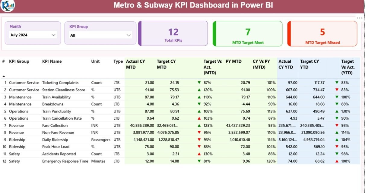
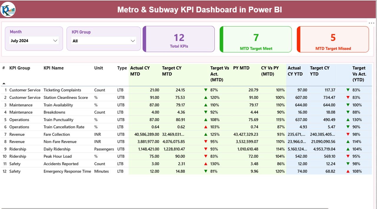
Summary Page – The Main Performance View
The Summary Page acts as the heart of the dashboard. It shows a fast overview of all KPIs and helps teams monitor results at a glance. When you select a month or KPI group, the entire dashboard refreshes.
Key Highlights of the Summary Page
- Month Slicer: Choose the month you want to analyze
- KPI Group Slicer: Filter KPIs by group (Operations, Safety, Service Quality, etc.)
- Total KPI Count Card: Shows how many KPIs exist
- MTD Target Met Count: Highlights how many KPIs met the month-to-date target
- MTD Target Missed Count: Shows KPIs that did not meet the monthly target
Below these cards, a detailed table presents complete KPI insights.
Fields in the Summary Table
- KPI Number – Sequence number for identification
- KPI Group – Category of KPI such as Operations or Maintenance
- KPI Name – Name of the metric
- Unit – Unit of measurement (minutes, %, count, etc.)
- Type – LTB (Lower the Better) or UTB (Upper the Better)
- Actual CY MTD – Current Year Month-to-Date actual value
- Target CY MTD – Current Year Month-to-Date target value
- MTD Status Icon – Green ▲ or Red ▼ to show performance
- Target vs Actual (MTD) – A percentage comparison
- PY MTD – Last year’s MTD value
- CY vs PY (MTD) – Comparison between this year and last year
- Actual CY YTD – Current Year Year-to-Date actual value
- Target CY YTD – Current Year Year-to-Date target
- YTD Status Icon – Red ▼ or Green ▲ based on performance
- Target vs Actual (YTD) – YTD comparison percentage
- PY YTD – Last year’s YTD performance
- CY vs PY (YTD) – YTD comparison with previous year
Why This Page Is Important
This page helps leaders track progress, highlight issues, and compare performance instantly. You spot delays, low productivity, or service gaps within seconds. Because the design is simple, every user—including non-technical users—understands the results quickly.
Click to buy Metro & Subway KPI Dashboard in Power BI
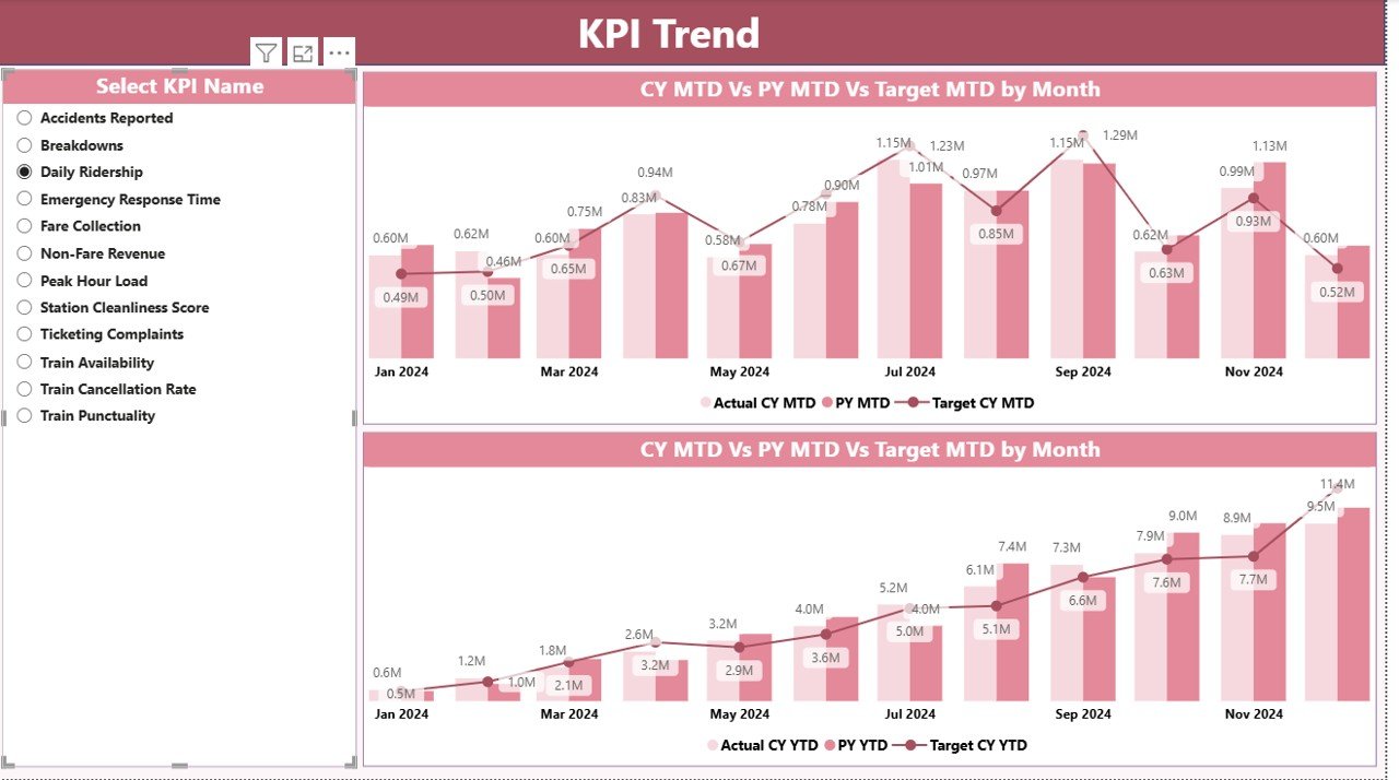
KPI Trend Page – Visual Analysis of Performance Trends
When teams want to check performance at a deeper level, they use the KPI Trend Page. It includes two combo charts designed to show both MTD and YTD performance visually.
What This Page Shows
- Current Year Actual (MTD + YTD)
- Target Values for the Year
- Previous Year Actuals
You simply select a KPI from the left slicer and see how that KPI performs across months.
Why Trend Analysis Matters
Trend charts help you:
- Understand performance patterns
- Detect early warning signs
- Compare actuals against targets
- Review long-term performance
- Analyze seasonal behavior of KPIs
- Improve planning and forecasting
Teams use this page to understand whether they are improving each month or moving in the wrong direction.
Click to buy Metro & Subway KPI Dashboard in Power BI
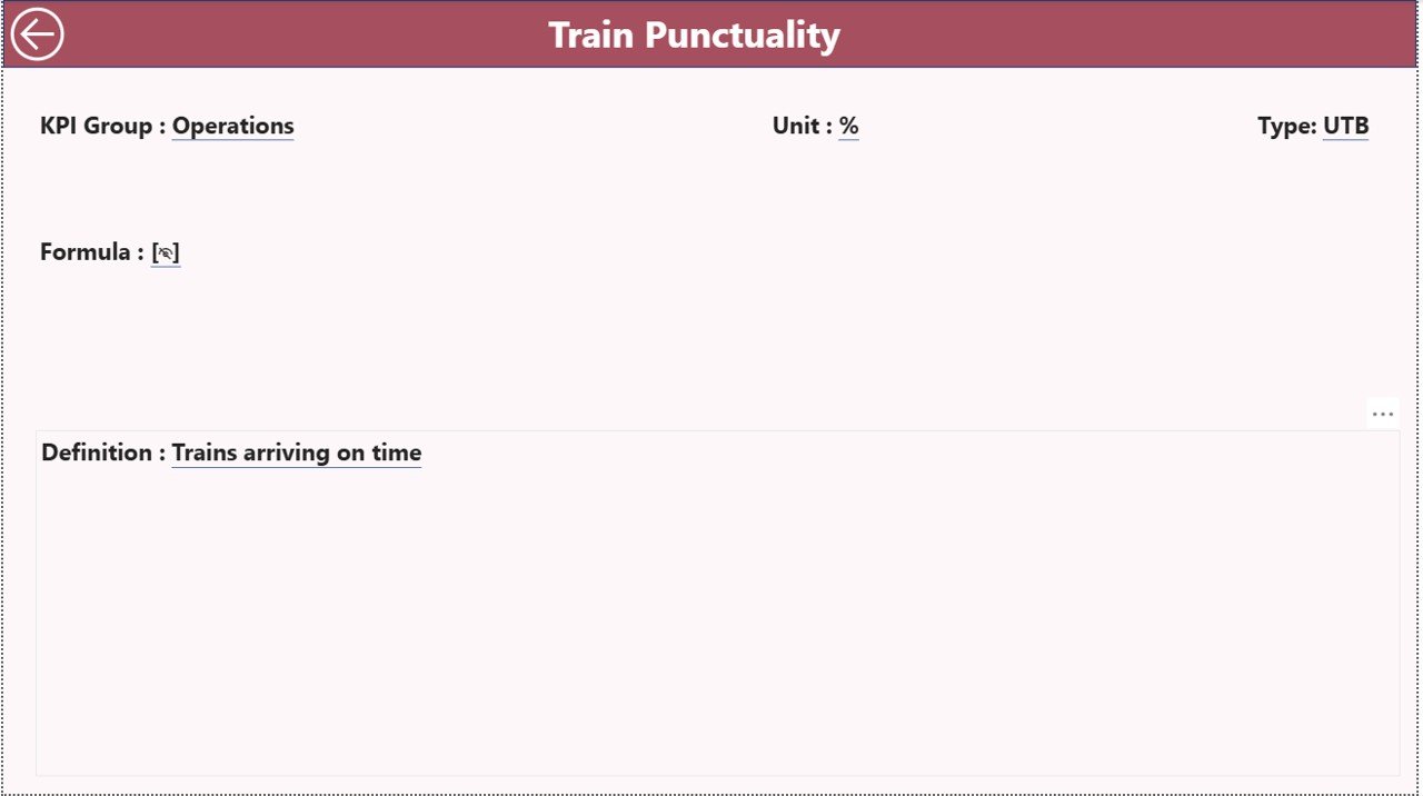
KPI Definition Page – Complete Description of Each KPI
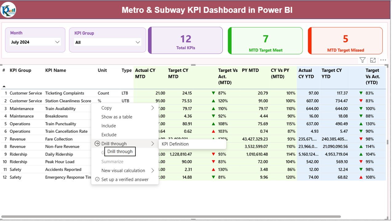
This page acts as a central reference for KPI details. It stays hidden because users access it through drill-through action from the Summary Page.
Information Available on the KPI Definition Page
- KPI Number
- KPI Group
- KPI Name
- Unit
- Formula
- KPI Definition
- KPI Type (LTB or UTB)
Since users jump to this page from the Summary Page, they understand the meaning of each KPI without searching manually. The page also includes a back button to return to the main report.
Click to buy Metro & Subway KPI Dashboard in Power BI
How the Excel Data Source Works
This dashboard uses a simple and structured Excel file. You fill only three sheets, and Power BI handles the entire reporting process.
Input_Actual Sheet
Here, you enter:
- KPI Name
- Month (use first date of the month)
- MTD Actual
- YTD Actual
This sheet captures the real performance numbers.
Input_Target Sheet
This sheet includes:
- KPI Name
- Month
- MTD Target
- YTD Target
Since targets drive performance, this sheet is important for comparison and evaluation.
KPI Definition Sheet
This sheet stores:
- KPI Number
- KPI Group
- KPI Name
- Unit
- Formula
- Definition
- Type (UTB or LTB)
Power BI uses this sheet to build drill-through details and create the summary table.
Click to buy Metro & Subway KPI Dashboard in Power BI
Advantages of Using a Metro & Subway KPI Dashboard in Power BI
A Metro & Subway KPI Dashboard offers strong advantages for operations, planning, and decision-making. Let us explore them in detail.
- Improved Real-Time Visibility
You view all important KPIs instantly. Because updates refresh in real time, your team never waits for manual reports. Decisions happen faster and delays reduce.
- More Clarity Across Departments
The dashboard breaks KPIs into groups such as:
- Operations
- Safety
- Maintenance
- Service Quality
- Staffing
As a result, every department views only what matters to them.
- Faster Decision-Making
When numbers update automatically, teams identify issues quickly. They correct problems before they grow. This creates a culture of active decision-making.
- Better Passenger Experience
When metro performance improves, passenger satisfaction also increases. This dashboard helps teams track punctuality, safety, and service quality continuously.
- Data-Driven Maintenance
Maintenance teams check YTD and MTD performance. They also compare it with targets. Because of this, they plan preventive actions and reduce unplanned breakdowns.
- Simple Drill-Through Features
Instead of searching for definitions, users click and see all details. This saves time and avoids confusion.
- Easy to Customize
Since Power BI offers a flexible structure, you add more KPIs, create new visuals, or expand categories without re-building the report.
Best Practices for the Metro & Subway KPI Dashboard in Power BI
To get the best results from this dashboard, follow these best practices.
- Keep KPI Definitions Clear
Use simple definitions so all users understand the KPIs. Clean definitions improve communication, clarity, and reporting accuracy.
- Update Data Monthly
Always maintain updated actual and target numbers. Timely data helps teams make the right decisions.
- Use the Right KPI Type (UTB or LTB)
Mark every KPI correctly:
- UTB – Upper the Better
- LTB – Lower the Better
This keeps KPI evaluation accurate.
- Review Trend Charts Regularly
Trend analysis builds insights for long-term planning. Check trend charts at least once a month to spot early changes.
- Keep the Excel File Clean
Avoid unnecessary columns or empty rows in the Excel file. Power BI imports clean data faster and with more stability.
- Train the Team
Teach users how to use slicers, drill-through actions, and chart interpretation. A well-trained team uses the dashboard more effectively.
- Expand KPIs Over Time
As your transit system grows, add new KPIs such as:
- Brake failure rate
- Ticket machine downtime
- Train energy usage
- Passenger dwell time
This keeps your dashboard relevant.
Conclusion
A Metro & Subway KPI Dashboard in Power BI brings complete visibility into transit operations. It simplifies reporting, improves decision-making, and keeps every team aligned. Since it uses clean Excel data and powerful visuals, leaders monitor performance easily and take action quickly.
This dashboard helps metro systems create a reliable service, strong safety standards, and better passenger experience. With clear KPIs, interactive charts, and trend analysis, your transit operations become smarter, faster, and more efficient.
Frequently Asked Questions (FAQs)
- What is a Metro & Subway KPI Dashboard in Power BI?
It is a ready-to-use reporting system that tracks operational, safety, and service KPIs using Excel data and Power BI visuals.
- Who should use this dashboard?
Operations managers, transit planners, safety teams, maintenance teams, and senior management use this dashboard.
- Can I add more KPIs to the dashboard?
Yes. You add new KPIs in the Excel file and update Power BI visuals accordingly.
- Do I need technical skills to use this dashboard?
No. The dashboard uses simple slicers, cards, and charts. Anyone can use it with minimal training.
- How often should I update the data?
Update the Excel sheets every month to keep the MTD and YTD calculations accurate.
- Can I change the visuals or layout?
Yes. Power BI allows full customization of colors, visuals, charts, and layouts.
- Why does the dashboard use LTB and UTB?
These labels help users understand whether higher values or lower values indicate better performance.
- Does the dashboard work with real-time data?
Yes, if connected to real-time data sources or live databases. The Excel version updates manually.
- Can I export these visuals to PDF or PowerPoint?
Yes. Power BI supports exports to PDF, PPT, and even automated subscriptions.
- How does drill-through help?
Drill-through shows complete KPI definitions, formulas, and details. It improves clarity and supports quick analysis.
Visit our YouTube channel to learn step-by-step video tutorials
Watch the step-by-step video tutorial:
Click to buy Metro & Subway KPI Dashboard in Power BI