Office emergencies never come with a warning. However, with the right planning, tools, and data visibility, organizations can reduce risks, protect employees, and control costs effectively. That is exactly why an Office Emergency Preparedness Dashboard in Excel plays a critical role in modern workplace management.
In this detailed guide, you will learn what an Office Emergency Preparedness Dashboard in Excel is, why organizations need it, how it works, its sheet-wise structure, key metrics, advantages, best practices, and frequently asked questions. Moreover, the article uses simple language, strong transitions, and practical examples to ensure clarity and SEO effectiveness.
Click to buy Office Emergency Preparedness Dashboard in Excel
What Is an Office Emergency Preparedness Dashboard in Excel?
An Office Emergency Preparedness Dashboard in Excel is a ready-to-use, interactive reporting tool that helps organizations monitor, analyze, and improve their emergency planning and response activities.
Instead of relying on scattered spreadsheets, manual reports, and static documents, this dashboard centralizes all emergency-related data into one structured Excel file. As a result, safety teams, HR managers, and leadership teams gain instant visibility into budget usage, participation levels, risk exposure, injuries, training effectiveness, and preparedness trends.
Moreover, because the dashboard is built in Excel, it remains easy to use, flexible, and accessible without advanced technical skills.
Why Do Organizations Need an Office Emergency Preparedness Dashboard?
Every workplace faces potential risks such as fire incidents, medical emergencies, natural disasters, equipment failures, or security threats. However, many organizations struggle to track preparedness efforts effectively.
Here is why an Office Emergency Preparedness Dashboard in Excel becomes essential:
- Emergency data often remains scattered across departments
- Budget tracking lacks clarity and accountability
- Participation and attendance rates stay unclear
- Risk levels do not get analyzed by department or workspace
- Management lacks monthly and trend-based insights
Therefore, this dashboard transforms raw emergency data into actionable insights, helping organizations prepare better, respond faster, and reduce losses.
How Does an Office Emergency Preparedness Dashboard in Excel Work?
The dashboard works by collecting emergency preparedness data into structured tables. Then, using Excel formulas, pivot tables, and charts, it converts that data into visual insights.
Because of this structure, users can:
- Filter data by emergency type, department, vendor, or risk level
- Track budgets, attendance, and injuries in real time
- Compare planned versus actual participation
- Monitor monthly trends and performance gaps
As a result, decision-makers can quickly identify weaknesses and take corrective actions.
What Sheets Are Included in the Office Emergency Preparedness Dashboard in Excel?
This ready-to-use Office Emergency Preparedness Dashboard in Excel includes multiple well-structured sheet tabs. Each sheet focuses on a specific analysis area, which ensures clarity and ease of navigation.
Below is a detailed explanation of each sheet.
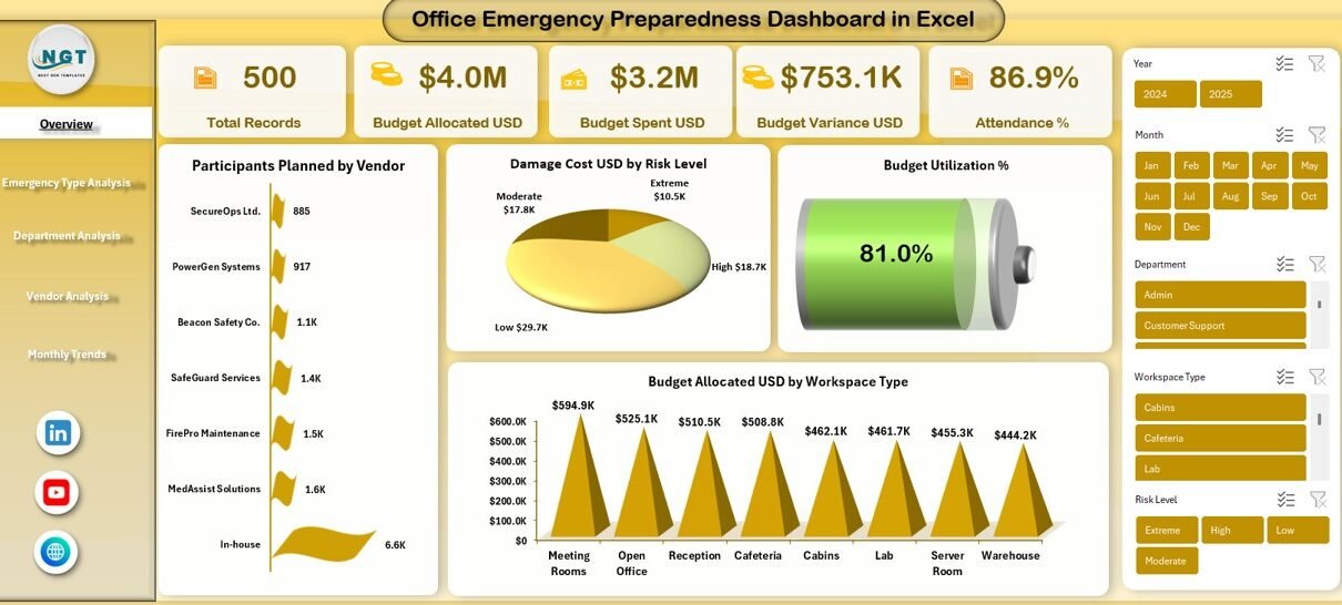
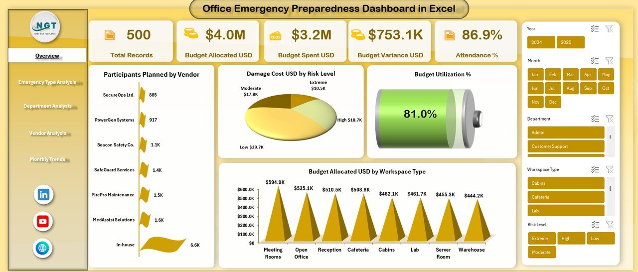
Overview Sheet Tab: What Does the Overview Page Show?
The Overview sheet acts as the central control panel of the dashboard. It summarizes high-level emergency preparedness metrics in one place.
Key KPIs Displayed on the Overview Sheet
- Total Records
Shows the total number of emergency preparedness activities logged in the system. - Budget Allocated (USD)
Displays the total budget planned for emergency preparedness initiatives. - Budget Spent (USD)
Highlights the actual amount spent on training, drills, and emergency resources. - Budget Variance (USD)
Shows the difference between allocated and spent budgets, helping track overspending or savings. - Attendance %
Measures the percentage of participants who actually attended planned emergency sessions. - Participants Planned by Vendor
Displays how many participants were planned under each external or internal vendor. - Damage Cost (USD) by Risk Level
Shows how financial damage varies across different risk levels. - Budget Utilization %
Indicates how efficiently the allocated budget is being used. - Budget Allocated (USD) by Workspace Type
Breaks down budget allocation across office areas such as floors, labs, warehouses, or common areas.
Because all these KPIs appear together, stakeholders can quickly assess the overall preparedness status.
Click to buy Office Emergency Preparedness Dashboard in Excel
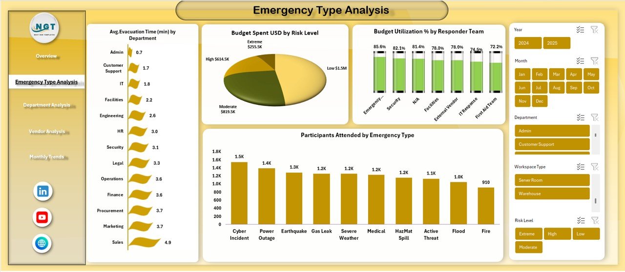
Emergency Type Analysis Sheet: How Do Different Emergencies Impact Resources?
The Emergency Type Analysis sheet focuses on understanding how different emergency types affect budgets, participation, and response teams.
Key Metrics on Emergency Type Analysis
- Budget Spent (USD) by Risk Level
Helps identify which risk categories consume the highest resources. - Participants Attended by Emergency Type
Shows attendance levels for fire drills, medical training, evacuation drills, and other emergency types. - Budget Utilization % by Responder Team
Tracks how efficiently responder teams such as security, medical, or fire wardens use allocated budgets. - Participants Attended by Emergency Type
Enables comparison of engagement levels across different emergency scenarios.
Because of this analysis, organizations can prioritize training and funding for high-impact emergency types.
Click to buy Office Emergency Preparedness Dashboard in Excel
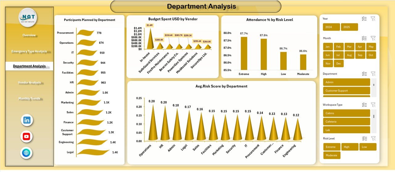
Department Analysis Sheet: How Prepared Are Individual Departments?
The Department Analysis sheet breaks emergency preparedness performance by department, which helps identify strong and weak areas.
Key Insights from Department Analysis
- Participants Planned by Department
Shows how many employees were scheduled for emergency preparedness activities. - Budget Spent (USD) by Vendor
Tracks spending patterns associated with vendors serving different departments. - Attendance % by Risk Level
Reveals whether high-risk departments show better or worse participation. - Average Risk Score by Department
Highlights departments with higher exposure to emergency risks.
Therefore, leadership teams can target specific departments for improvement initiatives.
Click to buy Office Emergency Preparedness Dashboard in Excel
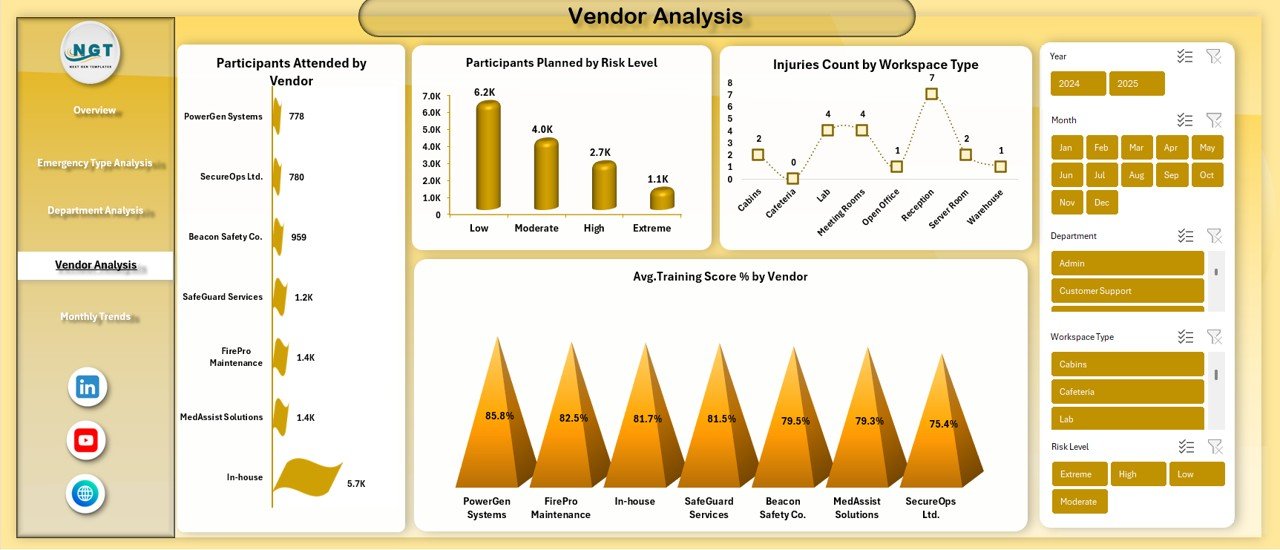
Vendor Analysis Sheet: How Effective Are Emergency Vendors?
Many organizations rely on external vendors for emergency training, equipment, or simulations. The Vendor Analysis sheet evaluates vendor performance.
Key Vendor Metrics Included
- Participants Attended by Vendor
Shows how well each vendor engages participants. - Participants Planned by Risk Level
Displays vendor involvement across different risk categories. - Injuries Count by Workspace Type
Helps assess whether vendor-led activities correlate with safety outcomes. - Average Training Score % by Vendor
Measures training quality and effectiveness.
As a result, organizations can make data-driven vendor selection and contract decisions.
Click to buy Office Emergency Preparedness Dashboard in Excel
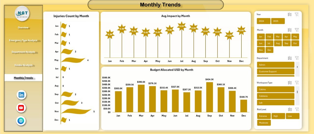
Monthly Trends Sheet: How Is Preparedness Changing Over Time?
The Monthly Trends sheet focuses on time-based analysis, which is critical for long-term planning.
Key Monthly Trend Metrics
- Injuries Count by Month
Tracks how injury incidents fluctuate over time. - Budget Allocated (USD) by Month
Shows monthly budget planning patterns. - Average Impact by Month
Helps assess the severity and consequences of incidents over time.
Because trends highlight patterns, organizations can plan proactive measures instead of reacting late.
Click to buy Office Emergency Preparedness Dashboard in Excel
Advantages of Office Emergency Preparedness Dashboard in Excel
Using an Office Emergency Preparedness Dashboard in Excel offers several strategic and operational benefits.
- Centralized Emergency Data Management
All emergency preparedness data stays in one structured file. Therefore, teams avoid confusion and duplication.
- Better Budget Control and Transparency
The dashboard clearly shows allocated budgets, actual spending, and variances. As a result, financial control improves significantly.
- Improved Employee Safety and Readiness
By tracking attendance, training scores, and injuries, organizations enhance employee preparedness.
- Faster and Smarter Decision-Making
Visual KPIs allow leadership to identify risks instantly and act quickly.
- No Advanced Tools Required
Since the dashboard runs in Excel, users do not need expensive software or technical expertise.
- Customizable and Scalable
Organizations can easily add new emergency types, departments, or vendors as needs evolve.
How Can This Dashboard Support Decision-Making?
This dashboard supports decision-making at multiple levels.
- HR teams can monitor attendance and training effectiveness
- Safety officers can analyze risks and injury trends
- Finance teams can control emergency budgets
- Leadership teams can evaluate overall preparedness maturity
Because of this alignment, organizations improve both safety outcomes and cost efficiency.
Best Practices for the Office Emergency Preparedness Dashboard in Excel
To maximize the value of this dashboard, organizations should follow proven best practices.
- Update Data Regularly
Always update emergency records after drills, incidents, or training sessions. Fresh data ensures reliable insights.
- Standardize Data Entry
Use consistent formats for departments, vendors, risk levels, and emergency types to avoid reporting errors.
- Review Dashboards Monthly
Monthly reviews help identify rising risks, budget overruns, or participation gaps early.
- Use Filters and Slicers Effectively
Interactive filters make analysis faster and more focused for different stakeholders.
- Link Insights to Action Plans
Always convert dashboard insights into corrective actions, training plans, or policy updates.
- Train Teams on Dashboard Usage
Ensure HR, safety, and management teams understand how to interpret dashboard visuals correctly.
Who Should Use an Office Emergency Preparedness Dashboard in Excel?
This dashboard proves valuable for:
- Corporate offices and business parks
- IT companies and shared workspaces
- Manufacturing and industrial offices
- Healthcare administrative offices
- Educational institutions
- Government and public sector offices
In short, any organization that prioritizes employee safety can benefit.
Conclusion: Why an Office Emergency Preparedness Dashboard in Excel Is a Smart Investment
An Office Emergency Preparedness Dashboard in Excel transforms emergency planning from a reactive process into a proactive strategy. Instead of relying on fragmented reports, organizations gain a unified view of budgets, risks, participation, injuries, and trends.
Moreover, because the dashboard remains easy to use, cost-effective, and customizable, it delivers long-term value without complexity. When organizations use data-driven insights to strengthen preparedness, they protect people, assets, and business continuity effectively.
Frequently Asked Questions (FAQs)
What is the main purpose of an Office Emergency Preparedness Dashboard in Excel?
The main purpose is to track, analyze, and improve workplace emergency preparedness using structured data and visual insights.
Can small organizations use this dashboard?
Yes, small and medium-sized organizations can easily use and customize this Excel-based dashboard.
Does this dashboard require advanced Excel skills?
No, basic Excel knowledge is enough to use and update the dashboard effectively.
Can I customize KPIs and sheets?
Yes, the dashboard is fully customizable based on organizational needs.
How often should emergency data be updated?
Ideally, data should be updated after every drill, training session, or emergency event.
Does this dashboard help with compliance audits?
Yes, it provides documented evidence of preparedness activities, budgets, and training outcomes.
Visit our YouTube channel to learn step-by-step video tutorials
Watch the step-by-step video tutorial:
Click to buy Office Emergency Preparedness Dashboard in Excel