The packaging industry operates in a fast-moving, cost-sensitive, and highly competitive environment. Manufacturers must balance production efficiency, quality standards, material usage, energy costs, delivery timelines, and customer satisfaction at the same time. However, many packaging companies still depend on scattered Excel files, manual reporting, and delayed performance reviews. As a result, decision-makers struggle to identify issues early and take corrective action on time.
That is exactly why a Packaging Industry KPI Dashboard in Power BI becomes a powerful and practical performance management solution.
In this in-depth guide, you will learn what a Packaging Industry KPI Dashboard in Power BI is, why it matters, how it works, its page-wise structure, advantages, opportunities for improvement, best practices, and frequently asked questions. Moreover, the article uses clear language, smooth transitions, and practical explanations to ensure easy understanding and strong SEO performance.
Click to buy Packaging Industry KPI Dashboard in Power BI
What Is a Packaging Industry KPI Dashboard in Power BI?
A Packaging Industry KPI Dashboard in Power BI is a ready-to-use, interactive analytics solution that helps packaging manufacturers track, analyze, and improve key performance indicators (KPIs) related to production, quality, cost, efficiency, and overall business performance.
Instead of managing multiple disconnected spreadsheets, this dashboard consolidates KPI data into a single Power BI file. As a result, plant managers, operations teams, quality controllers, and leadership gain instant visibility into both Month-to-Date (MTD) and Year-to-Date (YTD) performance.
Because the dashboard uses Excel as the data source and Power BI as the visualization layer, it remains flexible, scalable, and easy to maintain. Moreover, teams do not need advanced technical skills to start using it effectively.
Why Does the Packaging Industry Need a KPI Dashboard?
The packaging industry faces constant pressure to reduce costs, improve output quality, meet delivery timelines, and comply with sustainability goals. Therefore, performance tracking becomes essential rather than optional.
Without a KPI dashboard, packaging companies often face the following challenges:
- Limited visibility into real-time performance
- Delayed identification of production or quality issues
- Manual and time-consuming reporting processes
- Difficulty comparing current performance with targets and previous years
- Poor alignment between operational teams and management goals
However, when organizations adopt a Packaging Industry KPI Dashboard in Power BI, they gain clarity, control, and confidence. Consequently, decision-makers can act faster and smarter.
How Does the Packaging Industry KPI Dashboard in Power BI Work?
The dashboard follows a simple yet powerful structure. First, users enter KPI data into a structured Excel file. Then, Power BI automatically processes and visualizes that data across interactive dashboard pages.
The solution focuses on three core elements:
- Actual performance data
- Target benchmarks
- Historical (previous year) comparison
Because of this structure, users can evaluate performance from multiple angles without switching between files or reports.
What Are the Key Features of the Packaging Industry KPI Dashboard in Power BI?
The dashboard comes with several well-designed features that support daily, monthly, and yearly performance tracking.
Centralized KPI Monitoring
The dashboard displays all KPIs in one centralized Power BI report. Therefore, users no longer need to manage separate files for production, quality, and financial metrics.
Dynamic Month and KPI Group Slicers
Users can select a specific month and KPI group using slicers at the top of the dashboard. As a result, the entire report updates instantly without manual filtering.
MTD and YTD Performance Tracking
The dashboard shows both Month-to-Date and Year-to-Date values. Consequently, teams can track short-term performance while staying aligned with annual goals.
Target vs Actual Analysis
The dashboard automatically calculates Target vs Actual percentages for both MTD and YTD. Therefore, users can quickly see whether performance meets expectations.
Previous Year Comparison
By comparing current year performance with previous year data, the dashboard highlights growth trends and performance gaps.
Visual Status Indicators
The dashboard uses green and red icons (▲ ▼) to indicate KPI status. Thus, users can identify underperforming KPIs at a glance.
What Pages Are Included in the Packaging Industry KPI Dashboard in Power BI?
The dashboard includes three well-structured pages, each designed for a specific purpose.
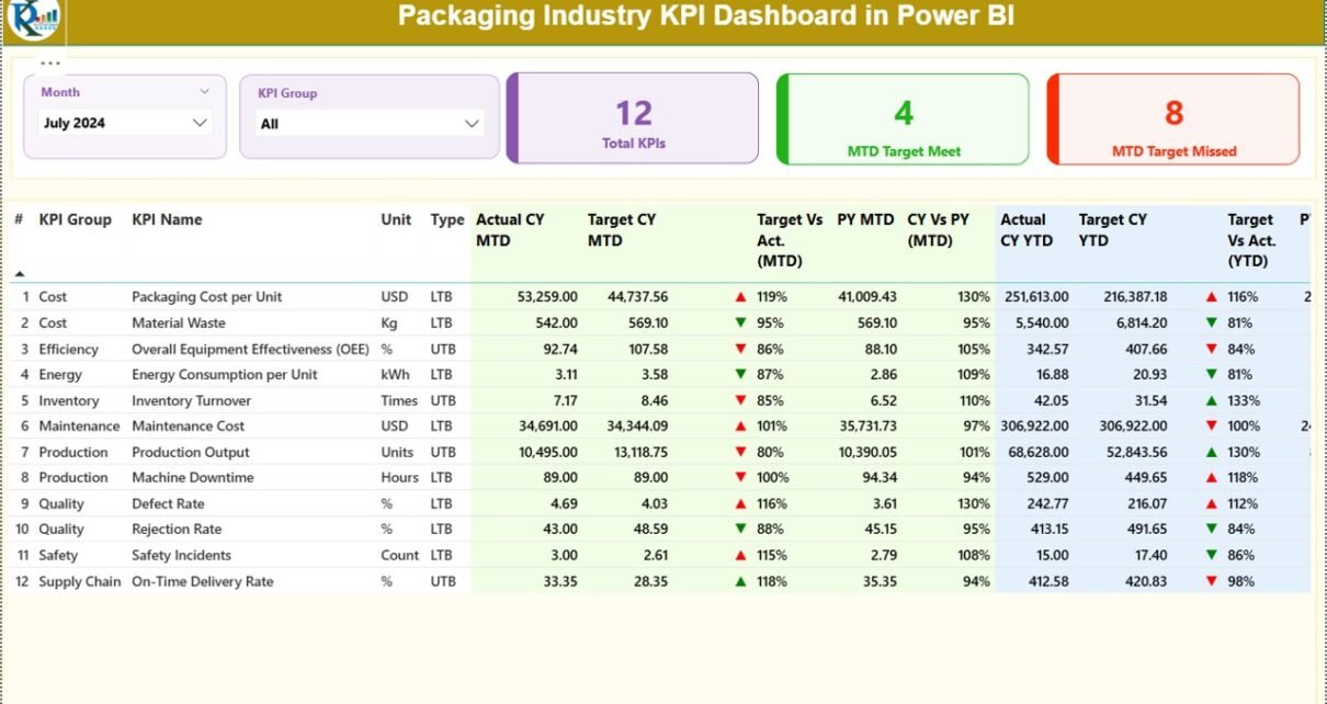
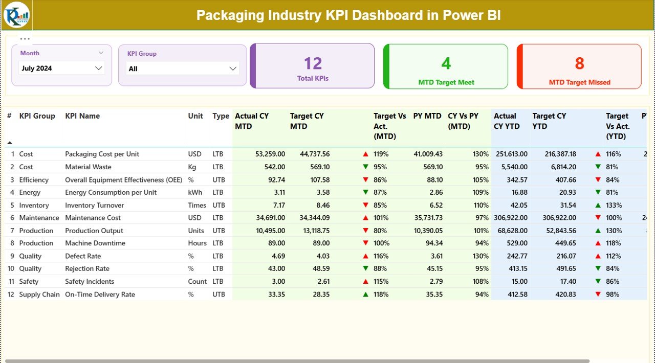
Summary Page Show
The Summary Page acts as the main control center of the dashboard.
Key Elements of the Summary Page
At the top of the page, users see:
- Month slicer
- KPI Group slicer
Below the slicers, the dashboard displays three key cards:
- Total KPIs Count
- MTD Target Met Count
- MTD Target Missed Count
These cards provide an instant snapshot of overall performance.
Detailed KPI Table
Below the cards, a detailed table presents comprehensive KPI information, including:
- KPI Number – Sequential number of each KPI
- KPI Group – Category or functional group of the KPI
- KPI Name – Name of the performance metric
- Unit – Unit of measurement
- Type – LTB (Lower the Better) or UTB (Upper the Better)
- Actual CY MTD – Current year actual MTD value
- Target CY MTD – Current year target MTD value
- MTD Status Icon – Visual indicator against target
- Target vs Actual (MTD) – Actual ÷ Target percentage
- Previous Year MTD – Same period last year
- CY vs PY (MTD) – Current vs previous year comparison
- Actual CY YTD – Current year actual YTD value
- Target CY YTD – Current year target YTD value
- YTD Status Icon – Visual indicator against target
- Target vs Actual (YTD) – Actual ÷ Target percentage
- Previous Year YTD – Last year YTD value
- CY vs PY (YTD) – Current vs previous year comparison
Because all these metrics appear on one page, decision-makers gain complete clarity without scrolling through multiple reports.
Click to buy Packaging Industry KPI Dashboard in Power BI
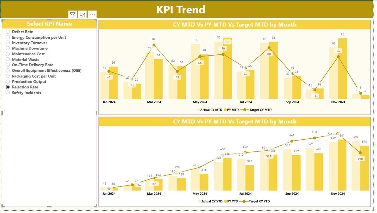
KPI Trend Page
The KPI Trend Page focuses on performance trends over time.
Key Highlights of the KPI Trend Page
Two combo charts display:
Actual Current Year values
Actual Previous Year values
Target values
Separate charts show trends for:
MTD performance
YTD performance
A KPI name slicer on the left allows users to select a specific KPI. As a result, they can analyze trends for individual metrics in detail.
This page helps users identify patterns, seasonality, and recurring issues.
Click to buy Packaging Industry KPI Dashboard in Power BI
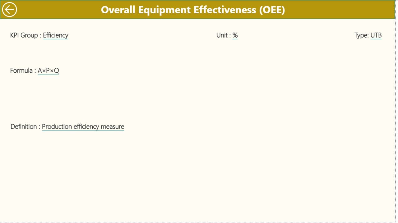
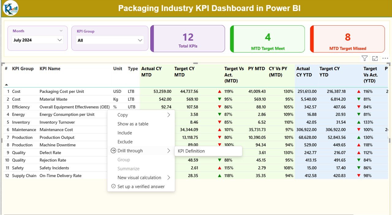
KPI Definition
The KPI Definition Page acts as a drill-through reference page.
Key Features of the KPI Definition Page
- Displays KPI formula
- Explains KPI definition in simple terms
- Shows KPI unit and type (LTB or UTB)
This page remains hidden by default. However, users can drill through from the Summary Page to view detailed KPI explanations. A back button at the top left corner allows easy navigation back to the main page.
Click to buy Packaging Industry KPI Dashboard in Power BI
What Excel Data Is Required for the Packaging Industry KPI Dashboard?
The dashboard uses an Excel file as its data source. Users must maintain three structured worksheets.
Input_Actual Sheet
In this sheet, users enter actual performance data.
Required Columns
- KPI Name
- Month (use the first date of the month)
- MTD value
- YTD value
This sheet captures real performance numbers.
Input_Target Sheet
In this sheet, users enter target benchmarks.
Required Columns
- KPI Name
- Month (use the first date of the month)
- MTD target
- YTD target
This structure ensures accurate target comparisons.
Click to buy Packaging Industry KPI Dashboard in Power BI
KPI Definition Sheet
This sheet stores KPI metadata.
Required Columns
- KPI Number
- KPI Group
- KPI Name
- Unit
- Formula
- Definition
- Type (LTB or UTB)
Because this sheet drives the KPI Definition Page, accurate data entry remains essential.
Advantages of the Packaging Industry KPI Dashboard in Power BI
A KPI dashboard delivers several tangible benefits for packaging companies.
Improved Decision-Making
The dashboard provides real-time insights. Therefore, managers can make faster and better decisions.
Time Savings
Automated calculations and visuals eliminate manual reporting. As a result, teams save hours every month.
Better Performance Visibility
Clear visuals and status icons highlight problem areas instantly.
Target Alignment
Teams can track performance against defined targets consistently.
Historical Comparison
Year-over-year comparisons support long-term planning and improvement.
Scalability
The dashboard supports additional KPIs without redesigning the entire model.
Opportunities for Improvement in KPI Tracking
Although the dashboard offers strong functionality, organizations can enhance results further by improving their processes.
- Standardize KPI definitions across departments
- Improve data accuracy at the source
- Increase update frequency for critical KPIs
- Train teams to interpret KPI trends effectively
- Align KPIs with strategic business goals
By addressing these areas, companies maximize the value of their KPI dashboards.
Best Practices for the Packaging Industry KPI Dashboard in Power BI
To get the best results, organizations should follow proven best practices.
Define Clear KPIs
Choose KPIs that directly impact productivity, quality, cost, and customer satisfaction.
Maintain Clean Data
Ensure accurate and timely data entry in Excel sheets.
Review KPIs Regularly
Schedule monthly and quarterly reviews using dashboard insights.
Use LTB and UTB Correctly
Assign KPI types carefully to ensure correct interpretation.
Limit KPI Overload
Track meaningful KPIs instead of adding unnecessary metrics.
Train Users
Educate teams on how to read and act on dashboard insights.
Who Can Benefit from a Packaging Industry KPI Dashboard?
This dashboard suits a wide range of users:
- Packaging plant managers
- Production and operations teams
- Quality assurance managers
- Supply chain and logistics teams
- Finance and cost control teams
- Senior management and executives
Because of its flexibility, the dashboard adapts to both small plants and large manufacturing groups.
Conclusion: Why the Packaging Industry KPI Dashboard in Power BI Matters
The packaging industry demands speed, accuracy, and accountability. A Packaging Industry KPI Dashboard in Power BI delivers all three in one unified solution.
By centralizing KPI data, automating calculations, and presenting insights visually, the dashboard empowers teams to monitor performance confidently. Moreover, it supports faster decision-making, stronger target alignment, and continuous improvement.
In a competitive market, companies that track performance effectively always stay ahead. Therefore, investing in a structured KPI dashboard becomes a strategic advantage rather than just a reporting tool.
Frequently Asked Questions (FAQs)
What is a Packaging Industry KPI Dashboard in Power BI?
It is an interactive Power BI report that tracks packaging industry KPIs using Excel data sources.
Which data source does the dashboard use?
The dashboard uses an Excel file with Actual, Target, and KPI Definition sheets.
Can users customize KPIs?
Yes, users can add or modify KPIs by updating the Excel data and definitions.
Does the dashboard support MTD and YTD analysis?
Yes, it provides detailed Month-to-Date and Year-to-Date performance tracking.
Is Power BI expertise required to use this dashboard?
No, users only need basic Excel knowledge. Power BI handles visualization automatically.
Can this dashboard work for multiple packaging plants?
Yes, organizations can extend the data model to include plant-level analysis.
Visit our YouTube channel to learn step-by-step video tutorials
Watch the step-by-step video tutorial: